

The rendering is as follows: 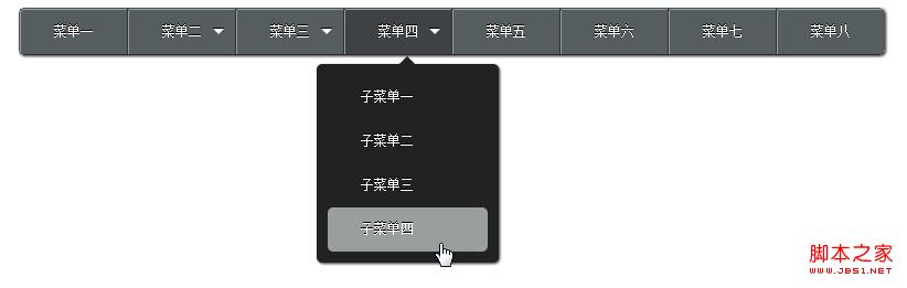
The code is as follows:
Copy code
The code is as follows:
<!DOCTYPE HTML>
<html>
<head>
<meta charset="UTF-8" />
<title>纯html+css导航</title>
<!-- mulder -->
<!-- qq:10221408 -->
<!-- 只支持 chrome firefox -->
<style>
*{
margin:0;
padding:0;
}
.clear:after {
clear: both;
content: ".";
display: block;
height: 0;
visibility: hidden;
}
nav{
display:inline-block;
border:1px solid #505255;
border-bottom: 1px solid #282C2F;
-moz-border-radius: 5px;
-webkit-border-radius: 5px;
margin:50px;
-webkit-box-shadow:1px 1px 3px #292929;
-moz-box-shadow:1px 1px 3px #292929;
}
li{
list-style:none;
float:left;
border-right: 1px solid #2E3235;
position: relative;
/*background: -moz-linear-gradient(top, #fff, #555D5F 2% ,#555D5F 50%,#3E4245 100%);
background: -webkit-gradient(linear, 0 0, 0 100%, from(#fff), color-stop(2%, #555D5F), color-stop(50%, #555D5F),to(#3E4245));*/
background:#555D5F;
}
li:hover{
/*background: -moz-linear-gradient(top, #fff, #3E4245 2% ,#555D5F 80%,#555D5F 100%);
background: -webkit-gradient(linear, 0 0, 0 100%, from(#fff), color-stop(2%, #3E4245), color-stop(80%, #3E4245),to(#555D5F));*/
background:#3E4245;
-moz-transition: background 1s ease-out;
-webkit-transition: background 1s ease-out;
}
li a{
display:block;
height:40px;
line-height:40px;
padding:0 30px;
font-size:12px;
color:#fff;
text-shadow: 0px -1px 0px #000;
text-decoration:none;
white-space:nowrap;
border-left: 1px solid #999E9F;
border-top: 1px solid #999E9F;
-moz-border-top-left-radius: 2px;
-webkit-border-top-left-radius: 2px;
z-index:100;
}
li > a{
position:relative;
}
li.first a{
-moz-border-radius-topleft: 4px;
-moz-border-radius-bottomleft: 4px;
-webkit-border-top-left-radius: 4px;
-webkit-border-bottom-left-radius: 4px;
}
li.last{
border-right: 0 none;
}
dl{
position:absolute;
display:block;
top:40px;
left: -25px;
width:165px;
background:#222222;
-moz-border-radius: 5px;
-webkit-border-radius: 5px;
-webkit-box-shadow:1px 1px 3px #292929;
-moz-box-shadow:1px 1px 3px #292929;
z-index:10;
}
li:hover dl{
top:50px;
display:block;
width:145px;
padding:10px;
}
dl a{
background:transparent;
border:0 none;
-moz-border-radius: 5px;
-webkit-border-radius: 5px;
-moz-transition: background 0.5s ease-out;
-webkit-transition: background 0.5s ease-out;
z-index:50;
}
dl a:hover{
color:#FFF;
background:#999E9F;
-moz-transition: background 0.3s ease-in-out, color 0.3s ease-in-out;
-webkit-transition: background 0.3s ease-in-out, color 0.3s ease-in-out;
}
dd{
margin-top:-40px;
opacity:0;
width:145px;
-webkit-transition-property:all;
/*-webkit-transition-timing-function: cubic-bezier(5,0,5,0);*/
-moz-transition-property: all;
/*-moz-transition-timing-function: cubic-bezier(5,0,5,0);*/
/*-webkit-transition-delay:5s;
-moz-transition-delay:5s;*/
}
li:hover dd{
margin-top:0;
opacity:1;
}
li dd:nth-child(1){
-webkit-transition-duration: 0.1s;
-moz-transition-duration: 0.1s;
}
li dd:nth-child(2){
-webkit-transition-duration: 0.2s;
-moz-transition-duration: 0.2s;
}
li dd:nth-child(3){
-webkit-transition-duration: 0.3s;
-moz-transition-duration: 0.3s;
}
li dd:nth-child(4){
-webkit-transition-duration: 0.4s;
-moz-transition-duration: 0.4s;
}
dt{
display:none;
margin-top:-25px;
padding-top:15px;
height:10px;
}
li:hover dt{
display:block;
}
.Darrow{
float:right;
margin:18px 10px 0 0;
border-width:5px;
border-color:#FFF transparent transparent transparent;
border-style:solid;
width:0;
height:0;
line-height:0;
overflow:hidden;
cursor:pointer;
text-shadow: 0px -1px 0px #000;
-webkit-box-shadow:0px -1px 0px #000;
-moz-box-shadow:0px -1px 0px #000;
}
.arrow{
margin:0 auto;
margin-top:-5px;
display:block;
width:10px;
height:10px;
background:#222222;
-webkit-transform: rotate(45deg);
-moz-transform: rotate(45deg);
}
</style>
</head>
<body>
<nav>
<ul class="clear">
<li class="first"><a href="#">菜单一</a></li>
<li>
<span class="Darrow"></span>
<a href="#">菜单二</a>
<dl>
<dt><span class="arrow"></span></dt>
<dd><a href="#">子菜单一</a></dd>
<dd><a href="#">子菜单二</a></dd>
<dd><a href="#">子菜单三子菜单三</a></dd>
</dl>
</li>
<li>
<span class="Darrow"></span>
<a href="#">菜单三</a>
<dl>
<dt><span class="arrow"></span></dt>
<dd><a href="#">子菜单一</a></dd>
<dd><a href="#">子菜单二</a></dd>
<dd><a href="#">子菜单三子菜单三</a></dd>
</dl>
</li>
<li>
<span class="Darrow"></span>
<a href="#">菜单四</a>
<dl>
<dt><span class="arrow"></span></dt>
<dd><a href="#">子菜单一</a></dd>
<dd><a href="#">子菜单二</a></dd>
<dd><a href="#">子菜单三</a></dd>
<dd><a href="#">子菜单四</a></dd>
</dl>
</li>
<li><a href="#">菜单五</a></li>
<li><a href="#">菜单六</a></li>
<li><a href="#">菜单七</a></li>
<li class="last"><a href="#">菜单八</a></li>
</ul>
</nav>
</body>
</html> css3 tutorial
 What are the production methods of html5 animation production?
 What are the css3 gradient properties?
 The difference between HTML and HTML5
 How to operate json with jquery
 How to modify folder 777 permissions
 vlookup matches two columns of data
 Cryptocurrency trading platform rankings
 Win11 My Computer Added to Desktop Tutorial


![[Web front-end] Node.js quick start](https://img.php.cn/upload/course/000/000/067/662b5d34ba7c0227.png)


