Win11 subsequent updates will optimize the right-click menu
In fact, as early as the win11 internal testing phase, many test users reported that the right-click menu system of win11 was very uncomfortable and uncomfortable to use. Although Microsoft made some subsequent adjustments, it still addressed the symptoms rather than the root cause. Recently, Microsoft finally said that it will launch a comprehensive optimization of the win11 right-click menu. Let’s take a look.
win11 right-click menu will be optimized and adjusted
1. Recently, Microsoft finally announced that it will optimize the win11 right-click menu in subsequent updates. The menu is optimized and adjusted.
2. Although the right-click menu of win11 looks cleaner and more beautiful, it sacrifices the user experience.
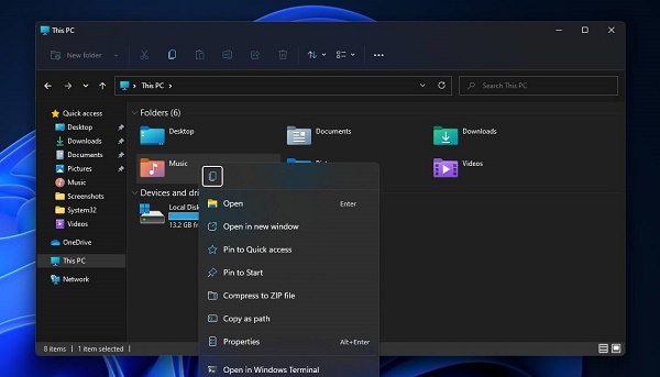
3. The win11 right-click menu has moved a large number of options to the secondary menu of "more options", making it very inconvenient to use.
4. This problem existed as early as the testing phase. At that time, Microsoft just moved the "Refresh" button back to the right-click menu, but it still did not completely solve the problem.
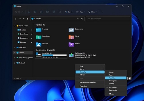
5. It is understood that Microsoft will redesign and create the secondary menu.
6. The new secondary menu will improve the efficiency of outgoing calls and solve the current problem of cumbersome and slow operations.
7. In terms of UI, the updated secondary menu will ignore the user-defined theme color and always maintain a blue interface.

8. This update is expected to be pushed to dev channel users first, and will be pushed to official version users only after passing the test.
9. Some people also predict that this update may be officially pushed together with the win11 22h2 version launched in October 2022.
10. In addition, Microsoft also announced that it will fix the crash problems of the taskbar and file explorer in subsequent patches.
The above is the detailed content of Win11 subsequent updates will optimize the right-click menu. For more information, please follow other related articles on the PHP Chinese website!

Hot AI Tools

Undresser.AI Undress
AI-powered app for creating realistic nude photos

AI Clothes Remover
Online AI tool for removing clothes from photos.

Undress AI Tool
Undress images for free

Clothoff.io
AI clothes remover

Video Face Swap
Swap faces in any video effortlessly with our completely free AI face swap tool!

Hot Article

Hot Tools

Notepad++7.3.1
Easy-to-use and free code editor

SublimeText3 Chinese version
Chinese version, very easy to use

Zend Studio 13.0.1
Powerful PHP integrated development environment

Dreamweaver CS6
Visual web development tools

SublimeText3 Mac version
God-level code editing software (SublimeText3)

Hot Topics
 1386
1386
 52
52
 ReactOS, the Open-Source Windows, Just Got an Update
Mar 25, 2025 am 03:02 AM
ReactOS 0.4.15 includes new storage drivers, which should help with overall stability and UDB drive compatibility, as well as new drivers for networking. There are also many updates to fonts support, the desktop shell, Windows APIs, themes, and file
 How to Create a Dynamic Table of Contents in Excel
Mar 24, 2025 am 08:01 AM
A table of contents is a total game-changer when working with large files – it keeps everything organized and easy to navigate. Unfortunately, unlike Word, Microsoft Excel doesn’t have a simple “Table of Contents” button that adds t
 New to Multi-Monitors? Don't Make These Mistakes
Mar 25, 2025 am 03:12 AM
Multi-monitor setups boost your productivity and deliver a more immersive experience. However, it's easy for a novice to stumble while assembling the setup and make mistakes. Here are some of the most common ones and how to avoid them.
 Lenovo Yoga Slim 9i 14 Gen 10 Laptop Review: Speedy Processing, Lacking Elsewhere
Mar 22, 2025 am 03:07 AM
The Lenovo Yoga Slim 9i (14-inch, 10th Gen Intel) offers a compelling blend of features: Microsoft Copilot AI integration, a stunning 4K OLED display, and robust Intel processing power. While it comes close to perfection, some shortcomings hold it b
 This ASUS ROG Zephyrus with an RTX 3070 Is 31% Off Right Now
Mar 22, 2025 am 06:02 AM
Great value for discount! Asus ROG Zephyrus G16 (2024) E-sports book has dropped significantly! Original price is $1999.99, current price is only $1379.99, saving $620! This Asus ROG Zephyrus G16 gaming laptop equipped with RTX 4070 graphics card brings excellent gaming performance at a lower price. It comes with a stunning 16-inch QHD OLED screen with a smooth 240Hz refresh rate. While the CPU isn't top-notch, its cool appearance, oversized storage space and powerful graphics card make it an ideal choice for users who pursue portable high-performance laptops. Best Buy exclusive offer! Currently, Best Buy is selling this product at a significant discount
 Microsoft's New PowerToys Search Is the Missing Feature Windows 11 Needs
Apr 03, 2025 am 03:53 AM
Microsoft's latest PowerToys update introduces a game-changing search feature reminiscent of macOS' Spotlight. This improved "Command Palette" (formerly PowerToys Run) surpasses the functionality of the Windows R Run command and the task
 What is Windows Insider Program?
Mar 21, 2025 pm 07:44 PM
The article discusses the Windows Insider Program, where users test pre-release Windows versions. It covers joining the program, its benefits, and new features like Snap Layouts and WSL improvements.
 What is a digital license?
Mar 21, 2025 pm 07:43 PM
The article discusses digital licenses, which are electronic versions of traditional licenses, offering convenience, security, and real-time updates. It details the process of obtaining a digital license and highlights its benefits over physical ones


