

Analyze the advantages and importance of responsive layout
Jan 05, 2024 am 11:01 AM
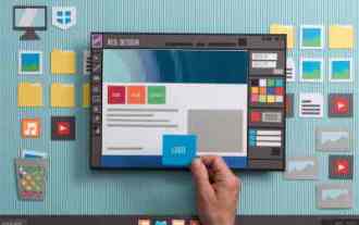
Why use responsive layout? Analysis of advantages requires specific code examples
With the popularity of mobile devices and the continuous development of technology, more and more people are beginning to use mobile phones, tablets and other mobile devices to browse the web. This also brings new challenges to web designers: How to make web pages display smoothly on different devices? This is why responsive layout is important.
Responsive Web Design is a design method that automatically adjusts the web page layout and element size according to the device screen size and resolution. Compared with traditional fixed layout, responsive layout can better adapt to devices of different screen sizes, ensuring that users can get a good browsing experience on any device.
So, why use responsive layout? Here are some of the main advantages:
- Improved user experience: Responsive layout allows web pages to automatically adjust layout and element sizes on different devices, ensuring that users can browse and operate web pages easily. For example, when users browse the web on mobile phones, responsive layout can automatically adjust the size and position of elements to make the page look clearer and easier to read, and does not require users to manually adjust the page zoom ratio.
- Save development costs and time: Using responsive layout avoids the need to develop separate web page versions for different devices. Traditional fixed layout requires writing separate codes for devices of different sizes, while responsive layout only requires writing one set of code to adapt to the display needs of different devices. This not only reduces development costs and time, but also facilitates maintenance.
- Improve website accessibility and searchability: Using responsive layout can improve the accessibility of web pages. Because for users, no matter what device they use, they can easily access website content. For search engines, responsive layout can make web content easier to index and improve the search ranking of the website.
Understanding the advantages of responsive layout, here is a code example to illustrate how to implement responsive layout:
<!DOCTYPE html>
<html>
<head>
  <style>
    .container {
      width: 100%;
      max-width: 1200px;
      margin: 0 auto;
      padding: 20px;
    }

    .box {
      width: 100%;
      height: 200px;
      background-color: #eaeaea;
      margin-bottom: 20px;
    }

    @media (min-width: 768px) {
      .box {
        width: 50%;
        height: 300px;
      }
    }

    @media (min-width: 1200px) {
      .box {
        width: 33.33%;
        height: 400px;
      }
    }
  </style>
</head>
<body>
  <div class="container">
    <div class="box"></div>
    <div class="box"></div>
    <div class="box"></div>
  </div>
</body>
</html>The above code example uses the media query (Media) in CSS3 Queries) to implement responsive layout. According to different device screen widths, you can see that the size of the box will automatically adjust.
When the device screen width is less than 768px, the width of the box is 100%; when the device screen width is greater than or equal to 768px, the width of the box is 50%; when the device screen width is greater than or equal to 1200px, the width of the box is 33.33%. In this way, no matter what device it is on, the size of the box can be automatically adjusted so that the page presents a good effect.
To sum up, responsive layout has become a design trend that cannot be ignored today with the popularity of mobile devices. It can improve user experience, save development costs and time, and improve website accessibility and searchability. By rationally using technologies such as media queries, we can easily implement responsive layout so that web pages can display the best results on different devices.
The above is the detailed content of Analyze the advantages and importance of responsive layout. For more information, please follow other related articles on the PHP Chinese website!

Hot Article

Hot tools Tags

Hot Article

Hot Article Tags

Notepad++7.3.1
Easy-to-use and free code editor

SublimeText3 Chinese version
Chinese version, very easy to use

Zend Studio 13.0.1
Powerful PHP integrated development environment

Dreamweaver CS6
Visual web development tools

SublimeText3 Mac version
God-level code editing software (SublimeText3)
Hot Topics


 Adding Box Shadows to WordPress Blocks and Elements
Mar 09, 2025 pm 12:53 PM
Adding Box Shadows to WordPress Blocks and Elements
Mar 09, 2025 pm 12:53 PM
Adding Box Shadows to WordPress Blocks and Elements
 Create a JavaScript Contact Form With the Smart Forms Framework
Mar 07, 2025 am 11:33 AM
Create a JavaScript Contact Form With the Smart Forms Framework
Mar 07, 2025 am 11:33 AM
Create a JavaScript Contact Form With the Smart Forms Framework
 Making Your First Custom Svelte Transition
Mar 15, 2025 am 11:08 AM
Making Your First Custom Svelte Transition
Mar 15, 2025 am 11:08 AM
Making Your First Custom Svelte Transition
 Create an Inline Text Editor With the contentEditable Attribute
Mar 02, 2025 am 09:03 AM
Create an Inline Text Editor With the contentEditable Attribute
Mar 02, 2025 am 09:03 AM
Create an Inline Text Editor With the contentEditable Attribute
 Demystifying Screen Readers: Accessible Forms & Best Practices
Mar 08, 2025 am 09:45 AM
Demystifying Screen Readers: Accessible Forms & Best Practices
Mar 08, 2025 am 09:45 AM
Demystifying Screen Readers: Accessible Forms & Best Practices

 Comparing the 5 Best PHP Form Builders (And 3 Free Scripts)
Mar 04, 2025 am 10:22 AM
Comparing the 5 Best PHP Form Builders (And 3 Free Scripts)
Mar 04, 2025 am 10:22 AM
Comparing the 5 Best PHP Form Builders (And 3 Free Scripts)
 File Upload With Multer in Node.js and Express
Mar 02, 2025 am 09:15 AM
File Upload With Multer in Node.js and Express
Mar 02, 2025 am 09:15 AM
File Upload With Multer in Node.js and Express
