

SVG and canvas are the same, both use standard HTML/CSS color representation methods, and these colors can be used for fill and stroke attributes.
There are basically the following ways to define colors :
1. Color name: directly use the color name red, blue, black...
2. rgba/rgb value: This is also It's easy to understand, for example #ff0000,rgba(255,100,100,0.5).
3. Hexadecimal value: Color defined in hexadecimal, such as #ffffff.
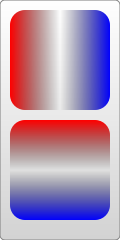
4. Gradient value: This is the same as canvas, supporting two gradient colors: linear gradient and circular gradient. As shown below:

5. Pattern fill: Use a custom pattern as the fill color.
The first ones are very simple, focus on the last two fill colors.
Linear Gradient
Use the linearGradient element to define a linear gradient, and each gradient color component is defined using the stop element. Look at the example below:
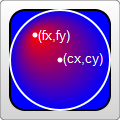
objectBoundingBox is the default value. The coordinates it uses are relative to the object bounding box (square bounding box, the situation that is not a square bounding box is more complicated, skip it), and the value range is 0 to 1. For example, the coordinate values of cx and cy in the above example are (0.25, 0.25). This means that the center of the circle is 1/4 of the upper left corner of the bounding box, and the radius of 0.25 means that the radius is 1/4 of the length of the object's square bounding box, as you can see in the picture.
userSpaceOnUse indicates that absolute coordinates are used. When using this setting, you must ensure that the gradient color and the filled object remain in the same position.
Look at the example below again. Note that the default value of the gradientUnits attribute is objectBoundingBox:
You will know the meaning of "focus" by looking at the renderings.
In addition, there are gradient elements and some transformation attributes, such as gradientTransform. This is not the focus here. Transformations will be summarized later.
Another attribute that may be used is the spreadMethod attribute, which defines the behavior that the gradient should take when it reaches its end point. This attribute has 3 optional values: pad (default value), reflect, repeat. Needless to say, pad is a natural transition. After the gradient color ends, the last member color is used to directly render the remaining part of the object. refect will continue the gradient color, but the gradient color will continue to be rendered in the reverse direction, starting from the last color to the first color; wait until it reaches the end of the gradient color again, and then reverse the order, so as to guide the object to be filled. . Repeat will also continue to render the gradient colors, but not in reverse order. It will still be rendered from the first color to the last color over and over again. The rendering is as follows:

Look at a piece of code that is repeatedly rendered:
Texture filling
Texture filling is also a popular filling method. In SVG, you can use pattern to create a texture, and then use this pattern to fill other objects . Look directly at the example:
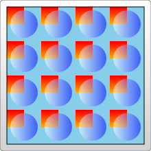
The example looks very simple, create a pattern from the gradient color, and then use the pattern
Fill the rectangle. Things to note here:
1. Different browsers have different effects when filling this pattern.
For example, the example works the same in FireFix and Chrome. But if you put the gradient color
Ifand pattern are defined in the same defs combination, FireFox can still render normally,
But Chrome cannot recognize the gradient color and will only fill it with the default black.
2. Pattern also needs to define id.
3. Pattern must also be defined in defs.
4. The use of pattern also assigns url(#id) directly to fill or stroke.
The above are very simple. Let’s focus on the coordinate representation in the example. The coordinates in the pattern are more complicated.
pattern contains two related attributes: patternUnits and patternContentUnits attributes; these two attributes still have only two values: objectBoundingBox and userSpaceOnUse. The meanings of these two values are explained above. What is easy to confuse here is that the default values of these two properties are different, but when you understand the reason for doing this, you will find that it really makes sense.
1. patternUnitsAttribute
This attribute is the same as Gradient’s gradientUnits attribute. By default, objectBoundingBox is used. The attributes affected by this attribute are x, y, width, and height. These four attributes define the starting point, width and height of the pattern respectively. They all use relative values. In the example, you want to fill 4 times in both the horizontal and vertical directions, so the width and height are both set to 0.25.
2. patternContentUnitsAttribute
The default value of this attribute is just the opposite, using userSpaceOnUse. This attribute describes the coordinate system of the shapes drawn in the pattern (such as the rect and circle above). That is to say, by default, the shape you draw in the pattern uses a different coordinate system than the size/position of the pattern itself. Consider the situation in the example above, where we want to fill a 200*200 rectangle and repeat it 4 times in each direction. This means that each pattern is 50*50, so the two rectangles and a circle in the pattern are drawn in this 50*50 rectangle. In this way we can understand the coordinates of the rectangle and circle in the pattern above. In addition, in order to be centered, the pattern in this example needs to be offset by 10px before rendering, and this value is restricted by the patternUnits attribute, so by default, the x and y values are: 10/200=0.05.
So why does pattern set the default values of the two attributes in this way?
This is determined by the user's usage (discussed with the above example):
The first pattern style : I think this is most cases, so it is processed as the default value: pattern It will be stretched as the outer shape is scaled. No matter how big the outer square is, the pattern will always be filled 4 times in both directions. But the graphics contained in the pattern will not stretch as the filled square outside scales. Although it is far-fetched, let’s understand it this way.
The second pattern style : The shape in the pattern also stretches as the surrounding shape scales. We can also explicitly set the value of the patternContentUnits attribute to objectBoundingBox to achieve this effect. For example, modify the pattern part as follows:

Practical reference:
Official documentation: http://www.w3.org/TR/SVG11/
Script index: http://msdn.microsoft.com/zh-cn/library /ff971910(v=vs.85).aspx
Development Center: https://developer.mozilla.org/en/SVG
Popular Reference: http: //www.chinasvg.com/
 What exchange is EDX?
 Usage of velocity annotation
 How to turn off windows security center
 What language can vscode be written in?
 How to save pictures in Douyin comment area to mobile phone
 How to recharge Ouyiokx
 How to use shift backdoor
 Windows 10 startup password setting tutorial
 What are the drawing software?


![[Web front-end] Node.js quick start](https://img.php.cn/upload/course/000/000/067/662b5d34ba7c0227.png)


