

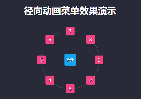
Final effect:
Before making the radial menu, you first need to know a few knowledge points:
Math.sin(x) The positive value of x. The return value is between -1.0 and 1.0;
Math.cos(x) The cosine value of x. Returns a number between -1.0 and 1.0;
X in these two functions refers to "radians" rather than "angles". The calculation formula for radians is: 2*PI/360*angle, expressed using js like this: Math.PI/180* Degree (1 degree = 180/Math.PI)
For example: 30° angle in radian = 2*PI/360*30
How to calculate the coordinates of any point on the circle (used to calculate the position of the submenu relative to the circle)
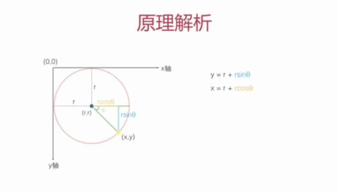
Use the upper left corner of the parent container as the dot to establish a coordinate system
The code is as follows:
<!DOCTYPE html>
<html lang="zh-cn">
<head>
<title>径向菜单的制作</title>
<meta charset="utf-8"/>
<meta name="keywords" content="" />
<meta name="description" content="" />
<script type="text/javascript" src="jquery.js"></script> <!--此处需引入jquery文件-->
<style type="text/css">
* {
margin: 0;
padding: 0;
}
body {
background-color: #292a38;
font-family: "Microsoft Yahei";
}
h1 {
margin-top: 20px;
text-align: center;
color: #fff;
}
.navWrap {
position: relative;
width: 200px;
height: 200px;
margin: 50px auto;
border: 2px dotted #4e5061;
border-radius: 50%;
}
.navWrap .main-nav {
position: absolute;
left: 50%;
top: 50%;
transform: translate(-50%,-50%);/*分别向左上移动元素对象的50%,保证居中*/
width: 40px;
height: 40px;
line-height: 40px;
font-size: 12px;
text-align: center;
text-decoration: none;
color: #fff;
border-radius: 3px;
text-shadow: 1px 1px 0px #000;
background: #15a5f3;
cursor: pointer;
}
.navWrap nav {
position: absolute;
width: 100%;
height: 100%;
transform: scale(0);
transition: all 0.5s ease-out;
opacity: 0;
}
.navWrap.active nav {
transform: scale(1);
opacity: 1;
}
.navWrap nav > a{
position: absolute;
width: 30px;
height: 30px;
background: #f44283;
text-align: center;
line-height: 30px;
text-decoration: none;
color: #fff;
border-radius: 3px;
text-shadow: 1px 1px 0px #000;
transform: translate(-50%,-50%);
}
</style>
</head>
<body>

<h1>径向动画菜单效果演示</h1>

<div class="navWrap">
<nav>
<a>1</a>
<a>2</a>
<a>3</a>
<a>4</a>
<a>5</a>
<a>6</a>
<a>7</a>
<a>8</a>
</nav>
<a class="main-nav">点我</a>
</div>

<script type="text/javascript">
$(document).ready(function() {
var isLocated = false; //防止重复初始化子菜单位置
$(".navWrap").on('click', '.main-nav', function(event) {
event.preventDefault();
var me = $(this);
var navWrap = me.closest('.navWrap');
var nav = navWrap.find('nav a');
if(!navWrap.hasClass('active')&&!isLocated){
//Y=R+Rsinθ
//X=R+Rcosθ
var r = navWrap.width()/2;
var startAngle =0, endAngle=360; //可以通过改变角度,做出各种各样的径向菜单

//子菜单的夹角
var total = nav.length;
var gap = (endAngle - startAngle)/total;

//角度->弧度
var radian = Math.PI/180;

/*
* 计算并确定各个子菜单的最终位置
*/
$.each(nav,function(index, el) {
// 当前子菜单与x轴正向的夹角 θ (角度->弧度)
var myAngle = (startAngle + gap*index) * radian; // θ
var x = r+r*Math.cos(myAngle),//myAngle为弧度
y = r+r*Math.sin(myAngle);
// 设置当前子菜单的位置 (left,top) = (x,y)
$(this).css({
left: x + 'px',
top: y + 'px'
});
});
isLocated = true;
}
navWrap.toggleClass('active');
});
})
</script>
</body>
</html>
The above is the entire content of this article, I hope you all like it.


![[Web front-end] Node.js quick start](https://img.php.cn/upload/course/000/000/067/662b5d34ba7c0227.png)


