
 Backend Development
Python Tutorial
Simple guide: Install matplotlib step-by-step and create eye-catching charts
Backend Development
Python Tutorial
Simple guide: Install matplotlib step-by-step and create eye-catching charts
Simple guide: Install matplotlib step-by-step and create eye-catching charts


Teach you step by step how to install matplotlib and easily draw beautiful charts. Specific code examples are required
In the field of data analysis and data visualization, matplotlib is a very powerful Python library . It provides us with rich drawing functions and can easily create various types of charts. This article will introduce you to how to install matplotlib and provide some specific code examples to help you better master the library.
Step 1: Install Python
First, we need to install Python. The latest Python version can be downloaded from the official website (https://www.python.org/downloads/). Select the corresponding installation package according to your operating system, download and run it. During the installation process, remember to check the "Add Python to PATH" option so that Python can be added to the system environment variables.
After the installation is complete, open a terminal (Windows users can use PowerShell) and run the following command to verify whether Python is installed successfully:
python --version
If successful, the version number of Python will be displayed.
Step 2: Install matplotlib
Next, we need to install matplotlib through Python’s package management tool pip. Run the following command in the terminal:
pip install matplotlib
You can also use conda to install matplotlib:
conda install matplotlib
This completes the installation of matplotlib.
Step 3: Draw a simple chart
Now, let’s look at some specific code examples to help you get started with matplotlib quickly.
First, we try to draw a simple line chart:
import matplotlib.pyplot as plt

# x轴数据
x = [1, 2, 3, 4, 5]
# y轴数据
y = [1, 4, 9, 16, 25]

# 绘制折线图
plt.plot(x, y)

# 添加标题
plt.title("Simple Line Chart")

# 添加x轴和y轴标签
plt.xlabel("x-axis")
plt.ylabel("y-axis")

# 显示图表
plt.show()Run the above code to display a simple line chart. You can try changing the values of x and y and observe how the graph changes.
Next, we try to draw a scatter plot:
import matplotlib.pyplot as plt

# x轴数据
x = [1, 2, 3, 4, 5]
# y轴数据
y = [1, 4, 9, 16, 25]

# 绘制散点图
plt.scatter(x, y)

# 添加标题
plt.title("Scatter Plot")

# 添加x轴和y轴标签
plt.xlabel("x-axis")
plt.ylabel("y-axis")

# 显示图表
plt.show()Similarly, by modifying the values of x and y, you can observe the changes in the scatter plot.
This is just the tip of the matplotlib iceberg. The library also supports drawing various charts such as bar charts, pie charts, box plots, heat maps, etc. You can learn more about usage and sample code by checking the official documentation (https://matplotlib.org/stable/gallery/index.html).
Summary:
This article details how to install matplotlib and provides some basic code examples. matplotlib is a powerful data visualization library that can help us draw various types of charts easily. I hope this article can help readers better master matplotlib and play a role in data analysis and data visualization work.
The above is the detailed content of Simple guide: Install matplotlib step-by-step and create eye-catching charts. For more information, please follow other related articles on the PHP Chinese website!

Hot AI Tools

Undresser.AI Undress
AI-powered app for creating realistic nude photos

AI Clothes Remover
Online AI tool for removing clothes from photos.

Undress AI Tool
Undress images for free

Clothoff.io
AI clothes remover

AI Hentai Generator
Generate AI Hentai for free.

Hot Article
Hot Tools

Notepad++7.3.1
Easy-to-use and free code editor

SublimeText3 Chinese version
Chinese version, very easy to use

Zend Studio 13.0.1
Powerful PHP integrated development environment

Dreamweaver CS6
Visual web development tools

SublimeText3 Mac version
God-level code editing software (SublimeText3)
Hot Topics
 1385
1385
 52
52

 Solution to the problem that Win11 system cannot install Chinese language pack
Mar 09, 2024 am 09:48 AM
Solution to the problem that Win11 system cannot install Chinese language pack
Mar 09, 2024 am 09:48 AM
Solution to the problem that Win11 system cannot install Chinese language pack With the launch of Windows 11 system, many users began to upgrade their operating system to experience new functions and interfaces. However, some users found that they were unable to install the Chinese language pack after upgrading, which troubled their experience. In this article, we will discuss the reasons why Win11 system cannot install the Chinese language pack and provide some solutions to help users solve this problem. Cause Analysis First, let us analyze the inability of Win11 system to
 Unable to install guest additions in VirtualBox
Mar 10, 2024 am 09:34 AM
Unable to install guest additions in VirtualBox
Mar 10, 2024 am 09:34 AM
You may not be able to install guest additions to a virtual machine in OracleVirtualBox. When we click on Devices>InstallGuestAdditionsCDImage, it just throws an error as shown below: VirtualBox - Error: Unable to insert virtual disc C: Programming FilesOracleVirtualBoxVBoxGuestAdditions.iso into ubuntu machine In this post we will understand what happens when you What to do when you can't install guest additions in VirtualBox. Unable to install guest additions in VirtualBox If you can't install it in Virtua
 What should I do if Baidu Netdisk is downloaded successfully but cannot be installed?
Mar 13, 2024 pm 10:22 PM
What should I do if Baidu Netdisk is downloaded successfully but cannot be installed?
Mar 13, 2024 pm 10:22 PM
If you have successfully downloaded the installation file of Baidu Netdisk, but cannot install it normally, it may be that there is an error in the integrity of the software file or there is a problem with the residual files and registry entries. Let this site take care of it for users. Let’s introduce the analysis of the problem that Baidu Netdisk is successfully downloaded but cannot be installed. Analysis of the problem that Baidu Netdisk downloaded successfully but could not be installed 1. Check the integrity of the installation file: Make sure that the downloaded installation file is complete and not damaged. You can download it again, or try to download the installation file from another trusted source. 2. Turn off anti-virus software and firewall: Some anti-virus software or firewall programs may prevent the installation program from running properly. Try disabling or exiting the anti-virus software and firewall, then re-run the installation
 How to install Android apps on Linux?
Mar 19, 2024 am 11:15 AM
How to install Android apps on Linux?
Mar 19, 2024 am 11:15 AM
Installing Android applications on Linux has always been a concern for many users. Especially for Linux users who like to use Android applications, it is very important to master how to install Android applications on Linux systems. Although running Android applications directly on Linux is not as simple as on the Android platform, by using emulators or third-party tools, we can still happily enjoy Android applications on Linux. The following will introduce how to install Android applications on Linux systems.
 How to install creo-creo installation tutorial
Mar 04, 2024 pm 10:30 PM
How to install creo-creo installation tutorial
Mar 04, 2024 pm 10:30 PM
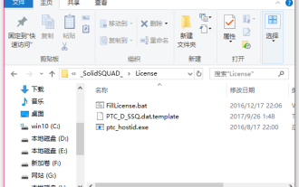
Many novice friends still don’t know how to install creo, so the editor below brings relevant tutorials on creo installation. Friends in need should take a look at it. I hope it can help you. 1. Open the downloaded installation package and find the License folder, as shown in the figure below: 2. Then copy it to the directory on the C drive, as shown in the figure below: 3. Double-click to enter and see if there is a license file, as shown below As shown in the picture: 4. Then copy the license file to this file, as shown in the following picture: 5. In the PROGRAMFILES file of the C drive, create a new PLC folder, as shown in the following picture: 6. Copy the license file as well Click in, as shown in the figure below: 7. Double-click the installation file of the main program. To install, check the box to install new software.
 How to install Podman on Ubuntu 24.04
Mar 22, 2024 am 11:26 AM
How to install Podman on Ubuntu 24.04
Mar 22, 2024 am 11:26 AM
If you have used Docker, you must understand daemons, containers, and their functions. A daemon is a service that runs in the background when a container is already in use in any system. Podman is a free management tool for managing and creating containers without relying on any daemon such as Docker. Therefore, it has advantages in managing containers without the need for long-term backend services. Additionally, Podman does not require root-level permissions to be used. This guide discusses in detail how to install Podman on Ubuntu24. To update the system, we first need to update the system and open the Terminal shell of Ubuntu24. During both installation and upgrade processes, we need to use the command line. a simple
 How to Install and Run the Ubuntu Notes App on Ubuntu 24.04
Mar 22, 2024 pm 04:40 PM
How to Install and Run the Ubuntu Notes App on Ubuntu 24.04
Mar 22, 2024 pm 04:40 PM
While studying in high school, some students take very clear and accurate notes, taking more notes than others in the same class. For some, note-taking is a hobby, while for others, it is a necessity when they easily forget small information about anything important. Microsoft's NTFS application is particularly useful for students who wish to save important notes beyond regular lectures. In this article, we will describe the installation of Ubuntu applications on Ubuntu24. Updating the Ubuntu System Before installing the Ubuntu installer, on Ubuntu24 we need to ensure that the newly configured system has been updated. We can use the most famous "a" in Ubuntu system
 Detailed steps to install Go language on Win7 computer
Mar 27, 2024 pm 02:00 PM
Detailed steps to install Go language on Win7 computer
Mar 27, 2024 pm 02:00 PM
Detailed steps to install Go language on Win7 computer Go (also known as Golang) is an open source programming language developed by Google. It is simple, efficient and has excellent concurrency performance. It is suitable for the development of cloud services, network applications and back-end systems. . Installing the Go language on a Win7 computer allows you to quickly get started with the language and start writing Go programs. The following will introduce in detail the steps to install the Go language on a Win7 computer, and attach specific code examples. Step 1: Download the Go language installation package and visit the Go official website
