
 Software Tutorial
Office Software
Detailed explanation of the steps to create an Excel column chart
Software Tutorial
Office Software
Detailed explanation of the steps to create an Excel column chart
Detailed explanation of the steps to create an Excel column chart

How to create a histogram in EXCEL
First make a pivot table, and then make this chart.
Suppose A is the name and B is the age. 100 lines in total.
1. Select cells A1:B100, execute "Data" - "Pivot Table and Pivot Chart", select "Pivot Table" for the report type you want to create, click Next, the selected area is: "Sheet1!$A$1:$B$100", click Next, click Finish.
Drag the item "Name" to the row area of the Pivot Table, and drag the item "Age" to the column area of the Pivot Table (as shown in Figure 1).
Place the mouse cursor in the cell of the age item, and then select "PivotTable" - "Group and Display Detailed Data" - "Combine" in the "PivotTable" toolbar (see Figure 2).
3. Enter 10 for “Start at”; enter 60 for “End at”; enter 10 for “Step Size” and click “OK”.
That is: count the number of people aged 10-60, and use 10 years as an age group. (As shown in Figure 3)
4. In the "Pivot Table" toolbar, click the "Chart Wizard" icon to get the chart you need. (As shown in Figure 4)
How to use Excel software to create a Pareto Chart
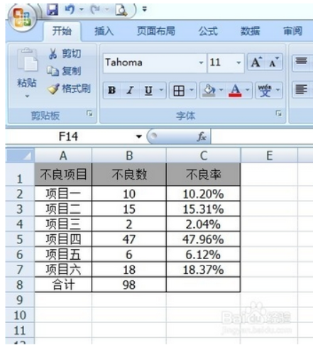
1. As shown in the figure below, the number of each defective item is counted, and the defective rate of each defective item can be obtained. But it looks very messy at this time and is far less intuitive than the arrangement chart.
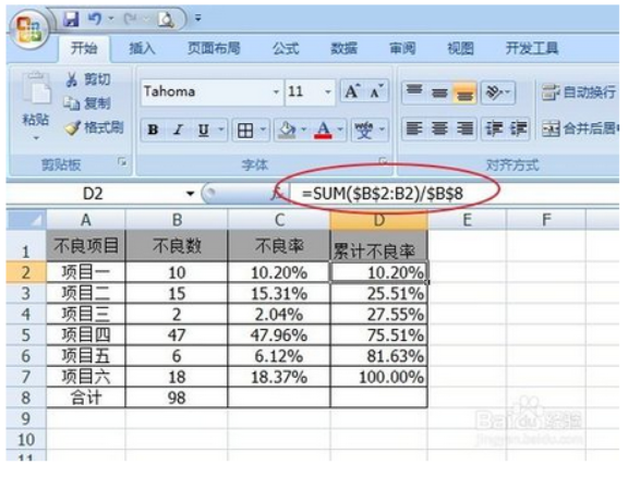
2. Next, calculate the cumulative defective rate (that is, the defective rate of each defective item is accumulated item by item), as shown below. Note: The first item and the total number of the sum must use "absolute reference". At this time, you can directly drop down without calculating one by one.
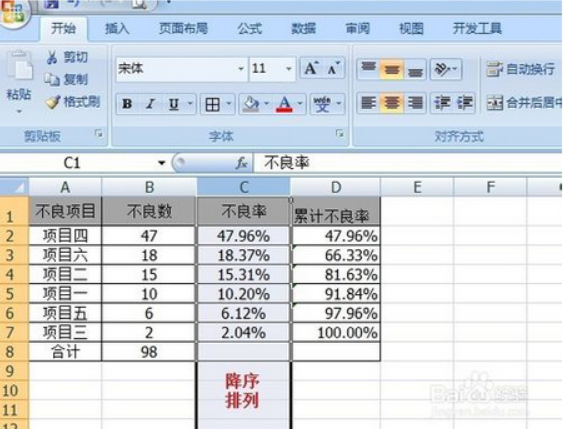
3. At this time, the cumulative defective rate is sorted in descending order, and the chart stage is completed.
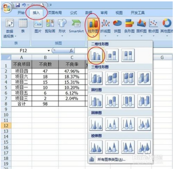
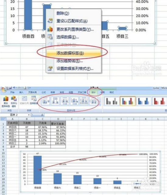
4. Insert a blank histogram, as shown below:
5. Select the blank chart area, right-click - "Select Data", select "Series Name" and "Series Value" (select the corresponding data content in the corresponding input box), click "Horizontal (Category) Axis" Click "Edit" of "Tab" and select the content of the horizontal axis (here, select item four - item three).
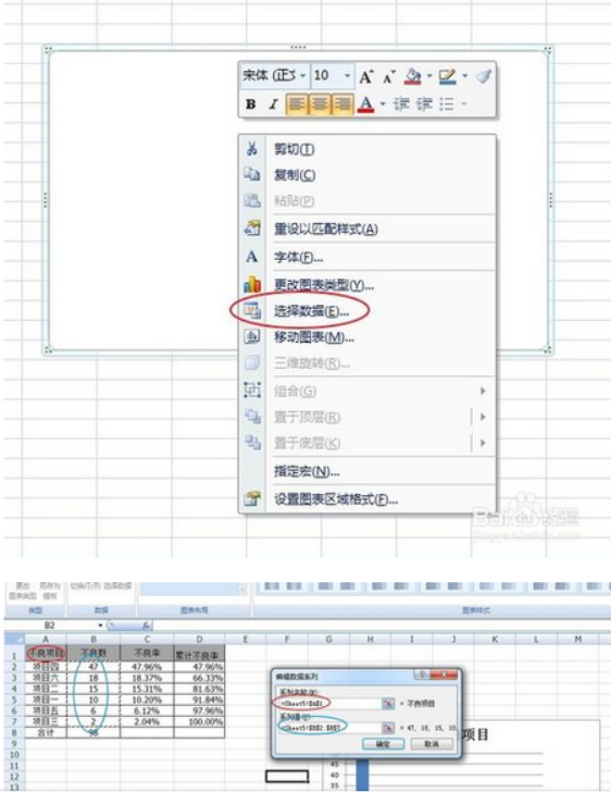
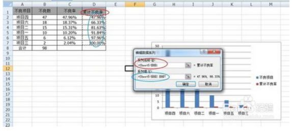
6. Press step 5 to add the cumulative defective rate: "Select data" - "Add".
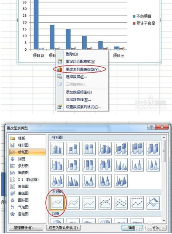
7. After adding the cumulative defective rate, select the histogram of the cumulative defective rate, right-click - "Change Series Chart Type" - select "Line Chart".
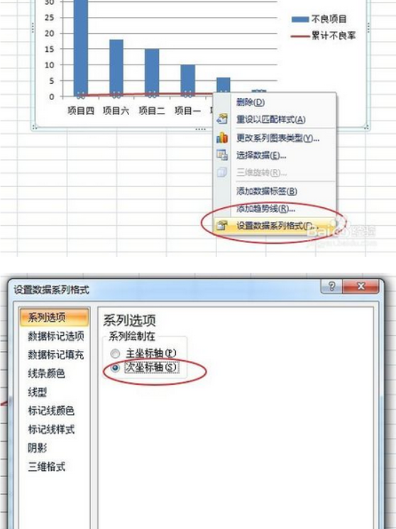
8. Select the line chart of the cumulative defective rate, right-click - "Set Data Series Format", and select the "Secondary Axis" as the coordinate axis of the line chart. After selecting, select the axis area, right-click - "Set Axis Format", and modify the axis format (for example, the maximum value of the cumulative defective rate is 100%).
9. At this point, the arrangement chart has been basically completed.
Next, make some small optimizations and adjustments, such as selecting a corner of the chart to adjust the chart size, "Add data label", and set the chart layout: select the chart - "Design" - "Chart Layout" and adjust the column spacing , adjust the graphic background or color, etc. Everyone can explore slowly.
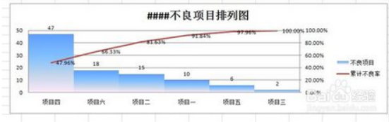
10. The final example of a Pareto Chart.
It can be clearly seen from the picture: item four is the main factor! OK!
The above is the detailed content of Detailed explanation of the steps to create an Excel column chart. For more information, please follow other related articles on the PHP Chinese website!

Hot AI Tools

Undresser.AI Undress
AI-powered app for creating realistic nude photos

AI Clothes Remover
Online AI tool for removing clothes from photos.

Undress AI Tool
Undress images for free

Clothoff.io
AI clothes remover

AI Hentai Generator
Generate AI Hentai for free.

Hot Article
Hot Tools

Notepad++7.3.1
Easy-to-use and free code editor

SublimeText3 Chinese version
Chinese version, very easy to use

Zend Studio 13.0.1
Powerful PHP integrated development environment

Dreamweaver CS6
Visual web development tools

SublimeText3 Mac version
God-level code editing software (SublimeText3)
Hot Topics


 Your Calculator App Can Be Replaced By Microsoft Excel
Mar 06, 2025 am 06:01 AM
Your Calculator App Can Be Replaced By Microsoft Excel
Mar 06, 2025 am 06:01 AM
Ditch the Calculator: Why and How to Use Excel for All Your Calculations I haven't touched a calculator in ages. Why? Because Microsoft Excel handles all my calculations with ease, and it can do the same for you. Why Excel Trumps a Calculator While
 Don't Create Tables in Word: Use Excel Instead
Mar 06, 2025 am 03:04 AM
Don't Create Tables in Word: Use Excel Instead
Mar 06, 2025 am 03:04 AM
Creating tables in Word, although improved, is still cumbersome and sometimes brings more problems. This is why you should always create tables in Microsoft Excel. Why is it better to create tables in Excel? In short, Word is a word processor, while Excel is a data processor. So Word is not built for the best table creation, but its similar product, Excel. Here are just some of the reasons why creating tables in Excel is better than using Microsoft Word: Although it is surprising that you can use many Excel-like features in Microsoft Word tables, in Excel you
 5 Things You Can Do in Excel for the Web Today That You Couldn't 12 Months Ago
Mar 22, 2025 am 03:03 AM
5 Things You Can Do in Excel for the Web Today That You Couldn't 12 Months Ago
Mar 22, 2025 am 03:03 AM
Excel web version features enhancements to improve efficiency! While Excel desktop version is more powerful, the web version has also been significantly improved over the past year. This article will focus on five key improvements: Easily insert rows and columns: In Excel web, just hover over the row or column header and click the " " sign that appears to insert a new row or column. There is no need to use the confusing right-click menu "insert" function anymore. This method is faster, and newly inserted rows or columns inherit the format of adjacent cells. Export as CSV files: Excel now supports exporting worksheets as CSV files for easy data transfer and compatibility with other software. Click "File" > "Export"
 How to Reduce the Gaps Between Bars and Columns in Excel Charts (And Why You Should)
Mar 08, 2025 am 03:01 AM
How to Reduce the Gaps Between Bars and Columns in Excel Charts (And Why You Should)
Mar 08, 2025 am 03:01 AM
Enhance Your Excel Charts: Reducing Gaps Between Bars and Columns Presenting data visually in charts significantly improves spreadsheet readability. Excel excels at chart creation, but its extensive menus can obscure simple yet powerful features, suc
 How to Use the AVERAGEIF and AVERAGEIFS Functions in Excel
Mar 07, 2025 am 06:03 AM
How to Use the AVERAGEIF and AVERAGEIFS Functions in Excel
Mar 07, 2025 am 06:03 AM
Quick View of AVERAGEIF and AVERAGEIFS Functions in Excel Excel's AVERAGEIF and AVERAGEIFS functions can be used to calculate the average value of a dataset. However, unlike simpler AVERAGE functions, they are able to include or exclude specific values in the calculation. How to use the AVERAGEIF function in Excel Excel's AVERAGEIF function allows you to calculate the average value of a filtered dataset based on a single condition set. AVERAGEIF function syntax The AVERAGEIF function contains three parameters: =AVERAGEIF(x,y,z)
 How to Use LAMBDA in Excel to Create Your Own Functions
Mar 21, 2025 am 03:08 AM
How to Use LAMBDA in Excel to Create Your Own Functions
Mar 21, 2025 am 03:08 AM
Excel's LAMBDA Functions: An easy guide to creating custom functions Before Excel introduced the LAMBDA function, creating a custom function requires VBA or macro. Now, with LAMBDA, you can easily implement it using the familiar Excel syntax. This guide will guide you step by step how to use the LAMBDA function. It is recommended that you read the parts of this guide in order, first understand the grammar and simple examples, and then learn practical applications. The LAMBDA function is available for Microsoft 365 (Windows and Mac), Excel 2024 (Windows and Mac), and Excel for the web. E
 Microsoft Excel Keyboard Shortcuts: Printable Cheat Sheet
Mar 14, 2025 am 12:06 AM
Microsoft Excel Keyboard Shortcuts: Printable Cheat Sheet
Mar 14, 2025 am 12:06 AM
Master Microsoft Excel with these essential keyboard shortcuts! This cheat sheet provides quick access to the most frequently used commands, saving you valuable time and effort. It covers essential key combinations, Paste Special functions, workboo
 If You Don't Use Excel's Hidden Camera Tool, You're Missing a Trick
Mar 25, 2025 am 02:48 AM
If You Don't Use Excel's Hidden Camera Tool, You're Missing a Trick
Mar 25, 2025 am 02:48 AM
Quick Links Why Use the Camera Tool?
