

Element selectors applied to responsive design
Jan 13, 2024 pm 02:23 PM
The application of element selectors in responsive design requires specific code examples
With the popularity of mobile devices, responsive design has become the basis of modern web design One of the requirements. And element selectors play a crucial role in responsive design. Through element selectors, we can customize different styles and layouts for different devices and screen sizes based on factors such as different device sizes, screen densities, browser window sizes, etc.
Using element selectors in responsive design can allow our web pages to present the best user experience on different devices. The following will introduce some common element selector applications, as well as corresponding code examples.
- @media query
@media query is a common element selector in CSS, which can apply different CSS styles to specific devices or screen sizes based on different media query conditions. . Common media query conditions include device width, device height, device orientation, screen pixel density, etc.
For example, we can use the @media query to apply different styles for devices with different screen sizes:
@media screen and (max-width: 600px) {
body {
font-size: 14px;
}
}
@media screen and (min-width: 601px) and (max-width: 1200px) {
body {
font-size: 16px;
}
}
@media screen and (min-width: 1201px) {
body {
font-size: 18px;
}
}
The above code , we use the @media query to define different font sizes for three different screen size devices. When the device width is less than or equal to 600px, the font size is 14px; when the device width is between 601px and 1200px, the font size is 16px; when the device width is greater than 1201px, the font size is 18px.
- :hover pseudo-class selector
: The hover pseudo-class selector can be used to apply different CSS styles when the mouse is hovering over an element. In responsive design, we can use the :hover selector to add interactive effects to elements on different devices.
For example, when the mouse hovers over a button, we can add a background color and transition effect to the button:
.btn:hover {
background-color : #ff0000;
transition: background-color 0.5s ease-in-out;
}
In the above code, when the mouse is hovering over a button with the .btn class, the button's The background color will change to red with a 0.5 second transition effect.
- :nth-child pseudo-class selector
:nth-child pseudo-class selector can be used to select the nth element in a set of elements, where n can be a specific number , or it can be an expression. In responsive design, we can use the :nth-child selector to apply different styles for different screen sizes or devices.
For example, we can use the :nth-child selector to add a different background color to the even items in a list:
li:nth-child(even) {
background-color: #f0f0f0;
}
In the above code, we use the :nth-child(even) selector to add a background color of #f0f0f0 to the even-numbered items in the list.
Through the above examples, we can see that element selectors play an important role in responsive design. Through @media query, :hover pseudo-class selector, :nth-child pseudo-class selector, etc., we can customize different styles and layouts for web pages according to different devices and screen sizes, thereby providing a better user experience.
It should be noted that when using element selectors, we should follow some best practices, such as avoiding the use of overly complex selectors and minimizing the nesting of selectors. This improves web page loading speed and performance.
To sum up, the application of element selectors in responsive design is very important. Through the flexible use of selectors, we can provide customized styles and layouts for different devices and screen sizes, thereby providing a better web experience.
The above is the detailed content of Element selectors applied to responsive design. For more information, please follow other related articles on the PHP Chinese website!

Hot Article

Hot tools Tags

Hot Article

Hot Article Tags

Notepad++7.3.1
Easy-to-use and free code editor

SublimeText3 Chinese version
Chinese version, very easy to use

Zend Studio 13.0.1
Powerful PHP integrated development environment

Dreamweaver CS6
Visual web development tools

SublimeText3 Mac version
God-level code editing software (SublimeText3)
Hot Topics


 The role and practical application of arrow symbols in PHP
Mar 22, 2024 am 11:30 AM
The role and practical application of arrow symbols in PHP
Mar 22, 2024 am 11:30 AM
The role and practical application of arrow symbols in PHP
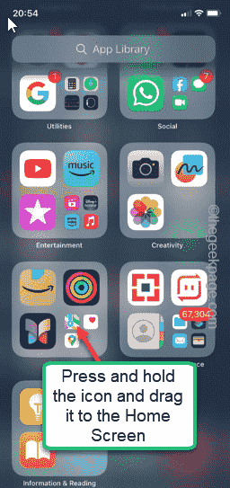 How to Undo Delete from Home Screen in iPhone
Apr 17, 2024 pm 07:37 PM
How to Undo Delete from Home Screen in iPhone
Apr 17, 2024 pm 07:37 PM
How to Undo Delete from Home Screen in iPhone
 From beginner to proficient: Explore various application scenarios of Linux tee command
Mar 20, 2024 am 10:00 AM
From beginner to proficient: Explore various application scenarios of Linux tee command
Mar 20, 2024 am 10:00 AM
From beginner to proficient: Explore various application scenarios of Linux tee command
 Explore the advantages and application scenarios of Go language
Mar 27, 2024 pm 03:48 PM
Explore the advantages and application scenarios of Go language
Mar 27, 2024 pm 03:48 PM
Explore the advantages and application scenarios of Go language
 The wide application of Linux in the field of cloud computing
Mar 20, 2024 pm 04:51 PM
The wide application of Linux in the field of cloud computing
Mar 20, 2024 pm 04:51 PM
The wide application of Linux in the field of cloud computing
 Understand the mechanism and application of Golang stack management
Mar 13, 2024 am 11:21 AM
Understand the mechanism and application of Golang stack management
Mar 13, 2024 am 11:21 AM
Understand the mechanism and application of Golang stack management
 Understanding MySQL timestamps: functions, features and application scenarios
Mar 15, 2024 pm 04:36 PM
Understanding MySQL timestamps: functions, features and application scenarios
Mar 15, 2024 pm 04:36 PM
Understanding MySQL timestamps: functions, features and application scenarios
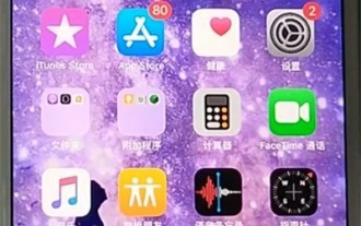 Apple tutorial on how to close running apps
Mar 22, 2024 pm 10:00 PM
Apple tutorial on how to close running apps
Mar 22, 2024 pm 10:00 PM
Apple tutorial on how to close running apps
