

How to choose the best mobile CSS framework for you?

Mobile CSS Framework Selection Guide: How to Find the Best One for You?
With the popularity of mobile devices and the growth of user demand for mobile applications and websites, it has become increasingly important to build pages that adapt to mobile screens. Using a CSS framework simplifies the development process and ensures that our pages display well on different devices. However, there are many different mobile CSS frameworks to choose from, so how do you find the one that’s right for you? This article will provide you with some selection guidelines, complete with specific code examples.
- Goal and demand analysis
Before choosing a mobile CSS framework, we first need to clarify our goals and needs. We need to consider the following aspects: - Device compatibility: Does our page need to display well on various mobile devices? Do you need to support different operating systems and browsers?
- Customization capabilities: Do we need the flexibility to customize styles to achieve specific design needs?
- Responsive design: Do we need to build pages that adapt to different screen sizes?
- Animation and interactive effects: Do we need some animation and interactive effects to enhance user experience?
- Browse mobile CSS frameworks on the market
There are many well-known mobile CSS frameworks on the market to choose from, such as Bootstrap, Foundation, Semantic UI, etc. We can understand the features and functions of each framework by browsing the official website, reading documentation, and viewing sample code. - Choose the framework that suits you best
When choosing a mobile CSS framework, you can consider the following factors: - Ease of use: Choosing a framework that is easy to use and quick to use can improve Development efficiency.
- Documentation and tutorials: Choosing a framework with detailed documentation and tutorials can help us better understand and use the framework.
- Community support: Choose a framework with an active community to get more help and support.
- Customization capabilities: Choose a framework that provides rich customization options to meet specific design needs.
- Responsive design support: If we need to build pages that adapt to different screen sizes, it is necessary to choose a framework with responsive design support.
- Animation and interactive effects: If we need some animation and interactive effects, choosing a framework that provides these functions can save development time.
The following are sample codes for some commonly used mobile CSS frameworks:
- Bootstrap:
<!DOCTYPE html>
<html>
<head>
  <link rel="stylesheet" href="https://cdn.jsdelivr.net/npm/bootstrap@4.6.0/dist/css/bootstrap.min.css">
</head>
<body>
  <div class="container">
    <div class="row">
      <div class="col-md-6">
        <h1 id="Hello-Bootstrap">Hello, Bootstrap!</h1>
      </div>
      <div class="col-md-6">
        <p>Welcome to the world of responsive web design.</p>
      </div>
    </div>
  </div>
</body>
</html>- Foundation:
<!DOCTYPE html>
<html>
<head>
  <link rel="stylesheet" href="https://cdn.jsdelivr.net/npm/foundation-sites/dist/css/foundation.min.css">
</head>
<body>
  <div class="grid-container">
    <div class="grid-x">
      <div class="cell medium-6">
        <h1 id="Hello-Foundation">Hello, Foundation!</h1>
      </div>
      <div class="cell medium-6">
        <p>Welcome to the amazing world of responsive web design.</p>
      </div>
    </div>
  </div>
</body>
</html>- Semantic UI:
<!DOCTYPE html>
<html>
<head>
  <link rel="stylesheet" href="https://cdn.jsdelivr.net/npm/semantic-ui/dist/semantic.min.css">
</head>
<body>
  <div class="ui grid">
    <div class="ui column">
      <h1 id="Hello-Semantic-UI">Hello, Semantic UI!</h1>
    </div>
    <div class="ui column">
      <p>Welcome to the world of beautiful and intuitive design.</p>
    </div>
  </div>
</body>
</html>The above are some common mobile CSS frameworks and their sample codes. By reading the official documentation and studying the sample code, we can have a deep understanding of the characteristics and usage of each framework and choose the framework that best suits us.
Summary:
When choosing a mobile CSS framework, we need to clarify our goals and needs and browse the different frameworks on the market. By considering factors such as ease of use, documentation and tutorials, community support, customization capabilities, responsive design support, and animated interactive effects, we can find the mobile CSS framework that best suits us. By reading the sample code and studying the official documentation, we can quickly get started and use the framework to build pages that adapt to the mobile phone screen. I hope this article will help you choose a mobile CSS framework!
The above is the detailed content of How to choose the best mobile CSS framework for you?. For more information, please follow other related articles on the PHP Chinese website!

Hot AI Tools

Undresser.AI Undress
AI-powered app for creating realistic nude photos

AI Clothes Remover
Online AI tool for removing clothes from photos.

Undress AI Tool
Undress images for free

Clothoff.io
AI clothes remover

Video Face Swap
Swap faces in any video effortlessly with our completely free AI face swap tool!

Hot Article
Hot Tools

Notepad++7.3.1
Easy-to-use and free code editor

SublimeText3 Chinese version
Chinese version, very easy to use

Zend Studio 13.0.1
Powerful PHP integrated development environment

Dreamweaver CS6
Visual web development tools

SublimeText3 Mac version
God-level code editing software (SublimeText3)
Hot Topics
 1386
1386
 52
52

 Samsung Galaxy S25 Ultra mobile phone leaked: 6.86 inches, horizontal screen-to-body ratio 94.1%
Aug 17, 2024 pm 01:49 PM
Samsung Galaxy S25 Ultra mobile phone leaked: 6.86 inches, horizontal screen-to-body ratio 94.1%
Aug 17, 2024 pm 01:49 PM
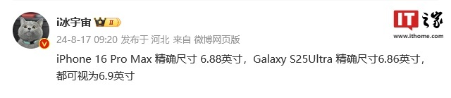
According to news on August 17, the source @ibinguniverse posted on Weibo today, stating that the exact size of Apple iPhone 16 Pro Max is 6.88 inches, and the exact size of Galaxy S25 Ultra is 6.86 inches. Both can be regarded as 6.9 inches. Sources indicate that the Samsung Galaxy S25 Ultra has a narrower body and a wider screen than the S24 Ultra, with a horizontal screen-to-body ratio of 94.1%, while the S24 Ultra’s horizontal screen-to-body ratio is 91.5%. Fenye checked the relevant Weibo of the source. He also commented on the newly exposed photos of iPhone 16 Pro Max and believed that it was wrong to be close to a micro-curve. The phone is actually a straight screen + 2.5D glass.
 'Tandem OLED' has been popularized by Apple. How is it better than OLED?
Aug 19, 2024 am 04:42 AM
'Tandem OLED' has been popularized by Apple. How is it better than OLED?
Aug 19, 2024 am 04:42 AM
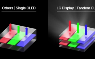
Although Apple has been criticized for its lack of innovation in recent years, Apple has not always stood still. At least in terms of hardware design, with the support of the high unit prices of Apple products, its engineers can easily try some new technologies without having to consider too much cost issues. For example, iPad Pro, as Apple's favorite "display technology" test field, iPad Pro has been at the forefront of display technology for portable smart devices from miniLED in 2021 to tandem OLED in 2024. Although the iPad Pro is not the first portable smart device equipped with a miniLED screen (MSI released a miniLED laptop a year earlier than Apple), when you compare the parameters of the two, you will quickly realize that they are not the same
 Hynix is the first to demonstrate UFS 4.1 flash memory: based on V9 TLC NAND particles
Aug 09, 2024 pm 03:33 PM
Hynix is the first to demonstrate UFS 4.1 flash memory: based on V9 TLC NAND particles
Aug 09, 2024 pm 03:33 PM
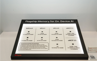
According to news on August 9, at the FMS2024 Summit, SK Hynix demonstrated its latest storage products, including UFS4.1 universal flash memory that has not yet officially released specifications. According to the official website of the JEDEC Solid State Technology Association, the latest UFS specification currently announced is UFS4.0 in August 2022. Its theoretical interface speed is as high as 46.4Gbps. It is expected that UFS4.1 will further improve the transmission rate. 1. Hynix demonstrated 512GB and 1TBUFS4.1 general-purpose flash memory products, based on 321-layer V91TbTLCNAND flash memory. SK Hynix also exhibited 3.2GbpsV92TbQLC and 3.6GbpsV9H1TbTLC particles. Hynix shows off V7-based
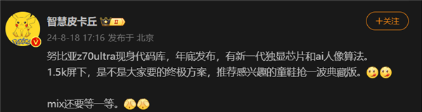 The first 1.5K under-screen camera! Nubia Z70 Ultra is here: the world's first Snapdragon 8 Gen4 true full-screen phone
Aug 19, 2024 pm 03:47 PM
The first 1.5K under-screen camera! Nubia Z70 Ultra is here: the world's first Snapdragon 8 Gen4 true full-screen phone
Aug 19, 2024 pm 03:47 PM
According to news on August 19, Nubia has been adhering to the true full-screen design since the release of Z50 Ultra, and has been continuously exploring the field of proactive photography under high-pixel screens. Today, digital blogger Wisdom Pikachu broke the news that the Nubia Z70 Ultra, which will be released in the second half of this year, will debut with 1.5K under-screen camera technology, which is the highest-resolution UDC solution in the industry so far. It is reported that ZTE’s under-screen proactive solution has advanced to the sixth generation. The latest under-screen proactive solution is available in the Nubia Z60 Ultra and Red Magic 9S Pro series. The screen resolution is 2480x1116, which is between 1080P and 1.5K resolution. This time Nubia will break through the limitations of existing resolutions and set a new benchmark in the industry.
 Apple and Huawei both wanted to make a buttonless phone, but Xiaomi made it first?
Aug 29, 2024 pm 03:33 PM
Apple and Huawei both wanted to make a buttonless phone, but Xiaomi made it first?
Aug 29, 2024 pm 03:33 PM
According to a report from Smartprix, Xiaomi is developing a buttonless mobile phone codenamed "Suzaku". According to this news, this mobile phone codenamed Zhuque will be designed with an integrated concept, use an under-screen camera, and be equipped with Qualcomm Snapdragon 8gen4 processor. If the plan does not change, we are likely to see its arrival in 2025. When I saw this news, I thought I was back in 2019 - at that time, Xiaomi released the Mi MIX Alpha concept phone, and the surround-screen button-less design was quite amazing. This is the first time I have seen the charm of a buttonless mobile phone. If you want a piece of "magic glass", you must first kill the buttons. In "The Biography of Steve Jobs", Jobs once expressed that he hoped that the mobile phone could be like a piece of "magic glass".
 For the first time, it is not the latest version. Google Pixel 9 series mobile phones are revealed to be pre-installed with Android 14 system.
Aug 01, 2024 pm 04:54 PM
For the first time, it is not the latest version. Google Pixel 9 series mobile phones are revealed to be pre-installed with Android 14 system.
Aug 01, 2024 pm 04:54 PM
According to news on August 1, the technology media Android Headline published a blog post yesterday (July 31), confirming from internal channels that the Google Pixel 9 series mobile phones will be equipped with the Android 14 system when leaving the factory. This is the first time in the history of Google Pixel phone releases. Normally, Pixel phones are equipped with the latest version of Android. In theory, the Pixel 9 series should be pre-installed with Android 15. It was reported on July 30 that Google released the Android 15 Beta 4.1 update. The update is small in scale and mainly fixes the problem of audio crashing during calls on Pixel devices. Given the small scale of this update, there is speculation that the official version of Android 15 may be launched soon. Google usually releases a new version of Android between August and September: Android
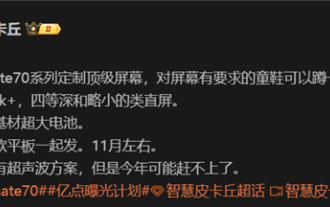 Huawei Mate 70 series configuration leaked: All series have 1.5K screens and super large batteries
Aug 08, 2024 pm 10:21 PM
Huawei Mate 70 series configuration leaked: All series have 1.5K screens and super large batteries
Aug 08, 2024 pm 10:21 PM
According to news on August 8, the detailed configuration information of Huawei Mate70 series mobile phones has been recently exposed. This series of mobile phones is expected to be released in the fourth quarter of 2024. 1. According to reports, the entire Mate70 series will use customized top-level 1.5K resolution screens to meet users’ requirements for screen clarity. It is expected that Huawei Mate70Pro and the extra-large cup version will be equipped with fourth-depth screens, while the standard Mate70 may adopt a slightly smaller straight-screen design. In addition to screen upgrades, the Huawei Mate70 series will also be equipped with ultra-large-capacity batteries with new base materials, which heralds a breakthrough in the battery life of Huawei Mate series mobile phones. Although Huawei is developing ultrasonic fingerprint unlocking technology, this year’s Mate70 series will not be equipped with this feature. this
 Realme GT7 Pro is full of products: ultrasonic fingerprint, super large battery, and 100W fast charging are all listed
Aug 23, 2024 pm 03:31 PM
Realme GT7 Pro is full of products: ultrasonic fingerprint, super large battery, and 100W fast charging are all listed
Aug 23, 2024 pm 03:31 PM
According to news on August 23, according to digital bloggers Digital Chat Station, the product capabilities of the Realme GT7 Pro will be comprehensively strengthened, and its configuration will cover ultrasonic fingerprints, periscope telephoto, ultra-large batteries, and 100-watt fast charging. 1. Realme GT7Pro has a built-in large 6000mAh battery and supports 100W fast charging. The engineering machine does not support wireless charging, and the mass production model is unknown. Equipped with single-point ultrasonic fingerprint recognition and supports IP68/69 dustproof and waterproof. Equipped with LYT6003X periscope, it does not support telephoto macro. Equipped with a 1.5K resolution equal depth four-curved screen, using BOE X2 substrate. It uses the Snapdragon 8Gen4 processor and supports up to 16GB of memory and 1TB of storage. The Realme GT7Pro is expected to be launched as soon as Q4 this year.
