How to graph a logarithmic function in Excel: detailed steps
How to draw a logarithmic function graph in an Excel table? It is very convenient to make charts in an Excel table. Now if you want to draw a logarithmic function graph in an Excel spreadsheet, you can make the continuous curve function more visual. How to do it specifically? Let’s take a look at the specific method of drawing a logarithmic function graph in an Excel table!
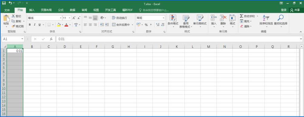
1. Open Excel 2016, enter 0.01 in cell A1 in the edit bar and select column A.
#2. Click the [Start] option in the interface toolbar, find [Sequence] in [Fill] and click it.

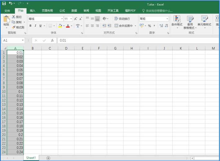
3. A sequence window will pop up. We set the [Step Value] to 0.01 (Note: This value is very critical, because the smaller the value, the smaller the curve. Smooth), set the [End Value] to 5 (this value is filled in according to your own needs, that is, fill in the function you draw). After setting, click the [OK] button at the bottom.

#4. Obtain the abscissa sequence of the image as shown in the figure.
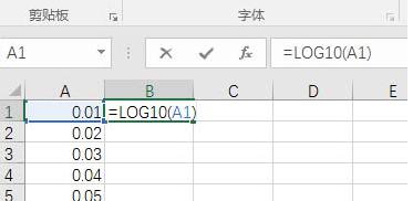
#5. We enter "=LOG10(A1)" in cell B1, which means to find the value of the logarithmic function with base 10.
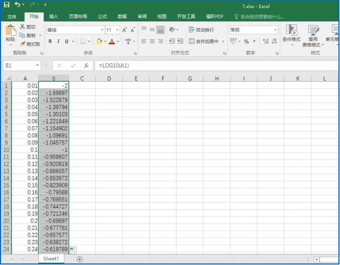
6. Directly drop down to fill in, and you can find out all the corresponding ordinate values (log values)
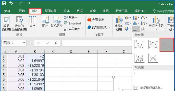
7. Select columns A and B, click [Insert] in the toolbar, find [Scatter Plot with Smooth Line] in [Scatter Plot] and click it.
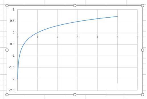
The above is the specific method of drawing a logarithmic function graph in an Excel table. Isn’t it very simple?
The above is the detailed content of How to graph a logarithmic function in Excel: detailed steps. For more information, please follow other related articles on the PHP Chinese website!

Hot AI Tools

Undresser.AI Undress
AI-powered app for creating realistic nude photos

AI Clothes Remover
Online AI tool for removing clothes from photos.

Undress AI Tool
Undress images for free

Clothoff.io
AI clothes remover

Video Face Swap
Swap faces in any video effortlessly with our completely free AI face swap tool!

Hot Article

Hot Tools

Notepad++7.3.1
Easy-to-use and free code editor

SublimeText3 Chinese version
Chinese version, very easy to use

Zend Studio 13.0.1
Powerful PHP integrated development environment

Dreamweaver CS6
Visual web development tools

SublimeText3 Mac version
God-level code editing software (SublimeText3)

Hot Topics
 ReactOS, the Open-Source Windows, Just Got an Update
Mar 25, 2025 am 03:02 AM
ReactOS 0.4.15 includes new storage drivers, which should help with overall stability and UDB drive compatibility, as well as new drivers for networking. There are also many updates to fonts support, the desktop shell, Windows APIs, themes, and file
 Microsoft's New PowerToys Search Is the Missing Feature Windows 11 Needs
Apr 03, 2025 am 03:53 AM
Microsoft's latest PowerToys update introduces a game-changing search feature reminiscent of macOS' Spotlight. This improved "Command Palette" (formerly PowerToys Run) surpasses the functionality of the Windows R Run command and the task
 New to Multi-Monitors? Don't Make These Mistakes
Mar 25, 2025 am 03:12 AM
Multi-monitor setups boost your productivity and deliver a more immersive experience. However, it's easy for a novice to stumble while assembling the setup and make mistakes. Here are some of the most common ones and how to avoid them.
 Windows kb5054979 update information Update content list
Apr 15, 2025 pm 05:36 PM
KB5054979 is a cumulative security update released on March 27, 2025, for Windows 11 version 24H2. It targets .NET Framework versions 3.5 and 4.8.1, enhancing security and overall stability. Notably, the update addresses an issue with file and directory operations on UNC shares using System.IO APIs. Two installation methods are provided: one through Windows Settings by checking for updates under Windows Update, and the other via a manual download from the Microsoft Update Catalog.
 How to Disable Windows 11 Round Corners: 4 Easy Methods!
Mar 27, 2025 pm 03:27 PM
This guide provides four methods to remove the rounded corners in Windows 11, restoring the classic square-edged look. While the rounded corners offer a modern aesthetic, some users prefer the sharper look for reasons including improved screenshot a
 Why Do Some Keyboards Have Coiled Cables?
Mar 27, 2025 pm 09:01 PM
For mechanical keyboard enthusiasts, those intriguing coiled cables are a common sight. But why the coil? Let's delve into the reasons. Coiled Cables: Primarily Aesthetics The main draw of coiled cables is their visual appeal. They enhance the look
 These Are My Go-To Free Alternatives for Paid Windows Apps
Apr 04, 2025 am 03:42 AM
Many free apps rival their paid counterparts in functionality. This list showcases excellent free Windows alternatives to popular paid software. I firmly believe in using free software unless a paid option offers a crucial, missing feature. These
 The Pixel 9a and Your Non-Private Smart Home: Weekly Roundup
Mar 25, 2025 am 03:09 AM
Smart Home Privacy Takes a Blow as Amazon Kills Alexa Local Processing Alexa devices will no longer offer a "do not send voice recordings" setting after March 28th. Future Alexa recordings must be sent to the Amazon cloud, though you can


