
 Backend Development
Python Tutorial
In-depth learning: Master the advanced techniques of matplotlib for drawing scatter plots
Backend Development
Python Tutorial
In-depth learning: Master the advanced techniques of matplotlib for drawing scatter plots
In-depth learning: Master the advanced techniques of matplotlib for drawing scatter plots


Advanced Guide: Mastering Matplotlib Advanced Scatter Plot Drawing Skills
Introduction:
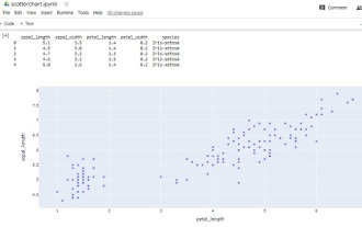
Matplotlib is a powerful, flexible and easy-to-use drawing library that provides Rich graphics drawing functions. Among them, scatter plot is a commonly used data visualization method, which can more intuitively display the relationship between data. This article will introduce the techniques of drawing advanced scatter plots in Matplotlib and provide specific code examples.
1. Basic scatter plot drawing
Before using Matplotlib to draw a scatter plot, you need to import the relevant libraries and data. The following is a basic scatter plot drawing example:
import matplotlib.pyplot as plt
import numpy as np

# 生成随机数据
np.random.seed(1)
x = np.random.randn(100)
y = np.random.randn(100)

# 绘制散点图
plt.scatter(x, y)

# 添加标题和标签
plt.title("Basic Scatter Plot")
plt.xlabel("X")
plt.ylabel("Y")

# 显示图形
plt.show()Running the above code will generate a basic scatter plot, in which the x and y axes represent the two dimensions of the data respectively.
2. Adjust the scatter point style
You can adjust the scatter diagram style by modifying parameters to make the graph more eye-catching. The following are some commonly used parameter settings:
# 绘制散点图(修改参数)
plt.scatter(x, y, c='red', s=100, alpha=0.5, marker='o', edgecolors='black')

# 添加标题和标签
plt.title("Customized Scatter Plot")
plt.xlabel("X")
plt.ylabel("Y")

# 显示图形
plt.show()In the above code, we use the c parameter to set the color of the scatter points to red, and the s parameter to set the size of the scatter points. is 100, the alpha parameter sets the transparency of the scatter points to 0.5, the marker parameter sets the shape of the scatter points to a circle, the edgecolors parameter sets the boundary color of the scatter points is black.
3. Draw multiple sets of scatter plots
In some cases, we need to draw multiple sets of scatter plots at the same time to show the relationship between different data. The following is an example of drawing multiple sets of scatter plots:
# 生成随机数据
np.random.seed(1)
x1 = np.random.randn(100)
y1 = np.random.randn(100)
x2 = np.random.randn(100)
y2 = np.random.randn(100)

# 绘制散点图(多组)
plt.scatter(x1, y1, c='red', label='Group 1')
plt.scatter(x2, y2, c='blue', label='Group 2')

# 添加标题和标签
plt.title("Multiple Scatter Plots")
plt.xlabel("X")
plt.ylabel("Y")

# 添加图例
plt.legend()

# 显示图形
plt.show() In the above code, we draw two sets of scatter plots by calling the scatter function multiple times, using red and blue respectively. express. Set the label of each set of scatter plots through the label parameter, and use the legend function to add a legend to the graph.
4. Use color mapping
When the data has a specific meaning, color can be represented as an additional dimension. The following is an example of using color mapping to draw a scatter plot:
# 生成随机数据
np.random.seed(1)
x = np.random.randn(100)
y = np.random.randn(100)
colors = np.random.rand(100)

# 绘制散点图(使用颜色映射)
plt.scatter(x, y, c=colors, cmap='viridis')

# 添加颜色映射说明
cbar = plt.colorbar()
cbar.set_label("Color")

# 添加标题和标签
plt.title("Scatter Plot with Color Mapping")
plt.xlabel("X")
plt.ylabel("Y")

# 显示图形
plt.show() In the above code, we pass an array as the basis for color mapping through the c parameter, and then pass cmapThe parameter specifies the color mapping scheme used. Then use the colorbar function to add color mapping instructions.
Conclusion:
Through the introduction of this article, we have learned how to use Matplotlib to draw advanced scatter plots. We can use techniques such as adjusting styles, drawing multiple sets of scatter plots, and using color mapping to show the relationship between data. I hope this article has been helpful to you in data visualization.
The above is the detailed content of In-depth learning: Master the advanced techniques of matplotlib for drawing scatter plots. For more information, please follow other related articles on the PHP Chinese website!

Hot AI Tools

Undresser.AI Undress
AI-powered app for creating realistic nude photos

AI Clothes Remover
Online AI tool for removing clothes from photos.

Undress AI Tool
Undress images for free

Clothoff.io
AI clothes remover

AI Hentai Generator
Generate AI Hentai for free.

Hot Article
Hot Tools

Notepad++7.3.1
Easy-to-use and free code editor

SublimeText3 Chinese version
Chinese version, very easy to use

Zend Studio 13.0.1
Powerful PHP integrated development environment

Dreamweaver CS6
Visual web development tools

SublimeText3 Mac version
God-level code editing software (SublimeText3)
Hot Topics
 1378
1378
 52
52

 How to use Baidu advanced search
Feb 22, 2024 am 11:09 AM
How to use Baidu advanced search
Feb 22, 2024 am 11:09 AM
How to use Baidu Advanced Search Baidu search engine is currently one of the most commonly used search engines in China. It provides a wealth of search functions, one of which is advanced search. Advanced search can help users search for the information they need more accurately and improve search efficiency. So, how to use Baidu advanced search? The first step is to open the Baidu search engine homepage. First, we need to open Baidu’s official website, which is www.baidu.com. This is the entrance to Baidu search. In the second step, click the Advanced Search button. On the right side of the Baidu search box, there is
 How to make a basic scatter plot using Python-Plotly?
Aug 31, 2023 pm 01:37 PM
How to make a basic scatter plot using Python-Plotly?
Aug 31, 2023 pm 01:37 PM
Sometimes the task is to analyze a data set and visualize the data using charts or plots. Plotly is a great open source graphics library that can be used with Python for making a variety of plots and charts quickly and easily. In this article, using two different examples, a Python library called Plotly is used with Python code to plot a scatter plot. In the first example, the Python installed in the computer system is used to run a Python program written to make a scatter plot. Another example, using Google Colab, shows how you can still use Python and Plotly and make scatter plots without Python installed on your computer. In these two
 Implementation of area chart and scatter chart functions of Vue statistical chart
Aug 20, 2023 am 11:58 AM
Implementation of area chart and scatter chart functions of Vue statistical chart
Aug 20, 2023 am 11:58 AM
The area chart and scatter chart functions of Vue statistical charts are implemented. With the continuous development of data visualization technology, statistical charts play an important role in data analysis and display. Under the Vue framework, we can use the existing chart library and combine it with Vue's two-way data binding and componentization features to easily implement the functions of area charts and scatter charts. This article will introduce how to use Vue and commonly used chart libraries to implement these two statistical charts. Implementation of area charts Area charts are often used to show the trend of data changes over time. In Vue, we can use v
 How to use scatter plots to display data relationships in ECharts
Dec 17, 2023 pm 09:53 PM
How to use scatter plots to display data relationships in ECharts
Dec 17, 2023 pm 09:53 PM
How to use scatter plots to display data relationships in ECharts requires specific code examples. ECharts is an open source data visualization library that provides a variety of chart types for users to display data. Among them, scatter plot is a commonly used way to display data. By expressing the position of data points in the coordinate system, the relationship between data can be visually displayed. This article will introduce how to use scatter plots to display data relationships in ECharts, and provide specific code examples. First, to draw a scatter plot using ECharts,
 How to use scatter plots to display data in Highcharts
Dec 17, 2023 pm 10:30 PM
How to use scatter plots to display data in Highcharts
Dec 17, 2023 pm 10:30 PM
How to use scatter plots to display data in Highcharts Preface Highcharts is an open source JavaScript chart library that provides a variety of chart types and powerful customization functions. Among them, scatter plot is a commonly used data visualization method that can show the relationship between two variables and the distribution of variables. This article will introduce how to use scatter plots to display data in Highcharts and provide specific code examples. Step 1: Introduce the Highcharts library
 ECharts polar scatter plot: how to display data distribution
Dec 18, 2023 pm 03:40 PM
ECharts polar scatter plot: how to display data distribution
Dec 18, 2023 pm 03:40 PM
ECharts polar scatter plot: How to display data distribution requires specific code examples Introduction: Data visualization is an important part of data analysis and presentation, and polar scatter plot, as a common data visualization method, can effectively display data The distribution helps us better understand the data. This article will use the ECharts library to implement polar coordinate scatter plots, and introduce how to display data distribution through specific code examples. 1. Introduction to ECharts ECharts is an open source data resource from Baidu.
 In-depth analysis of advanced usage and techniques of Pytest framework
Jan 13, 2024 am 10:32 AM
In-depth analysis of advanced usage and techniques of Pytest framework
Jan 13, 2024 am 10:32 AM
Detailed explanation of advanced usage and techniques of Pytest framework Introduction: Pytest is a powerful and easy-to-use Python testing framework. It provides rich functions and flexibility and can easily organize, run and manage test cases. In addition to basic testing functions, Pytest also provides some advanced usage and techniques to help developers better write and manage test code. This article will introduce in detail some advanced usage and techniques of the Pytest framework, and give specific code examples. 1. Using Pytes
 A beginner's guide to making scatter plots with matplotlib
Jan 17, 2024 am 09:58 AM
A beginner's guide to making scatter plots with matplotlib
Jan 17, 2024 am 09:58 AM
matplotlib is one of the most commonly used data visualization libraries in Python. It offers a variety of plotting options, including line graphs, bar graphs, scatter plots, and more. This article will teach you how to use matplotlib to draw scatter plots, and provide specific code examples to help beginners get started quickly. 1. Import the matplotlib module. Before you start using matplotlib to draw scatter plots, first, you need to import the relevant Python modules. The code is as follows: importpa
