

A beginner's guide to making scatter plots with matplotlib


matplotlib is one of the most commonly used data visualization libraries in Python. It offers a variety of plotting options, including line graphs, bar graphs, scatter plots, and more. This article will teach you how to use matplotlib to draw scatter plots, and provide specific code examples to help beginners get started quickly.
1. Import the matplotlib module
Before you start using matplotlib to draw scatter plots, first, you need to import the relevant Python modules. The code is as follows:
import pandas as pd
import matplotlib.pyplot as plt
Among them, for data analysis and processing, we need to use the pandas module. For drawing scatter plots, we need to use the matplotlib.pyplot module.
2. Preparing data
Drawing a scatter plot requires a set of two-dimensional coordinate data. Here, we use the DataFrame object in the pandas module to save the data. The sample code is as follows:
data = pd.DataFrame({'x': [1, 2, 3, 4, 5], 'y': [7.2, 6.4, 9.5, 8.1, 7.7]})Here we create a DataFrame object data and contains two columns x and y, each column contains 5 data points. For ease of understanding, we create data in the form of a dictionary.
3. Drawing scatter plots
With the data, we can start using matplotlib.pyplot to draw scatter plots. The code is as follows:
plt.scatter(data['x'], data['y'])
plt.show()
In the above code, the plt.scatter() function maps the data to the scatter plot, while the plt.show() function displays the graphics on the screen.
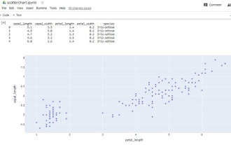
Run the code and we successfully draw a simple scatter plot.
4. Modify the scatter plot style
In addition to data, matplotlib also provides various drawing options to meet different visualization needs. For example, we can flexibly modify the color, size, shape, etc. of the scatter plot according to our needs. The sample code is as follows:
plt.scatter(data['x'], data['y'], color='red', marker='x', s=80)
plt.show()
In the above code, we modify the style of the scatter plot through the color, marker, and s parameters, that is, it becomes a red x-shaped scatter plot with a size of 80.
5. Add axis labels
In order to make the scatter plot easier to interpret, we need to add labels to the x and y axes. By calling the xlabel() and ylabel() functions, we can quickly add labels to the coordinate axes. The sample code is as follows:
plt.scatter(data['x'], data['y'], color='red', marker='x', s=80)
plt.xlabel('x-axis')
plt.ylabel('y-axis')
plt.show()6. Modify the axis scale and range
In some cases Next, we need to modify the range of the coordinate axis or display a more friendly scale. By calling the xlim() and ylim() functions, we can precisely modify the range of the coordinate axes. At the same time, using the xticks() and yticks() functions, we can customize the position and labels of the ticks.
7. Conclusion
The above is the content introduced in this article. Through the study of this article, beginners can understand how to use matplotlib to draw scatter plots and flexibly modify them according to specific needs. Graphic style. At the same time, it is recommended to practice more during the learning process to enhance your proficiency in the matplotlib module.
The above is the detailed content of A beginner's guide to making scatter plots with matplotlib. For more information, please follow other related articles on the PHP Chinese website!

Hot AI Tools

Undresser.AI Undress
AI-powered app for creating realistic nude photos

AI Clothes Remover
Online AI tool for removing clothes from photos.

Undress AI Tool
Undress images for free

Clothoff.io
AI clothes remover

AI Hentai Generator
Generate AI Hentai for free.

Hot Article
Hot Tools

Notepad++7.3.1
Easy-to-use and free code editor

SublimeText3 Chinese version
Chinese version, very easy to use

Zend Studio 13.0.1
Powerful PHP integrated development environment

Dreamweaver CS6
Visual web development tools

SublimeText3 Mac version
God-level code editing software (SublimeText3)
Hot Topics


 How to make a basic scatter plot using Python-Plotly?
Aug 31, 2023 pm 01:37 PM
How to make a basic scatter plot using Python-Plotly?
Aug 31, 2023 pm 01:37 PM
Sometimes the task is to analyze a data set and visualize the data using charts or plots. Plotly is a great open source graphics library that can be used with Python for making a variety of plots and charts quickly and easily. In this article, using two different examples, a Python library called Plotly is used with Python code to plot a scatter plot. In the first example, the Python installed in the computer system is used to run a Python program written to make a scatter plot. Another example, using Google Colab, shows how you can still use Python and Plotly and make scatter plots without Python installed on your computer. In these two
 Become a C expert: Five must-have compilers recommended
Feb 19, 2024 pm 01:03 PM
Become a C expert: Five must-have compilers recommended
Feb 19, 2024 pm 01:03 PM
From Beginner to Expert: Five Essential C Compiler Recommendations With the development of computer science, more and more people are interested in programming languages. As a high-level language widely used in system-level programming, C language has always been loved by programmers. In order to write efficient and stable code, it is important to choose a C language compiler that suits you. This article will introduce five essential C language compilers for beginners and experts to choose from. GCCGCC, the GNU compiler collection, is one of the most commonly used C language compilers
 C++ or Python, which one is more suitable for beginners?
Mar 25, 2024 am 10:54 AM
C++ or Python, which one is more suitable for beginners?
Mar 25, 2024 am 10:54 AM
C++ or Python, which one is more suitable for beginners? In this era of information technology sweeping the world, programming ability has become an essential skill. In the process of learning programming, choosing a suitable programming language is particularly important. Among many programming languages, C++ and Python are two popular choices for beginners. So, which one is more suitable for beginners, C++ or Python? The following will compare the advantages and disadvantages of the two in various aspects, and why choosing a certain language is more helpful for beginners to get started with programming.
 WooCommerce Tax Guide: A Guide for Beginners
Sep 04, 2023 am 08:25 AM
WooCommerce Tax Guide: A Guide for Beginners
Sep 04, 2023 am 08:25 AM
Now that we have learned about WooCommerce products and their related settings, let’s take a look at WooCommerce tax configuration options. Tax Setup As an online store owner, you never want to mess with tax rules and issues. WooCommerce helps you with this, offering multiple options to address all tax settings, which may vary depending on your country and individual store requirements. These options can be found at: WooCommerce->Settings->Taxes. Once you enter the Tax Settings tab, you will see a main Tax Settings section with three different tax brackets. These are: Tax Options Standard Rates Reduced Interest Rates Zero Interest Rates Taxes
 Implementation of area chart and scatter chart functions of Vue statistical chart
Aug 20, 2023 am 11:58 AM
Implementation of area chart and scatter chart functions of Vue statistical chart
Aug 20, 2023 am 11:58 AM
The area chart and scatter chart functions of Vue statistical charts are implemented. With the continuous development of data visualization technology, statistical charts play an important role in data analysis and display. Under the Vue framework, we can use the existing chart library and combine it with Vue's two-way data binding and componentization features to easily implement the functions of area charts and scatter charts. This article will introduce how to use Vue and commonly used chart libraries to implement these two statistical charts. Implementation of area charts Area charts are often used to show the trend of data changes over time. In Vue, we can use v
 Python beginners must learn: Master the basic usage of lambda functions
Feb 02, 2024 pm 06:41 PM
Python beginners must learn: Master the basic usage of lambda functions
Feb 02, 2024 pm 06:41 PM
Essential for beginners: To master the basic usage of lambda functions in Python, specific code examples are required. Overview: Python is a simple and easy-to-learn programming language. It has attracted the love of many programmers with its concise and flexible syntax. In Python, a lambda function is a special anonymous function that can be defined directly where the function is required without giving it a name. This article will introduce the basic use of lambda functions and provide specific code examples to help beginners better understand
 Pandas Beginner's Guide: HTML Table Data Reading Tips
Jan 09, 2024 am 08:10 AM
Pandas Beginner's Guide: HTML Table Data Reading Tips
Jan 09, 2024 am 08:10 AM
Beginner's Guide: How to Read HTML Tabular Data with Pandas Introduction: Pandas is a powerful Python library for data processing and analysis. It provides flexible data structures and data analysis tools, making data processing simpler and more efficient. Pandas can not only process data in CSV, Excel and other formats, but can also directly read HTML table data. This article will introduce how to use the Pandas library to read HTML table data, and provide specific code examples to help beginners
 How to use scatter plots to display data in Highcharts
Dec 17, 2023 pm 10:30 PM
How to use scatter plots to display data in Highcharts
Dec 17, 2023 pm 10:30 PM
How to use scatter plots to display data in Highcharts Preface Highcharts is an open source JavaScript chart library that provides a variety of chart types and powerful customization functions. Among them, scatter plot is a commonly used data visualization method that can show the relationship between two variables and the distribution of variables. This article will introduce how to use scatter plots to display data in Highcharts and provide specific code examples. Step 1: Introduce the Highcharts library
