
 Software Tutorial
Office Software
How to adjust the position of minor tick marks in excel graph
Software Tutorial
Office Software
How to adjust the position of minor tick marks in excel graph
How to adjust the position of minor tick marks in excel graph

How to change the position of the minor tick marks in the curve chart of excel chart making
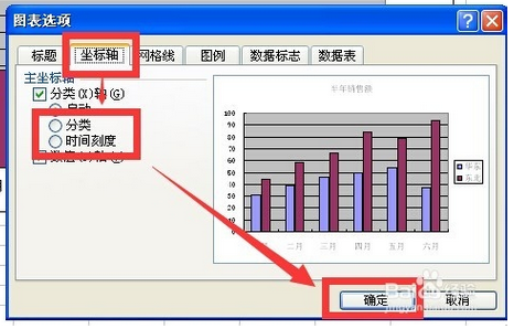
1, use excel to open a data table with charts
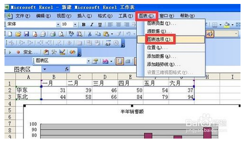
2, click the chart area to activate the chart
3, click the menu bar chart chart option
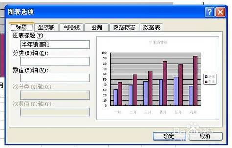
4, after clicking this command, the chart options dialog box will pop up
5, click the Axis tab and then switch between classification and time scale and click OK. If you select the data point of the time scale data series (a row or column of data in the data source) (one graph corresponds to one cell value) ) Blank data points will be formed in discontinuous charts in time. If you want to clear these data points, you can change the time axis to a category axis
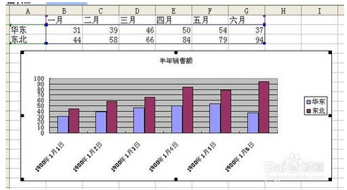
6, this is the display effect of the timeline
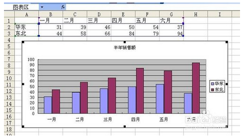
7, this is the display effect of the classification axis
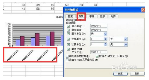
8, this is the scale option of the classification axis. It is relatively simple, only the maximum value, the minimum value, the basic unit, the primary unit, the secondary unit and the data in reverse order
9, this is the scale option of the time axis, including minimum value, maximum value, basic unit, major unit, minor unit, the value y-axis crosses the data in reverse order, the value y-axis crosses the date period, the value y-axis crosses the maximum value
How to display coordinate axis lines in excel
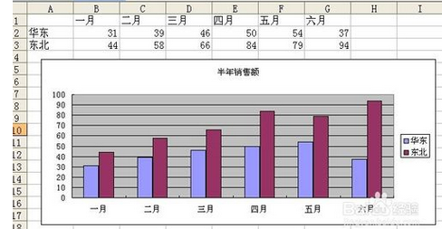
Select the table in the box, click Insert → Chart in the menu, as shown in the figure, select a chart form, insert a chart in the middle of the sheet, left-click and drag the chart to the specified position.
1.Set the vertical coordinate scale unit
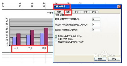
Select the vertical coordinate, click, and a border will be displayed on the vertical coordinate, indicating that it is selected. Right-click to bring up the menu command, select Format Axies at the bottom, and the coordinate axis setting window will pop up. The current main scale of the ordinate is 100. Now we will change the main scale to 50 and display the minor scale.
In the Axies Option page card, change the major scale value to 50. Generally speaking, the minor scale divides the major scale into five equal parts by default, so if the minor scale is automatic, its value is automatically changed to 10.
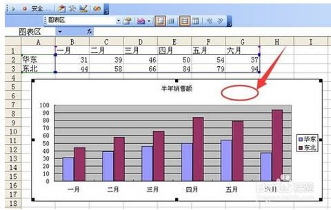
Select cross in the scale form, then close and exit. The result is as shown in the figure.
2. Display the vertical coordinate value unit and set its value display format
Next we add the display format and unit of the ordinate value. Right-click the ordinate, select Format Axies at the bottom, and in the second page card Number, select the financial item Accounting. The default number of decimal places is 2. Then position the mouse cursor in the input box below, and the category will automatically jump to the custom item, change the corresponding symbol, as shown in the picture, click the Add button behind the box, close and exit, and the effect will be as shown in the picture.
3. Display tick marks
The chart displays major tick marks by default. We can display minor tick marks and set their line style. Right-click the ordinate and select Add Minor Grindlines to add minor ticks.
4. Set the tick line style
Right-click the ordinate, select Format Minor Grindlines, and change the minor ticks to double-dots and dashes, as shown in the figure. Of course, if you don't want to display small tick marks, you can select the No Line option.
Similarly, you can set the main tick mark.
After the setting is completed, we find that the scale lines are too dense. We can repeat the steps of setting the scale unit and change the main scale unit to 100. The effect is as shown in the figure.
How to set the coordinate scale and unit of excel chart
How to set the X-axis scale value irregularly in excel chart
How to set the x-axis as the timeline or category axis in excel chart
1, use excel to open a data table with charts
2, click the chart area to activate the chart
3, click the menu bar chart chart option
4, after clicking this command, the chart options dialog box will pop up
5, click the Axis tab and then switch between classification and time scale and click OK. If you select the data point of the time scale data series (a row or column of data in the data source) (one graph corresponds to one cell value) ) Blank data points will be formed in discontinuous charts in time. If you want to clear these data points, you can change the time axis to a category axis
6, this is the display effect of the timeline
7, this is the display effect of the classification axis
8, this is the scale option of the classification axis. It is relatively simple, only the maximum value, the minimum value, the basic unit, the primary unit, the secondary unit and the data in reverse order
9, this is the scale option of the time axis, including minimum value, maximum value, basic unit, major unit, minor unit, the value y-axis crosses the data in reverse order, the value y-axis crosses the date period, the value y-axis crosses the maximum value
The above is the detailed content of How to adjust the position of minor tick marks in excel graph. For more information, please follow other related articles on the PHP Chinese website!

Hot AI Tools

Undresser.AI Undress
AI-powered app for creating realistic nude photos

AI Clothes Remover
Online AI tool for removing clothes from photos.

Undress AI Tool
Undress images for free

Clothoff.io
AI clothes remover

AI Hentai Generator
Generate AI Hentai for free.

Hot Article
Hot Tools

Notepad++7.3.1
Easy-to-use and free code editor

SublimeText3 Chinese version
Chinese version, very easy to use

Zend Studio 13.0.1
Powerful PHP integrated development environment

Dreamweaver CS6
Visual web development tools

SublimeText3 Mac version
God-level code editing software (SublimeText3)
Hot Topics
 1378
1378
 52
52

 5 Things You Can Do in Excel for the Web Today That You Couldn't 12 Months Ago
Mar 22, 2025 am 03:03 AM
5 Things You Can Do in Excel for the Web Today That You Couldn't 12 Months Ago
Mar 22, 2025 am 03:03 AM
Excel web version features enhancements to improve efficiency! While Excel desktop version is more powerful, the web version has also been significantly improved over the past year. This article will focus on five key improvements: Easily insert rows and columns: In Excel web, just hover over the row or column header and click the " " sign that appears to insert a new row or column. There is no need to use the confusing right-click menu "insert" function anymore. This method is faster, and newly inserted rows or columns inherit the format of adjacent cells. Export as CSV files: Excel now supports exporting worksheets as CSV files for easy data transfer and compatibility with other software. Click "File" > "Export"
 How to Use LAMBDA in Excel to Create Your Own Functions
Mar 21, 2025 am 03:08 AM
How to Use LAMBDA in Excel to Create Your Own Functions
Mar 21, 2025 am 03:08 AM
Excel's LAMBDA Functions: An easy guide to creating custom functions Before Excel introduced the LAMBDA function, creating a custom function requires VBA or macro. Now, with LAMBDA, you can easily implement it using the familiar Excel syntax. This guide will guide you step by step how to use the LAMBDA function. It is recommended that you read the parts of this guide in order, first understand the grammar and simple examples, and then learn practical applications. The LAMBDA function is available for Microsoft 365 (Windows and Mac), Excel 2024 (Windows and Mac), and Excel for the web. E
 If You Don't Use Excel's Hidden Camera Tool, You're Missing a Trick
Mar 25, 2025 am 02:48 AM
If You Don't Use Excel's Hidden Camera Tool, You're Missing a Trick
Mar 25, 2025 am 02:48 AM
Quick Links Why Use the Camera Tool?
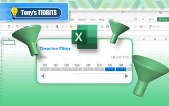 How to Create a Timeline Filter in Excel
Apr 03, 2025 am 03:51 AM
How to Create a Timeline Filter in Excel
Apr 03, 2025 am 03:51 AM
In Excel, using the timeline filter can display data by time period more efficiently, which is more convenient than using the filter button. The Timeline is a dynamic filtering option that allows you to quickly display data for a single date, month, quarter, or year. Step 1: Convert data to pivot table First, convert the original Excel data into a pivot table. Select any cell in the data table (formatted or not) and click PivotTable on the Insert tab of the ribbon. Related: How to Create Pivot Tables in Microsoft Excel Don't be intimidated by the pivot table! We will teach you basic skills that you can master in minutes. Related Articles In the dialog box, make sure the entire data range is selected (
 Use the PERCENTOF Function to Simplify Percentage Calculations in Excel
Mar 27, 2025 am 03:03 AM
Use the PERCENTOF Function to Simplify Percentage Calculations in Excel
Mar 27, 2025 am 03:03 AM
Excel's PERCENTOF function: Easily calculate the proportion of data subsets Excel's PERCENTOF function can quickly calculate the proportion of data subsets in the entire data set, avoiding the hassle of creating complex formulas. PERCENTOF function syntax The PERCENTOF function has two parameters: =PERCENTOF(a,b) in: a (required) is a subset of data that forms part of the entire data set; b (required) is the entire dataset. In other words, the PERCENTOF function calculates the percentage of the subset a to the total dataset b. Calculate the proportion of individual values using PERCENTOF The easiest way to use the PERCENTOF function is to calculate the single
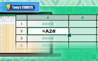 You Need to Know What the Hash Sign Does in Excel Formulas
Apr 08, 2025 am 12:55 AM
You Need to Know What the Hash Sign Does in Excel Formulas
Apr 08, 2025 am 12:55 AM
Excel Overflow Range Operator (#) enables formulas to be automatically adjusted to accommodate changes in overflow range size. This feature is only available for Microsoft 365 Excel for Windows or Mac. Common functions such as UNIQUE, COUNTIF, and SORTBY can be used in conjunction with overflow range operators to generate dynamic sortable lists. The pound sign (#) in the Excel formula is also called the overflow range operator, which instructs the program to consider all results in the overflow range. Therefore, even if the overflow range increases or decreases, the formula containing # will automatically reflect this change. How to list and sort unique values in Microsoft Excel

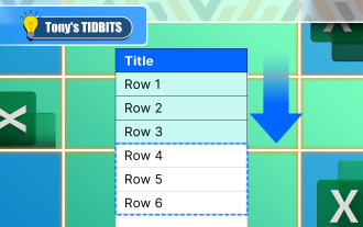 How to Format a Spilled Array in Excel
Apr 10, 2025 pm 12:01 PM
How to Format a Spilled Array in Excel
Apr 10, 2025 pm 12:01 PM
Use formula conditional formatting to handle overflow arrays in Excel Direct formatting of overflow arrays in Excel can cause problems, especially when the data shape or size changes. Formula-based conditional formatting rules allow automatic formatting to be adjusted when data parameters change. Adding a dollar sign ($) before a column reference applies a rule to all rows in the data. In Excel, you can apply direct formatting to the values or background of a cell to make the spreadsheet easier to read. However, when an Excel formula returns a set of values (called overflow arrays), applying direct formatting will cause problems if the size or shape of the data changes. Suppose you have this spreadsheet with overflow results from the PIVOTBY formula,
