
 Backend Development
Python Tutorial
Interpreting the dashboard: a key tool to improve the efficiency of data analysis
Backend Development
Python Tutorial
Interpreting the dashboard: a key tool to improve the efficiency of data analysis
Interpreting the dashboard: a key tool to improve the efficiency of data analysis


Dashboard is one of the important tools in data analysis. It can improve the efficiency and visualization of data analysis. This article will explain in detail the concept and function of dashboard and how to use code examples to build a dashboard.
1. What is dashboard?
Dashboard is a data visualization dashboard, usually composed of multiple widgets, used to display various aspects of data. It is a key tool in data analysis, helping analysts quickly and intuitively understand trends, relationships, and patterns in data.
A dashboard composed of multiple widgets usually contains charts and tables, and can display various data types and formats. Dashboard also allows users to interact, such as zooming in and out of charts via mouse hover or scroll wheel, to facilitate deeper exploration of data.
2. The role of dashboard
- Help users quickly understand data
Dashboard presents data in a visual way, allowing users to quickly understand data trends , relationships and patterns to make better decisions.
- Summarize and display all aspects of data
Dashboard can summarize and display all aspects of data, including various indicators, trends, relationships and patterns. This allows users to gain a more complete and in-depth understanding of the data.
- Convenient for users to interact and explore
Dashboard allows users to interact, such as zooming in and out of charts via mouse hover or scroll wheel, to facilitate deeper exploration of data.
3. Code example for building dashboard
The following code example will use Python's Dash library and Plotly chart library to build a simple dashboard.
- Import the necessary libraries
import dash
import dash_core_components as dcc
import dash_html_components as html
import plotly.express as px
import pandas as pd
- Construct the data set
# 构造一个简单的数据集
df = pd.DataFrame({
    "城市": ["北京", "上海", "广州", "深圳"],
    "人口": [2153, 2424, 1500, 1303],
    "GDP": [30698, 35506, 19612, 21323],
    "面积": [16410, 6340, 7434, 1997]
})- Construct the dashboard layout
app = dash.Dash(__name__)

app.layout = html.Div([
    html.H1("中国主要城市数据分析"),
    dcc.Graph(
        id="graph-bar",
        figure={
            "data": [
                {
                    "x": df["城市"],
                    "y": df["人口"],
                    "type": "bar",
                    "name": "人口"
                },
                {
                    "x": df["城市"],
                    "y": df["GDP"],
                    "type": "bar",
                    "name": "GDP"
                }
            ],
            "layout": {
                "title": "人口和GDP对比",
                "xaxis_title": "城市",
                "yaxis_title": "人口和GDP"
            }
        }
    ),
    dcc.Graph(
        id="graph-scatter",
        figure={
            "data": [
                {
                    "x": df["人口"],
                    "y": df["GDP"],
                    "mode": "markers",
                    "text": df["城市"]
                }
            ],
            "layout": {
                "title": "人口和GDP的关系",
                "xaxis_title": "人口",
                "yaxis_title": "GDP"
            }
        }
    ),
    dcc.Graph(
        id="graph-pie",
        figure={
            "data": [
                {
                    "values": df["面积"],
                    "labels": df["城市"],
                    "type": "pie"
                }
            ],
            "layout": {
                "title": "城市面积占比"
            }
        }
    )
])- Run dashboard
if __name__ == '__main__':
app.run_server(debug=True)4. Summary
Dashboard is one of the very important tools in data analysis. It can help users understand quickly and intuitively. Trends, relationships, and patterns in data. This article introduces the concept and function of dashboard and how to use code examples to build a dashboard. Through learning and practice, I hope readers can better apply dashboard to improve their data analysis capabilities.
The above is the detailed content of Interpreting the dashboard: a key tool to improve the efficiency of data analysis. For more information, please follow other related articles on the PHP Chinese website!

Hot AI Tools

Undresser.AI Undress
AI-powered app for creating realistic nude photos

AI Clothes Remover
Online AI tool for removing clothes from photos.

Undress AI Tool
Undress images for free

Clothoff.io
AI clothes remover

AI Hentai Generator
Generate AI Hentai for free.

Hot Article
Hot Tools

Notepad++7.3.1
Easy-to-use and free code editor

SublimeText3 Chinese version
Chinese version, very easy to use

Zend Studio 13.0.1
Powerful PHP integrated development environment

Dreamweaver CS6
Visual web development tools

SublimeText3 Mac version
God-level code editing software (SublimeText3)
Hot Topics
 1384
1384
 52
52

 Read CSV files and perform data analysis using pandas
Jan 09, 2024 am 09:26 AM
Read CSV files and perform data analysis using pandas
Jan 09, 2024 am 09:26 AM
Pandas is a powerful data analysis tool that can easily read and process various types of data files. Among them, CSV files are one of the most common and commonly used data file formats. This article will introduce how to use Pandas to read CSV files and perform data analysis, and provide specific code examples. 1. Import the necessary libraries First, we need to import the Pandas library and other related libraries that may be needed, as shown below: importpandasaspd 2. Read the CSV file using Pan
 PyCharm Remote Development Practical Guide: Improve Development Efficiency
Feb 23, 2024 pm 01:30 PM
PyCharm Remote Development Practical Guide: Improve Development Efficiency
Feb 23, 2024 pm 01:30 PM
PyCharm is a powerful Python integrated development environment (IDE) that is widely used by Python developers for code writing, debugging and project management. In the actual development process, most developers will face different problems, such as how to improve development efficiency, how to collaborate with team members on development, etc. This article will introduce a practical guide to remote development of PyCharm to help developers better use PyCharm for remote development and improve work efficiency. 1. Preparation work in PyCh
 Private deployment of Stable Diffusion to play with AI drawing
Mar 12, 2024 pm 05:49 PM
Private deployment of Stable Diffusion to play with AI drawing
Mar 12, 2024 pm 05:49 PM
StableDiffusion is an open source deep learning model. Its main function is to generate high-quality images through text descriptions, and supports functions such as graph generation, model merging, and model training. The operating interface of the model can be seen in the figure below. How to generate a picture. The following is an introduction to the process of creating a picture of a deer drinking water. When generating a picture, it is divided into prompt words and negative prompt words. When entering the prompt words, you must describe it clearly and try to describe the scene, object, style and color you want in detail. . For example, instead of just saying "the deer drinks water", it says "a creek, next to dense trees, and there are deer drinking water next to the creek". The negative prompt words are in the opposite direction. For example: no buildings, no people , no bridges, no fences, and too vague description may lead to inaccurate results.
 Master Python to improve work efficiency and quality of life
Feb 18, 2024 pm 05:57 PM
Master Python to improve work efficiency and quality of life
Feb 18, 2024 pm 05:57 PM
Title: Python makes life more convenient: Master this language to improve work efficiency and quality of life. As a powerful and easy-to-learn programming language, Python is becoming more and more popular in today's digital era. Not just for writing programs and performing data analysis, Python can also play a huge role in our daily lives. Mastering this language can not only improve work efficiency, but also improve the quality of life. This article will use specific code examples to demonstrate the wide application of Python in life and help readers
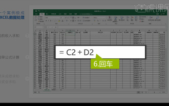 Integrated Excel data analysis
Mar 21, 2024 am 08:21 AM
Integrated Excel data analysis
Mar 21, 2024 am 08:21 AM
1. In this lesson, we will explain integrated Excel data analysis. We will complete it through a case. Open the course material and click on cell E2 to enter the formula. 2. We then select cell E53 to calculate all the following data. 3. Then we click on cell F2, and then we enter the formula to calculate it. Similarly, dragging down can calculate the value we want. 4. We select cell G2, click the Data tab, click Data Validation, select and confirm. 5. Let’s use the same method to automatically fill in the cells below that need to be calculated. 6. Next, we calculate the actual wages and select cell H2 to enter the formula. 7. Then we click on the value drop-down menu to click on other numbers.
 What are the recommended data analysis websites?
Mar 13, 2024 pm 05:44 PM
What are the recommended data analysis websites?
Mar 13, 2024 pm 05:44 PM
Recommended: 1. Business Data Analysis Forum; 2. National People’s Congress Economic Forum - Econometrics and Statistics Area; 3. China Statistics Forum; 4. Data Mining Learning and Exchange Forum; 5. Data Analysis Forum; 6. Website Data Analysis; 7. Data analysis; 8. Data Mining Research Institute; 9. S-PLUS, R Statistics Forum.
 Learn to use sessionstorage to improve front-end development efficiency
Jan 13, 2024 am 11:56 AM
Learn to use sessionstorage to improve front-end development efficiency
Jan 13, 2024 am 11:56 AM
To master the role of sessionStorage and improve front-end development efficiency, specific code examples are required. With the rapid development of the Internet, the field of front-end development is also changing with each passing day. When doing front-end development, we often need to process large amounts of data and store it in the browser for subsequent use. SessionStorage is a very important front-end development tool that can provide us with temporary local storage solutions and improve development efficiency. This article will introduce the role of sessionStorage,
 Full analysis of Java collection framework: dissecting data structure and revealing the secret of efficient storage
Feb 23, 2024 am 10:49 AM
Full analysis of Java collection framework: dissecting data structure and revealing the secret of efficient storage
Feb 23, 2024 am 10:49 AM
Overview of Java Collection Framework The Java collection framework is an important part of the Java programming language. It provides a series of container class libraries that can store and manage data. These container class libraries have different data structures to meet the data storage and processing needs in different scenarios. The advantage of the collection framework is that it provides a unified interface, allowing developers to operate different container class libraries in the same way, thereby reducing the difficulty of development. Data structures of the Java collection framework The Java collection framework contains a variety of data structures, each of which has its own unique characteristics and applicable scenarios. The following are several common Java collection framework data structures: 1. List: List is an ordered collection that allows elements to be repeated. Li
