 Technology peripherals
 It Industry
 Alipay ushered in a new logo design in 4 years: canceling the outer frame and text, using a three-dimensional natural light effect
Alipay ushered in a new logo design in 4 years: canceling the outer frame and text, using a three-dimensional natural light effect
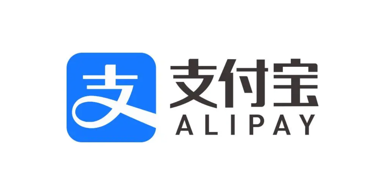
According to news from this site on January 19, Alipay today announced a new logo upgrade. Focusing on the three core concepts of "openness, technology, and warmth", removed the outer frame and text , and let the word "support" mark the logo. More open and prominent.

The new Logo also introduces three-dimensional natural light to increase transparency and flow. The attached picture of this website is as follows:

五福节" sign.

This site found that This is the first time Alipay has changed its logo after 4 years. . At the first Alipay Partner Conference in 2020, Alipay officially announced that it would adjust the light blue background of the old logo to a more vivid bright blue.

The above is the detailed content of Alipay ushered in a new logo design in 4 years: canceling the outer frame and text, using a three-dimensional natural light effect. For more information, please follow other related articles on the PHP Chinese website!

Hot AI Tools

Undresser.AI Undress
AI-powered app for creating realistic nude photos

AI Clothes Remover
Online AI tool for removing clothes from photos.

Undress AI Tool
Undress images for free

Clothoff.io
AI clothes remover

Video Face Swap
Swap faces in any video effortlessly with our completely free AI face swap tool!

Hot Article

Hot Tools

Notepad++7.3.1
Easy-to-use and free code editor

SublimeText3 Chinese version
Chinese version, very easy to use

Zend Studio 13.0.1
Powerful PHP integrated development environment

Dreamweaver CS6
Visual web development tools

SublimeText3 Mac version
God-level code editing software (SublimeText3)

Hot Topics
 1387
1387
 52
52
 Alipay PHP SDK transfer error: How to solve the problem of 'Cannot declare class SignData'?
Apr 01, 2025 am 07:21 AM
Alipay PHP...
 How to withdraw money from Bitget Wallet to Alipay
Sep 04, 2024 pm 07:25 PM
The steps to withdraw money to Alipay using BitgetWallet are as follows: Open BitgetWallet and enter your password or use your fingerprint to unlock. Click Withdraw to select a cryptocurrency. Enter Alipay information and fill in the payment account number and amount. Select network Select the network that matches the Alipay payment method. Set Handling Fee Confirm the handling fee amount and accept it. Confirm and submit the inspection information and click Confirm. Waiting for confirmation awaits verification by the blockchain network. Fund withdrawals received will be credited to the Alipay payment account.
 How to solve the problem of 'Undefined array key 'sign'' error when calling Alipay EasySDK using PHP?
Mar 31, 2025 pm 11:51 PM
Problem Description When calling Alipay EasySDK using PHP, after filling in the parameters according to the official code, an error message was reported during operation: "Undefined...
 List of handling fees for okx trading platform
Feb 15, 2025 pm 03:09 PM
The OKX trading platform offers a variety of rates, including transaction fees, withdrawal fees and financing fees. For spot transactions, transaction fees vary according to transaction volume and VIP level, and adopt the "market maker model", that is, the market charges a lower handling fee for each transaction. In addition, OKX also offers a variety of futures contracts, including currency standard contracts, USDT contracts and delivery contracts, and the fee structure of each contract is also different.
 Ouyi Exchange app domestic download tutorial
Mar 21, 2025 pm 05:42 PM
This article provides a detailed guide to safe download of Ouyi OKX App in China. Due to restrictions on domestic app stores, users are advised to download the App through the official website of Ouyi OKX, or use the QR code provided by the official website to scan and download. During the download process, be sure to verify the official website address, check the application permissions, perform a security scan after installation, and enable two-factor verification. During use, please abide by local laws and regulations, use a safe network environment, protect account security, be vigilant against fraud, and invest rationally. This article is for reference only and does not constitute investment advice. Digital asset transactions are at your own risk.
 The difference between H5 and mini-programs and APPs
Apr 06, 2025 am 10:42 AM
H5. The main difference between mini programs and APP is: technical architecture: H5 is based on web technology, and mini programs and APP are independent applications. Experience and functions: H5 is light and easy to use, with limited functions; mini programs are lightweight and have good interactiveness; APPs are powerful and have smooth experience. Compatibility: H5 is cross-platform compatible, applets and APPs are restricted by the platform. Development cost: H5 has low development cost, medium mini programs, and highest APP. Applicable scenarios: H5 is suitable for information display, applets are suitable for lightweight applications, and APPs are suitable for complex functions.
 Sesame Open Door Login Registration Entrance gate.io Exchange Registration Official Website Entrance
Mar 04, 2025 pm 04:51 PM
Gate.io (Sesame Open Door) is the world's leading cryptocurrency trading platform. This article provides a complete tutorial on spot trading of Gate.io. The tutorial covers steps such as account registration and login, KYC certification, fiat currency and digital currency recharge, trading pair selection, limit/market transaction orders, and orders and transaction records viewing, helping you quickly get started on the Gate.io platform for cryptocurrency trading. Whether a beginner or a veteran, you can benefit from this tutorial and easily master the Gate.io trading skills.
 How to withdraw money from Bitget Wallet Bitpie payment platform to Alipay or WeChat
Sep 04, 2024 pm 06:57 PM
How to withdraw money to Alipay or WeChat through BitgetWallet? 1. Log in to the BitgetWallet payment platform; 2. Select the asset to be withdrawn; 3. Click the "Withdraw" button; 4. Select the withdrawal method (Alipay or WeChat); 5. Enter the withdrawal amount and payment account number; 6. Confirm and submit.


