
1. Data source name definition
Open the data table with Excel 2013, click "Formula → Define Name", enter "Category Axis" in the name of the pop-up window, and enter "=OFFSET($A$2,,,COUNTA($A:$) in the reference position A)-1,1)"; define another name called "Value Axis" in the same way, and enter "=OFFSET($B$2,,,COUNTA($A:$A)-1," at the reference position) 1)” (Figure 2).
2. Chart data source modification
After the data source name is defined, it is time to modify the two data sources of the column chart.
Right-click the column chart, select "Select Data", and click the "Edit" button under "Legend Item (Series)" in the pop-up window. Enter "Sheet1! Value axis" in the series value of the pop-up window (Sheet1 is based on the name of the data table). Then click the "Edit" button under "Horizontal (Category) Axis Label" and enter "=Sheet1!Category Axis" in the pop-up window (Figure 3).
After clicking "OK", return to the Excel worksheet, add data in columns A and B, and the chart will automatically change and add columns.
Extension Tips:
The above only uses personal sales performance as an example, but in fact any table items that involve dynamic additions, such as student re-examination scores, family spare-time income statistics, etc., can be implemented using similar methods. This method is described in detail in the WPS tutorial.
Method/Step
Start Excel2013, for example, there is a table as shown below.
Select all or part of the columns of the table, here we take all columns as an example, and then click "Recommended Chart" in the "Insert" tab.
Note: If you know what chart to use, you can click the corresponding chart in the "Chart" group under the "Insert" tab.
At this time, the "Insert Chart" dialog box opens. The recommended charts are displayed on the left. Select the chart you need, and then click "OK".
Results as shown below.
Set chart elements: Select the chart and click the plus sign to select chart elements (select as needed).
Select the data to be displayed in the chart: Click "Province" below the chart, select the province you want to display in the interface that opens, and then click "OK".
Modify the title of the chart: Click the chart title to enter the editing state and re-enter the title.
Set the chart format: Double-click the corresponding part of the chart (such as grid lines), the format setting interface will be displayed on the right, and you can set it.
Note: The settings for other parts of the chart are similar.
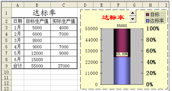
Making dynamic charts requires the following three knowledge points: using controls, defining names, and creating charts.
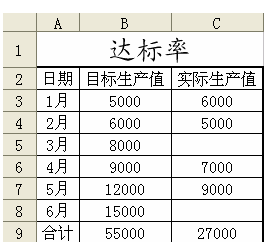
1: Using controls
1. Right-click anywhere on the menu bar or toolbar to bring up the "Control Toolbox" dialog box (you must have a VBA environment to use the "Control Toolbox").
2. Select "Numerical Adjustment Button" (icon: ) in the "Control Toolbox" and drag to draw an adjustment button in the blank area of the WPS table.
3. Right-click the "Adjustment Button", select "Properties" from the menu, and set the Linkedcell attribute to "E1", as shown in the figure. It is designed to associate cells and controls. When the user clicks the "Adjustment Button", the value of the "E1" cell will change accordingly.
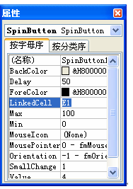
4. Close the "Properties" dialog box and click the "Exit Design Mode" button (icon:) in the "Control Toolbox".
2: Define the name
In order to obtain the compliance rate of the actual production progress, it is now necessary to define a name.
1. Select Insert\Name\Definition in the menu, enter the Define Name dialog box, and enter:
in the "Reference Location" field.=SUM(OFFSET($C$3,0,0,$E$2,1))/$B$9
2. Enter "Compliance Rate" in the name box above, and click the "Add" button on the right toolbar to complete the name definition. As shown in Figure 3.
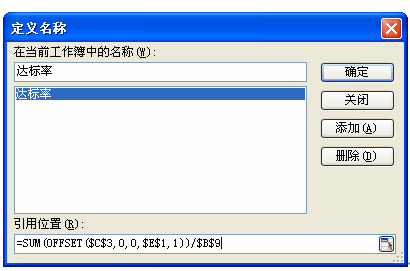
Formula explanation: The function of the OFFSET function is to use the specified reference as a reference and obtain a new reference through the given offset. Here, it takes the value of cell C3 as a reference, an offset of 0 rows and columns, a height of the value of E2, and a width of 1. For example, the number in cell E2 is 3, then the new reference area address generated by OFFSET is C3:C5, and then the SUM function is used to calculate the percentage of it and the target gross production value. It must be noted here that absolute references need to be used in C3, E1, and B9.
3: Generate chart
1. Click on the blank area, select Insert\Chart in the menu, open the chart dialog box, and click "Next" directly.
2. Enter the "Source Data" tab, click the "Add" button, enter "Actual Compliance Rate" in the "Name" edit box, enter "= Compliance Rate" in the "Value" edit box, and click " Confirm button.
3. Select the chart, the "Chart" toolbar will appear in the toolbar, select "Series" Standard Compliance Rate" in the "Chart Object" selection box, right-click and select "Data Series Format" from the menu. Check "Secondary Axis" on the "Coordinate Axis" tab.
4. Enter the "Data Flag" tab and check "Value" to display detailed data in the chart.
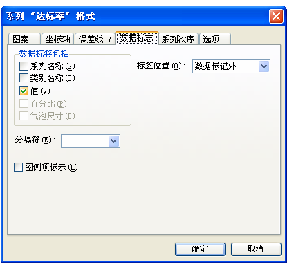
5. Right-click the secondary axis, select "Axis Format", enter the Number tab, set the number format to "Percent", and set the minimum value of the scale to 0 in the "Scale" tab. Set the maximum value to 1.
6. In the same way, set the minimum value of the main axis scale to 0 and the maximum value to 55000.
7. Chart beautification. This step can be based on personal preferences, such as setting borders, shading, filling effects, etc.
8. "Combination" of charts and adjustment buttons. Adjust the size of the chart and "Adjustment Button" appropriately to coordinate them. Select the chart, right-click and select "Send to Back". The final effect is as shown in Figure 5.
Give it a try, the chart data will also change when you click the "Adjustment Button".
The above is the detailed content of Create a dynamic production guide that updates row and column data in real time. For more information, please follow other related articles on the PHP Chinese website!
 What drawing software are there?
 Recommended order for learning c++ and c language
 How to withdraw money on WeChat without handling fees
 The performance of microcomputers mainly depends on
 How to use jsp programming software
 The Metaverse recognizes the top ten potential coins
 How to delete a folder in linux
 What to do if 302 found
 what is ed


