 Web Front-end
 HTML Tutorial
 Optimize the design of the bottom navigation bar to improve the fixed positioning function of mobile applications
Optimize the design of the bottom navigation bar to improve the fixed positioning function of mobile applications

Fixed positioning optimization of the bottom navigation bar design of mobile applications requires specific code examples
With the popularity of smartphones and the rapid development of mobile applications, people are increasingly Mobile phones are used in many places for various activities, such as socializing, shopping, learning and entertainment. In order to facilitate user operation and navigation, mobile applications usually design a bottom navigation bar. However, the bottom navigation bar will appear differently on different screen sizes and devices, so we need to use a fixed positioning method to optimize the bottom navigation bar design to ensure consistency and user-friendliness on different devices.
Fixed positioning is a layout method that keeps the element stationary relative to the browser window by setting the positioning attribute of the element to fixed. In mobile applications, we can set the bottom navigation bar to fixed positioning so that it always stays at the bottom of the screen regardless of the user scrolling the page or performing other operations.
The following is a sample code based on HTML and CSS for implementing a fixed-positioned bottom navigation bar:
HTML code:
<!DOCTYPE html>
<html>
<head>
  <meta charset="utf-8">
  <meta name="viewport" content="width=device-width, initial-scale=1.0">
  <title>底部导航栏</title>
  <link rel="stylesheet" href="style.css">
</head>
<body>
  <div class="container">
    <h1 id="移动应用">移动应用</h1>
    <div class="content">
      <!-- 页面内容 -->
    </div>
    <div class="footer">
      <ul>
        <li><a href="#">首页</a></li>
        <li><a href="#">消息</a></li>
        <li><a href="#">发现</a></li>
        <li><a href="#">我的</a></li>
      </ul>
    </div>
  </div>
</body>
</html>CSS code (style.css) :
body {
  margin: 0;
  padding: 0;
}

.container {
  position: relative;
  min-height: 100vh;
}

.content {
  /* 设置页面内容样式 */
}

.footer {
  position: fixed;
  bottom: 0;
  width: 100%;
  height: 50px;
  background-color: #f1f1f1;
}

.footer ul {
  display: flex;
  justify-content: space-around;
  align-items: center;
  height: 100%;
  list-style: none;
}

.footer li a {
  text-decoration: none;
  color: #333;
}With the above code, we set the div element (class "footer") of the bottom navigation bar to fixed positioning and align its bottom with the bottom of the screen.
In CSS, we use position: fixed; to set the positioning attribute of the element to fixed positioning, and bottom: 0; to align the bottom of the element with the screen Bottom aligned. We also beautify the appearance of the bottom navigation bar by setting the corresponding height, width and background color.
At the same time, we use flex layout to align the link elements in the navigation bar horizontally and centrally, and use justify-content: space-around; to equally divide the link elements in the navigation bar middle.
In this way, no matter what operations the user performs on the page, the bottom navigation bar will always remain at the bottom of the screen, providing users with convenient navigation functions.
By optimizing the bottom navigation bar design of mobile apps with fixed positioning, we can ensure a consistent and user-friendly navigation experience across different screen sizes and devices. The sample code given above is available for reference and modification to help developers better design and implement the bottom navigation bar in mobile applications.
The above is the detailed content of Optimize the design of the bottom navigation bar to improve the fixed positioning function of mobile applications. For more information, please follow other related articles on the PHP Chinese website!

Hot AI Tools

Undresser.AI Undress
AI-powered app for creating realistic nude photos

AI Clothes Remover
Online AI tool for removing clothes from photos.

Undress AI Tool
Undress images for free

Clothoff.io
AI clothes remover

AI Hentai Generator
Generate AI Hentai for free.

Hot Article

Hot Tools

Notepad++7.3.1
Easy-to-use and free code editor

SublimeText3 Chinese version
Chinese version, very easy to use

Zend Studio 13.0.1
Powerful PHP integrated development environment

Dreamweaver CS6
Visual web development tools

SublimeText3 Mac version
God-level code editing software (SublimeText3)

Hot Topics
 1378
1378
 52
52
 In-depth interpretation: Why is Laravel as slow as a snail?
Mar 07, 2024 am 09:54 AM
Laravel is a popular PHP development framework, but it is sometimes criticized for being as slow as a snail. What exactly causes Laravel's unsatisfactory speed? This article will provide an in-depth explanation of the reasons why Laravel is as slow as a snail from multiple aspects, and combine it with specific code examples to help readers gain a deeper understanding of this problem. 1. ORM query performance issues In Laravel, ORM (Object Relational Mapping) is a very powerful feature that allows
 Discussion on Golang's gc optimization strategy
Mar 06, 2024 pm 02:39 PM
Golang's garbage collection (GC) has always been a hot topic among developers. As a fast programming language, Golang's built-in garbage collector can manage memory very well, but as the size of the program increases, some performance problems sometimes occur. This article will explore Golang’s GC optimization strategies and provide some specific code examples. Garbage collection in Golang Golang's garbage collector is based on concurrent mark-sweep (concurrentmark-s
 C++ program optimization: time complexity reduction techniques
Jun 01, 2024 am 11:19 AM
Time complexity measures the execution time of an algorithm relative to the size of the input. Tips for reducing the time complexity of C++ programs include: choosing appropriate containers (such as vector, list) to optimize data storage and management. Utilize efficient algorithms such as quick sort to reduce computation time. Eliminate multiple operations to reduce double counting. Use conditional branches to avoid unnecessary calculations. Optimize linear search by using faster algorithms such as binary search.
 Decoding Laravel performance bottlenecks: Optimization techniques fully revealed!
Mar 06, 2024 pm 02:33 PM
Decoding Laravel performance bottlenecks: Optimization techniques fully revealed! Laravel, as a popular PHP framework, provides developers with rich functions and a convenient development experience. However, as the size of the project increases and the number of visits increases, we may face the challenge of performance bottlenecks. This article will delve into Laravel performance optimization techniques to help developers discover and solve potential performance problems. 1. Database query optimization using Eloquent delayed loading When using Eloquent to query the database, avoid
 Laravel performance bottleneck revealed: optimization solution revealed!
Mar 07, 2024 pm 01:30 PM
Laravel performance bottleneck revealed: optimization solution revealed! With the development of Internet technology, the performance optimization of websites and applications has become increasingly important. As a popular PHP framework, Laravel may face performance bottlenecks during the development process. This article will explore the performance problems that Laravel applications may encounter, and provide some optimization solutions and specific code examples so that developers can better solve these problems. 1. Database query optimization Database query is one of the common performance bottlenecks in Web applications. exist
 How to position elements in css
Apr 26, 2024 am 10:24 AM
There are four methods of CSS element positioning: static, relative, absolute, and fixed positioning. Static positioning is the default and the element is not affected by positioning rules. Relative positioning moves an element relative to itself without affecting document flow. Absolute positioning removes an element from the document flow and positions it relative to its ancestor elements. Fixed positioning positions an element relative to the viewport, always keeping it in the same position on the screen.
 How to optimize the startup items of WIN7 system
Mar 26, 2024 pm 06:20 PM
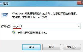
1. Press the key combination (win key + R) on the desktop to open the run window, then enter [regedit] and press Enter to confirm. 2. After opening the Registry Editor, we click to expand [HKEY_CURRENT_USERSoftwareMicrosoftWindowsCurrentVersionExplorer], and then see if there is a Serialize item in the directory. If not, we can right-click Explorer, create a new item, and name it Serialize. 3. Then click Serialize, then right-click the blank space in the right pane, create a new DWORD (32) bit value, and name it Star
 Vivox100s parameter configuration revealed: How to optimize processor performance?
Mar 24, 2024 am 10:27 AM
Vivox100s parameter configuration revealed: How to optimize processor performance? In today's era of rapid technological development, smartphones have become an indispensable part of our daily lives. As an important part of a smartphone, the performance optimization of the processor is directly related to the user experience of the mobile phone. As a high-profile smartphone, Vivox100s's parameter configuration has attracted much attention, especially the optimization of processor performance has attracted much attention from users. As the "brain" of the mobile phone, the processor directly affects the running speed of the mobile phone.


