
 Web Front-end
H5 Tutorial
How to use css3 attributes to enrich picture styles (rounded corners, shadows, gradients)_html5 tutorial skills
Web Front-end
H5 Tutorial
How to use css3 attributes to enrich picture styles (rounded corners, shadows, gradients)_html5 tutorial skills
How to use css3 attributes to enrich picture styles (rounded corners, shadows, gradients)_html5 tutorial skills

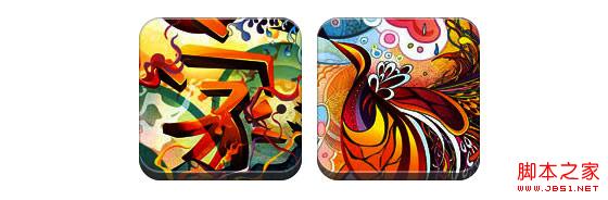
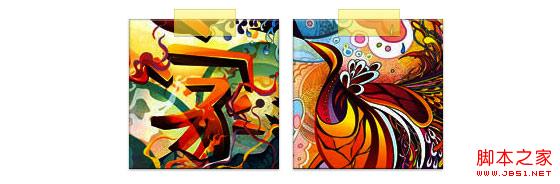
In CSS3, if box-shadow and border-radius are used directly on images, the browser cannot render them well. But if you use the image as a background-image, the added style browser can render it well. I will introduce how to use box-shadow, border-radius and transition to create different image style effects.
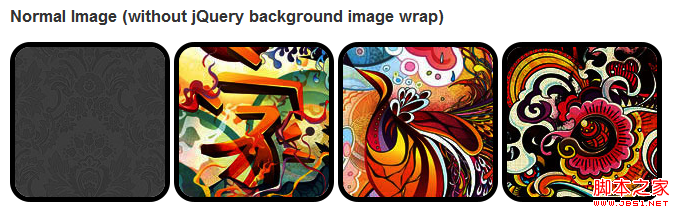
Problem
By looking at the demo, we can notice that we set border-radius and inline box-shadow for the first row of images. Firefox renders the border-radius of the image, but does not render the inline box-shadow. Both effects are not rendering in chrome and Safari.
.normal img {
border: solid 5px #000;
-webkit-border-radius: 20px;
-moz-border-radius: 20px;
border-radius: 20px;
-webkit-box-shadow: inset 0 1px 5px rgba(0,0,0,.5);
-moz-box-shadow: inset 0 1px 5px rgba(0,0,0,.5);
box-shadow: inset 0 1px 5px rgba(0,0,0,.5);
}
firefox effect:
chrome/safari
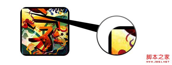
Workaround
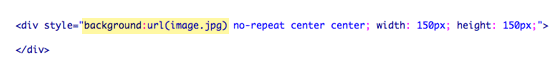
In order for border-radius and inline box-shadow to work properly, we need to convert the image into background-image.
Dynamic method
In order to complete this work dynamically, we need to use jquery to add a background image wrapper to each image. The following js code adds a span package to each image. The background image path of span is the path of the image.
The code is relatively simple, I think there is no need to explain it. If you are not sure, you can directly check the jquery API.
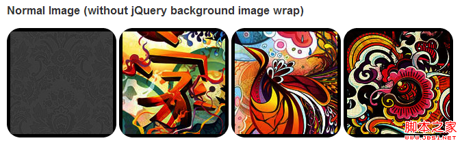
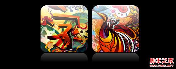
Output
The above code will output the following results:

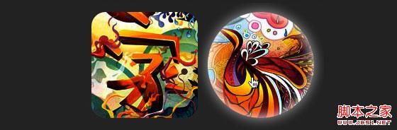
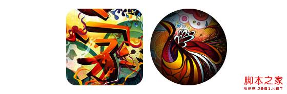
Circle image
Add that we use border-radius to achieve the effect of circular images, the effect is as follows:
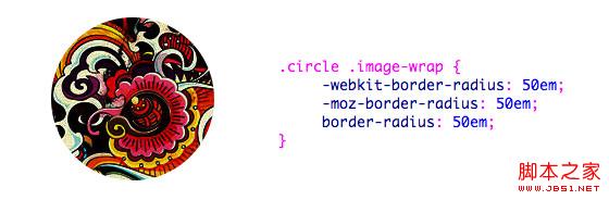
css:
.circle .image-wrap {
-webkit-border-radius: 50em;
-moz-border-radius: 50em;
border-radius: 50em;
}
Card style
The following is a card style picture, using multiple inline box-shadows.
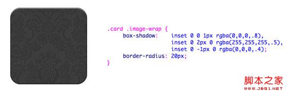
css:
.card .image-wrap {
-webkit-box-shadow: inset 0 0 1px rgba(0,0,0,.8), inset 0 2px 0 rgba(255,255,255,.5) , inset 0 -1px 0 rgba(0,0,0,.4);
-moz-box-shadow: inset 0 0 1px rgba(0,0,0,.8), inset 0 2px 0 rgba( 255,255,255,.5), inset 0 -1px 0 rgba(0,0,0,.4);
box-shadow: inset 0 0 1px rgba(0,0,0,.8), inset 0 2px 0 rgba(255,255,255,.5), inset 0 -1px 0 rgba(0,0,0,.4);
-webkit-border-radius: 20px;
-moz-border-radius: 20px;
border-radius: 20px;
}
Relief style
The following is the relief effect.
css:
.embossed .image-wrap {
-webkit-box-shadow: inset 0 0 2px rgba(0,0,0,.8), inset 0 2px 0 rgba(255,255,255,.5), inset 0 - 7px 0 rgba(0,0,0,.6), inset 0 -9px 0 rgba(255,255,255,.3);
-moz-box-shadow: inset 0 0 2px rgba(0,0,0,. 8), inset 0 2px 0 rgba(255,255,255,.5), inset 0 -7px 0 rgba(0,0,0,.6), inset 0 -9px 0 rgba(255,255,255,.3);
box- shadow: inset 0 0 2px rgba(0,0,0,.8), inset 0 2px 0 rgba(255,255,255,.5), inset 0 -7px 0 rgba(0,0,0,.6), inset 0 - 9px 0 rgba(255,255,255,.3);
-webkit-border-radius: 20px;
-moz-border-radius: 20px;
border-radius: 20px;
}
Soft relief style
Compared to the relief style, the new style adds a 1px blur attribute.
css:
.soft-embossed .image-wrap {
-webkit-box-shadow: inset 0 0 4px rgba(0,0,0,1), inset 0 2px 1px rgba(255,255,255,.5), inset 0 -9px 2px rgba(0,0,0,.6), inset 0 -12px 2px rgba(255,255,255,.3);
-moz-box-shadow: inset 0 0 4px rgba(0,0,0, 1), inset 0 2px 1px rgba(255,255,255,.5), inset 0 -9px 2px rgba(0,0,0,.6), inset 0 -12px 2px rgba(255,255,255,.3);
box- shadow: inset 0 0 4px rgba(0,0,0,1), inset 0 2px 1px rgba(255,255,255,.5), inset 0 -9px 2px rgba(0,0,0,.6), inset 0 -12px 2px rgba(255,255,255,.3);
-webkit-border-radius: 20px;
-moz-border-radius: 20px;
border-radius: 20px;
}
Cutout style
Use embedded box-shadow to achieve the cutout effect.
css:
.cut-out .image-wrap {
-webkit-box-shadow: 0 1px 0 rgba(255,255,255,.2), inset 0 4px 5px rgba(0,0,0,.6), inset 0 1px 0 rgba(0,0,0,.6);
-moz-box-shadow: 0 1px 0 rgba(255,255,255,.2), inset 0 4px 5px rgba(0,0,0,.6) , inset 0 1px 0 rgba(0,0,0,.6);
box-shadow: 0 1px 0 rgba(255,255,255,.2), inset 0 4px 5px rgba(0,0,0,.6) , inset 0 1px 0 rgba(0,0,0,.6);
-webkit-border-radius: 20px;
-moz-border-radius: 20px;
border-radius: 20px;
}
Deformation and glowing
In this example, we add the transition attribute to the image package. When the mouse slides over, it will change from rounded corners to Round. Then we use multiple box-shadows to achieve the glow effect.
css:
.morphing-glowing .image-wrap {
-webkit-transition: 1s;
-moz-transition: 1s;
transition: 1s;
-webkit-border-radius: 20px;
-moz-border-radius: 20px;
border-radius: 20px;
}
.morphing-glowing .image-wrap:hover {
-webkit-box-shadow: 0 0 20px rgba(255,255,255,.6), inset 0 0 20px rgba(255,255,255,1);
-moz-box-shadow: 0 0 20px rgba(255,255,255,.6), inset 255, 1);
box-shadow: 0 0 20px rgba(255,255,255,.6), inset 0 0 20px rgba(255,255,255,1);
-webkit-border-radius: 60em;
-moz- border-radius: 60em;
border-radius: 60em;
}
Highlight effect
The highlight effect is achieved by adding the :after pseudo-class to the element.

css:
.glossy .image-wrap {
-webkit-box-shadow: inset 0 -1px 0 rgba(0,0,0,.5);
-moz-box-shadow: inset 0 -1px 0 rgba(0,0,0,.5);
box-shadow: inset 0 -1px 0 rgba(0,0,0,.5);
-webkit-border-radius: 20px;
-moz-border-radius: 20px;
border-radius: 20px;
}
.glossy .image-wrap:after {
position: absolute;
content: ' ' ;
width: 100%;
height: 50%;
top: 0;
left: 0;
-webkit-border-radius: 20px;
-moz-border -radius: 20px;
border-radius: 20px;
background: -moz-linear-gradient(top, rgba(255,255,255,0.7) 0%, rgba(255,255,255,.1) 100%);
background: -webkit-gradient(linear, left top, left bottom, color-stop(0%,rgba(255,255,255,0.7)), color-stop(100%,rgba(255,255,255,.1)));
background: linear-gradient(top, rgba(255,255,255,0.7) 0%,rgba(255,255,255,.1) 100%);
}
Reflection effect
In this example, we move the highlight effect to the bottom to achieve the reflection effect.
css:
.reflection .image-wrap:after {
position: absolute;
content: ' ';
width: 100%;
height: 30px;
bottom: -31px;
left: 0;
-webkit-border-top-left-radius: 20px;
-webkit-border-top-right-radius: 20px;
-moz-border-radius-topleft: 20px;
-moz-border-radius-topright: 20px;
border-top-left-radius: 20px;
border-top-right-radius: 20px;
background: -moz- linear-gradient(top, rgba(0,0,0,.3) 0%, rgba(255,255,255,0) 100%);
background: -webkit-gradient(linear, left top, left bottom, color- stop(0%,rgba(0,0,0,.3)), color-stop(100%,rgba(255,255,255,0)));
background: linear-gradient(top, rgba(0,0 ,0,.3) 0%,rgba(255,255,255,0) 100%);
}
.reflection .image-wrap:hover {
position: relative;
top: -8px;
}
Highlight and Reflection
In this example we use :before and :after to combine the highlight and reflection effects.
css:
.glossy-reflection .image-wrap {
-webkit-box-shadow: inset 0 -1px 0 rgba(0,0,0,.5), inset 0 1px 0 rgba(255,255,255,.6);
-moz-box-shadow: inset 0 -1px 0 rgba(0,0,0,.5), inset 0 1px 0 rgba(255,255,255,.6);
box-shadow: inset 0 -1px 0 rgba(0,0,0,.5), inset 0 1px 0 rgba(255,255,255,.6);
-webkit-transition: 1s;
-moz-transition: 1s;
transition: 1s;
-webkit-border-radius: 20px;
-moz-border-radius: 20px;
border-radius: 20px;
}
.glossy-reflection .image-wrap :before {
position: absolute;
content: ' ';
width: 100%;
height: 50%;
top: 0;
left: 0;
-webkit-border-radius: 20px;
-moz-border-radius: 20px;
border-radius: 20px; ) 0%, rgba(255,255,255,.1) 100%);
background: -webkit-gradient(linear, left top, left bottom, color-stop(0%,rgba(255,255,255,0.7)), color- stop(100%,rgba(255,255,255,.1)));
background: linear-gradient(top, rgba(255,255,255,0.7) 0%,rgba(255,255,255,.1) 100%);
}
.glossy-reflection .image-wrap:after {
position: absolute;
content: ' ';
width: 100%;
height: 30px;
bottom: - 31px;
left: 0;
-webkit-border-top-left-radius: 20px;
-webkit-border-top-right-radius: 20px;
-moz-border-radius -topleft: 20px;
-moz-border-radius-topright: 20px;
border-top-left-radius: 20px;
border-top-right-radius: 20px;
background: -moz-linear-gradient(top, rgba(230,230,230,.3) 0%, rgba(230,230,230,0) 100%);
background: -webkit-gradient(linear, left top, left bottom, color-stop (0%,rgba(230,230,230,.3)), color-stop(100%,rgba(230,230,230,0)));
background: linear-gradient(top, rgba(230,230,230,.3) 0%, rgba(230,230,230,0) 100%);
}
Tape style
In this example, we use :after to achieve the tape effect.
css:
.tape .image-wrap {
-webkit-box-shadow: inset 0 0 2px rgba(0,0,0,.7), inset 0 2px 0 rgba(255,255,255,.3), inset 0 - 1px 0 rgba(0,0,0,.5), 0 1px 3px rgba(0,0,0,.4);
-moz-box-shadow: inset 0 0 2px rgba(0,0,0 ,.7), inset 0 2px 0 rgba(255,255,255,.3), inset 0 -1px 0 rgba(0,0,0,.5), 0 1px 3px rgba(0,0,0,.4);
box-shadow: inset 0 0 2px rgba(0,0,0,.7), inset 0 2px 0 rgba(255,255,255,.3), inset 0 -1px 0 rgba(0,0,0,.5) , 0 1px 3px rgba(0,0,0,.4);
}
.tape .image-wrap:after {
position: absolute;
content: ' ';
width: 60px;
height: 25px;
top: -10px;
left: 50%;
margin-left: -30px;
border: solid 1px rgba(137,130,48, .2);
background: -moz-linear-gradient(top, rgba(254,243,127,.6) 0%, rgba(240,224,54,.6) 100%);
background: -webkit-gradient (linear, left top, left bottom, color-stop(0%,rgba(254,243,127,.6)), color-stop(100%,rgba(240,224,54,.6)));
background: linear -gradient(top, rgba(254,243,127,.6) 0%,rgba(240,224,54,.6) 100%);
-webkit-box-shadow: inset 0 1px 0 rgba(255,255,255,.3), 0 1px 0 rgba(0,0,0,.2);
}
Transform and Colorize
In this example we use :after, achieves a radial gradient effect when the mouse passes over.
css:
.morphing-tinting .image-wrap {
position: relative;
-webkit-transition: 1s;
-moz-transition: 1s;
transition: 1s;
-webkit -border-radius: 20px;
-moz-border-radius: 20px;
border-radius: 20px; webkit-border-radius: 30em;
-moz-border-radius: 30em;
border-radius: 30em;
}
.morphing-tinting .image-wrap:after {
position: absolute;
content: ' ';
width: 100%;
height: 100%;
top: 0;
left: 0;
-webkit-transition: 1s;
-moz-transition: 1s;
transition: 1s;
-webkit-border-radius: 30em;
-moz-border-radius: 30em; 30em;
}
.morphing-tinting .image-wrap:hover:after {
background: -webkit-gradient(radial, 50% 50%, 40, 50% 50%, 80, from( rgba(0,0,0,0)), to(rgba(0,0,0,1)));
background: -moz-radial-gradient(50% 50%, circle, rgba(0, 0,0,0) 40px, rgba(0,0,0,1) 80px);
}
Feather edge circle
css:

Copy code
border-radius: 30em;
}
.feather .image-wrap:after {
position: absolute;
content: ' ';
width: 100%;
height: 100%;
top : 0;
left: 0;
background: -webkit-gradient(radial, 50% 50%, 50, 50% 50%, 70, from(rgba(255,255,255,0)), to(rgba( 255,255,255,1)));
background: -moz-radial-gradient(50% 50%, circle, rgba(255,255,255,0) 50px, rgba(255,255,255,1) 70px);
}
Browser Compatibility
Create your own implementation Use the :before and :after pseudo-classes to create many styles for images, and you can try to create new effects yourself.

Hot AI Tools

Undresser.AI Undress
AI-powered app for creating realistic nude photos

AI Clothes Remover
Online AI tool for removing clothes from photos.

Undress AI Tool
Undress images for free

Clothoff.io
AI clothes remover

AI Hentai Generator
Generate AI Hentai for free.

Hot Article
Hot Tools

Notepad++7.3.1
Easy-to-use and free code editor

SublimeText3 Chinese version
Chinese version, very easy to use

Zend Studio 13.0.1
Powerful PHP integrated development environment

Dreamweaver CS6
Visual web development tools

SublimeText3 Mac version
God-level code editing software (SublimeText3)
Hot Topics


 How to solve the problem of automatically saving pictures when publishing on Xiaohongshu? Where is the automatically saved image when posting?
Mar 22, 2024 am 08:06 AM
How to solve the problem of automatically saving pictures when publishing on Xiaohongshu? Where is the automatically saved image when posting?
Mar 22, 2024 am 08:06 AM
With the continuous development of social media, Xiaohongshu has become a platform for more and more young people to share their lives and discover beautiful things. Many users are troubled by auto-save issues when posting images. So, how to solve this problem? 1. How to solve the problem of automatically saving pictures when publishing on Xiaohongshu? 1. Clear the cache First, we can try to clear the cache data of Xiaohongshu. The steps are as follows: (1) Open Xiaohongshu and click the "My" button in the lower right corner; (2) On the personal center page, find "Settings" and click it; (3) Scroll down and find the "Clear Cache" option. Click OK. After clearing the cache, re-enter Xiaohongshu and try to post pictures to see if the automatic saving problem is solved. 2. Update the Xiaohongshu version to ensure that your Xiaohongshu
 How to post pictures in TikTok comments? Where is the entrance to the pictures in the comment area?
Mar 21, 2024 pm 09:12 PM
How to post pictures in TikTok comments? Where is the entrance to the pictures in the comment area?
Mar 21, 2024 pm 09:12 PM
With the popularity of Douyin short videos, user interactions in the comment area have become more colorful. Some users wish to share images in comments to better express their opinions or emotions. So, how to post pictures in TikTok comments? This article will answer this question in detail and provide you with some related tips and precautions. 1. How to post pictures in Douyin comments? 1. Open Douyin: First, you need to open Douyin APP and log in to your account. 2. Find the comment area: When browsing or posting a short video, find the place where you want to comment and click the "Comment" button. 3. Enter your comment content: Enter your comment content in the comment area. 4. Choose to send a picture: In the interface for entering comment content, you will see a "picture" button or a "+" button, click
 6 Ways to Make Pictures Sharper on iPhone
Mar 04, 2024 pm 06:25 PM
6 Ways to Make Pictures Sharper on iPhone
Mar 04, 2024 pm 06:25 PM
Apple's recent iPhones capture memories with crisp detail, saturation and brightness. But sometimes, you may encounter some issues that may cause the image to look less clear. While autofocus on iPhone cameras has come a long way, allowing you to take photos quickly, the camera can mistakenly focus on the wrong subject in certain situations, making the photo blurry in unwanted areas. If your photos on your iPhone look out of focus or lack sharpness overall, the following post should help you make them sharper. How to Make Pictures Clearer on iPhone [6 Methods] You can try using the native Photos app to clean up your photos. If you want more features and options
 How to make ppt pictures appear one by one
Mar 25, 2024 pm 04:00 PM
How to make ppt pictures appear one by one
Mar 25, 2024 pm 04:00 PM
In PowerPoint, it is a common technique to display pictures one by one, which can be achieved by setting animation effects. This guide details the steps to implement this technique, including basic setup, image insertion, adding animation, and adjusting animation order and timing. Additionally, advanced settings and adjustments are provided, such as using triggers, adjusting animation speed and order, and previewing animation effects. By following these steps and tips, users can easily set up pictures to appear one after another in PowerPoint, thereby enhancing the visual impact of the presentation and grabbing the attention of the audience.
 How to convert pdf documents into jpg images with Foxit PDF Reader - How to convert pdf documents into jpg images with Foxit PDF Reader
Mar 04, 2024 pm 05:49 PM
How to convert pdf documents into jpg images with Foxit PDF Reader - How to convert pdf documents into jpg images with Foxit PDF Reader
Mar 04, 2024 pm 05:49 PM
Are you also using Foxit PDF Reader software? So do you know how Foxit PDF Reader converts pdf documents into jpg images? The following article brings you how Foxit PDF Reader converts pdf documents into jpg images. For those who are interested in the method of converting jpg images, please come and take a look below. First start Foxit PDF Reader, then find "Features" on the top toolbar, and then select the "PDF to Others" function. Next, open a web page called "Foxit PDF Online Conversion". Click the "Login" button on the upper right side of the page to log in, and then turn on the "PDF to Image" function. Then click the upload button and add the pdf file you want to convert into an image. After adding it, click "Start Conversion"
 How to arrange two pictures side by side in wps document
Mar 20, 2024 pm 04:00 PM
How to arrange two pictures side by side in wps document
Mar 20, 2024 pm 04:00 PM
When using WPS office software, we found that not only one form is used, tables and pictures can be added to the text, pictures can also be added to the table, etc. These are all used together to make the content of the entire document look richer. , if you need to insert two pictures into the document and they need to be arranged side by side. Our next course can solve this problem: how to place two pictures side by side in a wps document. 1. First, you need to open the WPS software and find the picture you want to adjust. Left-click the picture and a menu bar will pop up, select "Page Layout". 2. Select "Tight wrapping" in text wrapping. 3. After all the pictures you need are confirmed to be set to "Tight text wrapping", you can drag the pictures to the appropriate position and click on the first picture.
 What should I do if the images on the webpage cannot be loaded? 6 solutions
Mar 15, 2024 am 10:30 AM
What should I do if the images on the webpage cannot be loaded? 6 solutions
Mar 15, 2024 am 10:30 AM
Some netizens found that when they opened the browser web page, the pictures on the web page could not be loaded for a long time. What happened? I checked that the network is normal, so where is the problem? The editor below will introduce to you six solutions to the problem that web page images cannot be loaded. Web page images cannot be loaded: 1. Internet speed problem The web page cannot display images. It may be because the computer's Internet speed is relatively slow and there are more softwares opened on the computer. And the images we access are relatively large, which may be due to loading timeout. As a result, the picture cannot be displayed. You can turn off the software that consumes more network speed. You can go to the task manager to check. 2. Too many visitors. If the webpage cannot display pictures, it may be because the webpages we visited were visited at the same time.
 How to make Win11 automatically display a picture at startup
Dec 31, 2023 pm 10:54 PM
How to make Win11 automatically display a picture at startup
Dec 31, 2023 pm 10:54 PM
Some users want to automatically open a picture when turning on the computer without changing the desktop wallpaper. We can use this function to enjoy pictures or prompt memos. In fact, the setting method is very simple. Just put the picture in the corresponding Just put it in the startup folder. Let’s take a look at it below. How to automatically open a picture when Windows 11 starts: 1. First, we need to double-click to open "This Computer" on the desktop. 2. After entering this computer, double-click to enter the system "c drive" 3. Then locate the following location "C:\Users\Administrator" \AppData\Roaming\Microsoft\Windows\StartMenu\Programs\Start
