Which one is better to use, Office 2010 or 2013?

Which one is easier to use, Office 2010 or 2013?
Compared to 2010, what attracts me in 2013 are some new features that may seem small but are very useful. For example, the power point function.
1. Easier "Presenter View"
In previous versions, various settings were required to access the speaker view, which was complicated and error-prone. In PPT2013, just find "Show Speaker View" in the playback interface and click to enter.
In the presenter view interface, we can view notes (not visible to the audience), see what is on the next page, and enlarge the slide size - these functions greatly facilitate our speeches.
2. The easy-to-use “Merge Shape”
ripe
Students who are familiar with PPT2010 may complain: This feature is also available in the 2010 version! However, before, it was hidden in hidden custom functions, making it difficult for ordinary people to find it. But in the 2013 version, it finally no longer "hide
Hide", and also wear an extra "Split" (formerly Union, Combine, Intersect, Subtract). With this tool, you can draw shapes that are not included in the built-in or default shapes.
3. The "color picker" that weighs four liang and weighs a thousand pounds
One of the difficulties in color matching is to pick the color. Although it can be obtained through external software, after all, it still has to record its RGB value and then input it into the "other fill colors" of the PPT, which adds a lot of workload for no reason. With the color picker, we can directly intercept the picture into PPT, and then use the color picker to pick it up. When changing the color, it will enter the "recently used colors".
4. The surprising "end position of the action path"
A major criticism of the previous action path was that it was difficult for us to grasp its destination during production, and the result was that it was easy to "go astray". When creating an action path in PPT2013, PowerPoint will show you where your object ends. The original object always exists, and the "ghost" image moves with the path to the end point.
In addition, the interface of PPT2013 is more concise and friendly, which is one of the reasons why I can’t put it down.
How about Yongzhong office2013
It is as close to Office 2013 in appearance and functionality as possible, and also integrates some functions that were only available in the previous professional version. It's really better than WPS.
1. Software and installation
The Yongzhong Office 2013 suite contains four components: Yongzhong text, Yongzhong forms, Yongzhong presentations, and Yongzhong PDF documents, which respectively correspond to Word 2013, Excel 2013, PowerPoint 2013 and Adobe PDF Reader. However, due to the functional modules, the size is still much smaller than Microsoft, only 60.7 MB. The installation steps include common options such as license agreement, installation path, file association, etc. However, the entire process is designed not to be bloated and can be completed in four steps. The entire installation takes about 1 minute, which is very fast.
The icons are still in the Office 2010 style, but some improvements have been made. Generally speaking, it is clear and easy to read, and the aesthetics are not bad.
2. Office Center
I think the Office Center is the biggest attraction of Yongzhong Office, because neither WPS nor MS Office is provided. To put it bluntly, this is an integrated working environment provided to users, integrating all Office components together. For example, if you need to open Word to process a document, you can directly click "New Text". If you need to make a spreadsheet, just click "New Table". Of course, templates are also integrated, so you can get whatever content you need in one stop.
3. Imitation Office 2013 appearance
Yongzhong Office 2013 adopts an appearance that is almost the same as MS Office 2013, which is currently unmatched by WPS. Of course, due to different positioning (MS Office is also responsible for touch tasks), there are still some differences in details. For example, take the file menu. Office 2013 uses the entire page for display, so it takes up a lot of space. However, Yongzhong Office still uses the traditional menu style. The victory lies in operating habits and the pop-up efficiency of the menu. Therefore, this is not a question of who is good or who is bad. I think it is a very correct idea for Yongzhong Office to strike a balance between retaining old user habits and absorbing the advantages of the new UI.
The new version of the Ribbon interface has also improved the window size. It can intelligently expand the buttons according to the width of the interface. It no longer has to use the left and right buttons to display it completely like the old version. In addition, the software also adds standard function mnemonics (displayed by pressing the Alt key), which is the same as MS Office.
How is wps easy to use?
For me personally, I recommend using wps! WPS is completely free, small in size, easy to use, simple, practical and cloud office storage.
The personal version is permanently free for individual users. It includes three functional modules: WPS text, WPS table, and WPS presentation. It corresponds one-to-one with MS Word, MS Excel, and MS PowerPoint. It is compatible with doc.xls.ppt and other file formats. You can Save and open Microsoft Word, Excel and PowerPoint files directly, and you can also easily edit WPS series documents with Microsoft Office.
Moreover, it fully respects the user's choices and preferences and provides four interface switching. I think it is more in line with our needs in life, entertainment, study and office, and is also more in line with our daily usage habits.
WPS 2013 users can switch between the new interface and the classic interface without any barriers. The familiar interface and familiar operating habits are presented. Users do not need to learn anymore, allowing old users to retain their long-term accumulated habits and cognition, and at the same time Adapt to and accept new interfaces and experiences with minimal learning costs.
The above is the detailed content of Which one is better to use, Office 2010 or 2013?. For more information, please follow other related articles on the PHP Chinese website!

Hot AI Tools

Undresser.AI Undress
AI-powered app for creating realistic nude photos

AI Clothes Remover
Online AI tool for removing clothes from photos.

Undress AI Tool
Undress images for free

Clothoff.io
AI clothes remover

AI Hentai Generator
Generate AI Hentai for free.

Hot Article

Hot Tools

Notepad++7.3.1
Easy-to-use and free code editor

SublimeText3 Chinese version
Chinese version, very easy to use

Zend Studio 13.0.1
Powerful PHP integrated development environment

Dreamweaver CS6
Visual web development tools

SublimeText3 Mac version
God-level code editing software (SublimeText3)

Hot Topics
 Your Calculator App Can Be Replaced By Microsoft Excel
Mar 06, 2025 am 06:01 AM
Ditch the Calculator: Why and How to Use Excel for All Your Calculations I haven't touched a calculator in ages. Why? Because Microsoft Excel handles all my calculations with ease, and it can do the same for you. Why Excel Trumps a Calculator While
 Don't Create Tables in Word: Use Excel Instead
Mar 06, 2025 am 03:04 AM
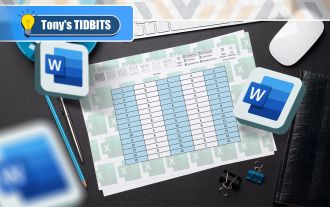
Creating tables in Word, although improved, is still cumbersome and sometimes brings more problems. This is why you should always create tables in Microsoft Excel. Why is it better to create tables in Excel? In short, Word is a word processor, while Excel is a data processor. So Word is not built for the best table creation, but its similar product, Excel. Here are just some of the reasons why creating tables in Excel is better than using Microsoft Word: Although it is surprising that you can use many Excel-like features in Microsoft Word tables, in Excel you
 How to Reduce the Gaps Between Bars and Columns in Excel Charts (And Why You Should)
Mar 08, 2025 am 03:01 AM
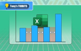
Enhance Your Excel Charts: Reducing Gaps Between Bars and Columns Presenting data visually in charts significantly improves spreadsheet readability. Excel excels at chart creation, but its extensive menus can obscure simple yet powerful features, suc
 How to Use the AVERAGEIF and AVERAGEIFS Functions in Excel
Mar 07, 2025 am 06:03 AM
Quick View of AVERAGEIF and AVERAGEIFS Functions in Excel Excel's AVERAGEIF and AVERAGEIFS functions can be used to calculate the average value of a dataset. However, unlike simpler AVERAGE functions, they are able to include or exclude specific values in the calculation. How to use the AVERAGEIF function in Excel Excel's AVERAGEIF function allows you to calculate the average value of a filtered dataset based on a single condition set. AVERAGEIF function syntax The AVERAGEIF function contains three parameters: =AVERAGEIF(x,y,z)
 5 Things You Can Do in Excel for the Web Today That You Couldn't 12 Months Ago
Mar 22, 2025 am 03:03 AM
Excel web version features enhancements to improve efficiency! While Excel desktop version is more powerful, the web version has also been significantly improved over the past year. This article will focus on five key improvements: Easily insert rows and columns: In Excel web, just hover over the row or column header and click the " " sign that appears to insert a new row or column. There is no need to use the confusing right-click menu "insert" function anymore. This method is faster, and newly inserted rows or columns inherit the format of adjacent cells. Export as CSV files: Excel now supports exporting worksheets as CSV files for easy data transfer and compatibility with other software. Click "File" > "Export"
 Microsoft Excel Keyboard Shortcuts: Printable Cheat Sheet
Mar 14, 2025 am 12:06 AM
Master Microsoft Excel with these essential keyboard shortcuts! This cheat sheet provides quick access to the most frequently used commands, saving you valuable time and effort. It covers essential key combinations, Paste Special functions, workboo
 How to Use LAMBDA in Excel to Create Your Own Functions
Mar 21, 2025 am 03:08 AM
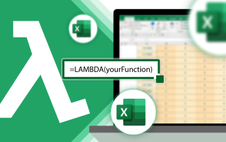
Excel's LAMBDA Functions: An easy guide to creating custom functions Before Excel introduced the LAMBDA function, creating a custom function requires VBA or macro. Now, with LAMBDA, you can easily implement it using the familiar Excel syntax. This guide will guide you step by step how to use the LAMBDA function. It is recommended that you read the parts of this guide in order, first understand the grammar and simple examples, and then learn practical applications. The LAMBDA function is available for Microsoft 365 (Windows and Mac), Excel 2024 (Windows and Mac), and Excel for the web. E
 If You Don't Use Excel's Hidden Camera Tool, You're Missing a Trick
Mar 25, 2025 am 02:48 AM
Quick Links Why Use the Camera Tool?


