
 Web Front-end
HTML Tutorial
Understand and appreciate the definition and importance of responsive layout and typography
Web Front-end
HTML Tutorial
Understand and appreciate the definition and importance of responsive layout and typography
Understand and appreciate the definition and importance of responsive layout and typography


In today's Internet era, web pages are accessed by a variety of devices, from traditional desktops to modern smartphones, and even other new devices that may appear in the future, all of which need to be able to adapt to different screens. Size and resolution of web design. This is what the concept of responsive layout involves. Responsive layout refers to adjusting the layout and typography of web pages so that they can adapt to different screen sizes and resolutions to provide a better user experience.
Responsive layout is not just about simply scaling and rearranging web page elements, it also needs to take into account the characteristics of different devices and user habits. For example, on mobile devices, users are more likely to scroll vertically, while on desktops, users are more accustomed to scrolling horizontally. Responsive layout needs to reasonably determine the display method of web page content based on the characteristics of the device and user.
In order to achieve responsive layout, designers need to use some technical means. The most commonly used of these are CSS media queries. By adding media query code in CSS, you can apply different styles and layout rules based on different width, height, resolution and other parameters of the device. Additionally, you can use techniques such as viewports and fluid grid layout to achieve responsive layout.
The importance of responsive layout is self-evident. First, it can greatly improve user experience. With the popularity of mobile devices, users' demand for accessing web pages on mobile devices is becoming stronger and stronger, and traditional fixed layouts cannot meet users' needs. Responsive layout can provide a better browsing experience according to different devices, so that users do not need to zoom and scroll to read content, but can browse the page directly.
Secondly, responsive layout can reduce development and maintenance costs. With responsive layout, you no longer need to make different versions of web pages for different devices, but only need to make one web page that adapts to different devices. This not only reduces the development workload, but also reduces maintenance costs, because only one web page needs to be maintained and updated.
In addition, responsive layout can also improve the search engine optimization (SEO) effect of web pages. Search engines often rank responsive web pages higher because they provide a better user experience and don't require users to zoom and scroll to read the content. Moreover, responsive layout can concentrate all web content on one URL, so that search engines can better index and include web content.
However, there are also some challenges and considerations with responsive layout. First, there are performance issues to consider. When a web page loads too many resources, it affects the loading speed of the web page, especially on mobile devices. Therefore, you need to pay attention to the reasonable control of resource loading in responsive layout to avoid too many image and script resources.
Secondly, you need to take into account the compatibility of different devices and browsers. Different devices and browsers have different levels of support for web pages, which may cause web pages to display abnormally on some devices. Therefore, compatibility testing needs to be performed during the design stage to ensure that the web page can display properly on various devices and browsers.
In summary, responsive layout is a web design solution that adapts to multiple devices. It can provide a better user experience, reduce development and maintenance costs, and at the same time improve the SEO effect of the web page. However, there are challenges such as performance issues and compatibility that need to be considered when using responsive layouts. Only by fully understanding the definition and importance of responsive layout can we better apply it to web design and provide a better user experience.
The above is the detailed content of Understand and appreciate the definition and importance of responsive layout and typography. For more information, please follow other related articles on the PHP Chinese website!

Hot AI Tools

Undresser.AI Undress
AI-powered app for creating realistic nude photos

AI Clothes Remover
Online AI tool for removing clothes from photos.

Undress AI Tool
Undress images for free

Clothoff.io
AI clothes remover

Video Face Swap
Swap faces in any video effortlessly with our completely free AI face swap tool!

Hot Article
Hot Tools

Notepad++7.3.1
Easy-to-use and free code editor

SublimeText3 Chinese version
Chinese version, very easy to use

Zend Studio 13.0.1
Powerful PHP integrated development environment

Dreamweaver CS6
Visual web development tools

SublimeText3 Mac version
God-level code editing software (SublimeText3)
Hot Topics
 1386
1386
 52
52

 What are the operating skills for excel typesetting?
Mar 20, 2024 pm 05:01 PM
What are the operating skills for excel typesetting?
Mar 20, 2024 pm 05:01 PM
In order to achieve the visual effect of the entire document, both word and excel files need to be typed. However, many novice friends do not know how to perform excel typesetting. Below, we will share some typesetting operation skills, hoping to give you some Inspiration on operational skills! 1. First, we create and open an excel form and enter some simple content to facilitate demonstration operations. 2. We find the print preview function menu in the menu bar above the file. 3. Click the print preview function, and we find that the table is asymmetrical when it is not typeset. We need to find the page setup function in the menu bar above the document. 4. Click Page Settings and find the margin function in the function menu that opens. 5. Click
 Analysis and solutions to the causes of misaligned typography in WordPress
Mar 05, 2024 am 11:45 AM
Analysis and solutions to the causes of misaligned typography in WordPress
Mar 05, 2024 am 11:45 AM
Analysis of causes and solutions to misaligned typography in WordPress When building a website using WordPress, you may encounter misaligned typography, which will affect the overall beauty and user experience of the website. There are many reasons for typography misalignment, which may be caused by theme compatibility issues, plug-in conflicts, CSS style conflicts, etc. This article will analyze common causes of misaligned typography in WordPress and provide some solutions, including specific code examples. 1. Reason Analysis Theme Compatibility Issues: Some WordPress
 The definition and function of MySQL composite primary key
Mar 15, 2024 pm 05:18 PM
The definition and function of MySQL composite primary key
Mar 15, 2024 pm 05:18 PM
The composite primary key in MySQL refers to the primary key composed of multiple fields in the table, which is used to uniquely identify each record. Unlike a single primary key, a composite primary key is formed by combining the values of multiple fields. When creating a table, you can define a composite primary key by specifying multiple fields as primary keys. In order to demonstrate the definition and function of composite primary keys, we first create a table named users, which contains three fields: id, username and email, where id is an auto-incrementing primary key and user
 What is Discuz? Definition and function introduction of Discuz
Mar 03, 2024 am 10:33 AM
What is Discuz? Definition and function introduction of Discuz
Mar 03, 2024 am 10:33 AM
"Exploring Discuz: Definition, Functions and Code Examples" With the rapid development of the Internet, community forums have become an important platform for people to obtain information and exchange opinions. Among the many community forum systems, Discuz, as a well-known open source forum software in China, is favored by the majority of website developers and administrators. So, what is Discuz? What functions does it have, and how can it help our website? This article will introduce Discuz in detail and attach specific code examples to help readers learn more about it.
 Introduction to PHP interfaces and how to define them
Mar 23, 2024 am 09:00 AM
Introduction to PHP interfaces and how to define them
Mar 23, 2024 am 09:00 AM
Introduction to PHP interface and how it is defined. PHP is an open source scripting language widely used in Web development. It is flexible, simple, and powerful. In PHP, an interface is a tool that defines common methods between multiple classes, achieving polymorphism and making code more flexible and reusable. This article will introduce the concept of PHP interfaces and how to define them, and provide specific code examples to demonstrate their usage. 1. PHP interface concept Interface plays an important role in object-oriented programming, defining the class application
 The definition and use of full-width characters
Mar 25, 2024 pm 03:33 PM
The definition and use of full-width characters
Mar 25, 2024 pm 03:33 PM
What are full-width characters? In computer encoding systems, double-width characters are a character encoding method that takes up two standard character positions. Correspondingly, the character encoding method that occupies a standard character position is called a half-width character. Full-width characters are usually used for input, display and printing of Chinese, Japanese, Korean and other Asian characters. In Chinese input methods and text editing, the usage scenarios of full-width characters and half-width characters are different. Use of full-width characters Chinese input method: In the Chinese input method, full-width characters are usually used to input Chinese characters, such as Chinese characters, symbols, etc.
 Discuz Editor: an efficient post layout tool
Mar 10, 2024 am 09:42 AM
Discuz Editor: an efficient post layout tool
Mar 10, 2024 am 09:42 AM
Discuz Editor: An efficient post layout tool. With the development of the Internet, online forums have become an important platform for people to communicate and share information. In the forum, users can not only express their opinions and ideas, but also discuss and interact with others. When publishing a post, a clear and beautiful format can often attract more readers and convey more accurate information. In order to facilitate users to quickly type and edit posts, the Discuz editor came into being and became an efficient post typesetting tool. Discu
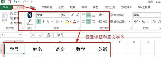 Basic operations of excel table layout
Mar 20, 2024 pm 03:50 PM
Basic operations of excel table layout
Mar 20, 2024 pm 03:50 PM
When everyone uses Excel for data processing, it is indispensable to format and beautify the data, so that it will be more beautiful when shown to others or printed out. Today I will introduce to you the basic operations of excel table formatting. I hope it will be helpful to those who have just started learning. Help for those new to Excel. 1. First select the text - click Start - typesetting the table text: Generally, the title font size is set to 14~16, black Song font, bold, and centered; the main text is generally set to 12 size, Song font, centered. Tips: If the content is small, you can set a larger font. 2. Set the appropriate row height and column width: Select the entire table - drag to uniformly adjust the row height and column width. You can also click Start - Format - Set the row height and column width - For the title row or
