

Techniques and Strategies for Implementing Responsive Layouts

Techniques and methods of how to implement responsive layout
Introduction:
With the popularity of mobile devices and the emergence of various terminals, the implementation of responsive layout has Become an important part of modern web development. Responsive layout allows web pages to automatically adapt to different screen sizes, providing a better user experience. This article will introduce the technology and methods of responsive layout and provide specific code examples.
1. Media Queries
Media queries are one of the basic technologies for implementing responsive layout. Through media queries, we can apply different styles based on information such as screen size, screen orientation, device type, and more.
Sample code:
/* 当屏幕宽度小于等于768px时应用该样式 */
@media (max-width: 768px) {
  body {
    background-color: lightblue;
  }
}

/* 当屏幕宽度大于768px时应用该样式 */
@media (min-width: 769px) {
  body {
    background-color: lightgreen;
  }
}2. Fluid Grid Layout
Fluid Grid Layout is a proportion-based layout method that can automatically adjust to changes in screen size. Adjust the size and position of web page elements.
Sample code:
.container {
  display: flex;
  flex-wrap: wrap;
}

.container .item {
  flex: 1 0 25%; /* 每行显示4个网格 */
  padding: 10px;
  box-sizing: border-box;
} 3. Responsive Images Design (Responsive Images)
In a responsive layout, the size of the image also needs to be adjusted according to changes in screen size. You can use the srcset and sizes attributes to provide images of different sizes for different screens, or use CSS's background-image to set a responsive background image.
Sample code:
<!-- 使用srcset和sizes属性 -->
<img src="/static/imghw/default1.png"  data-src="small.jpg"  class="lazy"
     srcset="large.jpg 1200w, medium.jpg 800w, small.jpg 400w"
     sizes="(min-width: 800px) 800px, 100vw"
     alt="Responsive Image">

<!-- 使用CSS background-image -->
<div class="image"></div>

<style>
.image {
  height: 200px;
  background-image: url(small.jpg);
  background-repeat: no-repeat;
  background-size: cover;
}

@media (min-width: 800px) {
  .image {
    background-image: url(medium.jpg);
  }
}
</style> 4. Mobile First Design (Mobile First)
Mobile first design is a design method that first considers the layout and functions of mobile devices, and then gradually adds appropriate Styles and interactions for large-screen devices.
Sample code:
/* 移动设备样式 */
.container {
  display: flex;
  flex-wrap: wrap;
}

.container .item {
  flex: 1 0 100%;
  padding: 10px;
  box-sizing: border-box;
}

/* 大屏幕样式 */
@media (min-width: 768px) {
  .container .item {
    flex: 1 0 33.33%;
  }
} 5. Media resource queries (Resource Queries)
Media resource queries are a method of loading resources on demand. You can use the <picture> element and the <source> element to load corresponding image resources based on screen size, pixel density and other conditions.
Sample code:
<picture>
  <source srcset="small.jpg" media="(max-width: 600px)">
  <source srcset="medium.jpg" media="(max-width: 1200px)">
  <img src="/static/imghw/default1.png"  data-src="large.jpg"  class="lazy" alt="Responsive Image">
</picture>
Conclusion:
Through technologies and methods such as media queries, fluid grid layout, image responsive design, mobile-first design and media resource queries, we can achieve Responsive layout provides a better browsing experience for users of different screen sizes. During the development process, we need to select appropriate technologies based on specific needs and project conditions, and conduct compatibility testing and debugging to ensure the stability and performance of the layout.
References:
- W3Schools - CSS Media Queries: https://www.w3schools.com/css/css_rwd_mediaqueries.asp
- MDN Web Docs - Responsive Images: https://developer.mozilla.org/en-US/docs/Learn/HTML/Multimedia_and_embedding/Responsive_images
- CSS-Tricks - A Complete Guide to Grid: https://css-tricks.com /snippets/css/complete-guide-grid/
The above is the detailed content of Techniques and Strategies for Implementing Responsive Layouts. For more information, please follow other related articles on the PHP Chinese website!

Hot AI Tools

Undresser.AI Undress
AI-powered app for creating realistic nude photos

AI Clothes Remover
Online AI tool for removing clothes from photos.

Undress AI Tool
Undress images for free

Clothoff.io
AI clothes remover

AI Hentai Generator
Generate AI Hentai for free.

Hot Article
Hot Tools

Notepad++7.3.1
Easy-to-use and free code editor

SublimeText3 Chinese version
Chinese version, very easy to use

Zend Studio 13.0.1
Powerful PHP integrated development environment

Dreamweaver CS6
Visual web development tools

SublimeText3 Mac version
God-level code editing software (SublimeText3)
Hot Topics
 1378
1378
 52
52

 How to write a novel in the Tomato Free Novel app. Share the tutorial on how to write a novel in Tomato Novel.
Mar 28, 2024 pm 12:50 PM
How to write a novel in the Tomato Free Novel app. Share the tutorial on how to write a novel in Tomato Novel.
Mar 28, 2024 pm 12:50 PM
Tomato Novel is a very popular novel reading software. We often have new novels and comics to read in Tomato Novel. Every novel and comic is very interesting. Many friends also want to write novels. Earn pocket money and edit the content of the novel you want to write into text. So how do we write the novel in it? My friends don’t know, so let’s go to this site together. Let’s take some time to look at an introduction to how to write a novel. Share the Tomato novel tutorial on how to write a novel. 1. First open the Tomato free novel app on your mobile phone and click on Personal Center - Writer Center. 2. Jump to the Tomato Writer Assistant page - click on Create a new book at the end of the novel.
 How to enter bios on Colorful motherboard? Teach you two methods
Mar 13, 2024 pm 06:01 PM
How to enter bios on Colorful motherboard? Teach you two methods
Mar 13, 2024 pm 06:01 PM
Colorful motherboards enjoy high popularity and market share in the Chinese domestic market, but some users of Colorful motherboards still don’t know how to enter the bios for settings? In response to this situation, the editor has specially brought you two methods to enter the colorful motherboard bios. Come and try it! Method 1: Use the U disk startup shortcut key to directly enter the U disk installation system. The shortcut key for the Colorful motherboard to start the U disk with one click is ESC or F11. First, use Black Shark Installation Master to create a Black Shark U disk boot disk, and then turn on the computer. When you see the startup screen, continuously press the ESC or F11 key on the keyboard to enter a window for sequential selection of startup items. Move the cursor to the place where "USB" is displayed, and then
 How to recover deleted contacts on WeChat (simple tutorial tells you how to recover deleted contacts)
May 01, 2024 pm 12:01 PM
How to recover deleted contacts on WeChat (simple tutorial tells you how to recover deleted contacts)
May 01, 2024 pm 12:01 PM
Unfortunately, people often delete certain contacts accidentally for some reasons. WeChat is a widely used social software. To help users solve this problem, this article will introduce how to retrieve deleted contacts in a simple way. 1. Understand the WeChat contact deletion mechanism. This provides us with the possibility to retrieve deleted contacts. The contact deletion mechanism in WeChat removes them from the address book, but does not delete them completely. 2. Use WeChat’s built-in “Contact Book Recovery” function. WeChat provides “Contact Book Recovery” to save time and energy. Users can quickly retrieve previously deleted contacts through this function. 3. Enter the WeChat settings page and click the lower right corner, open the WeChat application "Me" and click the settings icon in the upper right corner to enter the settings page.
 Summary of methods to obtain administrator rights in Win11
Mar 09, 2024 am 08:45 AM
Summary of methods to obtain administrator rights in Win11
Mar 09, 2024 am 08:45 AM
A summary of how to obtain Win11 administrator rights. In the Windows 11 operating system, administrator rights are one of the very important permissions that allow users to perform various operations on the system. Sometimes, we may need to obtain administrator rights to complete some operations, such as installing software, modifying system settings, etc. The following summarizes some methods for obtaining Win11 administrator rights, I hope it can help you. 1. Use shortcut keys. In Windows 11 system, you can quickly open the command prompt through shortcut keys.
 The secret of hatching mobile dragon eggs is revealed (step by step to teach you how to successfully hatch mobile dragon eggs)
May 04, 2024 pm 06:01 PM
The secret of hatching mobile dragon eggs is revealed (step by step to teach you how to successfully hatch mobile dragon eggs)
May 04, 2024 pm 06:01 PM
Mobile games have become an integral part of people's lives with the development of technology. It has attracted the attention of many players with its cute dragon egg image and interesting hatching process, and one of the games that has attracted much attention is the mobile version of Dragon Egg. To help players better cultivate and grow their own dragons in the game, this article will introduce to you how to hatch dragon eggs in the mobile version. 1. Choose the appropriate type of dragon egg. Players need to carefully choose the type of dragon egg that they like and suit themselves, based on the different types of dragon egg attributes and abilities provided in the game. 2. Upgrade the level of the incubation machine. Players need to improve the level of the incubation machine by completing tasks and collecting props. The level of the incubation machine determines the hatching speed and hatching success rate. 3. Collect the resources required for hatching. Players need to be in the game
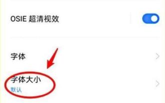 How to set font size on mobile phone (easily adjust font size on mobile phone)
May 07, 2024 pm 03:34 PM
How to set font size on mobile phone (easily adjust font size on mobile phone)
May 07, 2024 pm 03:34 PM
Setting font size has become an important personalization requirement as mobile phones become an important tool in people's daily lives. In order to meet the needs of different users, this article will introduce how to improve the mobile phone use experience and adjust the font size of the mobile phone through simple operations. Why do you need to adjust the font size of your mobile phone - Adjusting the font size can make the text clearer and easier to read - Suitable for the reading needs of users of different ages - Convenient for users with poor vision to use the font size setting function of the mobile phone system - How to enter the system settings interface - In Find and enter the "Display" option in the settings interface - find the "Font Size" option and adjust it. Adjust the font size with a third-party application - download and install an application that supports font size adjustment - open the application and enter the relevant settings interface - according to the individual
 Quickly master: How to open two WeChat accounts on Huawei mobile phones revealed!
Mar 23, 2024 am 10:42 AM
Quickly master: How to open two WeChat accounts on Huawei mobile phones revealed!
Mar 23, 2024 am 10:42 AM
In today's society, mobile phones have become an indispensable part of our lives. As an important tool for our daily communication, work, and life, WeChat is often used. However, it may be necessary to separate two WeChat accounts when handling different transactions, which requires the mobile phone to support logging in to two WeChat accounts at the same time. As a well-known domestic brand, Huawei mobile phones are used by many people. So what is the method to open two WeChat accounts on Huawei mobile phones? Let’s reveal the secret of this method. First of all, you need to use two WeChat accounts at the same time on your Huawei mobile phone. The easiest way is to
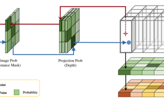 DualBEV: significantly surpassing BEVFormer and BEVDet4D, open the book!
Mar 21, 2024 pm 05:21 PM
DualBEV: significantly surpassing BEVFormer and BEVDet4D, open the book!
Mar 21, 2024 pm 05:21 PM
This paper explores the problem of accurately detecting objects from different viewing angles (such as perspective and bird's-eye view) in autonomous driving, especially how to effectively transform features from perspective (PV) to bird's-eye view (BEV) space. Transformation is implemented via the Visual Transformation (VT) module. Existing methods are broadly divided into two strategies: 2D to 3D and 3D to 2D conversion. 2D-to-3D methods improve dense 2D features by predicting depth probabilities, but the inherent uncertainty of depth predictions, especially in distant regions, may introduce inaccuracies. While 3D to 2D methods usually use 3D queries to sample 2D features and learn the attention weights of the correspondence between 3D and 2D features through a Transformer, which increases the computational and deployment time.
