
According to news on January 29, Samsung Bixby has been quietly updated recently, with a new user interface that is more consistent with the One UI design language. The latest version of Bixby, 3.3.53.16, introduces new animations and refined color schemes, making the overall style more stylish.
The updated Bixby interface uses a color scheme that mixes dark and light blue and purple, making it look more elegant. Bixby’s iconic sphere icon also now has a new look, with the sphere now appearing as gracefully as an ocean wave when summoned.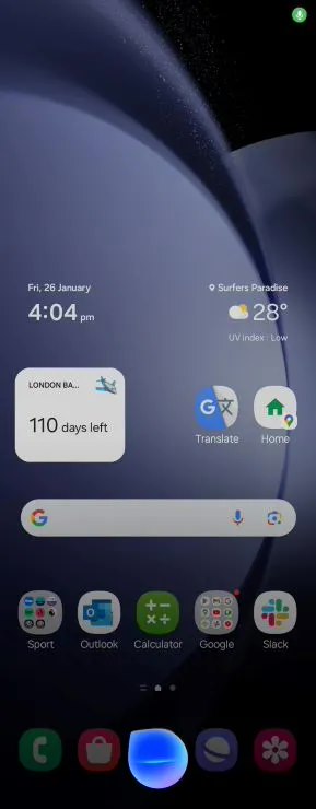 Despite previous rumors that Bixby might be abandoned, this update shows that Samsung is continuing to improve it. The updated Bixby UI rolls out just weeks after the Samsung Galaxy S24 launch and is currently available for devices running One UI 6.0 and above, including smartphones and tablets. On Samsung tablets, the Bixby icon will appear in the lower right corner of the screen, adding a touch of sophistication to the user experience.
 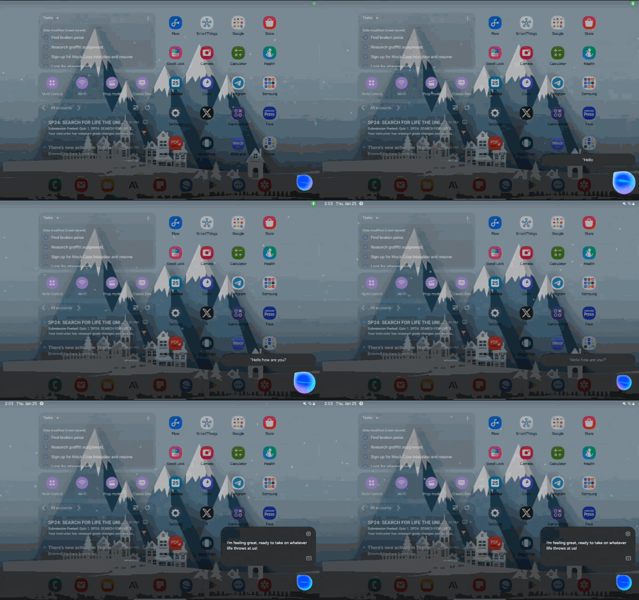 Note that this update mainly focuses on improving the visual appeal of Bixby, and its core functions have not changed.
 The above is the detailed content of Samsung Bixby receives a visual refresh with more refined UI and animations. For more information, please follow other related articles on the PHP Chinese website!
