
 Web Front-end
CSS Tutorial
Application of serif and sans-serif fonts in web design_Experience exchange
Web Front-end
CSS Tutorial
Application of serif and sans-serif fonts in web design_Experience exchange
Application of serif and sans-serif fonts in web design_Experience exchange

Howdy, 大家好,又是我~
上一次我们简单的谈了一下font set和一些要注意的基本问题。今天我们继续字体这一话题,深入讲讲上次提到的“通用字体族”。首先是最常用的 serif 和 sans-serif 这两个通用字体族。
- serif
Serif 在印刷学上指衬线字体。为了理解衬线字体的概念,大家先看几个典型的衬线字体的例子:
My
Georgia字体 King
Times New Roman 字体 汉字
宋体
单词 My 中的字母 “M”上下方突出的短横线就是所谓的衬线。同样,y的上方,K的上下,i 和n的下方也都有衬线,所以这些字体都被称为衬线字体。但衬线字体并不一定都有衬线,比如上面例子中的g, “汉”和“字”。事实上,只要满足末端加强原则的字体都是衬线字体。所谓的末端加强,就是使用衬线或粗细变化,使字体笔画的末端得到加强,以改善小号文字的可读性。比如上面例子中的y的下半部分,还有宋体的中文字符,都是采取加粗笔划的末端来达到末端加强的效果。除此之外,很多衬线字体还会采用加强竖向笔划(比如宋体中竖比横粗),夸张字形(最明显的就是小写g这个字符了)等方法进一步改善它的可读性。
因为衬线字体的可读性非常好,所以它应用的最多的地方也正是出版物或者印刷品的正文内容等以大段文字作为表现形式的作品上。
比较常见的衬线字体有 Georgia, Garamond, Times New Roman, 中文的宋体等等。
- sans-serif
衬线字体以外的一切字体都是无衬线字体。sans- 这个前缀其实是法语,所以比较标准的发音是 /san/ 而不是 /sans/。它的意思是“没有”。所以sans-serif就是无衬线字体。
Gut
Verdana 字体 Might
Arial 字体 书写
幼圆
无衬线字体比较圆滑,线条一般粗细均匀。比较适合用作艺术字、标题等。因为无衬线字体通常粗细比较均匀,所以在小字体显示的时候,可读性会降低,容易引起视觉疲劳。
常见的无i衬线字体有 Trebuchet MS, Tahoma, Verdana, Arial, Helvetica, 中文的幼圆、隶书等等。
- 什么时候用serif?什么时候用sans-serif?
从上面的介绍中,我们可以知道,衬线字体之所以被设计出来,就是为了用作正文内容的。大家可以随手抄起一张报纸,看看上面的文章是不是宋体。如果手头有外语读物的话,也可以翻来看一下,正文都是衬线字体。同样大小的衬线字体比无衬线字体容易阅读:
The quick brown fox jumps over the lazy dog.
The quick brown fox jumps over the lazy dog.
然后大家可以把报纸翻到头版头条——标题一般都会是各种粗细一致的综艺体或者是中Application of serif and sans-serif fonts in web design_Experience exchange。英文报纸的标题大多也是无衬线的。这个就是应用他们的基本原则。
但是大家可以看很多网站——它们的正文内容恰恰是无衬线的Tahoma, Verdana, Arial等等。中文网站可能因为字体的局限性,仍旧使用宋体居多,但查看它们的样式表,就会发现候补字体也大多是无衬线的。这样是不是不好呢?
当然不是。
衬线字体的可读性其实仅仅体现在小字体上。大家可以拿出刚刚抄起来的报纸,和你显示器上的文字比较一下——你会发现,报纸上的文字比显示器上的文字整整小一圈。实际上,新明晚报上通常大小的宋体文字,在点距为0.25mm的高质量液晶显示器上,大小大约只相当于10px ~ 11px的显示字符;在普通的液晶显示器(点距一般为0.28mm)上,甚至可能只相当于8px~10px的显示字符。
这个就是 print media 和 screen media 的最大区别。印刷业为了节约成本,因此会尽可能的在保证可读的情况下,把文字印小。显示器不存在这样的成本,因此可以显示比较大的文字。在文字足够大的情况下,无衬线字体也是同样可读的。而且因为无衬线字体通常有艺术性,因此在显示器上显示通常比较赏心悦目;而且无衬线字体种类比衬线字体多得多,因此选择余地也很大。所以大家尽可以放心去使用。但是必须保证以下原则:凡是使用无衬线字体的,必须保证其在正文内容中的可读性。否则,使用衬线字体。换而言之,如果你要使用无衬线字体显示网页的正文内容,那么,你必须把它的font-size设的足够大,以保证用户能轻易阅读。
至于具体将font-size 设多大,是因字体而异的。12px 对于 Verdana 来说已经完全足够,但是要能轻易的阅读隶书,可能需要24px以上才行。
对于11px以下的英文字体,推荐使用衬线字体。至于中文,因为显示器的硬件限制,不论是什么字体,都不推荐使用11px以下的font-size来显示。
- 其他的通用字体族
印刷学中,除了serif 和 sans-serif 之外,通常还有 monospace 等宽字体、scripts 手写体(比如花体)、blackletter 铅字体(也叫 gothic 哥特体。严格的说,很多常用的serif字体其实是gothic字体)、ornamental 装饰体(那些在文字笔划上或者周围有装饰花纹的字体。很多中世纪书籍上很常见。如果脑残体真的成了字体,那么应该可以算装饰体吧……)和 symbol 符号字体(比如有名的wedding123……)。
- 不过CSS对通用字体族的定义有点不一样。除了serif 和 sans-serif 之外,CSS还允许以下几个通用字体族:
-
-
monospace 等宽字体
所谓的等宽字体,是指每个字符宽度都一致的字体。一个著名的例子就是 Courier New 字体。因为字符宽度一致,所以特别容易对齐,能快速精确的定位到某行某列,因此经常用来显示代码。
要注意的是,一个等宽字体同时也可以是一个衬线(或者非衬线)字体。比如 Courier New 这个字体也可以看作是一个serif(严格的说是gothic)字体。
- cursive 书写体:相当于印刷学中的手写体。中文的华文行草就是这样的一个字体。
- fantasy 梦幻体:相当于印刷学中的装饰体。非常少见的一种字体,基本没有参考价值。
-
monospace 等宽字体
要注意的是,CSS中不支持symbol字体族。使用symbol类的字体请用图片。
- 一些你不知道的事情
-
中文的Application of serif and sans-serif fonts in web design_Experience exchange其实是衬线字体。大家可以看下面的图:

大家可以看到,其实Application of serif and sans-serif fonts in web design_Experience exchange的确是经过末端加强的,所以很多印刷品的正文也会使用Application of serif and sans-serif fonts in web design_Experience exchange。像这种使用温和的末端加强,笔划粗细大致一致的字体,其实也可以被称为petit-serif/小衬线体。(那些类似于宋体一样有显著末端加强,并且笔划粗细有明显区别的,通常称为slab-serif/雕版衬线体)
只是很遗憾,因为诸多的硬件原因,在显示器上实际显示Application of serif and sans-serif fonts in web design_Experience exchange时,大家还是可以把它看作一个无衬线字体
-
Italic is not italic
Italic is oblique. Italic, as the name suggests, is Italian. Italic is a way of writing (calligraphy script), while oblique is a printing style. The two are different things. The writing method taught in middle school English study books is Italian style. In addition to Italian, the more popular writing methods include French script (the legendary cursive script, the correct name is French Script), Gothic, Abraham script, etc.
Many sophisticated fonts will customize a special set of fonts for Italian fonts instead of simply displaying them in italics. For example, in the picture below, three lines of text are all in Georgia font. The first line is normal; the second line is oblique, which is italic; and the third line is the real italic.
Look carefully at the letters a, l, i, e and other letters in the third row - you can clearly see the difference. In fact, Georgia Italic and Georgia are two different font files in the system. When we specify font-style: italic, the system will automatically search whether the font Georgia Italic exists and try to use this font to display text content.
It stands to reason that when we use font-style: oblique to specify the font style, the browser should not look for the font Georgia Italic, but directly display the Georgia font obliquely, so in theory we should get the effect of the second line of text in the picture . Unfortunately, even the W3C's own reference implementation in the CSS specification states that "if UA cannot display italic and oblique correctly, you can use italic to display oblique instead." Therefore, almost no browsers implement the distinction between italic and oblique. Even if the font-style you set is oblique, you will find that the browser still displays italic


That’s it for today. In the next lecture, I will talk about how to build a reasonable font-family and recommend several font combinations to everyone. So, goodbye

Hot AI Tools

Undresser.AI Undress
AI-powered app for creating realistic nude photos

AI Clothes Remover
Online AI tool for removing clothes from photos.

Undress AI Tool
Undress images for free

Clothoff.io
AI clothes remover

AI Hentai Generator
Generate AI Hentai for free.

Hot Article
Hot Tools

Notepad++7.3.1
Easy-to-use and free code editor

SublimeText3 Chinese version
Chinese version, very easy to use

Zend Studio 13.0.1
Powerful PHP integrated development environment

Dreamweaver CS6
Visual web development tools

SublimeText3 Mac version
God-level code editing software (SublimeText3)
Hot Topics


 win10 font folder path details
Jan 03, 2024 pm 08:37 PM
win10 font folder path details
Jan 03, 2024 pm 08:37 PM
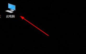
When inputting text, many friends like to add their favorite personalized fonts, but they do not know where the font folder path of the win10 system is and cannot add fonts. The following will introduce the specific folder path to you. Win10 font folder path: 1. Click "This PC" on the desktop. 2. Enter the system disk C drive. 3. Click the “windows” folder. 4. Pull down to find the "Fonts" folder. 5. You can enter the font library. Friends who have other questions can take a look to learn more about common problems with win10 fonts~
 How to change the font in Outlook on Apple mobile phone
Mar 08, 2024 pm 04:46 PM
How to change the font in Outlook on Apple mobile phone
Mar 08, 2024 pm 04:46 PM
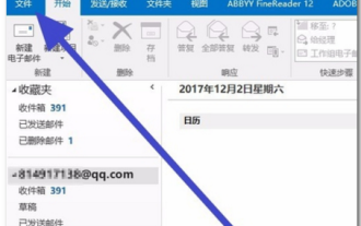
How to change the font in Outlook on Apple mobile phone? First open the Outlook software and click on the file in the upper left corner of the interface. You can set the font according to your own preferences. After the settings are completed, click the OK button. Let’s take a look! How to change the font in Outlook on Apple mobile phone 1. Open the Outlook software and click the "File" option in the upper left corner of the interface. 2. In the list that appears, find "Options" and click to enter. 3. On the left side of the option list, click "Mail". 4. Next, select “Letter and Fonts”. 5. If you want to set the font for new emails, reply emails, or composing, click the corresponding option to enter the settings. 6. Set the font according to personal preference. After the setting is completed, click OK
 How to make vivo mobile phone font larger and where to set it
Feb 24, 2024 pm 06:16 PM
How to make vivo mobile phone font larger and where to set it
Feb 24, 2024 pm 06:16 PM
How to make the font size of vivo mobile phone larger? Where can I set it? In vivo mobile phone, you can make the font size larger, but most users don’t know how to set the font size of vivo mobile phone. Next, the editor brings you the settings of how to make the font size of vivo mobile phone larger. Method graphic tutorials, interested users come and take a look! Vivo mobile phone usage tutorial How to make the font size of vivo mobile phone larger Where to set it 1. First open the [Settings] function in the vivo mobile phone and click on it; 2. Then jump to the settings interface and find the [Display and Brightness] function; 3. Then Reach the page in the picture below and click the [Font Size and Thickness] service; 4. Finally, slide the horizontal line in the picture below to adjust the font size.
 How to adjust the font, style, and size of Notepad in Windows 11
Sep 23, 2023 pm 11:25 PM
How to adjust the font, style, and size of Notepad in Windows 11
Sep 23, 2023 pm 11:25 PM
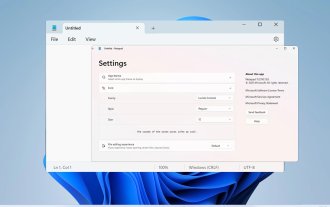
Many users want to change the font in Notepad on Windows 11 because the default font is too small or difficult to read for them. Changing fonts is quick and easy, and in this guide, we'll show you how to customize Notepad and change the font to suit your needs. What font does Windows 11 Notepad use by default? As for the default font options, Notepad uses the Consolas font and the default font size is set to 11 pixels. How to change Notepad font size and style in Windows 11? Use the Edit menu in Notepad to click the search button and type notepad. Select Notepad from the list of results. In Notepad, click the Edit menu and select Fonts. You should now see the settings in the left pane
 How to solve win11 font blur problem
Jan 13, 2024 pm 09:00 PM
How to solve win11 font blur problem
Jan 13, 2024 pm 09:00 PM
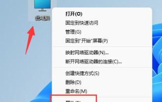
After updating the win11 system, some friends found that their win11 fonts were blurred and very uncomfortable to use. This may be due to a bug in the system version, or it may be that we have turned on special effects. Let’s follow the editor. Let’s see how to solve it. Win11 fonts are blurred: Method 1: 1. First, right-click this computer and open "Properties" 2. Then enter "Advanced System Settings" in the related link 3. Then click "Settings" in Performance to open it. 4. Under "Visual Effects" check "Adjust for Best Performance" and click "OK" to save. Method 2: 1. Right-click a blank space on the desktop and open "Display Settings" 2. Click "Zoom" under Zoom and Layout 3. Then click "Text Size" under relevant settings
 Detailed explanation of Win11 font installation method
Dec 27, 2023 pm 05:16 PM
Detailed explanation of Win11 font installation method
Dec 27, 2023 pm 05:16 PM
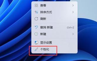
Some friends cannot find where their fonts are installed after installing win11 fonts, so they raise the issue of the installation location of win11 fonts. In fact, we can enter the font management in personalization to find the location where the fonts are installed. Let’s take a look below. Win11 font installation location: 1. First, right-click a blank space on the desktop and open "Personalization" settings. 2. Then enter the "Font" installation management settings. 3. Find the font you want and enter it. 4. If you can’t find it, you can also search directly above. 5. After entering the font, you can see the installation location of the win11 font in "Font File" under metadata. 6. If we want to uninstall the font, click Uninstall here.
 How to change the font of Xiaomi 11_How to change the font of Xiaomi 11
Mar 25, 2024 pm 07:26 PM
How to change the font of Xiaomi 11_How to change the font of Xiaomi 11
Mar 25, 2024 pm 07:26 PM
1. Open the phone settings and click [Display]. 2. Click [Font]. 3. Select the font you like or click [More Fonts] to download the application.
 Detailed explanation of how to deal with all font shadows in Win10 computer
Jul 23, 2023 pm 11:13 PM
Detailed explanation of how to deal with all font shadows in Win10 computer
Jul 23, 2023 pm 11:13 PM
In the process of using the computer, some problems may occur due to improper operation and other situations. Recently, some netizens said that what to do with all the font shadows on their win10 computers, which affects viewing, and the icons on the desktop have shadows. The editor below will teach you how to clear all font shadows on your computer desktop. The specific steps are as follows: 1. First turn on the computer, enter the win+r key combination, open the run window, and enter gpedit.msc to confirm. 2. Find Enable ActiveDesktop, double-click it to open it, and disable it. 3. Next we need to open the disable ActiveDesktop button below, and then enable it. 4. Then open the system of the control panel, open its advanced system settings properties, and then enter the Properties
