

Analyze the key elements of responsive layout

Analysis of the key components of responsive layout requires specific code examples
In today's mobile Internet era, people are increasingly using various types of devices to Browse the web on mobile phones, tablets, laptops, smart TVs, etc. These devices have different screen sizes and resolutions, so traditional fixed layouts no longer meet user needs. In contrast, responsive layout becomes the best choice to solve this problem.
Responsive layout refers to the use of CSS3 Media Queries and other related technologies to enable web pages to automatically adjust the layout and display effects according to the screen size and resolution of the device used by the user. In other words, a responsive layout provides an optimized user experience on different screens.
When designing a responsive layout, there are several key components that require special attention, as follows:
- Flexible Grid Layout:
Flexible grid layout is the cornerstone of responsive layout. By using percentage units and CSS3 Flexbox, we can create a grid system that adapts to different screen sizes. Here is a sample code:
.container {
  display: flex;
  flex-wrap: wrap;
}

.item {
  width: 25%;
}In the above code, the .container element is set to display: flex;, so that its inner child elements.item can be displayed in a row and will automatically adapt to the width of the parent element. By setting the width of the .item elements to 25%, we can display 4 .item elements in a row (assuming a maximum of 4 elements can be displayed in a row).
- Media Queries:
Media queries are another important component of responsive layout. It allows us to apply different styles based on different screen sizes and resolutions. Media queries use the @media rule, and conditions for specific screens can be specified via CSS3 Media Features. Here is a sample code:
@media screen and (max-width: 768px) {
  /* 在屏幕宽度小于 768px 时应用的样式 */
  .container {
    flex-direction: column;
  }

  .item {
    width: 100%;
  }
}In the above code, when the screen width is less than 768px, the flex-direction attribute of the .container element is set to column, so that .item elements will be arranged vertically. At the same time, the width of the .item element is set to 100% to fit on smaller screens.
- Adaptation of images and media:
In responsive layout, the adaptability of images and media is also an important consideration. By using the max-width property of CSS3, we can enable images and media to automatically scale to fit different screen sizes. The following is a sample code:
img {
  max-width: 100%;
  height: auto;
}In the above code, the max-width attribute of the img element is set to 100%, indicating that the width of the image cannot exceed The width of its parent element. At the same time, the height attribute is set to auto, which means that the height of the image will automatically adjust according to the width change.
To sum up, flexible grid layout, media queries, and adaptability of images and media are key components of responsive layout. They use CSS technology to enable web pages to provide a good and consistent user experience on different devices. In the actual development process, we can adjust their code according to specific needs to adapt to different layout requirements and user devices.
We hope that the above code examples and analysis can help readers better understand the key components of responsive layout and be able to use it flexibly in actual development.
The above is the detailed content of Analyze the key elements of responsive layout. For more information, please follow other related articles on the PHP Chinese website!

Hot AI Tools

Undresser.AI Undress
AI-powered app for creating realistic nude photos

AI Clothes Remover
Online AI tool for removing clothes from photos.

Undress AI Tool
Undress images for free

Clothoff.io
AI clothes remover

AI Hentai Generator
Generate AI Hentai for free.

Hot Article
Hot Tools

Notepad++7.3.1
Easy-to-use and free code editor

SublimeText3 Chinese version
Chinese version, very easy to use

Zend Studio 13.0.1
Powerful PHP integrated development environment

Dreamweaver CS6
Visual web development tools

SublimeText3 Mac version
God-level code editing software (SublimeText3)
Hot Topics


 How to check traffic on Apple mobile phone
May 09, 2024 pm 06:00 PM
How to check traffic on Apple mobile phone
May 09, 2024 pm 06:00 PM
How to check data usage on Apple 1. The specific steps to check data usage on Apple mobile phone are as follows: Open the settings of the phone. Click the Cellular button. Scroll down on the cellular network page to see the specific data usage of each application. Click Apply to also set allowed networks. 2. Turn on the phone, find the settings option on the phone desktop, and click to enter. In the settings interface, find "Cellular Network" in the taskbar below and click to enter. In the cellular network interface, find the "Usage" option on the page and click to enter. 3. Another way is to check the traffic by yourself through the mobile phone, but the mobile phone can only see the total usage and will not display the remaining traffic: turn on the iPhone, find the "Settings" option and open it. Select "Bee"
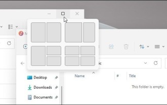 How to disable snapshot layout in Windows 11_ Tips for not using snapshot layout in win11
May 08, 2024 pm 06:46 PM
How to disable snapshot layout in Windows 11_ Tips for not using snapshot layout in win11
May 08, 2024 pm 06:46 PM
Win11 system announced the new [Snapshot Layout], which provides users with various window layout options through the [Maximize] button, so that users can choose from multiple layout templates to display two, three or four on the screen. open applications. This is an improvement over dragging multiple windows to the sides of the screen and then adjusting everything manually. [SnapGroups] will save the collection of apps the user is using and their layout, allowing the user to easily return to that setting when they have to stop and deal with other things. If someone is using a monitor that the user must unplug, when re-docking, the previously used snapshot layout will also be restored. To use snapshot layout, we can use the keyboard shortcut WindowsKey+Z to start
 How to sort the list page alphabetically in vscode How to sort the list page alphabetically in vscode
May 09, 2024 am 09:40 AM
How to sort the list page alphabetically in vscode How to sort the list page alphabetically in vscode
May 09, 2024 am 09:40 AM
1. First, after opening the vscode interface, click the settings icon button in the lower left corner of the page 2. Then, click the Settings option in the drop-down page column 3. Then, find the Explorer option in the jumped window 4. Finally, on the right side of the page Click the OpenEditorsnaming option, select the alphabetical button from the drop-down page and save the settings to complete the alphabetical sorting
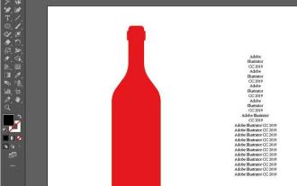 The operation process of creating bottle type text layout effect with AI
May 06, 2024 pm 02:28 PM
The operation process of creating bottle type text layout effect with AI
May 06, 2024 pm 02:28 PM
1. Open the material picture of a bottle in AI and type the text content that needs to be produced on the side. 2. Cancel the fill color of the bottle and only stroke it to form a hollow closed path. 3. Adjust the font size, font and line spacing of the text, and arrange the bottle layers to the top. 4. Select the text and the bottle at the same time, click Object-Envelope Distortion-Create with top-level object, and you will get a bottle-shaped text group. 5. Double-click the text to enter the isolation mode, and you can modify the text content and change the color. After the modification, the bottle shape will not be affected when exiting isolation mode. The final effect is as follows:
 How to set ring text in ai - specific method of setting ring text in ai
May 06, 2024 pm 05:58 PM
How to set ring text in ai - specific method of setting ring text in ai
May 06, 2024 pm 05:58 PM
1. First, after opening the interface, click the Ellipse tool to draw a perfect circle 2. Click the Path Text tool button on the left and enter text along the circular frame 3. Select the letter with the mouse, open the character panel, and set the font size to 20.7 pt4. Select the circle, click 3D options in the effect menu, and select the rotation button 5. In the opened 3D rotation option settings, set the position option to custom rotation effect, modify the parameters and click OK to save 6. Finally, it is a ring Just add a red fill effect to the text
 How to use matplotlib to generate charts in python
May 05, 2024 pm 07:54 PM
How to use matplotlib to generate charts in python
May 05, 2024 pm 07:54 PM
To use Matplotlib to generate charts in Python, follow these steps: Install the Matplotlib library. Import Matplotlib and use the plt.plot() function to generate the plot. Customize charts, set titles, labels, grids, colors and markers. Use the plt.savefig() function to save the chart to a file.
 Can I plug in a wireless network card when assembling a computer?
May 08, 2024 am 09:13 AM
Can I plug in a wireless network card when assembling a computer?
May 08, 2024 am 09:13 AM
Can I plug in a wireless network card when assembling a computer? First of all, the wireless network card you are talking about here should be a 2G/3G/4G wireless network card, that is, a wireless network card, right? My answer is yes. However, you also need an AP that supports USB wireless network cards, such as: (only for Jiuli use, not a recommended product) Can I use a wireless network card to access the Internet by assembling a desktop computer? Network cards are essential for modern computers. Without a network card, you cannot access the Internet, whether it is an onboard network card, an independent network card, or a wireless network card. When assembling a computer, a separate network card is generally not installed, because the current motherboards have integrated network cards, so there is no need to buy another one. However, the computers assembled now cannot use wireless Internet access like notebooks, because there is no wireless network card installed. Players can According to your own needs
 How to use merge in java
May 09, 2024 am 06:03 AM
How to use merge in java
May 09, 2024 am 06:03 AM
The merge() method in Java Collections merges two sorted ordered collections to generate a new sorted collection, maintaining the original order. Syntax: public static <T> List<T> merge(SortedMap<T, Double> a, SortedMap<T, Double> b). It accepts two sorted collections and returns a new collection containing all elements in sorted order. Note: The values of duplicate keys will be merged according to the merge function, and the original collection will not be modified.
