
Google Chrome browser has widely launched the new design of Material You! This design style prioritizes user personalization and provides a more personalized interface and functional experience. PHP editor Banana will introduce you to the various characteristic designs of Material You in detail, and how to experience this new user interface in the Chrome browser. Let’s explore this exciting new design together!
The last time Chrome got a facelift was in 2018, when Google's Material Theme design language was introduced. This time to celebrate the browser's 15th On its birthday, Chrome adopts Material You for Android and the web The design language adds many rounded elements, such as sidebars, while the tab bar, address bar and bookmarks bar become taller.
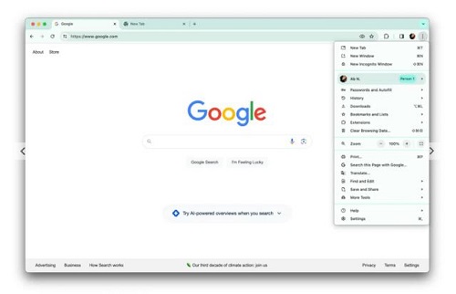
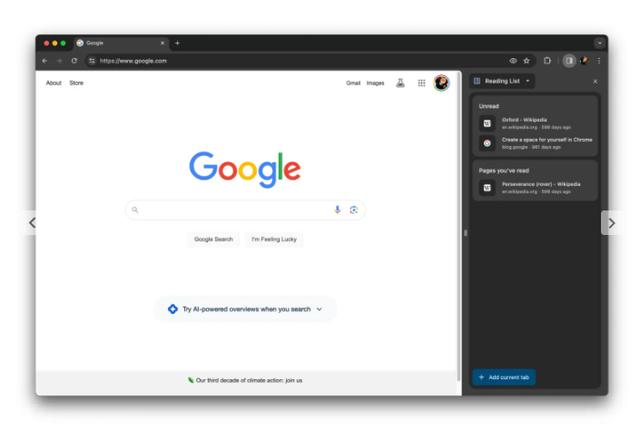
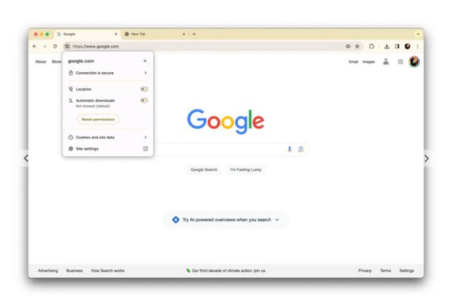
With the popularization of HTTPs technology, the multi-purpose box (where you enter URLs and search) no longer places the lock icon on the far left. Now, we see a new icon designed to remind users to click for site controls and other information.
Other changes include using outline icons (with hollow interiors) to improve readability. The most obvious example is in the three-dot overflow menu, where each item is paired with an icon, helping to make the list feel less dense. Menu items have also been reordered, and there's a submenu for the Google account you're signed in with.
In the meantime, colors are on this Material You Playing an important role in the design remodel, the new design uses new color combinations to "better set off your tabs and toolbars." On the new tab page, click "Customize Chrome" to try out different shades.
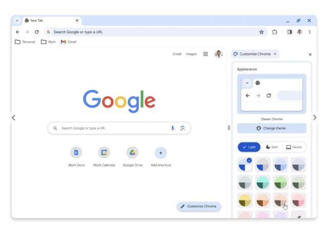
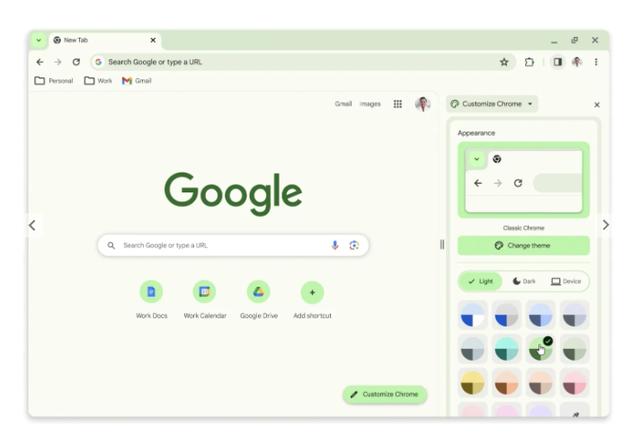
Overall, Chrome's basic layout hasn't changed. Update Google Chrome to the latest 119 on Mac, Windows, and Linux version, you can see this Material You design.
The above is the detailed content of Google Chrome has widely rolled out the new Material You design!. For more information, please follow other related articles on the PHP Chinese website!
 How to solve discuz database error
 latex usage
 What are the search sites?
 The difference between windows hibernation and sleep
 Dynamic link library initialization routine failed
 How to check ports in Linux
 Why can't the Himalayan connect to the Internet?
 Introduction to the main work content of the backend
 How to close the window opened by window.open


