
php editor Yuzi introduces to you the layout design principles of insurance ppt: the principle of intimacy and hierarchy. When making insurance-related ppts, it is very important to properly apply the principles of intimacy and hierarchy, which can improve the overall visual effect and information transmission effect. Through the use of reasonable layout, color, font and other design elements, you can make the ppt more attractive and professional, helping you better display insurance-related content. This article will introduce in detail the application techniques of intimacy and hierarchy principles in ppt layout design, allowing you to easily create eye-catching insurance ppts!
The first part emphasizes the importance of intimacy to the understanding of copywriting, analyzes the ppt of the case, and points out the existing problems: improper placement and deviations caused by different intimacy relationships.
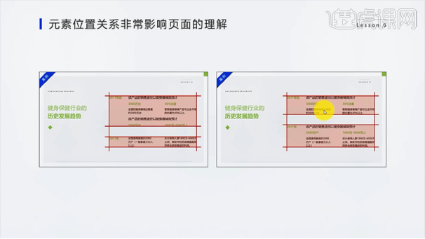
2. Part 2 [Two hierarchical relationships that affect intimacy in PPT] Through the analysis of this case, the size of the font, the white space and the color of the font are often used to highlight hierarchical relationships.
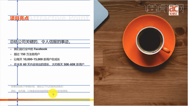
3. Two hierarchical relationships in the PPT page: [Father-son relationship, brother relationship] First analyze the father-son relationship: reflected in the title and body, subtitles, words, sentences As well as subtitles and main text, etc.

#4. Example: The father-son relationship is reflected in the enlargement of the font size, which weakens unimportant content and makes the page look beautiful.

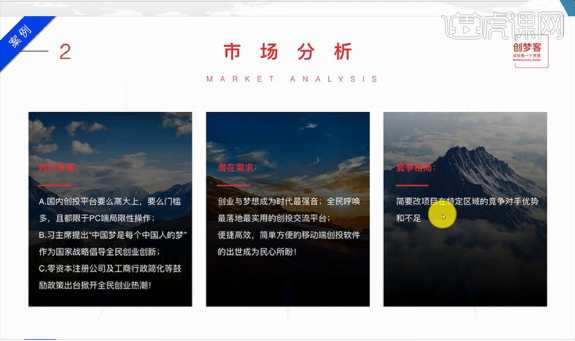
5. Then analyze the sibling relationship: reflected in the juxtaposed content, pay attention to the distance relationship between the title and the content, as well as the spacing and page margins between the content the size of. We must also follow the principle of "center of the page" to make the page more beautiful overall.
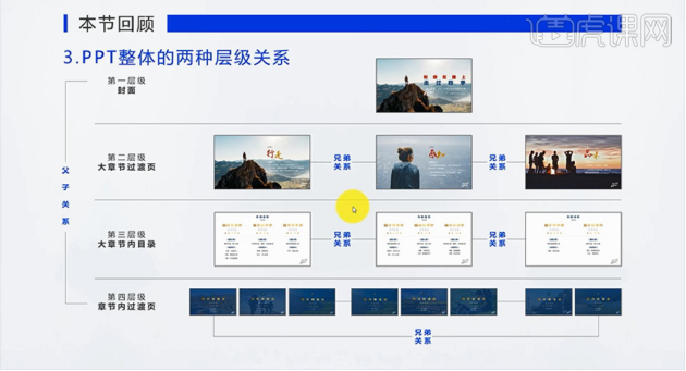
#6. The third part [Two hierarchical relationships of the overall PPT] Expand the entire PPT for hierarchical analysis - hierarchical progression.
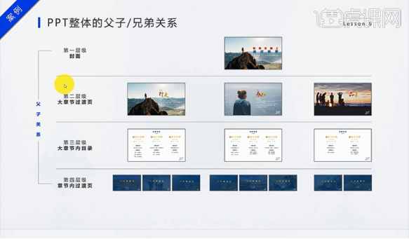
7. Review the content of this lesson [1. The position and relationship of elements affect the understanding of the page, 2. The two hierarchical relationships in the PPT page, 3. The overall PPT Two hierarchical relationships].
Here we mainly share it in the form of pictures. In fact, it may not be very effective. We can click on the course link: https://huke88.com/course/24712.html?pageType =1&key=ppt&identify=1626322030Watch the video tutorial, and you can find and learn more software tutorials on the website!
The above is the detailed content of Insurance ppt layout design principles: principles of intimacy and hierarchy. For more information, please follow other related articles on the PHP Chinese website!
 Drawing software
 How to find the greatest common divisor in C language
 Usage of Type keyword in Go
 WeChat payment deduction sequence
 How to solve operation timed out
 Introduction to Java special effects implementation methods
 What does frame rate mean?
 What is highlighting in jquery
 Reasons why website access prompts internal server error


