
php Xiaoxin teaches you how to transform the "ugly duckling" into a "white swan" and improve your professional image and performance through beautifying training PPT. Carefully designing the layout, choosing appropriate fonts, color matching, inserting pictures, animation effects, etc. are all key elements. With simple adjustments and optimizations, you can make your PPT glow with new charm, attract the audience's attention, improve the presentation effect, make your training content more vivid and interesting, and make it easier for students to understand and accept it.
Let’s take a look first. Excellent courseware has the same characteristics:
Clear logic
Key points
Concise writing
Pictures and texts
1. Let’s first find a picture as an example. You can observe it first.

Through observation and analysis, we can find the following problems:
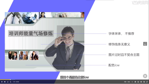
2. Let’s make modifications The first step - find the style
(You can browse some websites to find inspiration, such as petals.com)
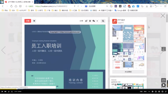
3. The second step is to find the color scheme . You can draw colors based on the styles you find.
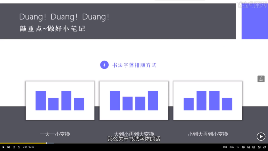
4. Here we use calligraphy fonts to create PPT covers. The following three are the main methods of calligraphy typesetting:
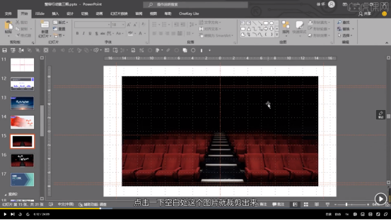
5. After the preparations are ready, we officially start production. First, click Insert - Picture in the tab above, insert the background picture you need and crop it (16:9), as shown below:
6. Let the picture cover the entire page: click on the picture - move it one layer down - put it to the bottom, hold down Ctrl shift, and enlarge it proportionally along the circle on the right, as shown in the picture:
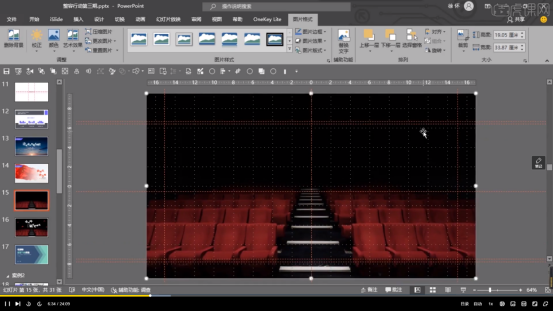
7. Select the page, click Start, set the theme color to white in the font interface of the tab, and drag the displayed text out one by one to turn it into a single word. As shown in the picture:
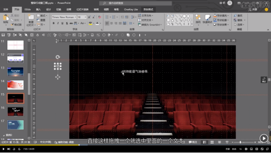
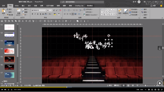
#8. Change the font to calligraphy font and set the font size to a suitable size.
9. Arrange the text in an aesthetically pleasing way, as shown in the picture:
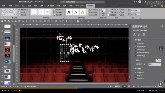
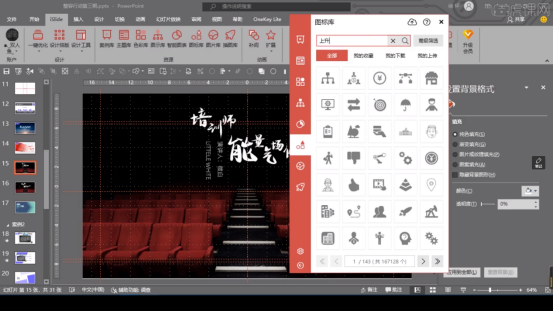
12. Increase the brightness, zoom, copy and paste the found icons, and layout multiple icons, and you're done.
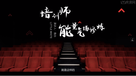
How about, through the comparison of the two pictures, from the color to the copywriting, the cover of this training PPT has become more advanced, and the aura is much stronger. This is the master’s training PPT! Have you learned it? Do you also want to design a high-end PPT? Let’s practice together!
The above is the detailed content of How to beautify training PPT so that the "ugly duckling" can become a "white swan". For more information, please follow other related articles on the PHP Chinese website!


