
php Xiaobian Yuzai will introduce you in detail how to create a pie chart in Excel. A pie chart is a type of chart that visually displays the proportion of data. Making a pie chart in Excel can help you present the data distribution more clearly. In Excel, you can quickly create beautiful and informative pie charts in just a few simple steps, making data analysis easier and more intuitive. Next, let’s learn how to quickly create beautiful pie charts in Excel!
1. First find the insert option in the Excel operation interface.
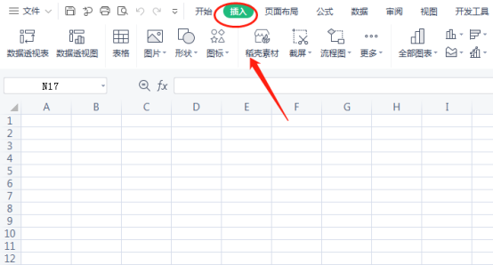
#2. There is an option to insert a pie chart in the options.
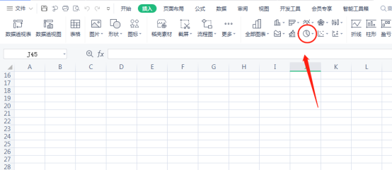
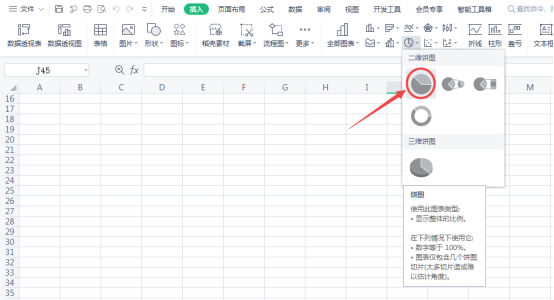
#3. Click on the pie chart to select the type you want. The two-dimensional pie chart chosen here is the most commonly used pie chart.
#4. After selecting, a blank border will appear in your chart.
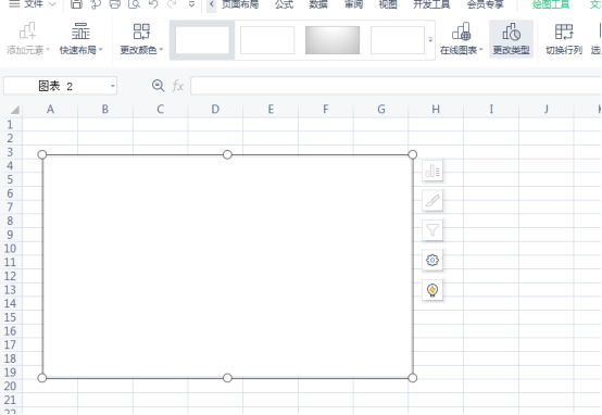
5. Now click to select data in your pie chart.
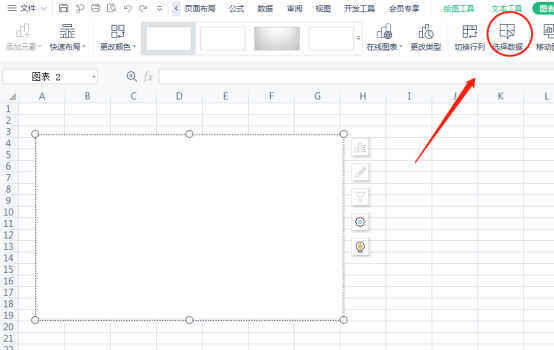
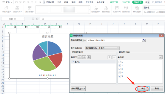
#6. Select the data you want to put into the graph and click OK. Here we randomly put in some data for display, and then the pie chart you selected before will display the graphic. In this way, the pie chart has been successfully inserted into the Excel table.
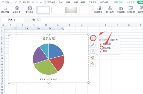
# 7. If you want to see the proportion of each part, it is also very simple. First click on the picture and check the data label.
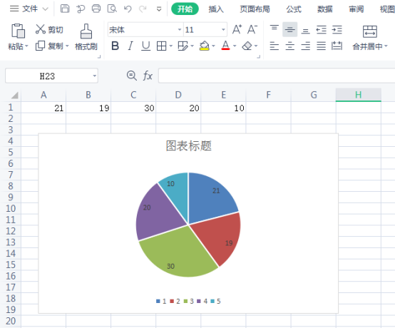
#8. Now that the proportion of each area has come out, our pie chart is ready.
The above is the detailed content of How to make excel pie chart. For more information, please follow other related articles on the PHP Chinese website!
 Compare the similarities and differences between two columns of data in excel
 excel duplicate item filter color
 How to copy an Excel table to make it the same size as the original
 Excel table slash divided into two
 Excel diagonal header is divided into two
 Absolute reference input method
 java export excel
 Excel input value is illegal


