How to make a histogram in WPS documents
If you want to insert a histogram into a WPS document, you can easily complete it in just a few simple steps. First, select the data to be inserted into the histogram in the document, then click the "Insert" option in the menu bar, select "Chart" and select the "Histogram" type in the pop-up window, and finally adjust the chart style and data source according to your needs , you can generate the histogram you want. Hope the above content is helpful to you!
After we open the WPS software we are using, the interface will differ depending on the WPS version, but it will not affect the operation. Next, find the "Insert" option in the main menu bar. After opening it, you will see the chart option.

After the chart is opened, the first one is the so-called column chart. In fact, there are three types of column charts, namely clustered column chart and stacked column chart. Bar chart and percentage stacked column chart, we can choose which one we need. Let me first introduce the use of this clustered column chart.
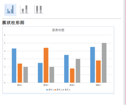
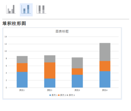
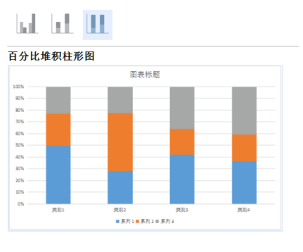
After selecting the clustered column chart, we can click OK below key, so that the column chart will appear in the operation interface, as shown in the figure.
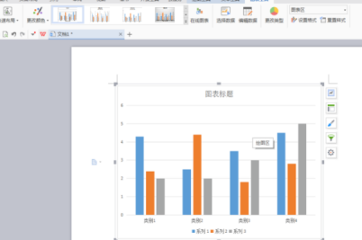
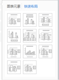
We can see that the clustered column chart is actually divided into 4 styles. We can choose which one is best and best matches our work.
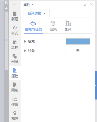
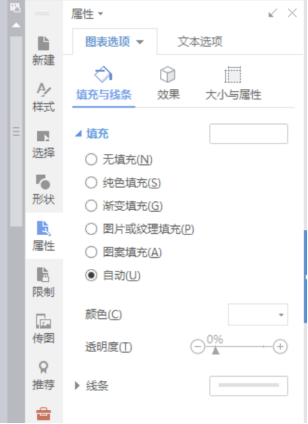
Then we can modify the color of the column according to our own requirements. We can choose the best color for ourselves. The method is to double-click the column in the graph, and the column attributes will appear, and we can modify it. .

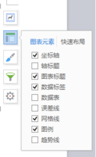
We can also click the left mouse button to display the options on the right and select the chart filter to modify the category and name of the chart. Title, value, etc., as shown in the figure.



So about how to make a WPS histogram, the editor has introduced it here. I hope your friends can watch it carefully and remember how to operate the column. When you really need it, I hope you can remember what the editor talked about today as soon as possible.
The above is the detailed content of How to make a histogram in WPS documents. For more information, please follow other related articles on the PHP Chinese website!

Hot AI Tools

Undresser.AI Undress
AI-powered app for creating realistic nude photos

AI Clothes Remover
Online AI tool for removing clothes from photos.

Undress AI Tool
Undress images for free

Clothoff.io
AI clothes remover

AI Hentai Generator
Generate AI Hentai for free.

Hot Article

Hot Tools

Notepad++7.3.1
Easy-to-use and free code editor

SublimeText3 Chinese version
Chinese version, very easy to use

Zend Studio 13.0.1
Powerful PHP integrated development environment

Dreamweaver CS6
Visual web development tools

SublimeText3 Mac version
God-level code editing software (SublimeText3)

Hot Topics
 1382
1382
 52
52
 How to uninstall wps document
Mar 20, 2024 pm 02:01 PM
How to uninstall WPS documents: Go to the control panel and find wpsoffic to uninstall WPS. WPS has the most favorite office functions of working people. Commonly used documents, forms, presentations and other functions can be used directly, which can provide a lot of work efficiency. But many friends don’t know how to uninstall wps files, so how to uninstall wps files? Let me explain it to you below. Uninstallation is the process of removing program files, folders, and related data from a computer to free up disk space and remove software from the system. In addition, uninstallation involves deleting the device driver and related registry information from the hard disk and then removing the device from the computer's physical device. The following are the steps to uninstall WPS documents, which are suitable for uninstalling any software.
 How to open macro function in WPS document or WPS table
Mar 20, 2024 pm 08:40 PM
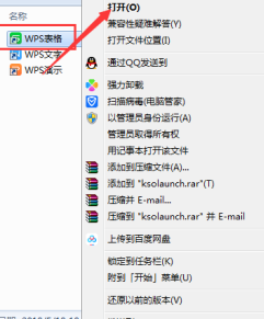
How to open macros in WPS: Select developer tools to open and load macros. As a powerful office software, WPS software provides great convenience for many office workers' daily needs of editing text, statistical data tables, etc. When using WPS software to create some WPS files, we often need to leave the macro function of the WPS software open. So how to open the macro function in a WPS file? Below, the editor will tell you about this matter using how to open macro functions in WPS tables and WPS documents as examples. If we need to open the macro function in the WPS form, we must first right-click or double-click to open the "WPS form" icon. Open the macro function "WPS Table" that needs to be opened.
 What are the process steps for installing fonts in WPS documents?
Mar 19, 2024 pm 11:30 PM
We use different fonts when we use WPS to make documents. Sometimes when we need to make special documents, the fonts are not enough. At this time, we need to install additional fonts in WPS. The theme of our class today is to teach you how to install fonts in WPS? In order to let everyone understand more thoroughly, I have compiled a step-by-step document, hoping to be helpful to the students. Collect it quickly if you need it! Step details: 1. We need to download our favorite fonts from the Internet. Here I downloaded [Muyao-Softbrush]. After downloading, the font style will be displayed. 2. Next, we see that there will be two buttons on the pop-up font style, [Print] and [Install], here
 How to draw a flow chart in WPS document
Mar 20, 2024 pm 10:20 PM
In our work meetings, we often use flow charts. The use of flow charts can make explanations more intuitive and convenient. In fact, it is not difficult to make a flow chart, just a wps document can be made. The editor below will explain to you the specific steps on how to draw a flow chart in a WPS document: 1. We open the wps software and select the Insert button in the menu bar. 2. We select the rounded rectangular frame of the flow chart and draw it on the page. There are various flow charts and arrow patterns inside. Just select one of them and pull it out in the document. Then right-click to add text and you can enter text. 3. At this time, we found that the drawn rectangular frame was solid, and we reset it in the drawing tool to fill it with a transparent color. 4. Let’s click on this rectangular box and use the mouse
 How to arrange two pictures side by side in wps document
Mar 20, 2024 pm 04:00 PM
When using WPS office software, we found that not only one form is used, tables and pictures can be added to the text, pictures can also be added to the table, etc. These are all used together to make the content of the entire document look richer. , if you need to insert two pictures into the document and they need to be arranged side by side. Our next course can solve this problem: how to place two pictures side by side in a wps document. 1. First, you need to open the WPS software and find the picture you want to adjust. Left-click the picture and a menu bar will pop up, select "Page Layout". 2. Select "Tight wrapping" in text wrapping. 3. After all the pictures you need are confirmed to be set to "Tight text wrapping", you can drag the pictures to the appropriate position and click on the first picture.
 Do you know how to add watermark to WPS documents?
Mar 20, 2024 am 08:40 AM
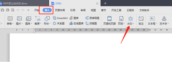
Adding watermarks to WPS documents can protect copyright to prevent your files from being misappropriated by others, and confidentiality is being promoted everywhere. Adding watermarks to WPS documents can also find the source of document printing, and can smoothly trace it back to the source. Whether it is to protect copyright or to keep confidentiality, adding watermarks to WPS documents at work is beneficial to yourself and others. There are many ways to load watermarks. Below we will share a simple method on how to add watermarks to WPS documents. 1. Open the WPS document and click [Watermark] in the [Insert] column in the toolbar. 2. Click the small inverted triangle next to [Watermark]. There are some watermark templates inside. 3. Customize a watermark and click [+]. 4. A dialog box will pop up, enter in [Content]
 Why can't the blank underline in the wps document be printed? How should I underline it?
Mar 20, 2024 am 09:40 AM
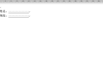
When entering text in Word, sometimes some positions need to be underlined to explain or emphasize. So why can't the blank underline in the WPS document be printed? How should I underline? The editor will introduce it to you in detail below, let’s take a look. In WPS documents, you can underline the blank spaces, as shown in the figure. How to do it? Please read below for detailed operations. Take the document in the picture as an example to demonstrate how to underline the blank space. Place the cursor on the right side of the colon of "Name" in the picture, and press the space bar on the keyboard. In order to facilitate the demonstration, I have increased the font size, as shown below: 2. Then, after the cursor reaches the set position, click and hold without letting go, and move to Drag on the left to the side of the colon, as shown in the picture: 3. Then click the "underline" icon, as indicated by the arrow in the picture.
 How to delete WPS document comments
Mar 20, 2024 pm 03:06 PM
When we use WPS documents to process text, we often add some comments to part of the text, so that the viewer can better understand its meaning. But when we finish using the comments, we want to delete them for the sake of beautiful layout. So how to delete the annotation function of a WPS document? The following editor will explain the steps in detail: 1. How to delete all annotations. Log in to the computer, open the WPS text; click the "Review" menu above; click one of the annotations; Click the lower part of the "Delete" tool button; in the pop-up submenu, click the "Delete all comments in document" submenu. You can see that all comments have been deleted. 2. Steps to delete a single comment: Click More in the upper right corner of a certain comment, and click "


