 Software Tutorial
 Office Software
 Specific steps for using color blocks to splice fake charts in PPT
Specific steps for using color blocks to splice fake charts in PPT
php editor Apple teaches you how to use color blocks to splice fake charts. First, open PPT and insert a rectangular shape, adjust the size and color, and then copy and paste multiple rectangles to represent different data. Next, add text to describe what each rectangle means, and finally arrange the rectangles into a chart-like shape to create a fake chart effect.
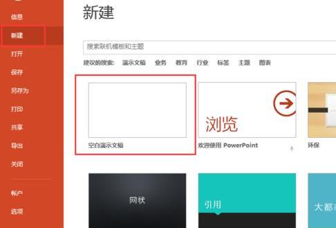
1. Create a new blank document.
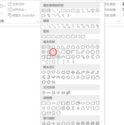
2. Select the shape, [Pie Shape].
3. Hold down the shift key to draw a pie shape. Do you see the yellow endpoint? By moving it, you can adjust the pie shape to any desired shape.
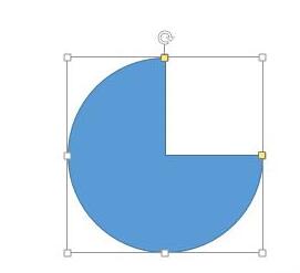
4. Change to gray and set the shape color and border.
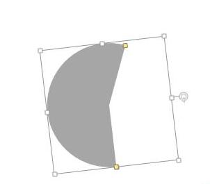
5. Ctrl D copy one, change it to another color you like, and adjust the size.
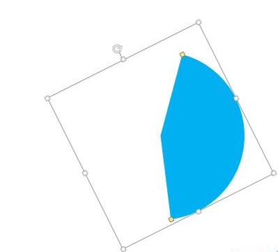
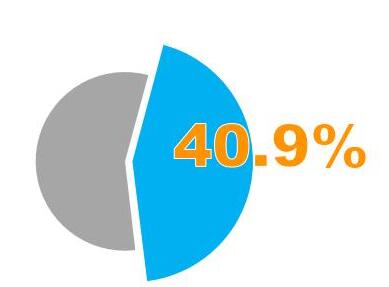
6. Merge the two together, adjust the size and position, enlarge the blue part and make the gray part smaller to create a highlighted effect.

7. Finally, add the data, and a fake pie chart is ready. Make several more according to the data you want.
The above is the detailed content of Specific steps for using color blocks to splice fake charts in PPT. For more information, please follow other related articles on the PHP Chinese website!

Hot AI Tools

Undresser.AI Undress
AI-powered app for creating realistic nude photos

AI Clothes Remover
Online AI tool for removing clothes from photos.

Undress AI Tool
Undress images for free

Clothoff.io
AI clothes remover

AI Hentai Generator
Generate AI Hentai for free.

Hot Article

Hot Tools

Notepad++7.3.1
Easy-to-use and free code editor

SublimeText3 Chinese version
Chinese version, very easy to use

Zend Studio 13.0.1
Powerful PHP integrated development environment

Dreamweaver CS6
Visual web development tools

SublimeText3 Mac version
God-level code editing software (SublimeText3)

Hot Topics
 How to check traffic on Apple mobile phone
May 09, 2024 pm 06:00 PM
How to check data usage on Apple 1. The specific steps to check data usage on Apple mobile phone are as follows: Open the settings of the phone. Click the Cellular button. Scroll down on the cellular network page to see the specific data usage of each application. Click Apply to also set allowed networks. 2. Turn on the phone, find the settings option on the phone desktop, and click to enter. In the settings interface, find "Cellular Network" in the taskbar below and click to enter. In the cellular network interface, find the "Usage" option on the page and click to enter. 3. Another way is to check the traffic by yourself through the mobile phone, but the mobile phone can only see the total usage and will not display the remaining traffic: turn on the iPhone, find the "Settings" option and open it. Select "Bee"
 How to disable snapshot layout in Windows 11_ Tips for not using snapshot layout in win11
May 08, 2024 pm 06:46 PM
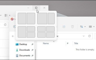
Win11 system announced the new [Snapshot Layout], which provides users with various window layout options through the [Maximize] button, so that users can choose from multiple layout templates to display two, three or four on the screen. open applications. This is an improvement over dragging multiple windows to the sides of the screen and then adjusting everything manually. [SnapGroups] will save the collection of apps the user is using and their layout, allowing the user to easily return to that setting when they have to stop and deal with other things. If someone is using a monitor that the user must unplug, when re-docking, the previously used snapshot layout will also be restored. To use snapshot layout, we can use the keyboard shortcut WindowsKey+Z to start
 How to sort the list page alphabetically in vscode How to sort the list page alphabetically in vscode
May 09, 2024 am 09:40 AM
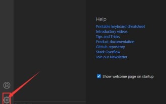
1. First, after opening the vscode interface, click the settings icon button in the lower left corner of the page 2. Then, click the Settings option in the drop-down page column 3. Then, find the Explorer option in the jumped window 4. Finally, on the right side of the page Click the OpenEditorsnaming option, select the alphabetical button from the drop-down page and save the settings to complete the alphabetical sorting
 How to set ring text in ai - specific method of setting ring text in ai
May 06, 2024 pm 05:58 PM
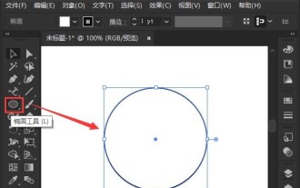
1. First, after opening the interface, click the Ellipse tool to draw a perfect circle 2. Click the Path Text tool button on the left and enter text along the circular frame 3. Select the letter with the mouse, open the character panel, and set the font size to 20.7 pt4. Select the circle, click 3D options in the effect menu, and select the rotation button 5. In the opened 3D rotation option settings, set the position option to custom rotation effect, modify the parameters and click OK to save 6. Finally, it is a ring Just add a red fill effect to the text
 Can I plug in a wireless network card when assembling a computer?
May 08, 2024 am 09:13 AM
Can I plug in a wireless network card when assembling a computer? First of all, the wireless network card you are talking about here should be a 2G/3G/4G wireless network card, that is, a wireless network card, right? My answer is yes. However, you also need an AP that supports USB wireless network cards, such as: (only for Jiuli use, not a recommended product) Can I use a wireless network card to access the Internet by assembling a desktop computer? Network cards are essential for modern computers. Without a network card, you cannot access the Internet, whether it is an onboard network card, an independent network card, or a wireless network card. When assembling a computer, a separate network card is generally not installed, because the current motherboards have integrated network cards, so there is no need to buy another one. However, the computers assembled now cannot use wireless Internet access like notebooks, because there is no wireless network card installed. Players can According to your own needs
 How to use merge in java
May 09, 2024 am 06:03 AM
The merge() method in Java Collections merges two sorted ordered collections to generate a new sorted collection, maintaining the original order. Syntax: public static <T> List<T> merge(SortedMap<T, Double> a, SortedMap<T, Double> b). It accepts two sorted collections and returns a new collection containing all elements in sorted order. Note: The values of duplicate keys will be merged according to the merge function, and the original collection will not be modified.
 What are the advanced C++ performance optimization techniques?
May 08, 2024 pm 09:18 PM
Performance optimization techniques in C++ include: Profiling to identify bottlenecks and improve array layout performance. Memory management uses smart pointers and memory pools to improve allocation and release efficiency. Concurrency leverages multi-threading and atomic operations to increase throughput of large applications. Data locality optimizes storage layout and access patterns and enhances data cache access speed. Code generation and compiler optimization applies compiler optimization techniques, such as inlining and loop unrolling, to generate optimized code for specific platforms and algorithms.
 What are the top ten virtual currency trading platforms? Ranking of the top ten virtual currency trading platforms in the world
Feb 20, 2025 pm 02:15 PM
With the popularity of cryptocurrencies, virtual currency trading platforms have emerged. The top ten virtual currency trading platforms in the world are ranked as follows according to transaction volume and market share: Binance, Coinbase, FTX, KuCoin, Crypto.com, Kraken, Huobi, Gate.io, Bitfinex, Gemini. These platforms offer a wide range of services, ranging from a wide range of cryptocurrency choices to derivatives trading, suitable for traders of varying levels.


