

How to make a curve chart in word document

Create a graph in Word: Prepare your data and organize it into two or more columns that contain x- and y-axis values. Go to the Insert tab and select Graph. Select the data range and fill in the chart title and axis labels. Customize charts (change line style, colors, data labels, etc.). Resize and position the chart and drag it anywhere in the document.

How to create a curve graph in Word
Introduction:
Curve graph A chart type used to show trends in data over time or other continuous variables. The process of creating a graph in Word is relatively simple.
Steps:
1. Prepare the data:
Collect the data to be plotted in the chart and organize it into two columns or more columns, where the first column represents the value on the x-axis (horizontal axis) and the remaining columns represent values on the y-axis (vertical axis).
2. Insert a chart:
In the Word document, go to the "Insert" tab and click "Chart" > "Graph" > "Curve" .
3. Select data:
In the pop-up "Insert Chart" window, click the "Select Data" button.
4. Set the data range:
In the "Select Data Source" dialog box, select the cell range that contains the data you want to chart.
5. Set the chart title and axis labels:
Return to the "Insert Chart" window and fill in the chart title, x-axis label and y-axis label.
6. Customize charts:
Word provides various customization options for curve charts. You can access these options by right-clicking on the chart and selecting "Chart Options". You can change line styles, colors, add data labels, and more.
7. Adjust the size and position of the chart:
Use the drag handle to adjust the size and position of the chart. You can drag it anywhere in the document.
Conclusion:
Following the steps above, you can create a line graph in Word to clearly and effectively display data trends.
The above is the detailed content of How to make a curve chart in word document. For more information, please follow other related articles on the PHP Chinese website!

Hot AI Tools

Undresser.AI Undress
AI-powered app for creating realistic nude photos

AI Clothes Remover
Online AI tool for removing clothes from photos.

Undress AI Tool
Undress images for free

Clothoff.io
AI clothes remover

AI Hentai Generator
Generate AI Hentai for free.

Hot Article
Hot Tools

Notepad++7.3.1
Easy-to-use and free code editor

SublimeText3 Chinese version
Chinese version, very easy to use

Zend Studio 13.0.1
Powerful PHP integrated development environment

Dreamweaver CS6
Visual web development tools

SublimeText3 Mac version
God-level code editing software (SublimeText3)
Hot Topics
 1379
1379
 52
52

 How to make a curve chart in word document
Mar 29, 2024 pm 07:19 PM
How to make a curve chart in word document
Mar 29, 2024 pm 07:19 PM
Create a graph in Word: Prepare your data and organize it into two or more columns that contain x- and y-axis values. Go to the Insert tab and select Graph. Select the data range and fill in the chart title and axis labels. Customize charts (change line style, colors, data labels, etc.). Resize and position the chart and drag it anywhere in the document.
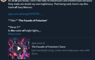 The first domestic music SOTA model is here! Optimized specifically for Chinese, free to use, no restrictions on genres
Apr 18, 2024 pm 06:50 PM
The first domestic music SOTA model is here! Optimized specifically for Chinese, free to use, no restrictions on genres
Apr 18, 2024 pm 06:50 PM
On the first anniversary of the release of the "Tiangong" model, Kunlun Worldwide announced that the "Tiangong 3.0" base model and the "Tiangong SkyMusic" music model have officially launched public beta. Since AI allows humans to achieve the freedom of music creation, even quarrels have become interesting. In the past, Aran Komatsuzaki, a well-known AI blogger on the X platform, wrote a song specifically to express his dissatisfaction with another AI scientist, Gary Marcus, and generated it using the currently popular Suno. You know, in the past, the war of words between these big guys was mainly to post a post, and then you and I would follow up. This time, Aran Komatsuzaki’s approach can be said to be a new trick. I don’t know if it is
 Graphviz Tutorial: Create Intuitive Data Visualizations
Apr 07, 2024 pm 10:00 PM
Graphviz Tutorial: Create Intuitive Data Visualizations
Apr 07, 2024 pm 10:00 PM
Graphviz is an open source toolkit that can be used to draw charts and graphs. It uses the DOT language to specify the chart structure. After installing Graphviz, you can use the DOT language to create charts, such as drawing knowledge graphs. After you generate your graph, you can use Graphviz's powerful features to visualize your data and improve its understandability.
 Compare and differentiate Spyder and PyCharm: Comparison of Python integrated development environments
Feb 25, 2024 am 09:03 AM
Compare and differentiate Spyder and PyCharm: Comparison of Python integrated development environments
Feb 25, 2024 am 09:03 AM
Spyder and PyCharm are two powerful Python integrated development environments (IDEs) that play important roles in the Python development process. This article will compare and contrast these two IDEs, conduct a detailed analysis in terms of interface design, functional features, plug-in support, etc., and demonstrate the differences between them through specific code examples. 1. Interface design and layout Spyder’s interface design is simple and clear, and is mainly divided into editor, variable viewer, file browser, command line terminal, etc.
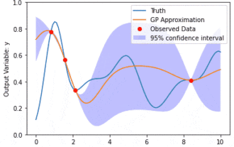 Data modeling using Kernel Model Gaussian Processes (KMGPs)
Jan 30, 2024 am 11:15 AM
Data modeling using Kernel Model Gaussian Processes (KMGPs)
Jan 30, 2024 am 11:15 AM
Kernel Model Gaussian Processes (KMGPs) are sophisticated tools for handling the complexity of various data sets. It extends the concept of traditional Gaussian processes through kernel functions. This article will discuss in detail the theoretical basis, practical applications and challenges of KMGPs. The kernel model Gaussian process is an extension of the traditional Gaussian process and is used in machine learning and statistics. Before understanding kmgp, you need to master the basic knowledge of Gaussian process, and then understand the role of the kernel model. Gaussian processes (GPs) are a set of random variables, a finite number of variables jointly distributed with a Gaussian distribution, and are used to define function probability distributions. Gaussian processes are commonly used in regression and classification tasks in machine learning and can be used to fit the probability distribution of data. An important feature of Gaussian processes is their ability to provide uncertainty estimates and predictions
 'Tiangong Big Model 3.0' was officially released on April 17th - a 400 billion parameter MoE super model that is simultaneously open source and has performance exceeding Grok1.0
Apr 01, 2024 pm 02:01 PM
'Tiangong Big Model 3.0' was officially released on April 17th - a 400 billion parameter MoE super model that is simultaneously open source and has performance exceeding Grok1.0
Apr 01, 2024 pm 02:01 PM
On April 17, 2023, Kunlun Wanwei released its self-developed dual-hundred-billion-level large language model "Tiangong 1.0", officially paving the way for the rise of domestic large-scale models. On the upcoming April 17, 2024, on the first anniversary of the "Tiangong" large model, Kunlun Wanwei announced that "Tiangong 3.0" has officially launched public beta! "Tiangong 3.0" adopts a 400-billion-level parameter MoE hybrid expert model, and will simultaneously select open source. It is one of the MoE models with the largest model parameters and the strongest performance in the world. Compared with the previous generation "Tiangong 2.0" MoE large model, "Tiangong 3.0" has amazing performance improvements in areas such as model semantic understanding, logical reasoning, versatility, generalization, uncertainty knowledge, and learning capabilities. Its model technical knowledge and capabilities have improved by more than 20
 Learn advanced charting techniques using Python in one hour
Sep 27, 2023 am 09:57 AM
Learn advanced charting techniques using Python in one hour
Sep 27, 2023 am 09:57 AM
Learn the advanced techniques of using Python to draw charts in one hour. Specific code examples are required. Introduction: Charts play a vital role in data visualization. Python, as a powerful, easy-to-learn and easy-to-use programming language, provides a variety of chart drawings. tools and libraries. This article will introduce some advanced techniques for drawing charts in Python to help readers get started quickly. 1. Matplotlib library Matplotlib is one of the most commonly used drawing libraries in Python. It provides a wealth of drawing functions and tools.
 PEPU Coin Price Prediction for 2025
Dec 12, 2024 am 11:32 AM
PEPU Coin Price Prediction for 2025
Dec 12, 2024 am 11:32 AM
PEPU Coin’s 2025 price prediction is based on a comprehensive analysis of technical, fundamentals, consensus, and statistical modeling. The forecast model takes into account factors such as market sentiment, regulatory environment, technological developments and macroeconomic factors that influence prices. Additionally, PEPU Coin can be compared to other cryptocurrencies such as BTC, ETH, BNB, USDC, and XRP to understand its investment potential and unique advantages. Further analysis also explores the PEPU coin’s potential value, long-term holding power and likelihood of reaching $1 within the next 5 years.
