
 Software Tutorial
Office Software
Detailed tutorial on making intuitive statistical charts in Excel tables
Software Tutorial
Office Software
Detailed tutorial on making intuitive statistical charts in Excel tables
Detailed tutorial on making intuitive statistical charts in Excel tables

php The editor will take you through a detailed tutorial on making intuitive statistical charts in Excel tables. Excel spreadsheet is an important tool in office software, and its powerful data processing functions provide convenience for statistical analysis. By learning how to use Excel to quickly generate intuitive statistical charts, you can more clearly show the patterns and trends behind the data and improve work efficiency and performance. Let us have an in-depth understanding of how to make statistical charts in Excel tables, improve our professional capabilities, and achieve the goal of visual data analysis.
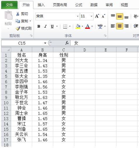
1. First, enter the data to be counted into Excel in rows or columns.
2. Select all content, click the menu bar, and insert the key. Select the PivotTable report.
3. The default is the new worksheet, click OK.
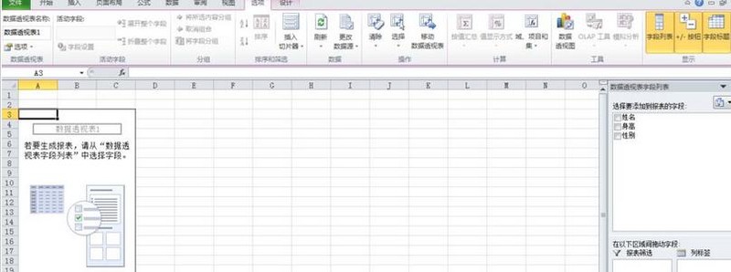
4. Select the fields to add the table. Select all three fields here. At this time, various statistical graphics appear in the menu bar, click on the graphics we want.
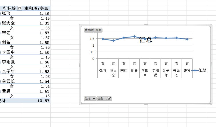
5. Click the insert line graph under the menu bar to automatically generate a line graph.
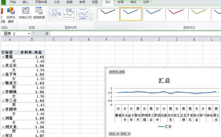
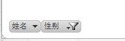
6. Filter the data according to different purposes of use. If you want to keep only the number of boys, uncheck the box in front of girls.
The above is the detailed content of Detailed tutorial on making intuitive statistical charts in Excel tables. For more information, please follow other related articles on the PHP Chinese website!

Hot AI Tools

Undresser.AI Undress
AI-powered app for creating realistic nude photos

AI Clothes Remover
Online AI tool for removing clothes from photos.

Undress AI Tool
Undress images for free

Clothoff.io
AI clothes remover

Video Face Swap
Swap faces in any video effortlessly with our completely free AI face swap tool!

Hot Article
Hot Tools

Notepad++7.3.1
Easy-to-use and free code editor

SublimeText3 Chinese version
Chinese version, very easy to use

Zend Studio 13.0.1
Powerful PHP integrated development environment

Dreamweaver CS6
Visual web development tools

SublimeText3 Mac version
God-level code editing software (SublimeText3)
Hot Topics
 1386
1386
 52
52

 How to implement statistical charts of massive data under the Vue framework
Aug 25, 2023 pm 04:20 PM
How to implement statistical charts of massive data under the Vue framework
Aug 25, 2023 pm 04:20 PM
How to implement statistical charts of massive data under the Vue framework Introduction: In recent years, data analysis and visualization have played an increasingly important role in all walks of life. In front-end development, charts are one of the most common and intuitive ways of displaying data. The Vue framework is a progressive JavaScript framework for building user interfaces. It provides many powerful tools and libraries that can help us quickly build charts and display massive data. This article will introduce how to implement statistical charts of massive data under the Vue framework, and attach
 Implementation of pie chart and radar chart functions in Vue statistical charts
Aug 18, 2023 pm 12:28 PM
Implementation of pie chart and radar chart functions in Vue statistical charts
Aug 18, 2023 pm 12:28 PM
Implementation of the pie chart and radar chart functions of Vue statistical charts Introduction: With the development of the Internet, the demand for data analysis and chart display is becoming more and more urgent. As a popular JavaScript framework, Vue provides a wealth of data visualization plug-ins and components to facilitate developers to quickly implement various statistical charts. This article will introduce how to use Vue to implement the functions of pie charts and radar charts, and provide relevant code examples. Introducing statistical chart plug-ins In Vue development, we can use some excellent statistical chart plug-ins to help us implement
 How to use Vue to implement real-time updated statistical charts
Aug 18, 2023 pm 10:41 PM
How to use Vue to implement real-time updated statistical charts
Aug 18, 2023 pm 10:41 PM
How to use Vue to implement real-time updated statistical charts Introduction: With the rapid development of the Internet and the explosive growth of data, data visualization has become an increasingly important way to convey information and analyze data. In front-end development, the Vue framework, as a popular JavaScript framework, can help us build interactive data visualization charts more efficiently. This article will introduce how to use Vue to implement a real-time updated statistical chart, obtain data in real time and update the chart through WebSocket, and provide relevant information at the same time.
 Implementation of area chart and scatter chart functions of Vue statistical chart
Aug 20, 2023 am 11:58 AM
Implementation of area chart and scatter chart functions of Vue statistical chart
Aug 20, 2023 am 11:58 AM
The area chart and scatter chart functions of Vue statistical charts are implemented. With the continuous development of data visualization technology, statistical charts play an important role in data analysis and display. Under the Vue framework, we can use the existing chart library and combine it with Vue's two-way data binding and componentization features to easily implement the functions of area charts and scatter charts. This article will introduce how to use Vue and commonly used chart libraries to implement these two statistical charts. Implementation of area charts Area charts are often used to show the trend of data changes over time. In Vue, we can use v
 Implementation of ranking and comparison functions of Vue statistical charts
Aug 26, 2023 am 09:45 AM
Implementation of ranking and comparison functions of Vue statistical charts
Aug 26, 2023 am 09:45 AM
The ranking and comparison functions of Vue statistical charts are implemented in the field of data visualization. Statistical charts are an intuitive and clear way to display data. As a popular front-end framework, Vue provides a wealth of tools and components to implement various charts. This article will introduce how to use Vue to implement the ranking and comparison functions of statistical charts. Before starting, we need to install Vue and related chart libraries. We will use Chart.js as the charting library, which provides rich chart types and interactive functions. C can be installed via the following command
 ECharts and golang technical guide: practical tips for creating various statistical charts
Dec 17, 2023 pm 09:56 PM
ECharts and golang technical guide: practical tips for creating various statistical charts
Dec 17, 2023 pm 09:56 PM
ECharts and golang technical guide: Practical tips for creating various statistical charts, specific code examples are required. Introduction: In the field of modern data visualization, statistical charts are an important tool for data analysis and visualization. ECharts is a powerful data visualization library, while golang is a fast, reliable and efficient programming language. This article will introduce you to how to use ECharts and golang to create various types of statistical charts, and provide code examples to help you master this skill. Preparation
 Optimization of animation effects for Vue statistical charts
Aug 26, 2023 pm 01:03 PM
Optimization of animation effects for Vue statistical charts
Aug 26, 2023 pm 01:03 PM
Optimizing the animation effect of Vue statistical charts In web development, data visualization is an important direction. Statistical charts can help users understand data more intuitively, and animation effects can further enhance user experience. As a popular front-end framework, Vue provides a wealth of tools and components to achieve data visualization. This article will introduce how to optimize the animation effect of Vue statistical charts. First, we need to choose a suitable statistical chart library. Currently, some popular charting libraries such as Chart.js, ECharts and Ap
 Tree structure and topology diagram optimization of Vue statistical charts
Aug 19, 2023 pm 03:05 PM
Tree structure and topology diagram optimization of Vue statistical charts
Aug 19, 2023 pm 03:05 PM
Optimization of the tree structure and topology diagram of Vue statistical charts In web development, statistical charts are one of the very common functions. As a popular JavaScript framework, Vue also provides a wealth of tools and components to implement various complex charts. In this article, we will focus on two common statistical chart structures: tree structure and topology chart, and introduce how to use Vue for optimization. Tree Structure A tree structure is a way of organizing data into hierarchical relationships. In statistical charts, tree structures can clearly display data
