Recently, it was revealed that iOS 18 may achieve a major breakthrough in home screen application layout. Apple fans are expected to bid farewell to the traditional "grid lock" mode and usher in a new era of free layout of application icons and various widgets.
This means that iPhone users can flexibly arrange the home screen interface according to personal preferences and actual needs, breaking the original strict alignment restrictions and giving the mobile phone interface unprecedented personalized space.

For loyal Apple fans, this change is a bit big, but for Android users, this is already an outdated feature. Now, iOS 18 is gearing up to catch up, and Apple intends to further get closer and compete with the Android camp in the field of home screen customization.
If the rumors are reliable, iOS 18 will give users unprecedented permissions to customize the iPhone home screen as they wish. Although Android phone users are already accustomed to this, I don't want my iPhone to look like an Android device.
This topic is somewhat contradictory: giving users greater freedom to create a unique home screen can make iOS closer to the personalized experience of Android, but it may also weaken the uniqueness of iOS. flavor.
iOS 18 and iPhone Home Screen
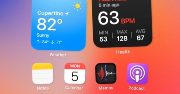
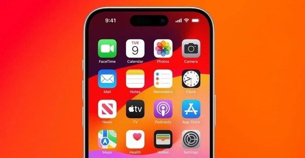
When it comes to iOS 18 and iPhone home screen, Apple’s rigorous and orderly grid application layout is indeed efficient and practical. Frequently used applications are always within reach in a fixed location, while infrequently used applications will be hidden in the App library or various folders, thus keeping the home screen clean and concise. Of course, you can also add widgets to spice things up and make smart use of areas you don’t plan to fill with app icons.

It is said that on iOS 18, users will be able to break the grid limitations and place application icons on the home screen more casually, which will create some blank space. This is a common practice in Android, where you can place apps anywhere on your home screen. Although these white spaces have no real purpose, other than allowing your wallpaper to be more fully displayed.
I personally like to arrange frequently used applications neatly at the bottom of the home screen of Android phones. I tend to stick to a fixed layout pattern and enjoy looking at my chosen wallpaper every time I unlock my phone, and that's the beauty of Android. However, for iOS, I really don't want it to absorb too many Android elements.
The Androidization of iOS
In recent years, in order to make iOS look innovative, Apple has borrowed many ideas from Android. For example, widgets were originally an iconic feature of Android. They first appeared in the Today view of iOS and were later integrated into the home screen of iOS 14. At the same time, Apple also launched the App Resource Library, which works similar to the application drawer on Android phones, making it easy to store infrequently used applications without having to uninstall them.

In iOS 16, the lock screen interface has been greatly optimized, allowing you to add widgets, adjust the clock font style, and create a variety of lock screen styles according to different situations. With these improvements and other minor tweaks over the years, the iPhone's software interface has definitely become more personal, but it's always remained very iOS.
Both parties influence each other, and Android phones are also adopting some iOS designs. Recently, manufacturers such as Xiaomi, OPPO and Huawei are trying to integrate Apple's Smart Island into their own Android interfaces. Earlier, many Android phones defaulted to multiple home screens similar to iOS to distribute applications instead of a single application drawer. This design was obviously inspired by iOS.
Going too far?
Although the two systems have many similarities, they still have obvious differences. The concern is that the rumored iOS 18 update may imitate Android too much. Even though users don’t have to and shouldn’t be forced to create gaps or large white spaces on their home screens, it wouldn’t be a big deal in my mind to finally be able to replicate my Android phone app layout and style nearly perfectly on an iOS device. Changes that people expect.
Theoretically, users can copy the iOS home screen layout to Android phones, but most people never do such a thing. I expect different phones to have different looks and feel, after all, they are equipped with different hardware and software. One phone should not look like a copy of another, but should maintain its own unique personality.

Many Android phones habitually borrow iOS interface design, just like some smart watches blindly imitate the watchOS style. I feel the same way when I see manufacturers imitating iPhone camera module designs. Simply put, if I want to own an iPhone and use iOS, then just buy it; if I want an Android phone, then buy Android.
В настоящее время, хотя критика по поводу однородного внешнего вида мобильных телефонов все еще существует, ситуация значительно улучшилась. Я не ожидаю, что в ближайшем будущем у нас возникнет подобное недовольство программным обеспечением для мобильных телефонов, особенно когда личность будет случайно стерта в погоне за персонализацией. Чрезмерное стремление к кроссплатформенности только заставит людей чувствовать себя скучно вместо настоящей персонализации.
Каждая операционная система мобильного телефона должна иметь свои особенности. Даже если есть небольшие различия, их нелегко спутать друг с другом.
Написано в конце
Границы между iOS и Android постепенно стираются.Хотя взаимные ссылки в определенной степени способствовали прогрессу отрасли, по-прежнему важно поддерживать основные функции и уникальный опыт. операционной системы.
Эта трансформация iOS 18 похожа на танец поиска тонкого баланса между персонализацией и узнаваемостью бренда. Она должна не только удовлетворять стремление пользователей к гибкости главного экрана, но и соответствовать тому, что всегда представляла собой iOS. Заказать , простота и элегантность.
В сфере мобильных операционных систем в будущем только найдя правильную точку опоры между совместимостью и самообслуживанием, мы сможем сохранить лидирующие позиции в рыночной конкуренции и завоевать лояльность пользователей и любовь к бренду. Это зависит от того, как с этим справляется производитель.
The above is the detailed content of Apple iOS 18 has another major innovation! Android users fell silent after watching this. For more information, please follow other related articles on the PHP Chinese website!
 What does Apple LTE network mean?
 The role of Apple's Do Not Disturb mode
 How to solve the problem that Apple cannot download more than 200 files
 Migrate data from Android phone to Apple phone
 How to unlock android permission restrictions
 Commonly used permutation and combination formulas
 Is Huawei's Hongmeng OS Android?
 Does Hongmeng OS count as Android?


