
 Software Tutorial
Office Software
How to add a graphic method for drawing column charts and line charts in excel2016
Software Tutorial
Office Software
How to add a graphic method for drawing column charts and line charts in excel2016
How to add a graphic method for drawing column charts and line charts in excel2016

php editor Xinyi will introduce to you how to add a graphic column chart and a line chart in Excel 2016. Column charts and line charts are commonly used chart types in Excel, and they can visually display data trends and comparison results. Through the detailed steps and diagrams in this article, you can easily learn to make these two charts in Excel 2016 to improve the effect of data display and visualization.
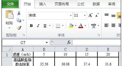
1. Create a new excel2016 and import the data used.
Using the data in the figure, the first row of data is used as the X-axis data, and the last two rows of data are used as the Y-axis data.
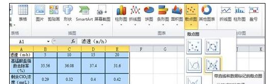
2. First draw the data into a scatter plot.
Select the data and select [Scatter Plot] in the [Insert] column. When drawing a scatter plot, select [Scatter Plot with Straight Lines and Data Markers] as shown in the figure.
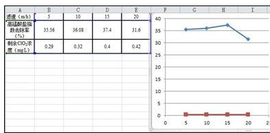
3. Data analysis.
As can be seen from the figure, the magnitude difference between the two sets of Y-axis data is large, and it is obviously inappropriate to display it under one Y-axis. Therefore, two Y-axes need to be used.
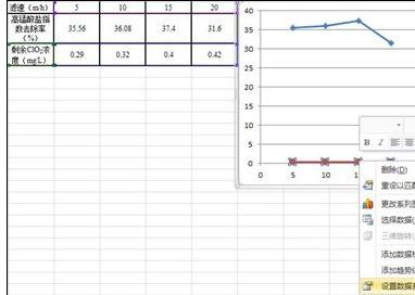
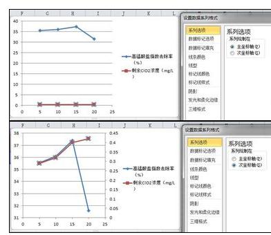
4. Change the coordinate axis of another set of numerical data.
Select the red data (the data to be operated on), right-click, and click [Set Data Series Format].
5. Click [Secondary Axis].
A dialog box will appear, click [Secondary Axis], then the second Y-axis will appear on the right side of the chart, and the selected data will be based on the second Y-axis.
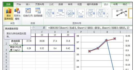
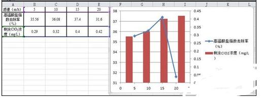
6. Change the chart type.
Select the red data (data to be operated), click the [Change Chart Type] icon in the upper left corner, and then select [Clustered Column Chart] in [Column Chart]. At this point, the diagram we need is almost complete.
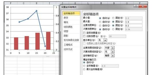
#7. When the coordinate data is inappropriate, the format of the coordinate axis needs to be changed.
The following figure is an example of changing the second Y axis. Click to select the second Y-axis data, then right-click and select [Format Axis].
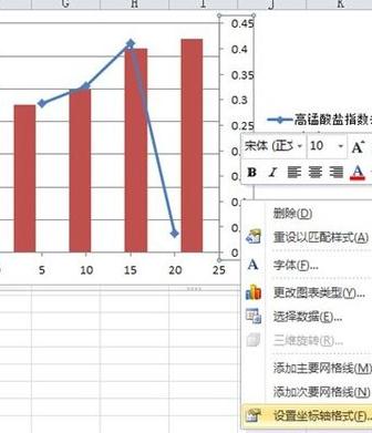
8. Setting of coordinate axis options.
In this example, the [maximum value] is fixed to 1, the [minimum value] is fixed to 0, the [major scale unit] is fixed to 0.2, and the [minor scale unit] only needs to be larger than the [major scale unit] 】As small as possible.
The above is the detailed content of How to add a graphic method for drawing column charts and line charts in excel2016. For more information, please follow other related articles on the PHP Chinese website!

Hot AI Tools

Undresser.AI Undress
AI-powered app for creating realistic nude photos

AI Clothes Remover
Online AI tool for removing clothes from photos.

Undress AI Tool
Undress images for free

Clothoff.io
AI clothes remover

Video Face Swap
Swap faces in any video effortlessly with our completely free AI face swap tool!

Hot Article
Hot Tools

Notepad++7.3.1
Easy-to-use and free code editor

SublimeText3 Chinese version
Chinese version, very easy to use

Zend Studio 13.0.1
Powerful PHP integrated development environment

Dreamweaver CS6
Visual web development tools

SublimeText3 Mac version
God-level code editing software (SublimeText3)
Hot Topics
 1387
1387
 52
52

 5 Things You Can Do in Excel for the Web Today That You Couldn't 12 Months Ago
Mar 22, 2025 am 03:03 AM
5 Things You Can Do in Excel for the Web Today That You Couldn't 12 Months Ago
Mar 22, 2025 am 03:03 AM
Excel web version features enhancements to improve efficiency! While Excel desktop version is more powerful, the web version has also been significantly improved over the past year. This article will focus on five key improvements: Easily insert rows and columns: In Excel web, just hover over the row or column header and click the " " sign that appears to insert a new row or column. There is no need to use the confusing right-click menu "insert" function anymore. This method is faster, and newly inserted rows or columns inherit the format of adjacent cells. Export as CSV files: Excel now supports exporting worksheets as CSV files for easy data transfer and compatibility with other software. Click "File" > "Export"
 How to Use LAMBDA in Excel to Create Your Own Functions
Mar 21, 2025 am 03:08 AM
How to Use LAMBDA in Excel to Create Your Own Functions
Mar 21, 2025 am 03:08 AM
Excel's LAMBDA Functions: An easy guide to creating custom functions Before Excel introduced the LAMBDA function, creating a custom function requires VBA or macro. Now, with LAMBDA, you can easily implement it using the familiar Excel syntax. This guide will guide you step by step how to use the LAMBDA function. It is recommended that you read the parts of this guide in order, first understand the grammar and simple examples, and then learn practical applications. The LAMBDA function is available for Microsoft 365 (Windows and Mac), Excel 2024 (Windows and Mac), and Excel for the web. E
 How to Create a Timeline Filter in Excel
Apr 03, 2025 am 03:51 AM
How to Create a Timeline Filter in Excel
Apr 03, 2025 am 03:51 AM
In Excel, using the timeline filter can display data by time period more efficiently, which is more convenient than using the filter button. The Timeline is a dynamic filtering option that allows you to quickly display data for a single date, month, quarter, or year. Step 1: Convert data to pivot table First, convert the original Excel data into a pivot table. Select any cell in the data table (formatted or not) and click PivotTable on the Insert tab of the ribbon. Related: How to Create Pivot Tables in Microsoft Excel Don't be intimidated by the pivot table! We will teach you basic skills that you can master in minutes. Related Articles In the dialog box, make sure the entire data range is selected (
 If You Don't Use Excel's Hidden Camera Tool, You're Missing a Trick
Mar 25, 2025 am 02:48 AM
If You Don't Use Excel's Hidden Camera Tool, You're Missing a Trick
Mar 25, 2025 am 02:48 AM
Quick Links Why Use the Camera Tool?
 You Need to Know What the Hash Sign Does in Excel Formulas
Apr 08, 2025 am 12:55 AM
You Need to Know What the Hash Sign Does in Excel Formulas
Apr 08, 2025 am 12:55 AM
Excel Overflow Range Operator (#) enables formulas to be automatically adjusted to accommodate changes in overflow range size. This feature is only available for Microsoft 365 Excel for Windows or Mac. Common functions such as UNIQUE, COUNTIF, and SORTBY can be used in conjunction with overflow range operators to generate dynamic sortable lists. The pound sign (#) in the Excel formula is also called the overflow range operator, which instructs the program to consider all results in the overflow range. Therefore, even if the overflow range increases or decreases, the formula containing # will automatically reflect this change. How to list and sort unique values in Microsoft Excel
 Use the PERCENTOF Function to Simplify Percentage Calculations in Excel
Mar 27, 2025 am 03:03 AM
Use the PERCENTOF Function to Simplify Percentage Calculations in Excel
Mar 27, 2025 am 03:03 AM
Excel's PERCENTOF function: Easily calculate the proportion of data subsets Excel's PERCENTOF function can quickly calculate the proportion of data subsets in the entire data set, avoiding the hassle of creating complex formulas. PERCENTOF function syntax The PERCENTOF function has two parameters: =PERCENTOF(a,b) in: a (required) is a subset of data that forms part of the entire data set; b (required) is the entire dataset. In other words, the PERCENTOF function calculates the percentage of the subset a to the total dataset b. Calculate the proportion of individual values using PERCENTOF The easiest way to use the PERCENTOF function is to calculate the single

 How to Format a Spilled Array in Excel
Apr 10, 2025 pm 12:01 PM
How to Format a Spilled Array in Excel
Apr 10, 2025 pm 12:01 PM
Use formula conditional formatting to handle overflow arrays in Excel Direct formatting of overflow arrays in Excel can cause problems, especially when the data shape or size changes. Formula-based conditional formatting rules allow automatic formatting to be adjusted when data parameters change. Adding a dollar sign ($) before a column reference applies a rule to all rows in the data. In Excel, you can apply direct formatting to the values or background of a cell to make the spreadsheet easier to read. However, when an Excel formula returns a set of values (called overflow arrays), applying direct formatting will cause problems if the size or shape of the data changes. Suppose you have this spreadsheet with overflow results from the PIVOTBY formula,
