
For the convenience of demonstration, create the following Excel table and generate an embedded histogram
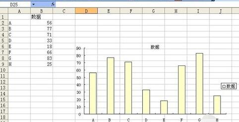
Double-click the column like
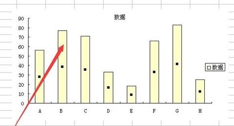
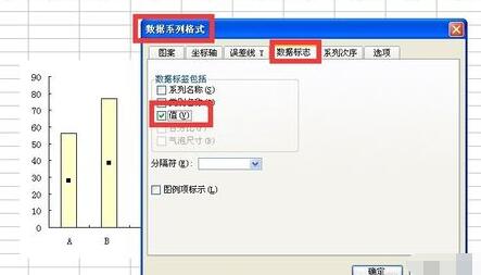
to pop up the data series format , set the data label to the value
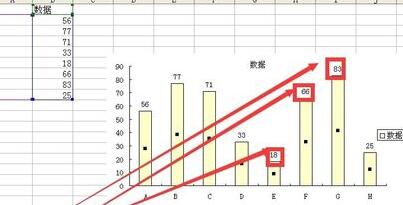
After setting, the value will be displayed on the icon
Double-click the data label
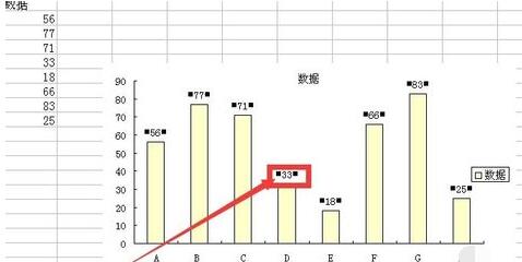
Pop-up data mark format
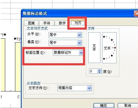
Set as follows, the label is within the mark, the display effect is as follows, the label value is a number, and the mark refers to the column
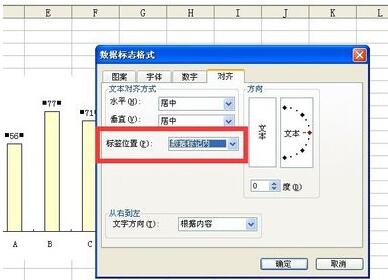
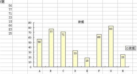
This is the effect of the label being centered
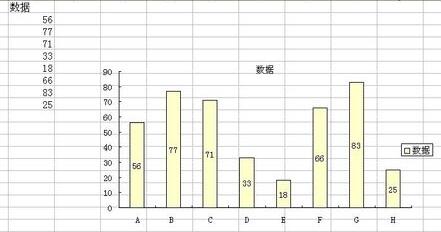
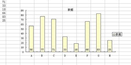
This is the effect of the label being inside the axis
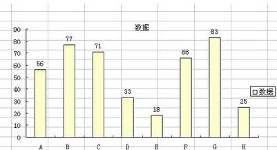
This is the effect of the label Effect outside data tags
Note that
tags refer to numbers and tags refer to columns.
The above is the detailed content of Detailed method to set the display position of data marks in Excel charts. For more information, please follow other related articles on the PHP Chinese website!


