
 Software Tutorial
Office Software
How to create a mixed data comparison chart of radar chart and pie chart in Excel
Software Tutorial
Office Software
How to create a mixed data comparison chart of radar chart and pie chart in Excel
How to create a mixed data comparison chart of radar chart and pie chart in Excel

Want to know how to merge radar charts with pie charts to show data comparison? PHP editor Youzi brings you detailed tutorials, allowing you to easily master the skills of making mixed data comparison charts in Excel and understand the steps to solve the problem.
First, add a column to the original data to calculate the proportion of each subsidiary in total sales, and the result is used as the data source of the pie chart. Select the sales data of each subsidiary and each product (i.e. A1:E6), select the [Insert] tab, click [Waterfall Chart → Radar Chart with Data Markers], select the inserted chart, and click [Chart Tools → Design] Style the chart as needed.
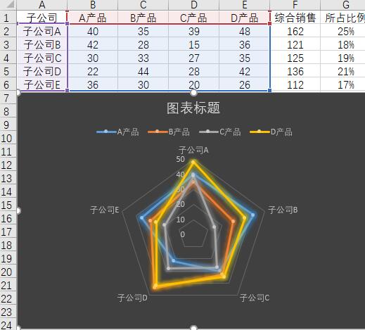
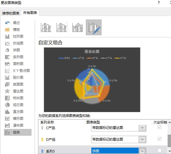
Select the pie chart data source (i.e. A2:A6, G2:G6), copy the data, select the chart, and paste; right-click the chart, select [Change Chart Type], and in the pop-up window Select [Combination], set the chart type of each product to [Radar Chart with Data Markers], and set the chart type of Series 5 to [Pie Chart].
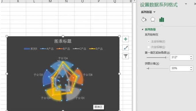
Right-click the pie chart in the chart, select [Format Data Series], and in the [Series Options] tab, adjust the starting angle of the first sector so that each pie The company represented by the chart corresponds to the data of the corresponding company in the radar chart; adjust the pie chart separation percentage.
Select the pie chart, set its fill color to [Solid Color Fill], and delete the label representing the company in the radar chart. Select the pie chart and click [Chart Tools→Add Chart Elements→Data Labels→Data Annotation] to add numerical labels to the pie chart. Right-click the network line of the radar chart, select [Set Grid Line Format], and set it as needed in the right window.
Finally, delete [Series 5] in the legend and change the chart title. Of course, the chart can be further beautified as needed. In this way, the pie chart and the radar chart are combined, and the comparison between the data is obvious.
Tips:
Of course, you can also change the pie chart to a donut chart as needed. You also need to adjust the starting angle of the first sector and adjust the inner diameter of the donut chart to further beautify it. Combination chart.
The above is the detailed content of How to create a mixed data comparison chart of radar chart and pie chart in Excel. For more information, please follow other related articles on the PHP Chinese website!

Hot AI Tools

Undresser.AI Undress
AI-powered app for creating realistic nude photos

AI Clothes Remover
Online AI tool for removing clothes from photos.

Undress AI Tool
Undress images for free

Clothoff.io
AI clothes remover

AI Hentai Generator
Generate AI Hentai for free.

Hot Article
Hot Tools

Notepad++7.3.1
Easy-to-use and free code editor

SublimeText3 Chinese version
Chinese version, very easy to use

Zend Studio 13.0.1
Powerful PHP integrated development environment

Dreamweaver CS6
Visual web development tools

SublimeText3 Mac version
God-level code editing software (SublimeText3)
Hot Topics


 Your Calculator App Can Be Replaced By Microsoft Excel
Mar 06, 2025 am 06:01 AM
Your Calculator App Can Be Replaced By Microsoft Excel
Mar 06, 2025 am 06:01 AM
Ditch the Calculator: Why and How to Use Excel for All Your Calculations I haven't touched a calculator in ages. Why? Because Microsoft Excel handles all my calculations with ease, and it can do the same for you. Why Excel Trumps a Calculator While
 Don't Create Tables in Word: Use Excel Instead
Mar 06, 2025 am 03:04 AM
Don't Create Tables in Word: Use Excel Instead
Mar 06, 2025 am 03:04 AM
Creating tables in Word, although improved, is still cumbersome and sometimes brings more problems. This is why you should always create tables in Microsoft Excel. Why is it better to create tables in Excel? In short, Word is a word processor, while Excel is a data processor. So Word is not built for the best table creation, but its similar product, Excel. Here are just some of the reasons why creating tables in Excel is better than using Microsoft Word: Although it is surprising that you can use many Excel-like features in Microsoft Word tables, in Excel you
 How to Reduce the Gaps Between Bars and Columns in Excel Charts (And Why You Should)
Mar 08, 2025 am 03:01 AM
How to Reduce the Gaps Between Bars and Columns in Excel Charts (And Why You Should)
Mar 08, 2025 am 03:01 AM
Enhance Your Excel Charts: Reducing Gaps Between Bars and Columns Presenting data visually in charts significantly improves spreadsheet readability. Excel excels at chart creation, but its extensive menus can obscure simple yet powerful features, suc
 How to Use the AVERAGEIF and AVERAGEIFS Functions in Excel
Mar 07, 2025 am 06:03 AM
How to Use the AVERAGEIF and AVERAGEIFS Functions in Excel
Mar 07, 2025 am 06:03 AM
Quick View of AVERAGEIF and AVERAGEIFS Functions in Excel Excel's AVERAGEIF and AVERAGEIFS functions can be used to calculate the average value of a dataset. However, unlike simpler AVERAGE functions, they are able to include or exclude specific values in the calculation. How to use the AVERAGEIF function in Excel Excel's AVERAGEIF function allows you to calculate the average value of a filtered dataset based on a single condition set. AVERAGEIF function syntax The AVERAGEIF function contains three parameters: =AVERAGEIF(x,y,z)
 5 Things You Can Do in Excel for the Web Today That You Couldn't 12 Months Ago
Mar 22, 2025 am 03:03 AM
5 Things You Can Do in Excel for the Web Today That You Couldn't 12 Months Ago
Mar 22, 2025 am 03:03 AM
Excel web version features enhancements to improve efficiency! While Excel desktop version is more powerful, the web version has also been significantly improved over the past year. This article will focus on five key improvements: Easily insert rows and columns: In Excel web, just hover over the row or column header and click the " " sign that appears to insert a new row or column. There is no need to use the confusing right-click menu "insert" function anymore. This method is faster, and newly inserted rows or columns inherit the format of adjacent cells. Export as CSV files: Excel now supports exporting worksheets as CSV files for easy data transfer and compatibility with other software. Click "File" > "Export"
 Microsoft Excel Keyboard Shortcuts: Printable Cheat Sheet
Mar 14, 2025 am 12:06 AM
Microsoft Excel Keyboard Shortcuts: Printable Cheat Sheet
Mar 14, 2025 am 12:06 AM
Master Microsoft Excel with these essential keyboard shortcuts! This cheat sheet provides quick access to the most frequently used commands, saving you valuable time and effort. It covers essential key combinations, Paste Special functions, workboo
 How to Use LAMBDA in Excel to Create Your Own Functions
Mar 21, 2025 am 03:08 AM
How to Use LAMBDA in Excel to Create Your Own Functions
Mar 21, 2025 am 03:08 AM
Excel's LAMBDA Functions: An easy guide to creating custom functions Before Excel introduced the LAMBDA function, creating a custom function requires VBA or macro. Now, with LAMBDA, you can easily implement it using the familiar Excel syntax. This guide will guide you step by step how to use the LAMBDA function. It is recommended that you read the parts of this guide in order, first understand the grammar and simple examples, and then learn practical applications. The LAMBDA function is available for Microsoft 365 (Windows and Mac), Excel 2024 (Windows and Mac), and Excel for the web. E
 If You Don't Use Excel's Hidden Camera Tool, You're Missing a Trick
Mar 25, 2025 am 02:48 AM
If You Don't Use Excel's Hidden Camera Tool, You're Missing a Trick
Mar 25, 2025 am 02:48 AM
Quick Links Why Use the Camera Tool?
