

Avalonjs creates responsive waterfall flow effects_javascript skills

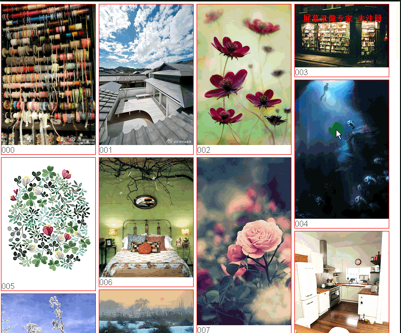
The layout is not based on float, nor is it based on absolute positioning. Just look at the html and css at the bottom. There is no annoying html insertion, the code is very refreshing
function getIndex(index) {
if (index < 10) {
index = "00" + index;
} else if (index < 100) {
index = "0" + index;
}
return index;
}
var $ = function(id) {
return document.getElementById(id);
};
require([ "avalon-min" ], function(avalon) {
var waterfall = {
load_items : null,
loaded_items:[],
col_num : 0,// 列数
waterfall_model : null,
col_width : 200,
loaded_num : 0,
init_num : 0,
loading : false,
start:0,
resizing:false,
find_shortest_col : function() {
// 找出最小高度的列
var a = avalon($('row0')).height(), min_i = 0;
for ( var i = 1; i < this.col_num; i++) {
var b = avalon($('row' + i)).height();
if (b < a) {
min_i = i;
a = b;
}
}
return min_i;
},
init : function(data) {
this.load_items = data;
this.loaded_items=this.loaded_items.concat(data);
this.waterfall_model = waterfall_model;
this.col_num = Math.floor(avalon(window).width()
/ this.col_width);
this.init_num = this.col_num;
for ( var j = 0; j < this.col_num; j++) {
waterfall_model.img_list.push([]);
}
for ( var j = 0; j < this.col_num; j++) {
// 第一行图片
var a={};
a.src=getIndex(data[j].src);
a.height=data[j].height;
a.text=data[j].text;
waterfall_model.img_list[j].push(a);
}
this.start=this.col_num;
},
add_item : function(i) {
var a = this.find_shortest_col();
var b={};
var c=this.load_items[this.init_num+i];
if(c){
b.src=getIndex(c.src);
b.height=c.height;
b.text=c.text;
waterfall_model.img_list[a].push(b);
}
},
resize_item:function(i){
//console.log(i);
var a = this.find_shortest_col();
var b={};
var c=this.loaded_items[this.init_num+i];
if(c){
b.src=getIndex(c.src);
b.height=c.height;
b.text=c.text;
waterfall_model.img_list[a].push(b);
}
}
};
var waterfall_model = avalon.define("waterfall",function(vm) {// vm
vm.img_list = [];
vm.rendered = function() {// 每次图片加载渲染后执行
if(waterfall.resizing){
if (waterfall.loaded_num+ waterfall.init_num<waterfall.loaded_items.length){
waterfall.loaded_num++;
waterfall.resize_item(waterfall.loaded_num);
//waterfall.start++;
}
}else{
if (waterfall.loaded_num + waterfall.init_num <waterfall.load_items.length){
waterfall.loaded_num++;
waterfall.add_item(waterfall.loaded_num);
waterfall.start++;
}
}
};
});
avalon.config({
debug:false
});
avalon.scan();
function debouncer( func , timeout ) {
var timeoutID , timeout = timeout || 200;
return function () {
var scope = this , args = arguments;
clearTimeout( timeoutID );
timeoutID = setTimeout( function () {
func.apply( scope , Array.prototype.slice.call( args ) );
} , timeout );
}
}
avalon.post("http://localhost/css/test.php?start=0", function(data) {
// 加载第一次
waterfall.init(data);
}, "json");
window.onscroll =debouncer( function ( e ) {
var scrollTop = avalon(window).scrollTop(), windowHeight = avalon(
window).height(), documentHeight = avalon(document).height();
if (windowHeight + scrollTop==documentHeight) {
avalon.post("http://localhost/css/test.php?start="+(waterfall.start), function(data) {
// 加载第一次
waterfall.resizing=false;
waterfall.load_items=data;
waterfall.loaded_items=waterfall.loaded_items.concat(data);
waterfall.loaded_num =waterfall.init_num=0;
waterfall.add_item(0);
}, "json");
}
});
window.onresize = debouncer( function ( e ) {
var windowWidth = avalon(window).width(), k = Math
.floor(windowWidth / 200), detect_left = avalon(
$('waterFallDetect')).offset().left;
if (Math.abs(detect_left) >= 199) {
waterfall.col_num = Math.floor(avalon(window).width()
/ waterfall.col_width);
waterfall_model.img_list = [];
for ( var j = 0; j < waterfall.col_num; j++) {
waterfall_model.img_list.push([]);
}
waterfall.resizing=true;
waterfall.loaded_num =waterfall.init_num=0;
//waterfall.start=0;
waterfall.resize_item(0);
}
},30) ;
});html
<div id='wrap' ms-controller="waterfall">
  <ul ms-each-els="img_list" id='wrap_row'>
    <li ms-each-el="els" ms-attr-id='row{{$index}}'
      data-each-rendered='rendered'>
      <p>
        <img
          ms-src="http://cued.xunlei.com/demos/publ/img/P_{{el.src}}.jpg"
          width='192' ms-attr-height='{{el.height}}'> <span>{{el.src}}</span>
      </p>
    </li>
    <li id='waterFallDetect' ms-if='$last'></li>
  </ul>
</div>css
#wrap ul li {
display: inline-block;
*display: inline;
zoom: 1;
vertical-align: top;
font-size: 16px;
}
#wrap ul li p {
margin: 5px 2.5px;
border: 1px solid red;
min-width: 192px;
min-height: 100px;
}
#wrap span {
display: block;
}
#waterFallDetect {
width: 192px;
height: 100px;
border: 1px solid red;
}The above is the entire content of this article, I hope you all like it.

Hot AI Tools

Undresser.AI Undress
AI-powered app for creating realistic nude photos

AI Clothes Remover
Online AI tool for removing clothes from photos.

Undress AI Tool
Undress images for free

Clothoff.io
AI clothes remover

Video Face Swap
Swap faces in any video effortlessly with our completely free AI face swap tool!

Hot Article
Hot Tools

Notepad++7.3.1
Easy-to-use and free code editor

SublimeText3 Chinese version
Chinese version, very easy to use

Zend Studio 13.0.1
Powerful PHP integrated development environment

Dreamweaver CS6
Visual web development tools

SublimeText3 Mac version
God-level code editing software (SublimeText3)
Hot Topics
 1392
1392
 52
52

 Tutorial on using CSS to implement responsive image automatic carousel effect
Nov 21, 2023 am 08:37 AM
Tutorial on using CSS to implement responsive image automatic carousel effect
Nov 21, 2023 am 08:37 AM
With the popularity of mobile devices, web design needs to take into account factors such as device resolution and screen size of different terminals to achieve a good user experience. When implementing responsive design of a website, it is often necessary to use the image carousel effect to display the content of multiple images in a limited visual window, and at the same time, it can also enhance the visual effect of the website. This article will introduce how to use CSS to achieve a responsive image automatic carousel effect, and provide code examples and analysis. Implementation ideas The implementation of responsive image carousel can be implemented through CSS flex layout. exist
 How to create a responsive tag cloud using HTML, CSS and jQuery
Oct 27, 2023 am 10:46 AM
How to create a responsive tag cloud using HTML, CSS and jQuery
Oct 27, 2023 am 10:46 AM
How to use HTML, CSS and jQuery to create a responsive tag cloud. A tag cloud is a common web element used to display various keywords or tags. It usually displays the importance of keywords in different font sizes or colors. In this article, we will introduce how to use HTML, CSS and jQuery to create a responsive tag cloud, and give specific code examples. Creating the HTML Structure First, we need to create the basic structure of the tag cloud in HTML. You can use an unordered list to represent tags
 Tutorial on implementing responsive sliding menu using CSS
Nov 21, 2023 am 08:08 AM
Tutorial on implementing responsive sliding menu using CSS
Nov 21, 2023 am 08:08 AM
A tutorial on using CSS to implement a responsive sliding menu requires specific code examples. In modern web design, responsive design has become an essential skill. To accommodate different devices and screen sizes, we need to add a responsive menu to the website. Today, we will use CSS to implement a responsive sliding menu and provide you with specific code examples. First, let's take a look at the implementation. We will create a navigation bar that automatically collapses when the screen width is smaller than a certain threshold and expands by clicking the menu button.
 How to create a responsive scrolling notification bar using HTML, CSS and jQuery
Oct 26, 2023 pm 12:12 PM
How to create a responsive scrolling notification bar using HTML, CSS and jQuery
Oct 26, 2023 pm 12:12 PM
How to use HTML, CSS and jQuery to create a responsive scrolling notification bar. With the popularity of mobile devices and the increase in user requirements for website access experience, designing a responsive scrolling notification bar has become more and more important. Responsive design ensures that the website displays properly on different devices and that users can easily view notification content. This article will introduce how to use HTML, CSS and jQuery to create a responsive scrolling notification bar, and provide specific code examples. First we need to create the HTM
 How to create a responsive carousel layout using HTML and CSS
Oct 20, 2023 pm 04:24 PM
How to create a responsive carousel layout using HTML and CSS
Oct 20, 2023 pm 04:24 PM
How to create a responsive carousel layout using HTML and CSS Carousels are a common element in modern web design. It can attract the user's attention, display multiple contents or images, and switch automatically. In this article, we will introduce how to create a responsive carousel layout using HTML and CSS. First, we need to create a basic HTML structure and add the required CSS styles. The following is a simple HTML structure: <!DOCTYPEhtml&g
 How to use JavaFX to build responsive UI interfaces in Java 9
Jul 30, 2023 pm 06:36 PM
How to use JavaFX to build responsive UI interfaces in Java 9
Jul 30, 2023 pm 06:36 PM
How to use JavaFX to build a responsive UI interface in Java9 Introduction: In the development process of computer applications, the user interface (UI) is a very important part. A good UI can improve the user experience and make the application more attractive. JavaFX is a graphical user interface (GUI) framework on the Java platform. It provides a rich set of tools and APIs to quickly build interactive UI interfaces. In Java 9, JavaFX has become a JavaSE
 How to use React to develop a responsive backend management system
Sep 28, 2023 pm 04:55 PM
How to use React to develop a responsive backend management system
Sep 28, 2023 pm 04:55 PM
How to use React to develop a responsive backend management system. With the rapid development of the Internet, more and more companies and organizations need an efficient, flexible, and easy-to-manage backend management system to handle daily operations. As one of the most popular JavaScript libraries currently, React provides a concise, efficient and maintainable way to build user interfaces. This article will introduce how to use React to develop a responsive backend management system and give specific code examples. Create a React project first
 Tips for Responsive Website Development with Webman
Aug 14, 2023 pm 12:27 PM
Tips for Responsive Website Development with Webman
Aug 14, 2023 pm 12:27 PM
Tips for Responsive Website Development with Webman In today’s digital age, people are increasingly relying on mobile devices to access the Internet. In order to provide a better user experience and adapt to different screen sizes, responsive website development has become an important trend. As a powerful framework, Webman provides us with many tools and technologies to realize the development of responsive websites. In this article, we will share some tips for using Webman for responsive website development, including how to set up media queries,
