
Confused about how to create a risk coordinate chart in Excel? Don’t worry, PHP editor Apple has brought you a detailed guide! This tutorial will delve into the concept of risk coordinate charts, taking you step-by-step through creating your own chart. Whether you're a beginner or an experienced Excel user, this guide provides you with clear, easy-to-follow, step-by-step instructions. By reading the following, you will acquire the knowledge and skills required to create a risk coordinate map.
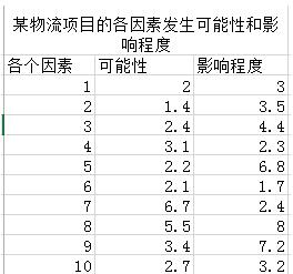
1. Select the data area - click Insert - Recommended chart.

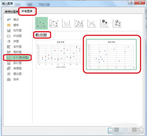
2. All charts - scatter plots.
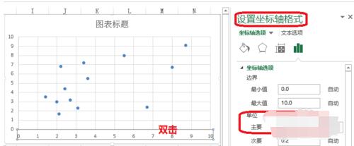
3. Double-click - Set axis format - Unit (set as needed).
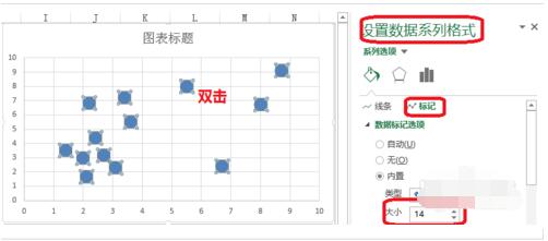
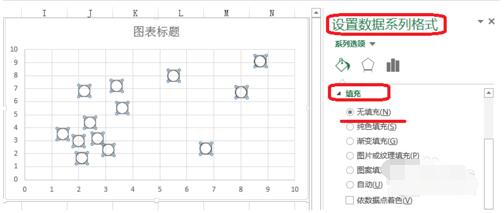
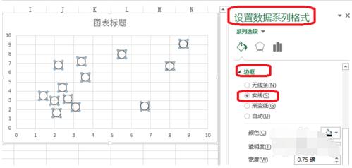
4. Double-click - Format data series - Mark (adjust the size of data mark options).
Padding - No padding.
Border - solid line.
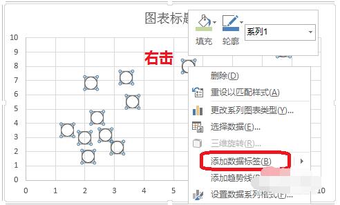
#5. Right-click - Add data label.
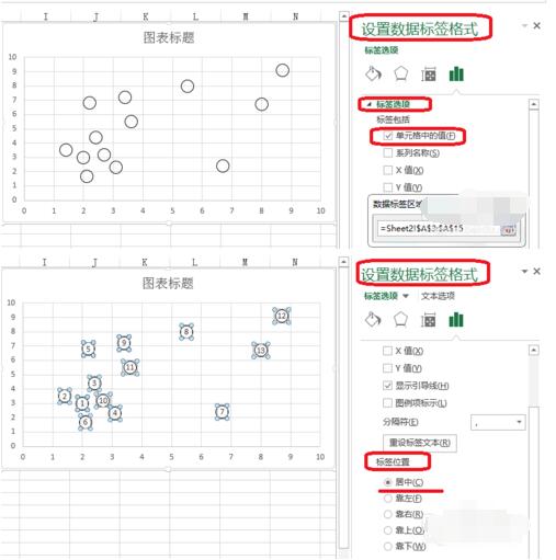
6. Double-click - Set data label format - Label options - Pass the data label area (select as needed).
Label position—centered.
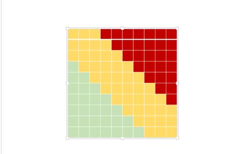
7. Use PPT to create a table as shown in the picture and save it as a picture.
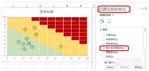
8. Double-click the drawing area - set the drawing area format - picture or textual fill - insert the picture from the file.
The above is the detailed content of How to make Excel risk coordinate chart_Excel risk coordinate chart method. For more information, please follow other related articles on the PHP Chinese website!


