手机网站宽度自动适应手机屏幕
其中:
width=device-width :表示宽度是设备屏幕的宽度
initial-scale=1.0 :表示初始的缩放比例
minimum-scale=0.5 :表示最小的缩放比例
maximum-scale=2.0 :表示最大的缩放比例
user-scalable=yes :表示用户是否可以调整缩放比例
如果希望打开网页就自动以原始比例显示,不允许用户修改的话,则将以上代码修改为:
方法二:
把页面最顶部类似下面这段代码:
.......>
替换为:
1
<code class="keyword" style="margin:0px !important;padding:0px !important;outline:0px !important;float:none !important;vertical-align:baseline !important;position:static !important;left:auto !important;top:auto !important;right:auto !important;bottom:auto !important;height:auto !important;width:auto !important;line-height:1.1em !important;font-family:Consolas, 'Bitstream Vera Sans Mono', 'Courier New', Courier, monospace !important;font-weight:bold !important;font-size:1em !important;min-height:auto !important;color:#006699 !important;background:none !important;">meta name="viewport" content="width=device-width, initial-scale=1.0, minimum-scale=1.0, maximum-scale=1.0, user-scalable=no" />
1
ttp://www.wapforum.org/DTD/xhtml-mobile10.dtd" style="color:#FF0000;">http://www.wapforum.org/DTD/xhtml-mobile10.dtd">

Hot AI Tools

Undresser.AI Undress
AI-powered app for creating realistic nude photos

AI Clothes Remover
Online AI tool for removing clothes from photos.

Undress AI Tool
Undress images for free

Clothoff.io
AI clothes remover

AI Hentai Generator
Generate AI Hentai for free.

Hot Article

Hot Tools

Notepad++7.3.1
Easy-to-use and free code editor

SublimeText3 Chinese version
Chinese version, very easy to use

Zend Studio 13.0.1
Powerful PHP integrated development environment

Dreamweaver CS6
Visual web development tools

SublimeText3 Mac version
God-level code editing software (SublimeText3)

Hot Topics
 1376
1376
 52
52
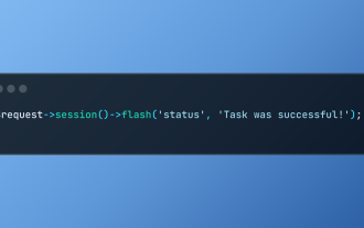
 Working with Flash Session Data in Laravel
Mar 12, 2025 pm 05:08 PM
Laravel simplifies handling temporary session data using its intuitive flash methods. This is perfect for displaying brief messages, alerts, or notifications within your application. Data persists only for the subsequent request by default: $request-
 cURL in PHP: How to Use the PHP cURL Extension in REST APIs
Mar 14, 2025 am 11:42 AM
The PHP Client URL (cURL) extension is a powerful tool for developers, enabling seamless interaction with remote servers and REST APIs. By leveraging libcurl, a well-respected multi-protocol file transfer library, PHP cURL facilitates efficient execution of various network protocols, including HTTP, HTTPS, and FTP. This extension offers granular control over HTTP requests, supports multiple concurrent operations, and provides built-in security features.
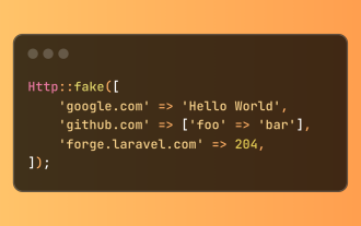
 Simplified HTTP Response Mocking in Laravel Tests
Mar 12, 2025 pm 05:09 PM
Laravel provides concise HTTP response simulation syntax, simplifying HTTP interaction testing. This approach significantly reduces code redundancy while making your test simulation more intuitive. The basic implementation provides a variety of response type shortcuts: use Illuminate\Support\Facades\Http; Http::fake([ 'google.com' => 'Hello World', 'github.com' => ['foo' => 'bar'], 'forge.laravel.com' =>
 Alipay PHP SDK transfer error: How to solve the problem of 'Cannot declare class SignData'?
Apr 01, 2025 am 07:21 AM
Alipay PHP...
 12 Best PHP Chat Scripts on CodeCanyon
Mar 13, 2025 pm 12:08 PM
Do you want to provide real-time, instant solutions to your customers' most pressing problems? Live chat lets you have real-time conversations with customers and resolve their problems instantly. It allows you to provide faster service to your custom
 Explain the concept of late static binding in PHP.
Mar 21, 2025 pm 01:33 PM
Article discusses late static binding (LSB) in PHP, introduced in PHP 5.3, allowing runtime resolution of static method calls for more flexible inheritance.Main issue: LSB vs. traditional polymorphism; LSB's practical applications and potential perfo
 Customizing/Extending Frameworks: How to add custom functionality.
Mar 28, 2025 pm 05:12 PM
The article discusses adding custom functionality to frameworks, focusing on understanding architecture, identifying extension points, and best practices for integration and debugging.
 Framework Security Features: Protecting against vulnerabilities.
Mar 28, 2025 pm 05:11 PM
Article discusses essential security features in frameworks to protect against vulnerabilities, including input validation, authentication, and regular updates.


