

Créer des effets en CSS

Écrit par Oscar Jite-Orimiono✏️
En tant que développeur frontend, vous avez probablement entendu l'analogie maison utilisée pour décrire HTML, CSS et JavaScript. HTML est la structure (murs, pièces, portes, etc.), CSS est le décorateur (peinture, aménagement et mobilier), tandis que JavaScript apporte des fonctionnalités avec l'électricité et la plomberie.
Regardons CSS séparément, d'abord parce que c'est incroyable, mais ensuite, CSS est puissant en soi et peut apporter un certain niveau de fonctionnalités là où JavaScript n'est pas nécessaire dans certains cas. Avec CSS, votre seule limite est votre imagination, mais il vaut mieux ne pas la laisser se déchaîner, car vous devez maintenir un haut niveau de fonctionnalités.
Dans cet article, vous apprendrez à créer des effets 3D avec CSS en utilisant des propriétés et des opérations pertinentes qui contrôlent les éléments dans un espace virtuel 3D, et nous aborderons également les illusions visuelles avec des ombres et de la lumière.
Comment savoir si quelque chose est en 3D ?
Les objets dans l'espace 3D ont trois dimensions : la longueur, la largeur – techniquement identique à la « longueur », mais communément considérée comme le côté le plus court, et la hauteur (ou la profondeur). Vous ne voyez qu’en 2D lorsque vous regardez un écran, vous aurez donc besoin d’une propriété CSS telle que transform pour créer des effets 3D.
La propriété transform comporte plusieurs opérations qui contrôlent les dimensions et la position 3D d'un élément. Vous contrôlez la position horizontale avec TranslateX(), la position verticale avec TranslateY() et la hauteur et la profondeur avec TranslateZ().
Considérez cette illustration. Nous avons deux éléments rectangulaires : un petit et l’autre grand. Le petit élément est l'enfant, et il est imbriqué dans le plus grand élément parent : 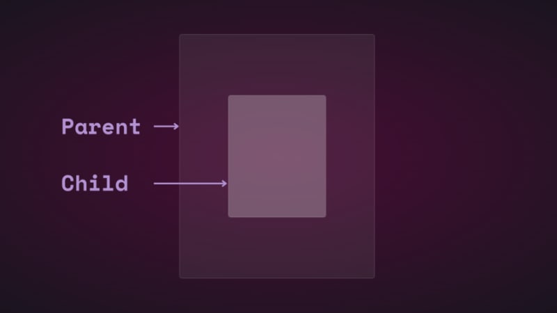
Si vous modifiez la position de l'élément enfant verticalement et horizontalement à l'aide de la traduction, vous le verrez bouger : 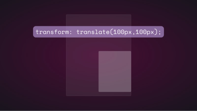
Si vous essayez de modifier la position de l'élément enfant sur l'axe z en ajoutant un translationZ(), rien ne se passera. L'axe z est perpendiculaire à la fenêtre, donc l'élément enfant doit apparaître plus petit lorsqu'il s'éloigne de l'écran et plus grand lorsqu'il se rapproche, n'est-ce pas ? C’est ainsi que cela fonctionne dans le monde réel lorsque l’on regarde un objet d’en haut. Cependant, les choses ne fonctionnent pas de la même manière virtuellement car il n’y a pas de perspective.
En CSS, la propriété perspective et l'opérateur perspective() sont très importants pour le fonctionnement des transformations 3D. La perspective est votre point de vue et crée l’illusion de profondeur et de hauteur.
La propriété perspective va sur l'élément parent, tandis que perspective() fonctionne avec la propriété transform sur l'élément enfant. Ils font la même chose – la plupart du temps.
Voyons comment la propriété perspective affecte TranslateZ(). Nous utiliserons une animation simple pour démontrer.
Voici le HTML et le CSS des éléments parent et enfant :
<div class="parent">
    <div class="child">
    </div>
  </div>

.parent {
  display: flex;
  justify-content: center;
  align-items: center;
  background: rgba(255, 255, 255, 0.07);
  width: 400px;
  height: 500px;
  border: 0.5px solid rgba(255, 255, 255, 0.15);
  border-radius: 5px;
  z-index: 0;
}
.child {
  background: rgba(255, 255, 255, 0.25);
  width: 200px;
  height: 250px;
  border: 1px solid rgba(255, 255, 255, 0.15);
  border-radius: 5px;
  z-index: 1;
}
Tout d'abord, ajoutez une perspective à l'élément parent, puis ajoutez l'animation de transformation à l'enfant :
.parent{
  perspective: 1000px;
}
.child{
   animation: transform 5s infinite ease-in-out alternate-reverse;
}
@keyframes transform{
  0%{
    transform: translateZ(-200px)
  }
  100%{
    transform: translateZ(200px)
  }
}
Et voici le résultat : 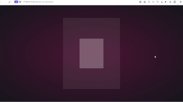
Vous obtiendrez le même résultat si vous utilisez l’opérateur perspective(). C'est une autre histoire lorsqu'il est utilisé avec rotate().
Faisons pivoter l'enfant le long de l'axe des x et voyons ce qui se passe :
.child{
  transform: perspective(10px) rotateX(2deg);
}
Voici une capture d'écran : 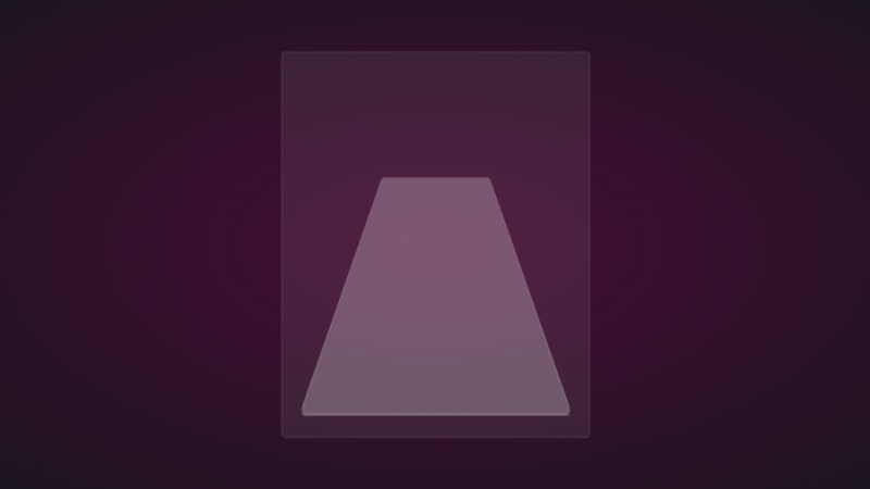
Si nous ajoutons une petite quantité de translation sur l’axe z, voici ce que vous obtenez : 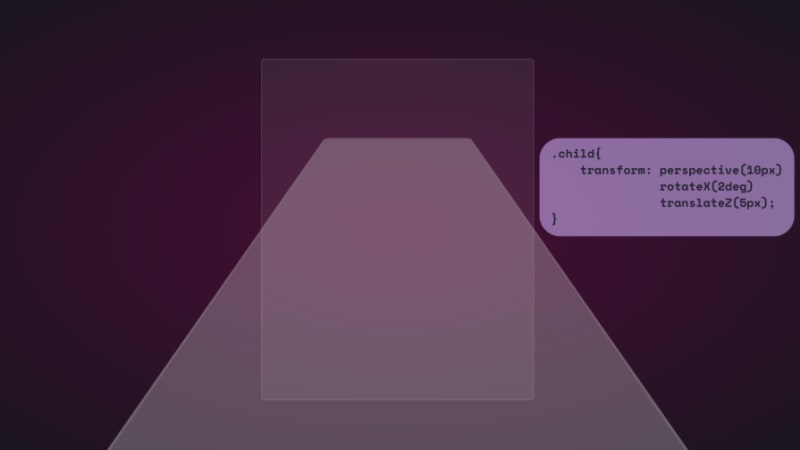
Pour le plaisir, voici jusqu'où cela s'étend : 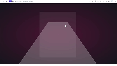
C’est comme si vous étiez à la surface de l’élément. Ce serait formidable si vous pouviez regarder cela via un casque VR.
Nous pouvons également utiliser la propriété autonome :
.parent {
  perspective: 10px;
}
.child {
  transform: rotateX(2deg) translateZ(5px);
}
Le résultat est le même, mais il ne débordera pas au-delà de la fenêtre. Ils ont tous deux leurs cas d’utilisation, et nous les verrons, ainsi que le reste des opérations de transformation, à l’œuvre au fur et à mesure que nous avançons.
Notez que la petite valeur de perspective utilisée dans l'exemple ci-dessus visait à exagérer l'effet 3D afin que vous puissiez voir comment il fonctionne. Vous voudriez surtout regarder l’élément d’en haut, donc une valeur beaucoup plus grande, jusqu’à 1 000 px, suffira. De petites valeurs de perspective font apparaître les éléments plus 3D.
Voici un CodePen avec une animation de transformation 3D.
Il est temps de passer à la partie amusante et de créer des effets 3D avec CSS !
Reflection and shadow
How objects interact with light is another way to tell they’re in 3D space. We can use the perspective() operator to create reflections and shadows in CSS to generate the illusion that an element is floating in 3D space.
3D text reflection
This example will feature text, but you can use other HTML elements:
<div class="content">
    <h1>Text in space</h1>
  </div>
We’re creating a reflection, so we need light. You’ll need the text-shadow property to create this light effect:
.content h1 {
  position: relative;
  font-size: 5rem;
  font-weight: 600;
  color: #fff;
  margin: 3px;
  text-shadow: 0px 0px 10px #b393d350, 0px 0px 20px #b393d350;
  text-transform: uppercase;
}
You should have glowing text at this point: 
It’s time to add the reflection using a pseudo-element:
  .content h1::before {
    content: "";
    position: absolute;
    top: 80%;
    left: 0;
    height: 100%;
    width: 100%;
    background: #b393d3;
    transform: perspective(10px) rotateX(10deg) scale(1,0.2);
    filter: blur(1em);
    opacity: 0.5;
  }
First, we give the pseudo-element the same dimensions as the text. Then we add a background with the same color as the text-shadow. Next, we add the transform property with three operations.
We’ve already seen how the first two work, so let’s talk about scale(). Remember how the child element stretches beyond the viewport? This prevents that by resizing the element along the x and y directions.
In this example, the reflection we created with the pseudo-element keeps its original size on the x-axis but is reduced to less than half on the y-axis. The opacity and filter make it look like the light fades the further it moves from the text: 
The text looks like it’s floating and reflecting light off the floor.
3D shadow
We can also create shadows using a similar method to the light. Let’s work with an image this time.
Here’s the image we’ll work with for this example: 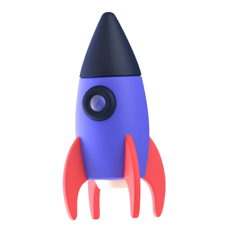
It’s nice to have the shadow match the shape and size of the element. In this case, we have a rocket, and this means our shadow should be round. Consequently, there’s no need for the perspective() operator.
Here’s the HTML:
<div class="content">
    <div class="rocket">
      <img src="rocket.png" alt="">
    </div>
  </div>
In CSS, go ahead and give the image any dimensions you want, then add a pseudo-element below it:
.rocket::before {
  content: "";
  position: absolute;
  bottom: -10%;
  left: 0;
  height: 50px;
  width: 100%;
  border-radius: 50%;
  background: radial-gradient(rgba(0, 0, 0, 0.8), transparent, transparent);
  transition: 0.5s;
}
The border-radius of 50 percent gives it an oval shape. You can add more height or a more specific width if you'd like. Shadows are black most of the time, so the background is a blurry radial-gradient fading from black to transparent.
Here’s a screenshot of how it should look at this point: 
Finally, let’s add some animation:
.rocket:hover img{
  transform: translateY(-40px);
}
.rocket:hover::before {
  opacity: 0.8;
  transform: scale(0.8);
}
This will move the rocket up and down, and the shadow will change as it moves. Hover on the rocket in the CodePen to see this 3D effect.
3D text animation
You can create 3D text with the CSS box-shadow property. You’ll need multiple shadow layers to create this effect.
Here’s the HTML:
<div class="content">
    <h1>3D text in 3D space</h1>
  </div>
Next, we need CSS to turn it into 3D text. We’ll use perspective and transform to tilt the text at an angle:
.content {
  position: relative;
  transform: translate(-50%, -50%);
  display: flex;
  align-items: center;
  justify-content: center;
  text-align: center;
  perspective: 1500px;
  transform-style: preserve-3d;
}
.content h1 {
  font-size: 5rem;
  font-weight: 600;
  color: #b393d3;
  text-shadow: 1px 4px 1px #480d35,
               1px 5px 1px #480d35,
               1px 6px 1px #480d35,/* to create the sides*/
               1px 10px 5px rgba(16, 16, 16, 0.5),
               1px 15px 10px rgba(16, 16, 16, 0.4),
               1px 20px 30px rgba(16, 16, 16, 0.3); /* real shadow */
  margin: 3px;
  transform: rotateX(15deg) rotateY(-20deg) rotateZ(10deg);
  text-transform: uppercase;
Here’s how the text should look at this point: 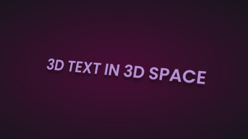
Now let’s add some animation:
.content:hover h1{
  transform: rotateX(2deg) rotateY(0deg) rotateZ(0deg);
  font-size: 4rem;
  transition: 500ms ease-in-out;
}
Here’s the 3D text plus tilt on hover effect on CodePen.
3D tilt effect
Let’s work with an image this time, and we’ll use the one below: 
Here’s the HTML:
<div class="text">
      <h2>Hover on the image</h2>
      <p>It uses a combination of all the rotate operators</p>
      <div class="tilt-img">
        <img src="7.jpg" alt="">
      </div>
    </div>
You could use a background image, but what’s important is that there’s a clear parent and child element.
In the CSS, use the transform property tilt the image at an angle, then reset it on hover:
.tilt-img {
  width: 600px;
  height: auto;
  margin-top: 20px;
  perspective: 1000px;
}
.tilt-img img {
  width: 100%;
  height: 100%;
  object-fit: contain;
  border-radius: 10px;
 transform: rotateX(15deg) rotateY(-5deg) rotateZ(1deg);
  box-shadow: 5px 5px 2px rgba(0, 0, 0, 0.5);
  transition: 2s;
}
.tilt-img:hover img{
  transform: none;
  box-shadow: 0px 2px 3px rgba(0, 0, 0, 0.5);
}
You can reverse it and add the tilt on hover, or change the transform values:
See the 3D image tilt with CSS on CodePen.
Tilt and mouse tracking
Here, we’re going to make an element tilt and follow the movement of the mouse when you hover over it. We’re going to work with vanilla-tilt.js, a JavaScript library.
Here’s what we’re aiming for: 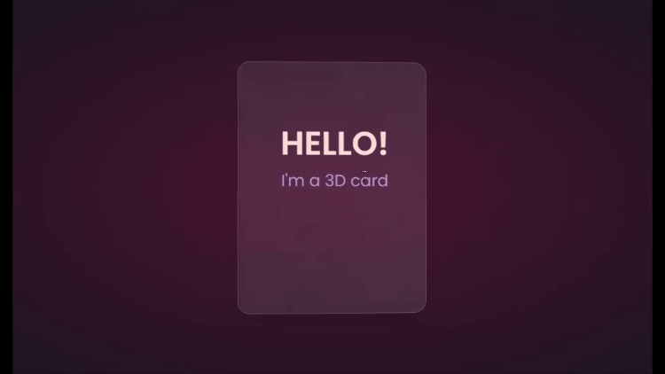
We’ll start with HTML, creating a card and some text:
<div class="box">
    <div class="elements">
      <h2>Hello!</h2>
      <p>I'm a 3D card</p>
    </div>
    <div class="card">
    </div>
  </div>
Next, we’ll style with CSS:
.box {
  position: relative;
  border-radius: 20px;
  transform-style: preserve-3d;
}
.box .card {
  position: relative;
  background: rgba(255, 255, 255, 0.07);
  width: 300px;
  min-height: 400px;
  backdrop-filter: blur(10px);
  border: 0.5px solid rgba(255, 255, 255, 0.15);
  border-radius: 20px;
  box-shadow: 0 25px 45px rgba(0,0,0,0.05);
}
.elements{
  position: absolute;
  top: 100px;
  left: 50px;
  width: 200px;
  height: auto;
  text-align: center;
  background: transparent;
  transform: translateZ(80px);
}
.elements h2{
  font-size: 3rem;
  font-weight: 600;
  color: #f6d8d5;
  text-transform: uppercase;
}
.elements p{
  font-size: 1.5rem;
  color: #b393d3;
}
The two CSS properties directly responsible for creating the 3D effect on the card are transform and transform-style.
First, we have the transform-style, set to preserve-3d, applied to the box. This means the card and any nested element are now in a 3D space. The transform property is applied to the text’s parent element, with the class name .elements. Here, translateZ(80px) moves the text toward the viewer.
These two properties combined create the illusion of depth, and the text will appear to be floating above the card.
Head to cdnjs.com to grab the Vanilla-tilt CDN and link it to your HTML document. Next, go to the main site and copy the VanillaTilt.init JavaScript function that controls the tilt. Add it just before the closing body tag:
<script type="text/javascript">
        VanillaTilt.init(document.querySelector(".your-element"), {
                max: 25,
                speed: 400
        });
</script>
Now all you have to do is replace .your-element with the class name of your element getting the 3D tilt effect, and you’re in business.
By default, the maximum tilt rotation and transition speed are defined by max and speed respectively. You can also add a glare, easing, or tilt direction and angle.
Here’s how to get the exact effect shown in the “HELLO” example above:
<script>
    VanillaTilt.init(document.querySelector(".box"), {
      max: 10,
      speed: 200,
      easing: "cubic-bezier(.03,.98,.52,.99)",
      reverse: true,
      glare: true,
      "max-glare": 0.1,
    });
  </script>
More functions and effects are listed on the main site.
Here’s a CodePen showing the 3D tilt effect.
Just to show that the library isn’t doing all the work and how important the transform and transform-style properties are for this 3D effect, here’s what it would look like if they weren’t included: 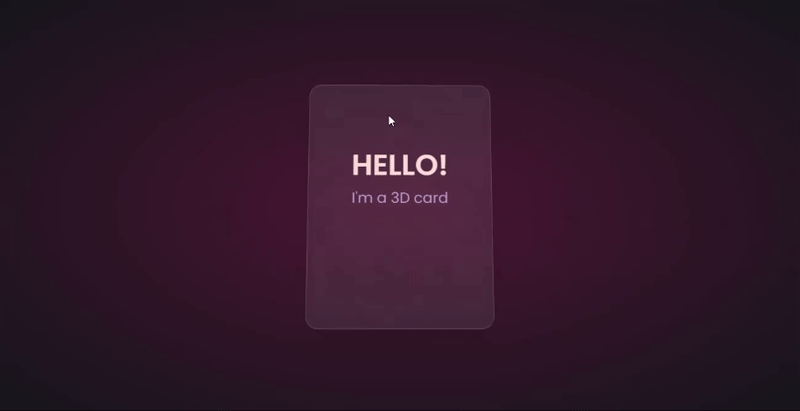
The text appears flush against the card and you’re left with only the tilting, which is nice, but not as nice as the 3D effect created when those properties are included.
Let’s explore another practical use case of this 3D effect.
Using the same card, we’ll add a background image and caption that’ll appear on hover:
.box .card {
  position: relative;
  background: url(/Captions/8.jpg) center;
  background-size: cover;
  background-repeat: no-repeat;
  width: 300px;
  min-height: 400px;
  border: 1px solid rgba(255, 255, 255, 0.15);
  border-radius: 10px;
  box-shadow: 0 25px 45px rgba(0,0,0,0.05);
  z-index: 0;
}
.elements{
  position: absolute;
  top: 60%;
  left: 30%;
  width: 250px;
  height: auto;
  padding: 10px;
  border-radius: 5px;
  text-align: center;
  background: rgba(255, 255, 255, 0.25);
  transform: translateZ(80px);
  z-index: 2;
  opacity: 0;
  transition: opacity 500ms;
}
.box:hover .elements{
  opacity: 1;
}
Here’s a CodePen with the result of the 3D image card with caption appearing on hover.
3D buttons
Buttons are common web components with many shapes, sizes, and purposes. No matter the button type, they all have one thing in common: you have to click on them to work. But how many times have you seen them actually “click”?
This will be a little micro-interaction that helps the user know they’ve done something. The main CSS property we’ll use for this 3D effect is the transform property.
Here’s how it should look: 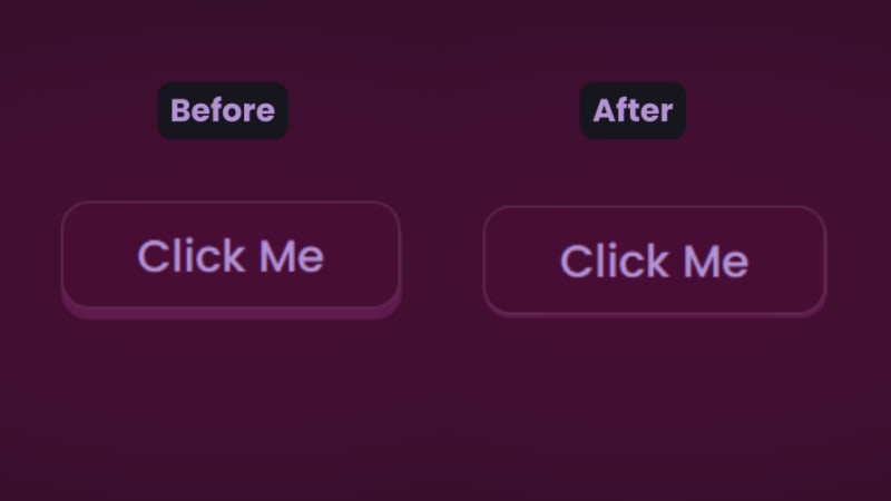
There are two distinct parts of this 3D button — the top with the "Click Me” text and the bottom and sides with a lighter color.
You’ll start with the HTML for the button:
<button class="btn"><span class="txt">Click Me</span></button>
In CSS, we’ll start with the bottom. That’s the button with the class name btn:
.btn {
  position: relative;
  background: #17151d;
  border-radius: 15px;
  border: none;
  cursor: pointer;
}
Next, we have the top of the button:
.text {
  display: block;
  padding: 10px 40px;
  border-radius: 15px;
  border: 1px solid rgba(255, 255, 255, 0.15);
  background: #480d35;
  font-size: 1.5rem;
  font-weight: 500;
  color: #b393d3;
  transform: translateY(-6px);
  transition: transform ease 0.1s;
}
The transform property is what creates the 3D effect of the button clicking. All that’s left is to reverse the transformation by a few pixels when you click on it:
.btn:active .text{
  transform: translateY(-2px);
}
And that’s how to create a 3D click button. Here’s a CodePen you can interact with.
Browser support for 3D transforms and final words
The transform property and its operators have excellent support across all the major browsers — unless you still use Internet Explorer. You can check it out yourself on CanIuse: 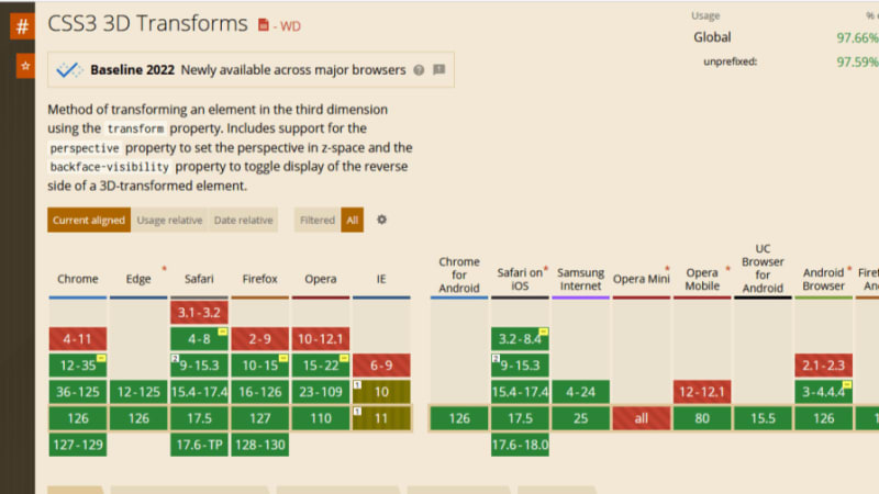
Unfortunately, the borders of the cards do not appear straight during animation on Firefox browsers, but it’s not clear why. Apart from that, the animation runs smoothly. Compare performance across browsers, and try different border thickness.
The web is your canvas, and CSS is your paintbrush. In this post, you’ve learned how to create 3D effects with the transform property. What other effects can you think of?
Is your frontend hogging your users' CPU?
As web frontends get increasingly complex, resource-greedy features demand more and more from the browser. If you’re interested in monitoring and tracking client-side CPU usage, memory usage, and more for all of your users in production, try LogRocket.
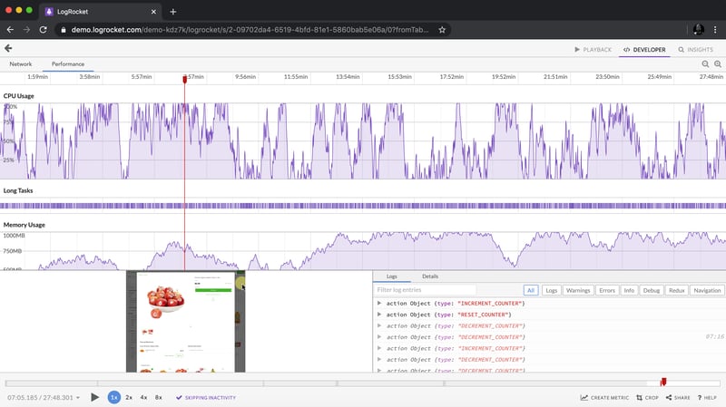
LogRocket is like a DVR for web and mobile apps, recording everything that happens in your web app, mobile app, or website. Instead of guessing why problems happen, you can aggregate and report on key frontend performance metrics, replay user sessions along with application state, log network requests, and automatically surface all errors.
Modernize how you debug web and mobile apps — start monitoring for free.
Ce qui précède est le contenu détaillé de. pour plus d'informations, suivez d'autres articles connexes sur le site Web de PHP en chinois!

Outils d'IA chauds

Undresser.AI Undress
Application basée sur l'IA pour créer des photos de nu réalistes

AI Clothes Remover
Outil d'IA en ligne pour supprimer les vêtements des photos.

Undress AI Tool
Images de déshabillage gratuites

Clothoff.io
Dissolvant de vêtements AI

Video Face Swap
Échangez les visages dans n'importe quelle vidéo sans effort grâce à notre outil d'échange de visage AI entièrement gratuit !

Article chaud
Outils chauds

Bloc-notes++7.3.1
Éditeur de code facile à utiliser et gratuit

SublimeText3 version chinoise
Version chinoise, très simple à utiliser

Envoyer Studio 13.0.1
Puissant environnement de développement intégré PHP

Dreamweaver CS6
Outils de développement Web visuel

SublimeText3 version Mac
Logiciel d'édition de code au niveau de Dieu (SublimeText3)
Sujets chauds
 1673
1673
 14
1429
52
1333
25
1278
29
1257
24
14
1429
52
1333
25
1278
29
1257
24

 Une comparaison des fournisseurs de formulaires statiques
Apr 16, 2025 am 11:20 AM
Une comparaison des fournisseurs de formulaires statiques
Apr 16, 2025 am 11:20 AM
Essayons de savoir un terme ici: "fournisseur de formulaire statique". Vous apportez votre HTML
 Une preuve de concept pour rendre Sass plus rapidement
Apr 16, 2025 am 10:38 AM
Une preuve de concept pour rendre Sass plus rapidement
Apr 16, 2025 am 10:38 AM
Au début d'un nouveau projet, la compilation SASS se produit en un clin d'œil. Cela se sent bien, surtout quand il est associé à BrowSersync, qui recharge
 Actualités hebdomadaires de la plate-forme: attribut HTML Loading, les principales spécifications Aria et le passage de iframe à Shadow Dom
Apr 17, 2025 am 10:55 AM
Actualités hebdomadaires de la plate-forme: attribut HTML Loading, les principales spécifications Aria et le passage de iframe à Shadow Dom
Apr 17, 2025 am 10:55 AM
Dans cette semaine, le Roundup des nouvelles de la plate-forme, Chrome présente un nouvel attribut pour le chargement, les spécifications d'accessibilité pour les développeurs Web et la BBC Moves
 Certains pratiques avec l'élément de dialogue HTML
Apr 16, 2025 am 11:33 AM
Certains pratiques avec l'élément de dialogue HTML
Apr 16, 2025 am 11:33 AM
C'est moi qui regarde l'élément HTML pour la première fois. J'en ai été conscient depuis un certain temps, mais il ne l'a pas encore pris pour un tour. Il a un peu cool et
 Forme de papier
Apr 16, 2025 am 11:24 AM
Forme de papier
Apr 16, 2025 am 11:24 AM
L'achat ou la construction est un débat classique de la technologie. Construire des choses vous-même peut être moins cher car il n'y a pas d'article de ligne sur votre facture de carte de crédit, mais
 Actualités de plate-forme hebdomadaire: bookmarklet d'espacement de texte, attente de haut niveau, nouvel indicateur de chargement d'ampli
Apr 17, 2025 am 11:26 AM
Actualités de plate-forme hebdomadaire: bookmarklet d'espacement de texte, attente de haut niveau, nouvel indicateur de chargement d'ampli
Apr 17, 2025 am 11:26 AM
Au cours de cette semaine, un Bookmarklet pratique pour inspecter la typographie, en utilisant Await pour bricoler comment les modules JavaScript s'importent, ainsi que Facebook & # 039; S
 Où devrait «abonner au podcast» vers le lien?
Apr 16, 2025 pm 12:04 PM
Où devrait «abonner au podcast» vers le lien?
Apr 16, 2025 pm 12:04 PM
Pendant un certain temps, iTunes était le grand chien du podcasting, donc si vous avez lié "Abonnez-vous au podcast" pour aimer:
 Options pour héberger vos propres analyses non-javascript
Apr 15, 2025 am 11:09 AM
Options pour héberger vos propres analyses non-javascript
Apr 15, 2025 am 11:09 AM
Il existe de nombreuses plates-formes d'analyse pour vous aider à suivre les données des visiteurs et d'utilisation sur vos sites. Peut-être plus particulièrement Google Analytics, qui est largement utilisé
