

Écrit par Emmanuel Odioko✏️
Pendant longtemps, la prise en charge limitée des fonctions mathématiques rendait la création d'animations CSS basées sur le temps beaucoup plus difficile. Une animation traditionnelle reposait sur des images clés et des durées dépourvues de la flexibilité des mises à jour temporelles basées sur des calculs complexes. Avec l'introduction de fonctions CSS telles que mod(), round() et les fonctions trigonométriques, les développeurs peuvent désormais explorer comment maîtriser les animations temporelles en CSS.
Pour tirer le meilleur parti de cet article sur les animations temporelles en CSS à l'aide de nouvelles fonctions CSS, vous devez avoir une bonne compréhension des animations et des transitions CSS. Vous devriez être capable de savoir comment créer des animations à l'aide de @keyframes et contrôler leur timing. Vous devez également avoir une compréhension de base de JavaScript, en vous concentrant davantage sur la capacité de manipuler des éléments DOM et de répondre aux événements utilisateur.
Enfin, une compréhension des nouvelles fonctions CSS comme calc() et une volonté d'explorer des fonctionnalités émergentes comme mod(), des fonctions trigonométriques incluant sin() et cos() et round() constitueraient une bonne base.
Au moment où vous aurez fini de lire cet article, vous comprendrez comment les animations étaient traditionnellement implémentées sur un canevas HTML à l'aide de JavaScript et comment elles se comparent aux nouvelles fonctions CSS. Nous comprendrons la facilité d'utilisation des fonctions mod(),round() et trigonométriques par rapport aux images clés CSS traditionnelles.
Les animations temporelles ne sont pas nouvelles : elles existent depuis plus d'une décennie. Certains sont compliqués à utiliser, d’autres non. Vous connaissez ces fichiers CSS où les calculs mathématiques sont primaires ? Les animations temporelles en font partie.
Comme leur nom l'indique, ces animations sont étroitement liées au temps, dans la mesure où les propriétés des éléments, telles que la position, la taille, la couleur, l'opacité, etc., changent avec le temps. L'animation temporelle CSS produit des transitions fluides améliorant la sensation des applications Web et offrant une meilleure expérience utilisateur.
Les animations CSS basées sur le temps consistent principalement en une chronologie de début et de fin définie et des points d'interpolation. L'interpolation fait ici référence au calcul de valeurs intermédiaires entre le début et la fin de l'animation sur une durée donnée au fur et à mesure de l'avancement de l'animation. Le but de l'interpolation est d'assurer une transition en douceur de l'état initial à l'état final.
Les animations basées sur le temps se produisent avec la combinaison de variables CSS et de quelques fonctions mathématiques. Cette unité permet aux développeurs de créer des animations qui changent au fil du temps et aboutissent à des animations plus flexibles dont les animations par images clés ne peuvent que rêver. Décomposons les concepts clés et leur fonctionnement.
Dans cette section, nous décomposerons la structure générale de création d'animations temporelles en composants clés.
L'état initial définit les propriétés de départ de l'élément avant le début de l'animation. Il peut s'agir d'une position, d'une taille, d'une couleur, d'une opacité spécifiées, etc. Exemple ci-dessous :
.box {
  opacity: 0;
  transform: translateY(-20px);
}
Dans le code ci-dessus, nous avons l'état initial d'un élément avec la classe box qui définit ses propriétés d'opacité et de transformation.
Le déclencheur d'animation spécifie l'événement qui lance l'animation. Les déclencheurs courants incluent les interactions de l'utilisateur telles que les clics ou les survols, les événements de chargement de page ou les conditions spécifiques de l'application telles que l'exécution d'une action par un utilisateur.
Les propriétés de l'animation incluent la durée de l'animation, la fonction de synchronisation, le délai, le nombre d'itérations, la direction et le mode de remplissage. Une animation peut avoir tout ou partie de ces propriétés. Un exemple de déclencheur avec le sélecteur de survol est présenté ci-dessous :
.box:hover {
  animation: fadeIn 1s ease-in-out forwards;
}
Cela montre l'ajout d'un fondu d'animation qui est déclenché lorsque l'élément avec la zone de classe est survolé et dure une seconde. Le comportement et le timing de l'animation sont également spécifiés. Lisez cet article pour plus d’informations sur les fonctions d’animation et de synchronisation de transition.
Comme indiqué précédemment, il s'agit d'états intermédiaires de l'animation à différents points de la timeline. Chaque image clé spécifie les propriétés de l'élément à un moment particulier, permettant des transitions progressives entre les états initial et final. Un exemple d'implémentation de points d'interpolation est la propriété CSS keyframes :
@keyframes fadeIn {
  0% {
    opacity: 0;
    transform: translateY(-20px);
  }
  100% {
    opacity: 1;
    transform: translateY(0);
  }
}
L'exemple ci-dessus utilise des images clés pour définir les propriétés de l'animation fadeIn à zéro et 100 % de la progression de l'animation.
Time-based animation has become increasingly essential in web applications as it helps with better user experience. The usage of these animations ranges from subtle micro-interactions to significant site transitions, giving web apps a more dynamic feel. Below are common use cases of these animations.
Micro-interactions are small, often subtle, and reusable animations that occur in response to user actions. These brief animations provide feedback. You may have come across animations such as pop-up warnings, loading spinners indicating ongoing processes, or a button indicating a click action. All of these are micro-interactions and consist of time-based animations.  Image source: https://userpilot.com/blog/micro-interaction-examples/[/caption]
In the image above, we have a submit button which shows a loader and a tick when the user clicks on it. The essence of these micro interactions is to commit to the user the process of the submission and the success of the operation.
Site transitions are used to indicate state or page changes on a web application to create a fluid user experience using effects such as fading, sliding, or scaling elements. With time-based animations, these transitions are possible. Common transition effect applications are toggling navigation and side menus, parallax animations, opening and closing of modals, etc.
Image source: https://medium.com/@9cv9official/create-a-beautiful-hover-triggered-expandable-sidebar-with-simple-html-css-and-javascript-9f5f80a908d1[/caption] Image source: https://medium.com/@9cv9official/create-a-beautiful-hover-triggered-expandable-sidebar-with-simple-html-css-and-javascript-9f5f80a908d1
In the GIF above, there is a sidebar which uses a transition animation to expand the sidebar on a mouse hover event.
Let’s get into the new mathematical CSS functions mod(), round(), and the trigonometric functions sin(), cos() and tan() while discussing each in detail.
Like the JavaScript modulo operator %, this function returns the remainder after an arithmetic modulus operation has been carried out on two operands. In essence, the modulus is the leftover value after the dividend is divided by the other operand, the divisor, and no more division can occur. In JavaScript, using the modulo operator will take the following form:10%4.
This operation would leave behind a Modulus of 2 as 10 is only divisible by the divisor 4 twice, leaving behind a remainder of 2. Similarly, the CSS Mod function would perform the same function with the following syntax instead: mod(10, 4).
It is also important to note that the modulus takes the sign of the divisor. As such, the result of mod(10, -4) would be -2 instead.
The mod() function primarily accepts two sets of parameters mod(dividend, divisor) which are essentially two comma-separated values. These operands must be of the same dimension for them to be valid and can take a variety of values as parameters thereby improving the range of its application. Operands passed to mod() can be numbers, percentages, or dimensions.
Mod() can also take in the unit of its operands (e.g. px, rem, vh, deg) and can also handle mathematical calculations as dividend or divisor. Below are some examples showing the use of this CSS function:
/* using <numbers> without units */
scale: mod(18, 7); /* result is 4 */

/* <percentage> and <dimension>  with units  */
height: mod(100vh, 30vh); /* result is 10vh */
width: mod(500px, 200px); /* result is 100px */
transform: rotate(mod(90deg, 20deg)); /* result is 10deg */

/* negative <percentage> and <dimension>  with units  */
height: mod(18rem, -4rem); /* result is 2rem */
rotate: mod (180deg, -100deg); /* result is 80deg */

/* working with calculations */
width: mod(40px*2, 15px); /* result is 5px */
transform: scale(mod(2*3, 1.8)); /* result is 0.6 */
rotate: mod(10turn, 8turn/2); /* result is 2turn */
The code block above shows different applications of the mod() in CSS styles.
While the examples shown use known values, time-based functions are expected to be used with CSS variables which are dynamic and make it possible for the styles to change values depending on the variable passed to the function. The outcome of the operation is then dependent on the calculation using the specified variables, and can produce a wider range of outcomes compared to when hardcoded values are used.
Below you’ll find the general syntax for all possibilities of mod() as illustrated by MDN:
<mod()> =
  mod( <calc-sum> , <calc-sum> )

<calc-sum> =
  <calc-product> [ [ '+' | '-' ] <calc-product> ]*

<calc-product> =
  <calc-value> [ [ '*' | '/' ] <calc-value> ]*

<calc-value> =
  <number>        |
  <dimension>     |
  <percentage>    |
  <calc-keyword>  |
  ( <calc-sum> )

<calc-keyword> =
  e          |
  pi         |
  infinity   |
  -infinity  |
  NaN
In the syntax above, calc-sum represents the operands of the modulus operation. The syntax also shows the types of values calc-sum can contain and the possibility of negative and positive values. Furthermore, the syntax above also shows the possible calc-keywords e, pi, infinity, -infinity, and NaN.
The CSS round() function value is based on a specified rounding strategy. Note that strategy refers to the pattern of rounding the value such as rounding up or down, rounding to zero, rounding to the nearest occurrence of a number, etc..
The syntax for applying the CSS round() is given below:
round(<rounding-strategy>, valueToRound, roundingInterval)
Here's a breakdown of the CSS round() function into smaller bits and highlights of the functions of each keyword and the possible values they can take.
The rounding strategy is the type of technique that would be used to round a specified value. This is optional (defaults to nearest if unspecified), and can be one of the following:
This is the value we intend to round using the function, and it can be a
The rounding interval refers to the interval a value is rounded with a reference to. This entry can be a
Below is an example illustrating the use of the CSS round() function:
<!DOCTYPE html>
<html lang="en">
<head>
  <meta charset="UTF-8">
  <meta name="viewport" content="width=device-width, initial-scale=1.0">
  <title>Document</title>
  <style>
    body{
      display: flex;
      justify-content: center;
      align-items: center;
      height: 100vh;
      margin: 0;
    }

    /* using the round() function */
    .ball {
      width: 100px;
      height: 100px;
      background-color: red;
      color: white;
      text-align: center;
      line-height: 100px;
      margin: 10px;
    }
    .ball-1{
        border-radius: round(down, 70%, var(--rounding-interval)); /*rounded down to the interval of 50% */
    }

    .ball-2{
        border-radius: round(up, 70%, var(--rounding-interval2)); /* rounded up to interval of 100% */
    }

    .ball-3{
        border-radius: round(nearest, 15%, var(--rounding-interval3)); /* rounded to the nearest interval 25% */
    }

  </style>
</head>
<body>
    <!-- rounded containers -->
  <div class="ball ball-1" style="--rounding-interval:50%;">rounded 50%</div>
  <div class="ball ball-2" style="--rounding-interval2:100%;"> rounded 100%</div>
  <div class="ball ball-3" style="--rounding-interval3:25%;"> rounded 25%</div>
</body>
</html>
In this example, we used round() and CSS variables to round values to a specified roundingInterval in the style of each element. Below is the outcome of this example: 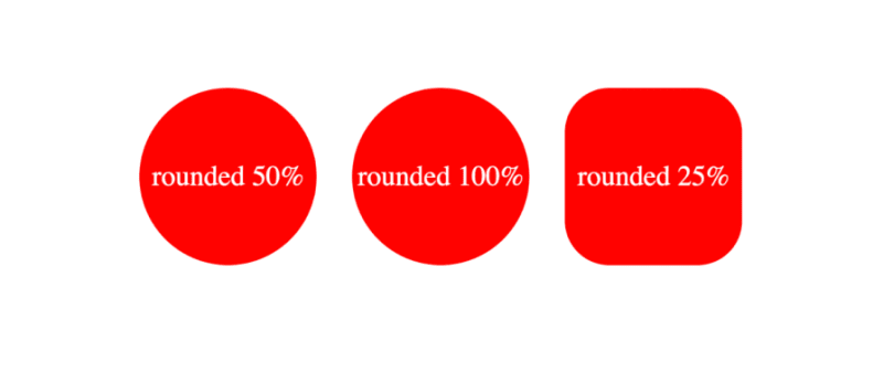 The formal syntax of the CSS round() function according to MDN docs is given by the following:
<round()> =
  round( <rounding-strategy>? , <calc-sum> , <calc-sum>? )

<rounding-strategy> =
  nearest  |
  up       |
  down     |
  to-zero

<calc-sum> =
  <calc-product> [ [ '+' | '-' ] <calc-product> ]*

<calc-product> =
  <calc-value> [ [ '*' | '/' ] <calc-value> ]*

<calc-value> =
  <number>        |
  <dimension>     |
  <percentage>    |
  <calc-keyword>  |
  ( <calc-sum> )

<calc-keyword> =
  e          |
  pi         |
  infinity   |
  -infinity  |
  NaN
In the syntax above, rounding-strategy is the intended rounding pattern and calc-sum represents the operands. The formula also shows the possible entries for rounding-strategy and calc-sum. Finally, it outlines the possible calc-keywords e, pi, infinity, -infinity, and NaN.
The CSS trigonometric functions perform the same operations as in mathematics, as such, the sin() function returns the sine of a number as a value between the range of -1 and 1, cos() returns the cosine of a value, and tan() returns the tangent of a specified value.
Arguments passed to these functions must be either a number or an angle, and they will be treated as radians. Units such as deg and turn represent angle and can be used with arguments here.
Example applications of these functions are shown below:
scale: sin(45deg); /* result is 0.7071067811865475 */
rotate: cos(30deg); /* result is 0.8660254037844387 */
height: calc(50px * tan(30deg)); /* result is 28.86751345948129px */
All trigonometric CSS functions bear similarity, taking in only a single parameter that is resolved to an angle.
Sin() takes in only one parameter which must be a number or angle, or a mathematical expression that resolves to either of them. The syntax of sin() is as follows: \
sin(angle)
The formal syntax of sin() is shown below: \
<sin()> =
  sin( <calc-sum> )

<calc-sum> =
  <calc-product> [ [ '+' | '-' ] <calc-product> ]*

<calc-product> =
  <calc-value> [ [ '*' | '/' ] <calc-value> ]*

<calc-value> =
  <number>        |
  <dimension>     |
  <percentage>    |
  <calc-keyword>  |
  ( <calc-sum> )

<calc-keyword> =
  e          |
  pi         |
  infinity   |
  -infinity  |
  NaN
The syntax above shows the possible values for calc-sum and calc-keyword.
The parameter of cos() is either a number, an angle, or contains a single calculation that must resolve to either type.
As such, the syntax for cos() is the following:
cos(angle)
The formal syntax of all possibilities of cos() is below:
<cos()> =
  cos( <calc-sum> )

<calc-sum> =
  <calc-product> [ [ '+' | '-' ] <calc-product> ]*

<calc-product> =
  <calc-value> [ [ '*' | '/' ] <calc-value> ]*

<calc-value> =
  <number>        |
  <dimension>     |
  <percentage>    |
  <calc-keyword>  |
  ( <calc-sum> )

<calc-keyword> =
  e          |
  pi         |
  infinity   |
  -infinity  |
  NaN
Where calc-sum is the parameter, calc-value is the allowed types of parameters, and calc-keywords are possible units that can be added to the mathematical expression.
The tan() function also takes a number, an angle, or a single calculation that must resolve to either type, similar to the other trigonometric functions. The syntax of tan() is given by the following:
tan(angle)
The formal syntax of this function is shown below:
<tan()> =
  tan( <calc-sum> )

<calc-sum> =
  <calc-product> [ [ '+' | '-' ] <calc-product> ]*

<calc-product> =
  <calc-value> [ [ '*' | '/' ] <calc-value> ]*

<calc-value> =
  <number>        |
  <dimension>     |
  <percentage>    |
  <calc-keyword>  |
  ( <calc-sum> )

<calc-keyword> =
  e          |
  pi         |
  infinity   |
  -infinity  |
  NaN
This syntax shows all possible values of calc-sum, the operand, and the calc-keyword.
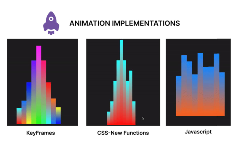
In this section, we will create an animation using CSS functions, keyframes for an alternative, and JavaScript for a second alternative. In the end, we will compare the code and contrast the approaches to determine the benefits of usingCSS functions in creating CSS animations over other options.
Let's start by creating our music beat bar animation using CSS functions. This animation focuses on animating multiple bars, changing the property of the height and background colors using values generated with CSS functions:
<!DOCTYPE html>
<html lang="en">

<head>
  <meta charset="UTF-8">
  <meta name="viewport" content="width=device-width, initial-scale=1.0">
  <title>Beats Bar Animation with CSS Functions</title>
  <style>
    :root {
      /* change the value of --t infinitely */
      animation: animate-time 1000ms linear infinite;
    }

    @keyframes animate-time {
      from {
        --t: 0;
      }

      to {
        --t: 100000;
      }
    }

    body {
      display: flex;
      justify-content: center;
      align-items: center;
      height: 100vh;
      background-color: #222;
      margin: 0;
    }

    .container {
      height: 500px;
      width: 250px;
      position: relative;
      display: flex;
      gap: 10px;
    }

    .bar {
      position: absolute;
      bottom: 0;
      width: 20px;
      height: 20px;
      --frequency: 1;
      --time: calc(var(--t) / 1000 / var(--frequency));
      --rounded-time: round(nearest, var(--time));
      /* Adjust frequency of animation */
      --amplitude: 30px;
      /* base height */
      --base-height: 20px;
      /* Transition for smooth height change */
      transition: height 0.5s ease-in-out, background 1s ease-in-out;
      /* Calculate dynamic hue using mod and round */
      --hue: mod(round(nearest, calc(var(--time) * 10)), 360);
      --alpha: calc(0.5 + 0.5 * cos(calc(var(--time) * 1turn)));
      /* Apply dynamic linear gradient background */
      background: linear-gradient(to top,
          hsla(var(--hue), 100%, 50%, var(--alpha)),
          hsla(calc(var(--hue) + 180), 100%, 50%, var(--alpha)));
    }

    .bar1 {
      /* Calculate height based on rounded time */
      height: calc(var(--base-height) + var(--amplitude) * var(--rounded-time)/46 * var(--index-a));
      margin-left: 10px;
    }

    .bar2 {
      /* Calculate height based on rounded time */
      height: calc(var(--base-height) + var(--amplitude) * var(--rounded-time)/46 * var(--index-b));
      margin-left: 30px;
    }

    .bar3 {
      /* Calculate height based on rounded time */
      height: calc(var(--base-height) + var(--amplitude) * var(--rounded-time)/46 * var(--index-c));
      margin-left: 50px;
    }

    .bar4 {
      /* Calculate height based on rounded time */
      height: calc(var(--base-height) + var(--amplitude) * var(--rounded-time)/46 * var(--index-d));
      margin-left: 70px;
    }

    .bar5 {
      /* Calculate height based on rounded time */
      height: calc(var(--base-height) + var(--amplitude) * var(--rounded-time)/46 * var(--index-e));
      margin-left: 90px;
    }

    .bar6 {
      /* Calculate height based on rounded time */
      height: calc(var(--base-height) + var(--amplitude) * var(--rounded-time)/46 * var(--index-f));
      margin-left: 110px;
    }

    .bar7 {
      /* Calculate height based on rounded time */
      height: calc(var(--base-height) + var(--amplitude) * var(--rounded-time)/46 * var(--index-g));
      margin-left: 130px;
    }

    .bar8 {
      /* Calculate height based on rounded time */
      height: calc(var(--base-height) + var(--amplitude) * var(--rounded-time)/46 * var(--index-h));
      margin-left: 150px;
    }

    .bar9 {
      /* Calculate height based on rounded time */
      height: calc(var(--base-height) + var(--amplitude) * var(--rounded-time)/46 * var(--index-i));
      margin-left: 170px;
    }
  </style>
</head>

<body>
  <div class="container">
    <div class="bar bar1" style="--index-a: 1;"></div>
    <div class="bar bar2" style="--index-b: 2;"></div>
    <div class="bar bar3" style="--index-c: 4;"></div>
    <div class="bar bar4" style="--index-d: 6;"></div>
    <div class="bar bar5" style="--index-e: 8;"></div>
    <div class="bar bar6" style="--index-f: 6;"></div>
    <div class="bar bar7" style="--index-g: 4;"></div>
    <div class="bar bar8" style="--index-h: 5;"></div>
    <div class="bar bar9" style="--index-i: 2;"></div>
  </div>
</body>

</html>
Here’s a breakdown of the code block above:
The code above produces the following animation: 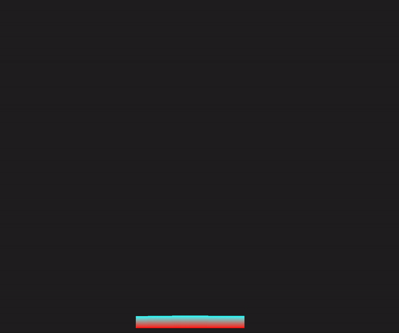
In this section, we will rebuild the sound bar animation, but we’ll use animations and CSS keyframes instead:
<!DOCTYPE html>
<html lang="en">

<head>
  <meta charset="UTF-8">
  <meta name="viewport" content="width=device-width, initial-scale=1.0">
  <title>Beats Bar Animation with CSS Keyframes</title>
  <style>
    body {
      display: flex;
      justify-content: center;
      align-items: center;
      height: 100vh;
      background-color: #222;
      margin: 0;
    }

    .container {
      height: 500px;
      width: 250px;
      position: relative;
      display: flex;
      gap: 10px;
    }

    .bar {
      position: absolute;
      bottom: 0;
      width: 20px;
      height: 20px;
      --amplitude: 30px;
      --base-height: 20px;
      --frequency: 1;
      transition: height 0.5s ease-in-out;
      animation: bounce 1s infinite;
    }

    @keyframes bounce {

      0%,
      100% {
        height: calc(var(--base-height) + var(--amplitude) * 0.5);
      }

      50% {
        height: calc(var(--base-height) + var(--amplitude));
      }
    }

    .bar1 {
      animation: bounce1 1s infinite, colorChange1 2s infinite;
      margin-left: 10px;
    }

    .bar2 {
      animation: bounce2 1s infinite, colorChange2 2s infinite;
      margin-left: 30px;
    }

    .bar3 {
      animation: bounce3 1s infinite, colorChange3 2s infinite;
      margin-left: 50px;
    }

    .bar4 {
      animation: bounce4 1s infinite, colorChange4 2s infinite;
      margin-left: 70px;
    }

    .bar5 {
      animation: bounce5 1s infinite, colorChange5 2s infinite;
      margin-left: 90px;
    }

    .bar6 {
      animation: bounce6 1s infinite, colorChange6 2s infinite;
      margin-left: 110px;
    }

    .bar7 {
      animation: bounce7 1s infinite, colorChange7 2s infinite;
      margin-left: 130px;
    }

    .bar8 {
      animation: bounce8 1s infinite, colorChange8 2s infinite;
      margin-left: 150px;
    }

    .bar9 {
      animation: bounce9 1s infinite, colorChange9 2s infinite;
      margin-left: 170px;
    }

    @keyframes colorChange1 {

      0%,
      100% {
        background: linear-gradient(to top, hsla(0, 100%, 50%, 1), hsla(180, 100%, 50%, 1));
      }

      50% {
        background: linear-gradient(to top, hsla(180, 100%, 50%, 1), hsla(360, 100%, 50%, 1));
      }
    }

    @keyframes colorChange2 {

      0%,
      100% {
        background: linear-gradient(to top, hsla(30, 100%, 50%, 1), hsla(210, 100%, 50%, 1));
      }

      50% {
        background: linear-gradient(to top, hsla(210, 100%, 50%, 1), hsla(390, 100%, 50%, 1));
      }
    }

    @keyframes colorChange3 {

      0%,
      100% {
        background: linear-gradient(to top, hsla(60, 100%, 50%, 1), hsla(240, 100%, 50%, 1));
      }

      50% {
        background: linear-gradient(to top, hsla(240, 100%, 50%, 1), hsla(420, 100%, 50%, 1));
      }
    }

    @keyframes colorChange4 {

      0%,
      100% {
        background: linear-gradient(to top, hsla(90, 100%, 50%, 1), hsla(270, 100%, 50%, 1));
      }

      50% {
        background: linear-gradient(to top, hsla(270, 100%, 50%, 1), hsla(450, 100%, 50%, 1));
      }
    }

    @keyframes colorChange5 {

      0%,
      100% {
        background: linear-gradient(to top, hsla(120, 100%, 50%, 1), hsla(300, 100%, 50%, 1));
      }

      50% {
        background: linear-gradient(to top, hsla(300, 100%, 50%, 1), hsla(480, 100%, 50%, 1));
      }
    }

    @keyframes colorChange6 {

      0%,
      100% {
        background: linear-gradient(to top, hsla(150, 100%, 50%, 1), hsla(330, 100%, 50%, 1));
      }

      50% {
        background: linear-gradient(to top, hsla(330, 100%, 50%, 1), hsla(510, 100%, 50%, 1));
      }
    }

    @keyframes colorChange7 {

      0%,
      100% {
        background: linear-gradient(to top, hsla(180, 100%, 50%, 1), hsla(360, 100%, 50%, 1));
      }

      50% {
        background: linear-gradient(to top, hsla(360, 100%, 50%, 1), hsla(540, 100%, 50%, 1));
      }
    }

    @keyframes colorChange8 {

      0%,
      100% {
        background: linear-gradient(to top, hsla(210, 100%, 50%, 1), hsla(390, 100%, 50%, 1));
      }

      50% {
        background: linear-gradient(to top, hsla(390, 100%, 50%, 1), hsla(570, 100%, 50%, 1));
      }
    }

    @keyframes colorChange9 {

      0%,
      100% {
        background: linear-gradient(to top, hsla(240, 100%, 50%, 1), hsla(420, 100%, 50%, 1));
      }

      50% {
        background: linear-gradient(to top, hsla(420, 100%, 50%, 1), hsla(600, 100%, 50%, 1));
      }
    }

    @keyframes bounce1 {

      0%,
      100% {
        height: calc(var(--base-height) + var(--amplitude) * 0.5);
      }

      50% {
        height: calc(var(--base-height) + var(--amplitude) * 1.5);
      }
    }

    @keyframes bounce2 {

      0%,
      100% {
        height: calc(var(--base-height) + var(--amplitude) * 1.5);
      }

      50% {
        height: calc(var(--base-height) + var(--amplitude) * 2.5);
      }
    }

    @keyframes bounce3 {

      0%,
      100% {
        height: calc(var(--base-height) + var(--amplitude) * 2.5);
      }

      50% {
        height: calc(var(--base-height) + var(--amplitude) * 5);
      }
    }

    @keyframes bounce4 {

      0%,
      100% {
        height: calc(var(--base-height) + var(--amplitude) * 4.5);
      }

      50% {
        height: calc(var(--base-height) + var(--amplitude) * 8);
      }
    }

    @keyframes bounce5 {

      0%,
      100% {
        height: calc(var(--base-height) + var(--amplitude) * 6.5);
      }

      50% {
        height: calc(var(--base-height) + var(--amplitude) * 10);
      }
    }

    @keyframes bounce6 {

      0%,
      100% {
        height: calc(var(--base-height) + var(--amplitude) * 4.5);
      }

      50% {
        height: calc(var(--base-height) + var(--amplitude) * 8);
      }
    }

    @keyframes bounce7 {

      0%,
      100% {
        height: calc(var(--base-height) + var(--amplitude) * 2.5);
      }

      50% {
        height: calc(var(--base-height) + var(--amplitude) * 5);
      }
    }

    @keyframes bounce8 {

      0%,
      100% {
        height: calc(var(--base-height) + var(--amplitude) * 1.4);
      }

      50% {
        height: calc(var(--base-height) + var(--amplitude) * 2.8);
      }
    }

    @keyframes bounce9 {

      0%,
      100% {
        height: calc(var(--base-height) + var(--amplitude) * 0.5);
      }

      50% {
        height: calc(var(--base-height) + var(--amplitude) * 1.6);
      }
    }
  </style>
</head>

<body>
  <div class="container">
    <div class="bar bar1"></div>
    <div class="bar bar2"></div>
    <div class="bar bar3"></div>
    <div class="bar bar4"></div>
    <div class="bar bar5"></div>
    <div class="bar bar6"></div>
    <div class="bar bar7"></div>
    <div class="bar bar8"></div>
    <div class="bar bar9"></div>
  </div>
</body>

</html>
In the code above, we have styles for the body, container, and bar elements. We added an initial fallback animation state bounce and defined the animation properties with keyframes. Furthermore, we had to create separate keyframes animations for each bar’s height and background color change. The output of this animation is shown below: 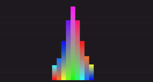
Here, we will demonstrate how we can work with HTML, CSS, and JavaScript to recreate the animation in the previous section:
<!DOCTYPE html>
<html lang="en">

<head>
  <meta charset="UTF-8">
  <meta name="viewport" content="width=device-width, initial-scale=1.0">
  <title>Beats Bar Animation with JavaScript</title>
  <style>
    body {
      display: flex;
      justify-content: center;
      align-items: center;
      height: 100vh;
      background-color: #222;
      margin: 0;
    }

    .container {
      display: flex;
      gap: 0;
      position: relative;
    }

    .bar {
      width: 20px;
      position: absolute;
      bottom: 0;
      transition: height 0.1s ease-in-out, background 0.1s ease-in-out;
    }

    .bar1 {
      left: 0;
    }

    .bar2 {
      left: 20px;
    }

    .bar3 {
      left: 40px;
    }

    .bar4 {
      left: 60px;
    }

    .bar5 {
      left: 80px;
    }

    .bar6 {
      left: 100px;
    }

    .bar7 {
      left: 120px;
    }

    .bar8 {
      left: 140px;
    }

    .bar9 {
      left: 160px;
    }
  </style>
</head>

<body>
  <div class="container">
    <div class="bar bar1" data-index="1"></div>
    <div class="bar bar2" data-index="2"></div>
    <div class="bar bar3" data-index="3"></div>
    <div class="bar bar4" data-index="4"></div>
    <div class="bar bar5" data-index="5"></div>
    <div class="bar bar6" data-index="6"></div>
    <div class="bar bar7" data-index="7"></div>
    <div class="bar bar8" data-index="8"></div>
    <div class="bar bar9" data-index="9"></div>
  </div>

  <script>
    const bars = document.querySelectorAll('.bar');
    const baseHeight = 100; // Base height of bars
    const amplitude = 150; // Amplitude of height changes
    const frequency = 2; // Frequency of the animation
    const animationSpeed = 0.1; // Speed of the animation

    function animateBars() {
      const currentTime = Date.now() / 1000; // Get the current time in seconds we will use this as a flux value

      bars.forEach((bar, index) => {
        // Calculate the height of the bar based on the current time
        const timeOffset = index * frequency;
        const height = baseHeight + amplitude * Math.abs(Math.sin(currentTime * frequency + timeOffset));
        bar.style.height = `${height}px`;

        const hue = (currentTime * 50) % 360; // Dynamic hue based on time
        const alpha = 1; // alpha of 1 to avoid transparency at any point
        // Set the background color of the bar using a linear gradient
        bar.style.background = `linear-gradient(to top, hsla(${hue}, 100%, 50%, ${alpha}), hsla(${(hue + 180) % 360}, 100%, 50%, ${alpha}))`;
      });

      requestAnimationFrame(animateBars);
    }

    function initializeBars() {
      // Set the initial height and color of the bars
      bars.forEach((bar, index) => {
        const initialHeight = baseHeight + amplitude * Math.abs(Math.sin(index * frequency));
        bar.style.height = `${initialHeight}px`;

        const initialHue = (index * 50) % 360; // Initial hue based on index
        const initialAlpha = 1; // Set initial alpha to 1 to avoid transparency
        bar.style.background = `linear-gradient(to top, hsla(${initialHue}, 100%, 50%, ${initialAlpha}), hsla(${(initialHue + 180) % 360}, 100%, 50%, ${initialAlpha}))`;
      });
    }

    // Initialize the bars with their initial heights and colors
    initializeBars();

    // Start the animation
    animateBars();
  </script>
</body>

</html>
In the code above, we styled the elements with CSS and created the HTML structure. We used JavaScript to select all elements with the class bar and also declared the variables. Next, we used a set of mathematical calculations to offset the bar height property and apply visual changes to the background gradient. The result is shown in the GIF below: 
Let’s compare these different methods using certain technical aspects:
| Technical aspect | CSS functions | Keyframes | JavaScript |
|---|---|---|---|
| Code length | Generally shorter, making use of variables and functions | Can be lengthy depending on the number of keyframes and the interpolation points defined | The length depends on factors such as the elements to be manipulated, the logic, and properties to be applied. |
| Ease of implementation | Simple for dynamic, repetitive patterns | Simple for predefined animations | Complex logic handling and interaction |
| Performance | High performance, offloaded to the GPU, and less CPU-intensive | High performance, offloaded to the GPU, less CPU intensive | Can be less performant, dependent on the JavaScript engine and the amount of JavaScript to be executed on the web |
| Control | Dynamic and flexible | Static, predefined frames | Highly dynamic and interactive |
| Maintenance | Easy to maintain, concise syntax | Easy to maintain but can get verbose | Can become complex and harder to maintain, and make changes to the logic |
| Animation types | Best for simple, repetitive, mathematical animations | Great for detailed, multi-step animations | Best for interactive and responsive animations |
| Reusability | High reusability with CSS variables since mathematical functions can create different values for the same variable | Moderate, requires duplication for different animations | High reusability with functions and logic |
| Browser compatibility | `Mod()` and `Round()` are not compatible with Opera and Samsung browsers, the rest are fine | Keyframes have been around for a while, so it will be compatible for time-based animations | JavaScript is compatible with all browsers for time-based animations |
D'après ce qui précède, nous pouvons voir que les fonctions CSS lorsqu'elles sont utilisées pour l'animation excellent en termes de simplicité, de réutilisabilité du code, de contrôle et de performances par rapport à d'autres implémentations.
Au cours de l'article, nous avons couvert les animations temporelles allant de mod() à round() puis aux fonctions trigonométriques.
Nous avons également comparé ces fonctions avec les images clés et Javascript, et nous avons pu constater que l'animation basée sur le temps se développe principalement grâce à sa simplicité, sa réutilisabilité améliorée et l'optimisation des performances, car elles sont légères et moins susceptibles d'avoir un impact sur les performances par rapport aux fonctions complexes. animations.
Cela, à son tour, contribue à améliorer l’expérience utilisateur. Continuez à explorer ces fonctions et continuez à coder !!
À mesure que les interfaces Web deviennent de plus en plus complexes, les fonctionnalités gourmandes en ressources exigent de plus en plus du navigateur. Si vous souhaitez surveiller et suivre l'utilisation du processeur côté client, l'utilisation de la mémoire et bien plus encore pour tous vos utilisateurs en production, essayez LogRocket.
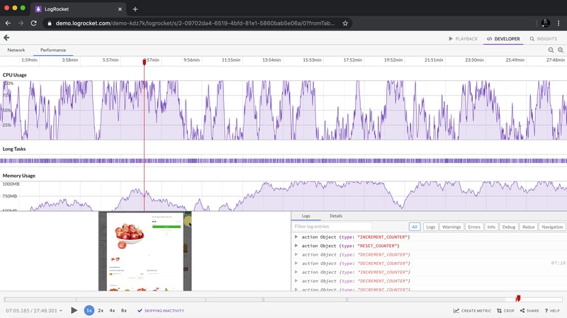
LogRocket est comme un DVR pour les applications Web et mobiles, enregistrant tout ce qui se passe dans votre application Web, votre application mobile ou votre site Web. Au lieu de deviner pourquoi les problèmes surviennent, vous pouvez regrouper et créer des rapports sur les principales mesures de performances du front-end, relire les sessions utilisateur avec l'état de l'application, enregistrer les requêtes réseau et faire apparaître automatiquement toutes les erreurs.
Modernisez la façon dont vous déboguez les applications Web et mobiles : démarrez la surveillance gratuitement.
Ce qui précède est le contenu détaillé de. pour plus d'informations, suivez d'autres articles connexes sur le site Web de PHP en chinois!


![[Web front-end] Démarrage rapide de Node.js](https://img.php.cn/upload/course/000/000/067/662b5d34ba7c0227.png)


