

Comment créer un compte à rebours en utilisant CSS

Écrit par Carlos Mucuho✏️
Les comptes à rebours sont une fonctionnalité populaire sur de nombreux sites Web, améliorant les fonctionnalités pour les événements, les ventes et l'engagement des utilisateurs. Bien que JavaScript soit couramment utilisé pour le comportement dynamique sur le Web, il est également possible de créer un compte à rebours fonctionnel et visuellement attrayant en utilisant uniquement CSS.
Dans ce tutoriel, nous explorerons les deux approches, en commençant par un compte à rebours JavaScript de base, puis en passant à un compte à rebours CSS uniquement. À la fin, nous comparerons les performances des deux approches à l'aide de Chrome DevTools et discuterons de chacun de leurs avantages et inconvénients.
Création d'un compte à rebours JavaScript de base
Nous allons commencer par créer un simple compte à rebours qui se met à jour toutes les secondes. La minuterie comprendra un bouton de démarrage et de pause pour contrôler son fonctionnement.
Création de la structure des répertoires
Avant de créer le compte à rebours JavaScript, nous devons créer un répertoire pour stocker les applications que nous allons créer tout au long de ce didacticiel.
Ouvrez une fenêtre de terminal, accédez à un répertoire adapté à votre projet et utilisez la commande suivante pour créer un répertoire nommé compte à rebours :
mkdir countdown-timer
Ensuite, accédez à ce répertoire :
cd countdown-timer
Créez deux sous-répertoires nommés javascript-countdown et css-only-countdown, et à l'intérieur de chaque sous-répertoire, créez un sous-répertoire nommé public :
mkdir javascript-countdown && mkdir javascript-countdown/public
mkdir css-only-countdown && mkdir css-only-countdown/public
Création du serveur d'applications
Ensuite, accédez au sous-répertoire javascript-countdown, initialisez un nouveau projet de nœud avec les paramètres par défaut et installez le package express :
cd javascript-countdown
npm init -y
npm install express
Ouvrez votre éditeur de texte préféré, créez un fichier nommé server.js et ajoutez-y le code suivant :
const express = require('express');
const app = express();
const port = 3001

app.use(express.static('public'));
app.listen(port, () => {
  console.log(`Javascript countdown app server started on port ${port}`);
});
Le code ci-dessus crée un serveur express qui sera utilisé pour servir l'application de compte à rebours JavaScript dans le port 3001.
Structure HTML
Toujours dans votre éditeur de texte, créez les fichiers suivants dans le sous-répertoire public situé à l'intérieur du répertoire javascript-countdown :
- index.html pour le code HTML
- styles.css pour le code CSS
- index.js pour le code JavaScript
Ajoutez le code suivant à index.html :
<!DOCTYPE html>
<html lang="en">
<head>
  <meta charset="UTF-8">
  <meta name="viewport" content="width=device-width, initial-scale=1.0">
  <link rel="stylesheet" href="styles.css">
  <title>Javascript Countdown Timer</title>
</head>

<body>
  <div class="container">
    <div class="controls">
      <button id="startBtn">Start</button>
      <button id="pauseBtn">Pause</button>
    </div>
    <div class="countdown-container">
      <div class="countdown"></div>
    </div>
  </div>
  <script src="index.js"></script>
</body>

</html>
Ce fichier HTML met en place une structure de base avec un conteneur contenant des boutons de contrôle et une zone d'affichage du compte à rebours.
Implémentation d'une logique de compte à rebours à l'aide de JavaScript
Ensuite, nous ajouterons JavaScript pour gérer la logique du compte à rebours. Ajoutez le code suivant à index.js :
window.addEventListener("load", () => {
  const startBtn = document.getElementById('startBtn');
  const pauseBtn = document.getElementById('pauseBtn');
  const countdownView = document.getElementsByClassName('countdown')[0];

  let totalTime = 10;
  let timeLeft;
  let countDownIntervalID;
  let isPaused = false;

  pauseBtn.style.display = 'none';
});
Dans ce bloc de code, nous initialisons les éléments startBtn, pauseBtn et countdownView par leurs identifiants et classes respectifs. Nous définissons également quelques variables initiales : totalTime, timeLeft, countDownIntervalID et isPaused. De plus, nous avons configuré le bouton pause pour qu'il soit masqué initialement.
Maintenant, ajoutons des écouteurs d'événements pour les boutons de démarrage et de pause :
startBtn.addEventListener('click', startOrStopTimer);
pauseBtn.addEventListener('click', pauseOrResumeTimer);
Ces lignes attachent les écouteurs d'événements de clic aux boutons de démarrage et de pause. Les fonctions startOrStopTimer et pauseOrResumeTimer sont définies ultérieurement pour gérer les clics sur les boutons.
Ajoutez le code suivant pour définir la fonction startOrStopTimer :
function startOrStopTimer() {
  startBtn.innerHTML = startBtn.innerHTML === 'Start' ? 'Stop' : 'Start';
  if (countDownIntervalID === undefined && !isPaused) {
    timeLeft = totalTime;
    startTimer();
    pauseBtn.style.display = 'inline';
  } else {
    stopTimer();
    countdownView.innerHTML = '';
    pauseBtn.style.display = 'none';
    isPaused = false;
    pauseBtn.innerHTML = 'Pause';
  }
}
Dans cette fonction, nous basculons le texte du bouton de démarrage entre Start et Stop. Si le compte à rebours n'est pas en cours et n'est pas en pause, nous initialisons timeLeft à totalTime et démarrons le chronomètre. Sinon, nous arrêtons le chronomètre et réinitialisons la vue.
Maintenant, définissez la fonction startTimer :
function startTimer() {
  countDownIntervalID = setInterval(() => {
    countdownView.innerHTML = timeLeft;

    if (timeLeft === 0) {
      stopTimer();
      startBtn.innerHTML = 'Start';
      pauseBtn.style.display = 'none';
      countdownView.innerHTML = '';
    } else {
      timeLeft = timeLeft - 1;
    }
  }, 1000);
}
Cette fonction définit un intervalle pour mettre à jour le compte à rebours chaque seconde. Si timeLeft atteint zéro, nous arrêtons le chronomètre, réinitialisons le texte du bouton de démarrage et masquons le bouton pause.
Ensuite, ajoutez la fonction stopTimer :
function stopTimer() {
  if (countDownIntervalID !== undefined) {
    clearInterval(countDownIntervalID);
    countDownIntervalID = undefined;
  }
}
Cette fonction efface l'intervalle du compte à rebours et réinitialise countDownIntervalID. Enfin, ajoutez la fonction pauseOrResumeTimer :
function pauseOrResumeTimer() {
  isPaused = !isPaused;
  pauseBtn.innerHTML = isPaused ? 'Resume' : 'Pause';

  if (countDownIntervalID !== undefined) {
    stopTimer();
  } else {
    startTimer();
  }
}
Dans cette fonction, nous basculons l'état de pause et le texte du bouton entre Pause et Reprendre. Si le compte à rebours est en cours, on arrête le chronomètre ; sinon, on recommence.
Style CSS
Maintenant, stylisons le compte à rebours en utilisant CSS. Ajoutez le code suivant à styles.css :
body {
  background-color: black;
  font-family: Arial, sans-serif;
  height: 100%;
}

.container {
  display: flex;
  flex-direction: column;
  justify-content: center;
  align-items: center;
}

.controls {
  width: 20%;
  margin-top: 10%;
  display: flex;
  justify-content: space-between;
  flex-direction: row;
  flex-wrap: wrap;
}

.countdown-container {
  position: relative;
  width: 20vw;
  height: 20vw;
  margin-top: 2%;
  border: 0.4em solid #9b51e0;
}

button {
  font-size: 1.5em;
  border: none;
  padding: 0.3em;
  background-color: #9b51e0;
  border-radius: 0.4em;
  color: white;
}

.countdown {
  position: relative;
  width: 100%;
  height: 100%;
  list-style: none;
  padding: 0;
  margin: 0;
  display: flex;
  justify-content: center;
  align-items: center;
  font-size: 5em;
  color: #9b51e0;
}
Ce CSS définit les styles pour l'interface du compte à rebours. L'arrière-plan du corps est défini sur noir et nous utilisons Arial comme police principale. La classe .container est conçue pour centrer son contenu et fournir un espacement entre les éléments. La classe .controls stylise les boutons permettant de démarrer et de mettre en pause le minuteur, en garantissant qu'ils sont uniformément espacés et réactifs. La classe .countdown-container définit la taille et l'apparence de l'affichage du compte à rebours, y compris une bordure et une marge.
Retournez sur votre terminal et exécutez la commande suivante pour commencer à servir l'application de compte à rebours JavaScript :
node server.js
Open a new tab in your browser, navigate to http://localhost:3001, and you should see something similar to the following: 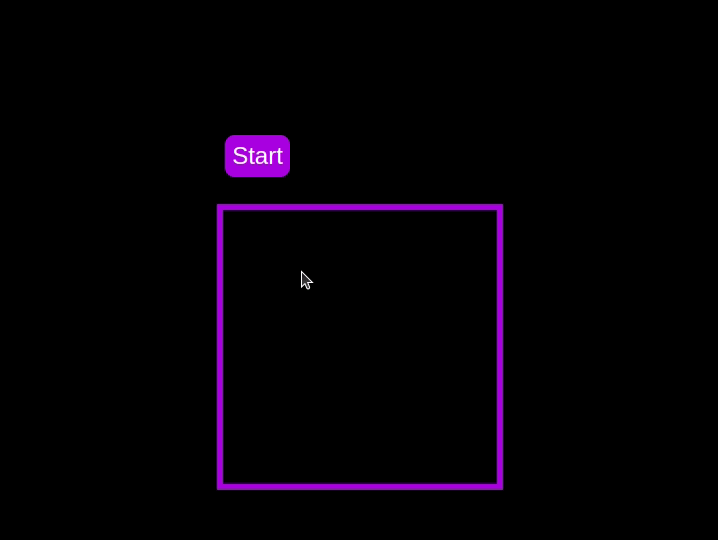 Test out the countdown timer and once you are done, terminate the server application and move to the next step.
Adding a circular progress indicator
To enhance the user experience of our countdown timer, let’s add a circular progress indicator to give the user a visual representation of the time remaining.
First, we need to modify our HTML code to include the circular progress element. In index.html, we add a span element with a class of circular-progress inside the countdown-container div. This span element will be used to create the circular progress indicator:
<div class="countdown-container">
  <span class="circular-progress"></span>
  <div class="countdown"></div>
</div>
Next, we need to define the CSS for the circular progress indicator. In styles.css, we add the following code:
.countdown-container {
  ...
  /* border : 0.4em solid #9b51e0; */
}
.circular-progress {
  width: 20vw;
  height: 20vw;
  border-radius: 50%;
  display: flex;
  justify-content: center;
  align-items: center;
  position: absolute;
  transition: 0.5s;
  background-color: #13171f;
}

.circular-progress::before {
  width: 18.5vw;
  height: 18.5vw;
  content: "";
  position: absolute;
  border-radius: 50%;
  background-color: black;
}
This code first removes the border from the countdown-container div, then sets the dimensions and shape of the circular progress indicator, as well as its position and background color. We also add a ::before pseudo-element to create the inner circle of the progress indicator.
Now we need to add the JavaScript code to animate the circular progress indicator.
Add the following code in the variables initialization block:
const circularProgressEl = document.getElementsByClassName("circular-progress")[0];
let circularProgress;
let circularProgressIntervalID;
This code initializes the circularProgressEl variable to target the circular progress element and creates two new variables, circularProgress and circularProgressIntervalID, that will be used to animate the progress indicator.
Add the following code below the pauseOrResumeTimer() function:
function startCircularProgressAnimation() {
  let start = totalTime - timeLeft;
  let degreesPerSecond = 360 / totalTime;
  let degreesPerInterval = degreesPerSecond / 20;
  circularProgress = degreesPerSecond * start;

  circularProgressIntervalID = setInterval(() => {
    if (Math.round(circularProgress) === 360) {
      clearInterval(circularProgressIntervalID);
    } else {
      circularProgress = circularProgress + degreesPerInterval;
      circularProgressEl.style.background = `conic-gradient(#9b51e0 ${circularProgress}deg, #13171f 0deg)`;
    }
  }, 50);
}
This code defines the startCircularProgressAnimation function, which calculates the starting point and degree of rotation for the circular progress indicator, and sets up an interval to animate the progress indicator.
Add the following code below the startCircularProgressAnimation:
function resumeCircularProgressAnimation() {
  startCircularProgressAnimation();
}

function pauseCircularProgressAnimation() {
  clearInterval(circularProgressIntervalID);
}

function stopCircularProgressAnimation() {
  clearInterval(circularProgressIntervalID);
  circularProgressEl.style.background = `conic-gradient(#9b51e0 0deg, #13171f 0deg)`;
}
This code defines the resumeCircularProgressAnimation, pauseCircularProgressAnimation, and stopCircularProgressAnimation functions, which are used to start, pause, and stop the circular progress animation.
Finally, we need to modify the startOrStopTimer and pauseOrResumeTimer functions to start and stop the circular progress animation along with the timer:
function startOrStopTimer() {
  // ...
  if (countDownIntervalID === undefined && !isPaused) {
    // ...
    startCircularProgressAnimation();
  } else {
    // ...
    stopCircularProgressAnimation();
  }
}

function pauseOrResumeTimer() {
  // ...
  if (countDownIntervalID !== undefined) {
    stopTimer();
    pauseCircularProgressAnimation();
  } else {
    startTimer();
    resumeCircularProgressAnimation();
  }
}
With these modifications, our countdown timer now includes a circular progress indicator that animates along with the timer.
Return to your terminal and run the following command to start serving the JavaScript countdown application:
node server.js
Go back to the tab in your browser where you visited the http://localhost:3001 URL, refresh the page, and you should see something similar to the following: 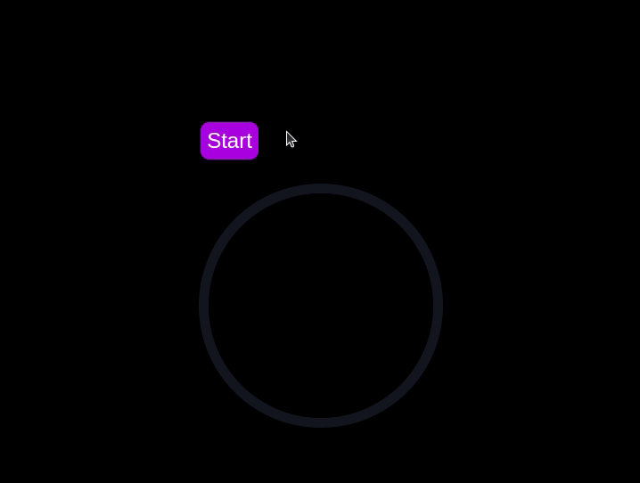
Implementing a CSS-only countdown timer
In this section, we'll dive into creating a countdown timer that updates every second and is made using only CSS. Our timer will be simple yet functional, featuring start and pause buttons to control its operation.
Creating the application server
Navigate to the css-only-countdown subdirectory, initialize a new node project, and install the express package:
cd ../css-only-countdown
npm init -y
npm install express
Then, return to your text editor, create a file named server.js, and add the following code to it:
const express = require('express');
const app = express();
const port = 3002
app.use(express.static('public'));

app.listen(port, () => {
  console.log(`Css-only countdown app server started on port ${port}`);
});
The code above creates an express server that will be used to serve the JavaScript countdown application in port 3002.
HTML structure
Still in your text editor, create the following files in the public subdirectory:
- index.html for the HTML code
- styles.css for the CSS code
Add the following code to the index.html file:
<!DOCTYPE html>
<html lang="en">
<head>
  <meta charset="UTF-8">
  <meta name="viewport" content="width=device-width, initial-scale=1.0">
  <link rel="stylesheet" href="styles.css">
  <title>CSS Countdown Timer</title>
</head>
<body>
  <div class="container">
    <div class="controls">
      <input type="checkbox" id="startBtn" class="checkbox-wrapper">
      <label for="startBtn" id="startLabel">
        <span>Stop</span>
        <span>Start</span>
      </label>
      <input type="checkbox" id="pauseBtn" class="checkbox-wrapper">
      <label for="pauseBtn" id="pauseLabel">
        <span>Resume</span>
        <span>Pause</span>
      </label>
      <div class="countdown-container">
        <ul class="countdown">
          <li>10</li>
          <li>9</li>
          <li>8</li>
          <li>7</li>
          <li>6</li>
          <li>5</li>
          <li>4</li>
          <li>3</li>
          <li>2</li>
          <li>1</li>
        </ul>
      </div>
    </div>
  </div>
</body>
</html>
This code sets up the basic structure of our countdown timer. It includes a container div that holds the controls for starting and pausing the timer, as well as the countdown display itself. The controls div contains two checkboxes with labels that will serve as our start and pause buttons. These buttons toggle their respective states using CSS, thanks to the checkbox hack.
The countdown-container div holds an unordered list (ul) of list items (li) representing the countdown numbers from 10 to one. These numbers will be displayed one by one as the timer counts down.
CSS styling
Now, let's style the countdown timer using CSS. Add the following code to styles.css:
body {
  background-color: black;
  font-family: Arial, sans-serif;
  height: 100%;
}

.container {
  display: flex;
  flex-direction: column;
  justify-content: center;
  align-items: center;
}

.controls {
  width: 20%;
  margin-top: 10%;
  display: flex;
  justify-content: space-between;
  flex-direction: row;
  flex-wrap: wrap;
}

.countdown-container {
  position: relative;
  width: 20vw;
  height: 20vw;
  margin-top: 12%;
  border : 0.4em solid #9b51e0;
}

#startLabel span {
  display: none;
}

label {
  cursor: pointer;
  font-size: 1.5em;
  padding: 0.3em;
  background-color: #9b51e0;
  border-radius: 0.4em;
  color: white;
}

#startBtn:checked~#startLabel span:nth-child(1) {
  display: inline;
}

#startBtn:not(:checked)~#startLabel span:nth-child(2) {
  display: inline;
}

#startBtn:not(:checked)~#pauseLabel,
#pauseBtn {
  display: none;
}

#pauseLabel span {
  display: none;
}

#pauseBtn:checked~#pauseLabel span:nth-child(1) {
  display: inline;
}

#pauseBtn:not(:checked)~#pauseLabel span:nth-child(2) {
  display: inline;
}

.checkbox-wrapper {
  display: none;
}
In this CSS file, we start by setting some basic styles for the body and container. The body has a black background and uses the Arial font. The container is centered using flexbox and has a margin to push it down from the top of the viewport.
The controls div is styled to be responsive and to ensure that the buttons are spaced out evenly. The countdown-container div is styled with a border, which will later be replaced by the circular progress indicator.
We use the checkbox hack to toggle the visibility of the labels for the start and pause buttons. Depending on whether the checkboxes are checked or not, different spans within the labels are displayed. This allows the labels to show different text (Start or Stop, Pause or Resume) based on the state of the checkboxes.
Now, add the following code to the bottom of the styles.css file:
.countdown {
  position: relative;
  width: 100%;
  height: 100%;
  list-style: none;
  padding: 0;
  margin: 0;
  display: flex;
  justify-content: center;
  align-items: center;
  font-size: 5em;
  color: #9b51e0;
}

.countdown li {
  position: absolute;
  opacity: 0;
  transition: opacity 1s linear;
}

#startBtn:checked~.countdown-container .countdown li:nth-child(1) {
  animation-delay: 0s;
}

#startBtn:checked~.countdown-container .countdown li:nth-child(2) {
  animation-delay: 1s;
}

#startBtn:checked~.countdown-container .countdown li:nth-child(3) {
  animation-delay: 2s;
}

#startBtn:checked~.countdown-container .countdown li:nth-child(4) {
  animation-delay: 3s;
}

#startBtn:checked~.countdown-container .countdown li:nth-child(5) {
  animation-delay: 4s;
}

#startBtn:checked~.countdown-container .countdown li:nth-child(6) {
  animation-delay: 5s;
}

#startBtn:checked~.countdown-container .countdown li:nth-child(7) {
  animation-delay: 6s;
}

#startBtn:checked~.countdown-container .countdown li:nth-child(8) {
  animation-delay: 7s;
}

#startBtn:checked~.countdown-container .countdown li:nth-child(9) {
  animation-delay: 8s;
}

#startBtn:checked~.countdown-container .countdown li:nth-child(10) {
  animation-delay: 9s;
}

@keyframes countdownAnimation {
  0%,
  10% {
    opacity: 1;
  }
  11%,
  100% {
    opacity: 0;
  }
}

#startBtn:checked~.countdown-container .countdown li {
  animation: countdownAnimation 10s steps(10) forwards;
}

#pauseBtn:checked~.countdown-container .countdown li {
  animation-play-state: paused;
}
With this code, we style the countdown list. The countdown class is positioned absolutely within the countdown-container, and its list items are initially hidden with opacity: 0.
We then use keyframes and the animation property to create the countdown effect. The list items are displayed one by one with a delay using the animation-delay property. The countdownAnimation keyframes control the visibility of each list item, making them visible for a short period before hiding them again.
We also pause the animation when the pause button is checked, using the animation-play-state property.
Go back to your terminal and run the following command to start serving the CSS-only countdown application:
node server.js
Open a new tab in your browser, navigate to http://localhost:3002 URL, and you should see something similar to the following: 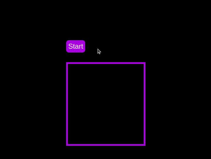 Test out the countdown timer and once you are done, terminate the server application and move to the next step.
Adding a circular progress indicator
To make the countdown timer more visually appealing, we can add a circular progress indicator that shows the remaining time. To do this, we will modify the HTML and CSS code as follows:
First, replace the countdown-container div in the index.html file with the following code:
<div class="countdown-container">
  <span class="circular-progress">
  </span>
  <ul class="countdown">
    <li>10</li>
    <li>9</li>
    <li>8</li>
    <li>7</li>
    <li>6</li>
    <li>5</li>
    <li>4</li>
    <li>3</li>
    <li>2</li>
    <li>1</li>
  </ul>
</div>
In this code, we add a span element with a class of circular-progress inside the countdown-container div.
Next, add the following code to the styles.css file:
.countdown-container {
  ...
  /* border : 0.4em solid #9b51e0; */
}

.circular-progress {
  width: 20vw;
  height: 20vw;
  border-radius: 50%;
  display: flex;
  justify-content: center;
  align-items: center;
  position: absolute;
  transition: 0.5s;
  background: conic-gradient(#9b51e0 var(--angle), #13171f 0deg);
}

.circular-progress::before {
  width: 18.5vw;
  height: 18.5vw;
  content: "";
  position: absolute;
  border-radius: 50%;
  background-color: black;
}

@keyframes circularProgressAnimation {
  to {
    --angle: 360deg;
  }
}

@property --angle {
  syntax: "<angle>";
  initial-value: 0deg;
  inherits: false;
}

#startBtn:checked~.countdown-container .circular-progress {
  opacity: 1;
  animation: circularProgressAnimation 10s linear;
}

#pauseBtn:checked~.countdown-container .circular-progress {
  animation-play-state: paused;
}
In this code, we first remove the border from the countdown-container div, and then add styles for the circular-progress class. The circular progress indicator is a span element that is absolutely positioned within the countdown-container. It uses a conic gradient to create the circular progress effect.
We also define a keyframe animation, circularProgressAnimation, that animates the progress indicator from 0 to 360 degrees over the duration of the countdown. The --angle CSS property is used to control the angle of the gradient.
Finally, we use the checkbox hack to start and pause the circular progress animation along with the countdown numbers. The animation is applied to the circular-progress span when the start button is checked and paused when the pause button is checked.
With these modifications, our countdown timer now includes a circular progress indicator that animates along with the timer.
Go back to your terminal and run the following command to start serving the CSS-only countdown application:
node server.js
Return to the tab in your browser where you visited the http://localhost:3002 URL, refresh the page, and you should see something similar to the following: 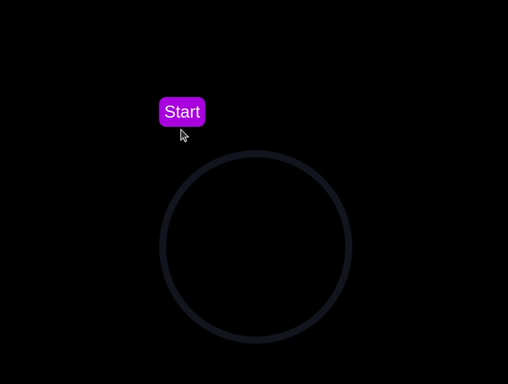
Using Chrome DevTools to compare timer performance
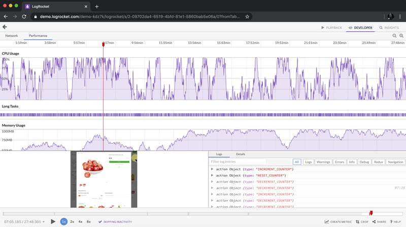
Now that we have implemented both the CSS-only and JavaScript countdown timers, let's compare their performance using Chrome DevTools.
To get started, open the Chrome browser and navigate to the webpage containing the countdown timers. Right-click anywhere on the page and select Inspect to open Chrome DevTools.
In the DevTools window, click on the Network tab and then refresh both the JavaScript and CSS-only countdown pages. This tab allows you to monitor all network requests made by the page, including HTML, CSS, JavaScript, and other resources: 
By analyzing the requests, you can determine how many resources are being loaded, their sizes, and the overall impact on page load time:
| CSS-only countdown timer | JavaScript countdown timer | |
|---|---|---|
| Number of requests | 2 | 3 |
| Total size | 4.5 KB | 4.7 KB |
| Page load | 24 ms | 27 ms |
Aus diesen Ergebnissen können wir ersehen, dass der reine CSS-Countdown-Timer weniger Anfragen erfordert und eine etwas kleinere Gesamtgröße im Vergleich zum JavaScript-Countdown-Timer hat. Dies führt zu einer geringfügig schnelleren Seitenladezeit für die reine CSS-Version und macht sie hinsichtlich des anfänglichen Ladens effizienter.
Navigieren Sie nun im DevTools-Fenster zur Registerkarte Leistung und starten Sie eine Aufzeichnungssitzung, indem Sie auf die Schaltfläche Aufzeichnen klicken. Um den JavaScript-Countdown-Timer auszuwerten, klicken Sie auf die Schaltfläche Start auf der entsprechenden Seite und lassen Sie den Timer ablaufen. Sobald der Timer angehalten ist, beenden Sie die Aufnahme auf der Registerkarte Leistung.
Führen Sie diesen Vorgang sowohl für die JS- als auch für die CSS-only Countdown-Seiten durch, um Leistungsdaten für jede Implementierung zu sammeln. Die Registerkarte Leistung bietet eine umfassende Analyse der Laufzeitleistung Ihrer Seite, einschließlich Skripterstellungs-, Rendering- und Malzeiten. Durch die Analyse dieser Metriken können Sie Bereiche identifizieren, die möglicherweise optimiert werden müssen, um die Leistung Ihrer Webanwendung zu verbessern:
| CSS-only countdown timer | JavaScript countdown timer | |
|---|---|---|
| Scripting | 2 ms | 49 ms |
| Rendering | 510 ms | 103 ms |
| Painting | 275 ms | 55 ms |
Bei der Interpretation dieser Ergebnisse stellen wir fest, dass die Skriptzeit für den reinen CSS-Countdown-Timer deutlich kürzer ist als für den JavaScript-Countdown-Timer, was auf einen minimalen Ausführungsaufwand hinweist. Der reine CSS-Countdown-Timer hat jedoch längere Render- und Malzeiten. Dies liegt daran, dass das Rendern von CSS-Animationen manchmal mehr Aufwand für den Browser erfordert, insbesondere bei komplexen Stilen oder Übergängen.
Im Gegensatz dazu weist der JavaScript-Countdown-Timer aufgrund der Logik beim Aktualisieren des Countdowns eine höhere Skripterstellungszeit auf, profitiert jedoch von kürzeren Rendering- und Malzeiten. Dies deutet darauf hin, dass JavaScript zwar einen gewissen Overhead in Bezug auf die Skriptausführung verursacht, es jedoch effizienter in Bezug auf die Aktualisierung des DOM und das Rendern von Änderungen sein kann.
Insgesamt ist der Nur-CSS-Countdown-Timer effizienter für Szenarien, in denen die Minimierung der Skriptausführungszeit von entscheidender Bedeutung ist, während der JavaScript-Timer möglicherweise eine bessere Leistung erbringt, wenn die Render- und Zeichenzeiten im Vordergrund stehen.
Vor- und Nachteile jedes Ansatzes
Nachdem wir sowohl die reinen CSS- als auch die JavaScript-Countdown-Timer untersucht haben, wollen wir ihre Vor- und Nachteile abwägen, um herauszufinden, welcher Ansatz Ihren Anforderungen am besten entspricht.
Nur CSS-Countdown-Timer
Der Nur-CSS-Countdown-Timer nutzt reines CSS, um den Countdown-Effekt zu erzielen, und bietet so eine leichte und unkomplizierte Lösung.
Zu seinen Vorteilen gehören die folgenden:
- Minimaler Skriptaufwand: Wie in unserer Leistungsanalyse zu sehen ist, erfordert der reine CSS-Timer nur sehr wenig Skripting, was zu einer geringeren CPU-Auslastung für die Skriptausführung führt. Dies kann für die Verbesserung der Gesamtleistung der Seite von Vorteil sein, insbesondere auf Geräten mit begrenzter Rechenleistung
- Vereinfachte Codebasis: Durch die Verwendung von CSS für Animationen bleibt der Code sauberer und wartbarer. Dieser Ansatz reduziert die Komplexität der Implementierung und kann es Entwicklern erleichtern, den Code zu verstehen und zu verwalten
Nachteile dieses Ansatzes sind:
- Höhere Render- und Malzeiten: Der reine CSS-Timer hat tendenziell längere Render- und Malzeiten. Dies liegt an der Natur von CSS-Animationen, die höhere Anforderungen an die Rendering-Engine des Browsers stellen können. Dies könnte die Leistung auf Seiten mit mehreren Animationen oder komplexen Layouts beeinträchtigen
- Eingeschränkte Interaktivität: CSS-Animationen sind von Natur aus weniger flexibel als JavaScript. Die Implementierung interaktiverer Funktionen wie dynamische Aktualisierungen oder bedingte Logik kann eine Herausforderung sein und erfordert möglicherweise zusätzliches JavaScript, wodurch der Vorteil der Einfachheit teilweise zunichte gemacht wird
JavaScript-Countdown-Timer
Der JavaScript-Countdown-Timer hingegen verwendet JavaScript, um die Countdown-Logik und DOM-Updates zu verwalten. Dieser Ansatz bietet mehr Kontrolle und Flexibilität.
Zu den Vorteilen dieses Ansatzes gehören:
- Erweiterte Kontrolle und Flexibilität: JavaScript bietet eine differenzierte Kontrolle über die Countdown-Logik und die DOM-Manipulation. Dies ermöglicht komplexere Interaktionen, bedingtes Verhalten und dynamische Aktualisierungen und eignet sich somit für anspruchsvollere Anwendungen
- Effizientes Rendern und Malen: Wie unsere Leistungsanalyse zeigt, profitiert der JavaScript-Timer von kürzeren Rendering- und Malzeiten. JavaScript kann Aktualisierungen des DOM optimieren, was zu flüssigeren Animationen und einer besseren Leistung in Szenarien mit häufigen Aktualisierungen führt
Zu den Nachteilen gehören:
- Höherer Skriptaufwand: Der Hauptnachteil des JavaScript-Countdown-Timers ist die längere Skriptzeit. Die JavaScript-Logik führt zu zusätzlichem CPU-Overhead, der sich auf die Leistung auswirken kann, insbesondere auf Geräten mit geringerer Rechenleistung oder auf Seiten mit starker Skriptnutzung
- Erhöhte Komplexität: Die Implementierung eines JavaScript-Countdown-Timers erfordert das Schreiben und Verwalten von mehr Code, was die Komplexität des Projekts erhöhen kann. Diese zusätzliche Komplexität kann die Wartung und das Debuggen der Codebasis erschweren
Der reine CSS-Timer ist leichtgewichtig und leicht zu verstehen, was ihn zu einer guten Wahl für einfache Countdowns mit minimalem Skripting macht. Bei komplexeren Animationen und interaktiven Funktionen kann es jedoch zu Problemen kommen. Andererseits bietet der JavaScript-Timer mehr Kontrolle und Flexibilität und ermöglicht dynamischere Interaktionen. Dies geht mit einem höheren Skriptaufwand und erhöhter Komplexität einher.
Letztendlich hängt die Wahl zwischen den beiden Ansätzen von den spezifischen Anforderungen Ihres Projekts und den Kompromissen ab, die Sie bereit sind zu akzeptieren.
Abschluss
In diesem Tutorial haben wir zwei Methoden zum Erstellen eines Countdown-Timers untersucht: die Verwendung von JavaScript und die ausschließliche Verwendung von CSS. Wir begannen mit einem einfachen JavaScript-Countdown-Timer und fügten Funktionalität und Stil hinzu, um ihn benutzerfreundlich und optisch ansprechend zu gestalten. Anschließend haben wir einen reinen CSS-Countdown-Timer implementiert, der die Leistungsfähigkeit von CSS für die Erstellung einfacher, aber effektiver Animationen demonstriert.
Ganz gleich, ob Sie den reinen CSS-Ansatz wegen seiner Einfachheit oder den JavaScript-Ansatz wegen seiner Flexibilität wählen, Sie verfügen jetzt über die Tools und das Wissen, um einen Countdown-Timer zu implementieren, der den Anforderungen Ihres Projekts entspricht.
Belastet Ihr Frontend die CPU Ihrer Benutzer?
Da Web-Frontends immer komplexer werden, fordern ressourcenintensive Funktionen immer mehr vom Browser. Wenn Sie daran interessiert sind, die clientseitige CPU-Nutzung, Speichernutzung und mehr für alle Ihre Benutzer in der Produktion zu überwachen und zu verfolgen, probieren Sie LogRocket aus.
LogRocket ist wie ein DVR für Web- und mobile Apps und zeichnet alles auf, was in Ihrer Web-App, mobilen App oder Website passiert. Anstatt zu erraten, warum Probleme auftreten, können Sie wichtige Frontend-Leistungsmetriken zusammenfassen und darüber berichten, Benutzersitzungen zusammen mit dem Anwendungsstatus wiedergeben, Netzwerkanfragen protokollieren und alle Fehler automatisch aufdecken.
Modernisieren Sie die Art und Weise, wie Sie Web- und mobile Apps debuggen – beginnen Sie mit der kostenlosen Überwachung.
Ce qui précède est le contenu détaillé de. pour plus d'informations, suivez d'autres articles connexes sur le site Web de PHP en chinois!

Outils d'IA chauds

Undresser.AI Undress
Application basée sur l'IA pour créer des photos de nu réalistes

AI Clothes Remover
Outil d'IA en ligne pour supprimer les vêtements des photos.

Undress AI Tool
Images de déshabillage gratuites

Clothoff.io
Dissolvant de vêtements AI

Video Face Swap
Échangez les visages dans n'importe quelle vidéo sans effort grâce à notre outil d'échange de visage AI entièrement gratuit !

Article chaud
Outils chauds

Bloc-notes++7.3.1
Éditeur de code facile à utiliser et gratuit

SublimeText3 version chinoise
Version chinoise, très simple à utiliser

Envoyer Studio 13.0.1
Puissant environnement de développement intégré PHP

Dreamweaver CS6
Outils de développement Web visuel

SublimeText3 version Mac
Logiciel d'édition de code au niveau de Dieu (SublimeText3)
Sujets chauds
 1670
1670
 14
1428
52
1329
25
1276
29
1256
24
14
1428
52
1329
25
1276
29
1256
24

 Une comparaison des fournisseurs de formulaires statiques
Apr 16, 2025 am 11:20 AM
Une comparaison des fournisseurs de formulaires statiques
Apr 16, 2025 am 11:20 AM
Essayons de savoir un terme ici: "fournisseur de formulaire statique". Vous apportez votre HTML
 Une preuve de concept pour rendre Sass plus rapidement
Apr 16, 2025 am 10:38 AM
Une preuve de concept pour rendre Sass plus rapidement
Apr 16, 2025 am 10:38 AM
Au début d'un nouveau projet, la compilation SASS se produit en un clin d'œil. Cela se sent bien, surtout quand il est associé à BrowSersync, qui recharge
 Actualités hebdomadaires de la plate-forme: attribut HTML Loading, les principales spécifications Aria et le passage de iframe à Shadow Dom
Apr 17, 2025 am 10:55 AM
Actualités hebdomadaires de la plate-forme: attribut HTML Loading, les principales spécifications Aria et le passage de iframe à Shadow Dom
Apr 17, 2025 am 10:55 AM
Dans cette semaine, le Roundup des nouvelles de la plate-forme, Chrome présente un nouvel attribut pour le chargement, les spécifications d'accessibilité pour les développeurs Web et la BBC Moves
 Certains pratiques avec l'élément de dialogue HTML
Apr 16, 2025 am 11:33 AM
Certains pratiques avec l'élément de dialogue HTML
Apr 16, 2025 am 11:33 AM
C'est moi qui regarde l'élément HTML pour la première fois. J'en ai été conscient depuis un certain temps, mais il ne l'a pas encore pris pour un tour. Il a un peu cool et
 Forme de papier
Apr 16, 2025 am 11:24 AM
Forme de papier
Apr 16, 2025 am 11:24 AM
L'achat ou la construction est un débat classique de la technologie. Construire des choses vous-même peut être moins cher car il n'y a pas d'article de ligne sur votre facture de carte de crédit, mais
 Où devrait «abonner au podcast» vers le lien?
Apr 16, 2025 pm 12:04 PM
Où devrait «abonner au podcast» vers le lien?
Apr 16, 2025 pm 12:04 PM
Pendant un certain temps, iTunes était le grand chien du podcasting, donc si vous avez lié "Abonnez-vous au podcast" pour aimer:
 Actualités de plate-forme hebdomadaire: bookmarklet d'espacement de texte, attente de haut niveau, nouvel indicateur de chargement d'ampli
Apr 17, 2025 am 11:26 AM
Actualités de plate-forme hebdomadaire: bookmarklet d'espacement de texte, attente de haut niveau, nouvel indicateur de chargement d'ampli
Apr 17, 2025 am 11:26 AM
Au cours de cette semaine, un Bookmarklet pratique pour inspecter la typographie, en utilisant Await pour bricoler comment les modules JavaScript s'importent, ainsi que Facebook & # 039; S
 Options pour héberger vos propres analyses non-javascript
Apr 15, 2025 am 11:09 AM
Options pour héberger vos propres analyses non-javascript
Apr 15, 2025 am 11:09 AM
Il existe de nombreuses plates-formes d'analyse pour vous aider à suivre les données des visiteurs et d'utilisation sur vos sites. Peut-être plus particulièrement Google Analytics, qui est largement utilisé
