

CSS3 pour obtenir un effet de vélo animé
Cette fois je vais vous apporter CSS3 pour réaliser l'effet vélo animé. Quelles sont les précautions pour réaliser l'effet vélo animé avec CSS3 Voici un cas pratique, jetons un oeil.
Tout d'abord, jetons un coup d'œil aux rendus implémentés (statiques) :
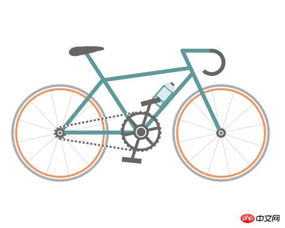
Code source de l'instance :
<!DOCTYPE html>
<html>
 <head>
  <meta charset="UTF-8">
  <title>自行车</title>
  <style type="text/css">
   * {
    margin: 0;
    padding: 0
   }

   ol,
   ul {
    list-style: none/*去掉圆点或数字*/
   }

   .cycle-outer {
    width: 534px;
    height: 260px;
    position: absolute;
    /*绝对定位*/
    top: 50%;
    /*距离顶部*/
    margin: -160px 0 0 -267px;
    /*距离外边距*/
    left: 50%;
   }

   .cycle-wrapper {
    width: 534px;
    height: 260px;
    margin: 0 auto;
    position: relative;
    /*相对定位*/
   }

   .cycle-wheel-front {
    /*前轮*/
    margin: 100px 0 0 330px;
   }

   .cycle-wheel-back {
    /*后轮*/
    margin: 100px 0 0 0px;
   }

   .cycle-wheel-outer {
    background: transparent;
    border: 5px solid #aaa;
    border-radius: 50%;
    /*画外轮圆圈*/
    width: 190px;
    height: 190px;
    position: absolute;
    margin-top: 5px;
    animation: wheel-rotate 2s linear infinite;
    /*定义动画*/
   }
   /*轮胎开始旋转*/
   @keyframes wheel-rotate {
    from {
     transform: rotate(0deg);
    }
    to {
     transform: rotate(360deg);
    }
   }

   .cycle-wheel-outer:after {
    /*插入内轮胎圆圈*/
    background: transparent;
    border: 4px solid #EF9058;
    border-radius: 50%;
    width: 176px;
    height: 176px;
    position: absolute;
    margin: 3px;
    content: "";
   }

   .spoke {
    /*开始画车轮线条*/
    position: absolute;
    width: 1px;
    height: 200px;
    background: #ccc;
    margin: -5px 0 0 95px;
    z-index: 0;
   }

   .spoke:after {
    /*在后面插入两条*/
    content: "";
    position: absolute;
    width: 1px;
    height: 200px;
    background: #ccc;
    transform: rotate(120deg);
   }

   .spoke:before {
    /*在前面插入两条*/
    content: "";
    position: absolute;
    width: 1px;
    height: 200px;
    background: #ccc;
    transform: rotate(240deg);
   }
   /*轮胎线条完成*/

   .spoke-container li:nth-child(2) {
    /*中心点旋转*/
    transform: rotate(30deg);
   }

   .inner-disc {
    /*画中心轴圆点*/
    background: #666;
    width: 20px;
    height: 20px;
    border-radius: 50%;
    position: absolute;
    left: 50%;
    margin: -10px 0 0 -10px;
    top: 50%;
   }
   /*.cycle-wheel-back .inner-disc:after {
    content: "";
    background: #666;
    width: 20px;
    height: 20px;
    border-radius: 50%;
    position: absolute;
    left: 50%;
    margin: -10px 0 0 -10px;
    top: 50%;
   }*/

   .inner-disc-2 {
    /*画轮胎中心轴的圆圈*/
    background: transparent;
    width: 6px;
    height: 6px;
    border: 2px solid #FFF;
    border-radius: 50%;
    position: absolute;
    left: 50%;
    margin: -5px 0 0 -5px;
    top: 50%;
   }

   .cycle-wheel-back .inner-disc-2:after {
    /*插入后轮轴心齿轮*/
    content: "";
    background: transparent;
    width: 18px;
    height: 18px;
    border-radius: 50%;
    position: absolute;
    left: 50%;
    margin: -13px 0 0 -13px;
    top: 50%;
    border: 4px dotted #666;
   }
   .cycle-body {
    margin-left: 125px;
   }
   .front-wheel-frame {/*前叉*/
    background: #5E999B;
    width: 8px;
    height: 180px;
    position: absolute;
    z-index: 2;
    transform: rotate(-25deg);
    margin: -72px 0 0 260px;
   }
   .top-frame {/*上管*/
    background: #5E999B;
    width: 180px;
    height: 8px;
    position: absolute;
    z-index: 2;
    margin: -20px 0 0 62px;
    transform: rotate(-8deg);
   }
   .front-frame {/*下管*/
    background: #5E999B;
    width: 8px;
    height: 160px;
    position: absolute;
    z-index: 2;
    transform: rotate(41deg);
    margin: -36px 0 0 189px;
   }
   .center-frame { /*坐杆*/
    background: #5E999B;
    width: 8px;
    height: 205px;
    position: absolute;
    z-index: 2;
    transform: rotate(-33deg);
    margin: -84px 0 0 75px;
   }
   .back-frame {/*后管*/
    background: #5E999B;
    width: 8px;
    height: 136px;
    position: absolute;
    z-index: 2;
    transform: rotate(39deg);
    margin: -23px 0 0 19px;
   }
   .bottom-frame {/*后叉or平管*/
    background: #5E999B;
    width: 159px;
    height: 8px;
    position: absolute;
    z-index: 2;
    margin: 100px 0 0 -16px;
   }
   .handlebar-front {/*车把*/
    width: 60px;
    height: 8px;
    background: #5E999B;
    z-index: 2;
    position: absolute;
    margin: -68px 0 0 222px;
    border-top-left-radius: 3px;
    border-bottom-left-radius: 3px;
   }
   .handlebar-curve {/*车把手*/
    width: 40px;
    height: 40px;
    border: 8px solid #666;
    border-top-right-radius: 100%;
    border-bottom-right-radius: 100%;
    border-bottom-left-radius: 100%;
    background: transparent;
    position: absolute;
    margin: -68px 0 0 258px;
    border-left: 8px solid transparent;
    border-top: 8px solid #666;
    border-bottom: 8px solid #666;
   }
   /*座垫*/
   .seat {
    width: 50px;
    height: 10px;
    background: #666;
    border-radius: 44%;
    position: absolute;
    margin: -73px 0 0 15px;
   }

   .seat:after {
    width: 0px;
    height: 0px;
    border-style: solid;
    border-width: 0 40px 16px 40px;
    border-color: transparent transparent #666 transparent;
    content: "";
    position: absolute;
    z-index: 3;
    transform: rotate(-12deg);
    position: absolute;
    border-radius: 100%;
    margin: 0 0 0 -26px;
   }
   .seat:before {
    width: 0px;
    height: 0px;
    border-style: solid;
    border-width: 0 40px 16px 40px;
    border-color: transparent transparent #666 transparent;
    content: "";
    position: absolute;
    z-index: 3;
    transform: rotate(179deg);
    position: absolute;
    border-radius: 100%;
    margin: 0 0 0 -26px;
   }
   .seat span {
    width: 32px;
    height: 19px;
    background: #666;
    border-radius: 100%;
    position: absolute;
    margin: 1px 0 0 -22px;
    transform: rotate(-11deg);
   }
   /*去掉中心轴的*/
   .chain-rotation {
    position: absolute;
    z-index: 16;
   }
   /*中心轴*/
   .chain-disc-inner {
    background: #666;
    width: 18px;
    height: 18px;
    border-radius: 50%;
    position: absolute;
    margin: 2px;
    z-index: 4;
   }
   .chain-disc-outer {
    background: #FFF;
    width: 22px;
    height: 22px;
    border: 5px solid #666;
    border-radius: 50%;
    position: absolute;
    margin: 87px 0 0 250px;
    z-index: 3;
    content: "";
   }
   /*牙盘*/
   .chain-rods {
    height: 70px;
    width: 6px;
    background: #666;
    position: absolute;
    margin: 67px 0 0 263px;
    z-index: 15;
    animation: wheel-rotate 2s linear infinite;
   }
   .chain-rods:before {
    content: "";
    height: 70px;
    width: 6px;
    background: #666;
    position: absolute;
    transform: rotate(120deg);
   }
   .chain-rods:after {
    content: "";
    height: 70px;
    width: 6px;
    background: #666;
    position: absolute;
    transform: rotate(240deg);
    -webkit-transform: rotate(240deg);
    -moz-transform: rotate(240deg);
   }
   .outer-axle {
    height: 70px;
    width: 70px;
    border-radius: 50%;
    background: transparent;
    border: 5px solid #666;
    position: absolute;
    margin: 62px 0 0 226px;
    z-index: 3;
   }

   .outer-axle:after {
    content: "";
    height: 74px;
    width: 74px;
    border-radius: 50%;
    background: transparent;
    border: 5px dotted #666;
    margin: -7px;
    position: absolute;
    z-index: 3;
    animation: wheel-rotate 2s linear infinite;
   }
   /*车链子*/
   .chain-up {
    background-color: transparent;
    background-size: 8px 2px;
    background-position: 0 0, 30px 30px;
    width: 155px;
    height: 4px;
    position: absolute;
    z-index: 9;
    background: #EEE;
    transform: rotate(-11deg);
    margin: 76px 0 0 98px;
   }
   .chain-up:before {
    content: "";
    background-color: transparent;
    background-image: linear-gradient(90deg, #666 25%, transparent 25%, transparent 75%, #666 75%, #666);
    background-size: 8px 2px;
    background-position: 0 0, 30px 30px;
    width: 155px;
    height: 4px;
    animation: chainUp 2s linear infinite;
    position: absolute;
    z-index: 10;
   }
   .chain-bottom {
    background-color: transparent;
    background-size: 8px 2px;
    background-position: 0 0, 30px 30px;
    width: 155px;
    height: 4px;
    position: absolute;
    z-index: 9;
    background: #EEE;
    -webkit-transform: rotate(9deg);
    -moz-transform: rotate(9deg);
    transform: rotate(9deg);
    margin: 127px 0 0 98px;
   }

   .chain-bottom:before {
    content: "";
    background-color: transparent;
    background-image: linear-gradient(90deg, #666 25%, transparent 25%, transparent 75%, #666 75%, #666);
    background-size: 8px 2px;
    background-position: 0 0, 30px 30px;
    width: 155px;
    height: 4px;
    animation: chainDown 2s linear infinite;
    position: absolute;
    z-index: 10;
   }
   /*脚踏*/
   .pedal-rod {
    height: 120px;
    width: 6px;
    background: #666;
    position: absolute;
    margin: -25px 0 0 0px;
   }

   .pedal-rod:before {
    width: 40px;
    height: 10px;
    background: #666;
    position: absolute;
    margin: 10px;
    content: "";
    margin: -7px -17px;
    animation: pedal1 2s linear infinite;
   }

   .pedal-rod:after {
    width: 40px;
    height: 10px;
    background: #666;
    position: absolute;
    margin: 10px;
    content: "";
    margin: 119px -17px;
    animation: pedal2 2s linear infinite;
   }
   /*水壶架*/
   .bottle-holder {
    width: 20px;
    height: 36px;
    background: #daeded;
    border: 3px solid #5E999B;
    position: absolute;
    margin: 54px 0 0 -25px;
   }

   .bottle-holder:after {
    width: 20px;
    height: 3px;
    content: "";
    background: #5E999B;
    position: absolute;
    margin: 24px 0 0 0px;
   }
   /*水壶*/
   .bottle-holder:before {
    background-color: #daeded;
    width: 18px;
    height: 10px;
    border-radius: 30% / 100%;
    border-bottom-left-radius: 0;
    border-bottom-right-radius: 0;
    content: "";
    position: absolute;
    margin-top: -13px;
    border: 1px solid #98baba;
    border-bottom: 0;
   }
   .bottle-holder span {
    position: absolute;
    width: 9px;
    height: 4px;
    background: #666;
    margin: -17px 0 0 5px;
   }
   /*车链子动画*/
   @keyframes chainUp {
    0% {
     background-position: 0 25%;
    }
    100% {
     background-position: 100% 0;
    }
   }
   @keyframes chainDown {
    0% {
     background-position: 100% 0;
    }
    100% {
     background-position: 0 25%;
    }
   }
   /*脚踏动画*/
   @keyframes pedal1 {
    0% {
     transform: rotate(00deg);
    }
    25% {
     transform: rotate(-140deg);
    }
    50% {
     transform: rotate(-180deg);
    }
    75% {
     transform: rotate(-240deg);
    }
    100% {
     transform: rotate(-360deg);
    }
   }
   @keyframes pedal2 {
    0% {
     transform: rotate(00deg);
    }
    25% {
     transform: rotate(-60deg);
    }
    50% {
     transform: rotate(-180deg);
    }
    75% {
     transform: rotate(-340deg);
    }
    100% {
     transform: rotate(-360deg);
    }
   }
  </style>
 </head>
 <body>
  <p class="cycle-outer">
   <p class="cycle-wrapper">
    <!--
                 描述:车架
                -->
    <p class="cycle-body">
     <p class="seat">
      <span></span>
     </p>
     <p class="front-wheel-frame"></p>

     <p class="top-frame"></p>
     <p class="front-frame">
      <p class="bottle-holder">
       <span></span>
      </p>
     </p>
     <p class="center-frame"></p>
     <p class="back-frame"></p>
     <p class="bottom-frame"></p>
     <p class="handlebar-front"></p>
     <p class="handlebar-curve"></p>
    </p>
    <!--
                 描述:后轮
                -->
    <p class="cycle-wheel cycle-wheel-back">
     <p class="cycle-wheel-outer">
      <p class="cycle-wheel-inner">
       <p class="cycle-wheel-inner-padding">
        <ul class="spoke-container">
         <li class="spoke"></li>
         <li class="spoke"></li>
        </ul>
        <p class="inner-disc"></p>
        <p class="inner-disc-2"></p>
       </p>
      </p>
     </p>
    </p>
    <!--
                 描述:前轮
                -->
    <p class="cycle-wheel cycle-wheel-front">
     <p class="cycle-wheel-outer">
      <p class="cycle-wheel-inner">
       <p class="cycle-wheel-inner-padding">
        <ul class="spoke-container">
         <li class="spoke"></li>
         <li class="spoke"></li>
        </ul>
        <p class="inner-disc"></p>
        <p class="inner-disc-2"></p>
       </p>
      </p>
     </p>
    </p>
    <!--
                 描述:中心轴  车链子 牙盘 水壶架  水壶   脚踏
                -->
    <p class="chain-up"></p>
    <p class="chain-bottom"></p>
    <p class="chain-rotation">
     <p class="outer-axle"></p>
     <p class="chain-disc-outer">
      <p class="chain-disc-inner"></p>
     </p>
    </p>
    <p class="chain-rods">
     <p class="pedal-rod"></p>
    </p>
   </p>
  </p>
  <p style="text-align:center;clear:both;">
 </body>
</html>Je pense que vous maîtrisez la méthode après avoir lu le cas dans cet article. Pour des informations plus intéressantes, veuillez prêter attention aux autres articles connexes sur le site Web chinois de php !
Lecture recommandée :
Explication détaillée de l'utilisation du sélecteur multi-classe CSS3
Css pour créer une animation d'ondulation
Utilisation avancée de la pièce jointe en arrière-plan en CSS
Ce qui précède est le contenu détaillé de. pour plus d'informations, suivez d'autres articles connexes sur le site Web de PHP en chinois!

Outils d'IA chauds

Undresser.AI Undress
Application basée sur l'IA pour créer des photos de nu réalistes

AI Clothes Remover
Outil d'IA en ligne pour supprimer les vêtements des photos.

Undress AI Tool
Images de déshabillage gratuites

Clothoff.io
Dissolvant de vêtements AI

AI Hentai Generator
Générez AI Hentai gratuitement.

Article chaud
Outils chauds

Bloc-notes++7.3.1
Éditeur de code facile à utiliser et gratuit

SublimeText3 version chinoise
Version chinoise, très simple à utiliser

Envoyer Studio 13.0.1
Puissant environnement de développement intégré PHP

Dreamweaver CS6
Outils de développement Web visuel

SublimeText3 version Mac
Logiciel d'édition de code au niveau de Dieu (SublimeText3)


 Comment utiliser Bootstrap en Vue
Apr 07, 2025 pm 11:33 PM
Comment utiliser Bootstrap en Vue
Apr 07, 2025 pm 11:33 PM
L'utilisation de bootstrap dans vue.js est divisée en cinq étapes: installer bootstrap. Importer un bootstrap dans main.js. Utilisez le composant bootstrap directement dans le modèle. Facultatif: style personnalisé. Facultatif: utilisez des plug-ins.
 Les rôles de HTML, CSS et JavaScript: responsabilités de base
Apr 08, 2025 pm 07:05 PM
Les rôles de HTML, CSS et JavaScript: responsabilités de base
Apr 08, 2025 pm 07:05 PM
HTML définit la structure Web, CSS est responsable du style et de la mise en page, et JavaScript donne une interaction dynamique. Les trois exercent leurs fonctions dans le développement Web et construisent conjointement un site Web coloré.
 Comment écrire des lignes fendues sur bootstrap
Apr 07, 2025 pm 03:12 PM
Comment écrire des lignes fendues sur bootstrap
Apr 07, 2025 pm 03:12 PM
Il existe deux façons de créer une ligne divisée bootstrap: en utilisant la balise, qui crée une ligne divisée horizontale. Utilisez la propriété CSS Border pour créer des lignes de fractionnement de style personnalisées.
 Comment redimensionner le bootstrap
Apr 07, 2025 pm 03:18 PM
Comment redimensionner le bootstrap
Apr 07, 2025 pm 03:18 PM
Pour ajuster la taille des éléments dans Bootstrap, vous pouvez utiliser la classe de dimension, qui comprend: ajuster la largeur: .col-, .w-, .mw-ajustement Hauteur: .h-, .min-h-, .max-h-
 Comprendre HTML, CSS et JavaScript: un guide pour débutant
Apr 12, 2025 am 12:02 AM
Comprendre HTML, CSS et JavaScript: un guide pour débutant
Apr 12, 2025 am 12:02 AM
WebDevelopmentReliesOnHTML, CSS, etjavascript: 1) HTMLSTRUCTURESCONTENT, 2) CSSSTYLESIT, et3) JavascriptAdddsInterActivity, Forming TheasisofmodernweBEBExperiences.
 Comment configurer le cadre de bootstrap
Apr 07, 2025 pm 03:27 PM
Comment configurer le cadre de bootstrap
Apr 07, 2025 pm 03:27 PM
Pour configurer le framework Bootstrap, vous devez suivre ces étapes: 1. Référez le fichier bootstrap via CDN; 2. Téléchargez et hébergez le fichier sur votre propre serveur; 3. Incluez le fichier bootstrap dans HTML; 4. Compiler les sass / moins au besoin; 5. Importer un fichier personnalisé (facultatif). Une fois la configuration terminée, vous pouvez utiliser les systèmes, composants et styles de grille de Bootstrap pour créer des sites Web et des applications réactifs.
 Comment insérer des photos sur bootstrap
Apr 07, 2025 pm 03:30 PM
Comment insérer des photos sur bootstrap
Apr 07, 2025 pm 03:30 PM
Il existe plusieurs façons d'insérer des images dans Bootstrap: insérer directement les images, en utilisant la balise HTML IMG. Avec le composant d'image bootstrap, vous pouvez fournir des images réactives et plus de styles. Définissez la taille de l'image, utilisez la classe IMG-FLUID pour rendre l'image adaptable. Réglez la bordure en utilisant la classe IMG-border. Réglez les coins arrondis et utilisez la classe Roundée IMG. Réglez l'ombre, utilisez la classe Shadow. Redimensionner et positionner l'image, en utilisant le style CSS. À l'aide de l'image d'arrière-plan, utilisez la propriété CSS d'image d'arrière-plan.
 Comment utiliser le bouton bootstrap
Apr 07, 2025 pm 03:09 PM
Comment utiliser le bouton bootstrap
Apr 07, 2025 pm 03:09 PM
Comment utiliser le bouton bootstrap? Introduisez Bootstrap CSS pour créer des éléments de bouton et ajoutez la classe de bouton bootstrap pour ajouter du texte du bouton
