
Cette fois, je vais vous proposer une simulation 2D pour réaliser les effets spéciaux d'animation de rotation de la grande roue. Quelles sont les précautions pour utiliser la simulation 2D pour réaliser les effets spéciaux de l'animation de rotation de la grande roue. Voici un cas pratique. , jetons un coup d'oeil.
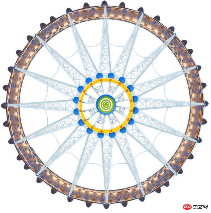
Regardez d'abord les rendus :

En raison de la taille du téléchargement, il ne peut être enregistré qu'à cet effet. l'image originale est illimitée. Rond et rond.
Code :
<span style="font-size:18px;"><!DOCTYPE html>
<html>
<head>
    <meta charset="utf-8" />
    <title>模拟摩天轮动画</title>
    <style>
    *{margin:0;padding:0;}
    .image{width:80px;height:80px;}
    .image1{width:620px;height:620px;}
    .p1{position:relative;margin:10px auto;width:638px;
            animation:run 20s linear infinite;
            -webkit-animation:run 20s linear infinite;
            -moz-animation:run 20s linear infinite;
            -o-animation:run 20s linear infinite;
        }
    img:nth-child(2){
            position:absolute;top:25px;left:270px;opacity:0.7;
            animation:run2 20s linear infinite;
            -webkit-animation:run2 20s linear infinite;
            -moz-animation:run2 20s linear infinite;
            -o-animation:run2 20s linear infinite;
            transform-origin:top center;
            -webkit-transform-origin:top center;
            -moz-transform-origin:top center;
            -o-transform-origin:top center;
        }
        img:nth-child(3){
            position:absolute;top:580px;left:270px;opacity:0.7;
            animation:run2 20s linear infinite;
            -webkit-animation:run2 20s linear infinite;
            -moz-animation:run2 20s linear infinite;
            -o-animation:run2 20s linear infinite;
            transform-origin:top center;
            -webkit-transform-origin:top center;
            -moz-transform-origin:top center;
            -o-transform-origin:top center;
        }
        img:nth-child(4){
            position:absolute;top:300px;left:550px;opacity:0.7;
            animation:run2 20s linear infinite;
            -webkit-animation:run2 20s linear infinite;
            -moz-animation:run2 20s linear infinite;
            -o-animation:run2 20s linear infinite;
            transform-origin:top center;
            -webkit-transform-origin:top center;
            -moz-transform-origin:top center;
            -o-transform-origin:top center;
        }
        img:nth-child(5){
            position:absolute;top:300px;left:0px;opacity:0.7;
            animation:run2 20s linear infinite;
            -webkit-animation:run2 20s linear infinite;
            -moz-animation:run2 20s linear infinite;
            -o-animation:run2 20s linear infinite;
            transform-origin:top center;
            -webkit-transform-origin:top center;
            -moz-transform-origin:top center;
            -o-transform-origin:top center;
        }
        @keyframes run
        {
            0%{transform:rotate(0deg)}
            100%{transform:rotate(360deg)}
        }
        @-webkit-keyframes run
        {
            0%{-webkit-transform:rotate(0deg)}
            100%{-webkit-transform:rotate(360deg)}
        }
        @-moz-keyframes run
        {
            0%{-moz-transform:rotate(0deg)}
            100%{-moz-transform:rotate(360deg)}
        }
        @-o-keyframes run
        {
            0%{-o-transform:rotate(0deg)}
            100%{-o-transform:rotate(360deg)}
        }

        @keyframes run2
        {
            0%{transform:rotate(0deg)}
            100%{transform:rotate(-360deg)}
        }
        @-webkit-keyframes run2
        {
            0%{-webkit-transform:rotate(0deg)}
            100%{-webkit-transform:rotate(-360deg)}
        }
        @-moz-keyframes run2
        {
            0%{-moz-transform:rotate(0deg)}
            100%{-moz-transform:rotate(-360deg)}
        }
        @-o-keyframes run2
        {
            0%{-o-transform:rotate(0deg)}
            100%{-o-transform:rotate(-360deg)}
        }
    </style>
</head>
<body>
    <p class="p1">
        <img src="1.png" class="image1">
        <img src="1.jpg" class="image">
        <img src="2.jpg" class="image">
        <img src="3.jpg" class="image">
        <img src="4.jpg" class="image">

    </p>
</body>
</html></span>Image originale de la grande roue :
Commentaires : transform-origin vous permet de changer la position de l'élément en cours de transformation.
La fonction principale de cet attribut est de sélectionner une position puis de faire pivoter autour de cette position. Je pense que vous maîtrisez la méthode après avoir lu le cas dans cet article. Pour des informations plus intéressantes, veuillez prêter attention aux autres articles connexes sur le site Web chinois de php ! Lecture recommandée :Comment gérer le problème de compatibilité nth-child() sous IE8
Box-sizing du tutoriel graphique des attributs CSS3
Comment gérer la disparition des lignes de bordure CSS
Réaliser plusieurs arrière-plans pour simuler des bordures dynamiques
Ce qui précède est le contenu détaillé de. pour plus d'informations, suivez d'autres articles connexes sur le site Web de PHP en chinois!
 L'écran de l'ordinateur n'affiche aucun signal
 Que signifie une startup héritée ?
 Introduction au document en JS
 Application officielle de l'échange euro-italien
 Comment télécharger et enregistrer les vidéos phares du jour
 Raisons pour lesquelles l'accès au site Web provoque une erreur de serveur interne
 Méthode de mise en œuvre de la fonction VUE page suivante
 Échange de Bitcoins
 Que dois-je faire si le fichier chm ne peut pas être ouvert ?


![[Web front-end] Démarrage rapide de Node.js](https://img.php.cn/upload/course/000/000/067/662b5d34ba7c0227.png)


