

Cet article vous apporte des connaissances sur plusieurs techniques de positionnement et de centrage absolu CSS pour réaliser un centrage vertical et un centrage horizontal. J'espère qu'il vous sera utile.
Nous utilisons souvent margin:0 auto pour réaliser un centrage horizontal, mais pensons toujours que margin:auto ne peut pas réaliser un centrage vertical... En fait, pour réaliser un centrage vertical, il suffit de déclarer le hauteur de l'élément et le CSS suivant :
.Absolute-Center {
  margin: auto;
  position: absolute;
  top: 0; left: 0; bottom: 0; right: 0;
}Je ne suis pas la première personne à implémenter cette méthode. C'est peut-être juste une petite technique très courante, j'ose la nommer Centrage absolu, Malgré tout, la plupart des articles traitant de la verticale. centering ne mentionne jamais cette méthode. Ce n'est que lorsque j'ai récemment parcouru les commentaires de l'article "Comment centrer n'importe quoi avec CSS" que j'ai découvert cette utilisation. Simon et Priit ont mentionné cette méthode dans la liste des commentaires.
Si vous avez des fonctionnalités d'extension ou des suggestions, vous pouvez laisser un commentaire ici :
CodePen
SmashingMagazine
Twitter @shshaw
Pros :
1 .Prend en charge plusieurs navigateurs, y compris IE8-IE10
2 Pas besoin d'autres balises spéciales, moins de code CSS
3. Prend en charge la valeur de l'attribut pourcentage% et l'attribut min/max
4. . Seule cette classe peut être utilisée pour centrer n'importe quel bloc de contenu
5. Elle peut être centrée indépendamment du fait que le remplissage soit défini (sans utiliser l'attribut box-sizing)
6.
7. Prend parfaitement en charge le centrage de l'image.
Inconvénients :
1. La hauteur doit être déclarée (voir Hauteur variable).
2. Il est recommandé de définir overflow:auto pour empêcher le contenu de déborder hors des limites. (Voir Débordement).
3. Ne fonctionne pas sur les appareils Windows Phone.
Compatibilité des navigateurs :
Chrome, Firefox, Safari, Mobile Safari, IE8-10.
La méthode de positionnement absolu fonctionne dans la dernière version de Chrome, Firefox, Safari, Mobile Safari , IE8-10. Tous les tests ont été réussis.
Tableau comparatif :
La méthode de centrage absolu n'est pas la seule méthode de mise en œuvre. Il existe d'autres méthodes pour réaliser un centrage vertical, et chacune a ses propres avantages. La technologie que vous utilisez dépend de la prise en charge de votre navigateur et des balises de langue que vous utilisez. Ce tableau comparatif vous aidera à faire le bon choix en fonction de vos besoins.

Explication :
Grâce à la description ci-dessus, le mécanisme de fonctionnement du centrage absolu (AbsoluteCentering) peut être expliqué comme suit :
1. Dans des conditions normales flux de contenu ( flux de contenu normal), l'effet de margin:auto est équivalent à margin-top:0;margin-bottom:0.
W3C écrit que si 'margin-top' ou 'margin-bottom' sont 'auto', leur valeur utilisée est 0.
2 position:absolute fait sortir le bloc de positionnement absolu du. flux de contenu. La partie positionnée de manière absolue n’est pas rendue tandis que le reste du flux de contenu est rendu.
Developer.mozilla.org :...un élément positionné de manière absolue est retiré du flux et ne prend donc pas de place
3. block area : 0; right: 0; réattribuera un cadre de délimitation au navigateur. À ce moment, le bloc remplira tout l'espace disponible de son élément parent. L'élément parent est généralement le corps ou un conteneur déclaré comme position:relative. ;.
Developer.mozilla.org : Pour les éléments positionnés de manière absolue, les propriétés haut, droite, bas et gauche spécifient les décalages par rapport au bord du bloc conteneur de l'élément (à quoi l'élément est positionné par rapport à la définition d'une hauteur ou d'une largeur pour le). le bloc de contenu empêche le bloc de contenu d'occuper tout l'espace disponible et invite le navigateur à recalculer la marge en fonction du nouveau cadre de délimitation :auto
Developer.mozilla.org: The margin of the[absolutely positioned] element is then positioned inside these offsets.
5、由于内容块被绝对定位,脱离了正常的内容流,浏览器会给margin-top,margin-bottom相同的值,使元素块在先前定义的边界内居中。
W3.org: If none of the three [top, bottom,height] are 'auto': If both 'margin-top' and 'margin-bottom' are 'auto', solvethe equation under the extra constraint that the two margins get equal values.AKA: center the block vertically
这么看来, margin:auto似乎生来就是为绝对居中(Absolute Centering)设计的,所以绝对居中(Absolute Centering)应该都兼容符合标准的现代浏览器。
简而言之(TL;DR):绝对定位元素不在普通内容流中渲染,因此margin:auto可以使内容在通过top: 0; left: 0; bottom: 0;right: 0;设置的边界内垂直居中。
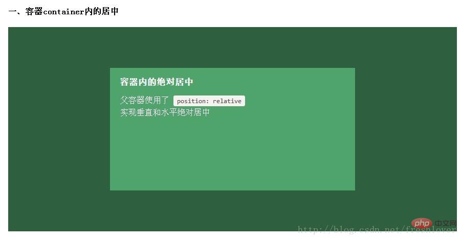
居中方式:
.Center-Container {
  position: relative;
}

.Absolute-Center {
  width: 50%;
  height: 50%;
  overflow: auto;
  margin: auto;
  position: absolute;
  top: 0; left: 0; bottom: 0; right: 0;
}
以下其余的demo默认上面的CSS样式已引用包括进去,在此基础上只提供额外的类供用户追加以实现不同的功能。
想让内容块一直停留在可视区域内?将内容块设置为position:fixed;并设置一个较大的z-index层叠属性值。
.Absolute-Center.is-Fixed {
  position: fixed;
  z-index: 999;
}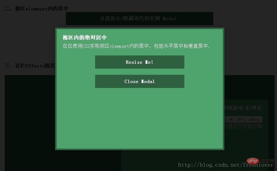
注意:对MobileSafari,若内容块不是放在设置为position:relative;的父容器中,内容块将垂直居中于整个文档,而不是可视区域内垂直居中。
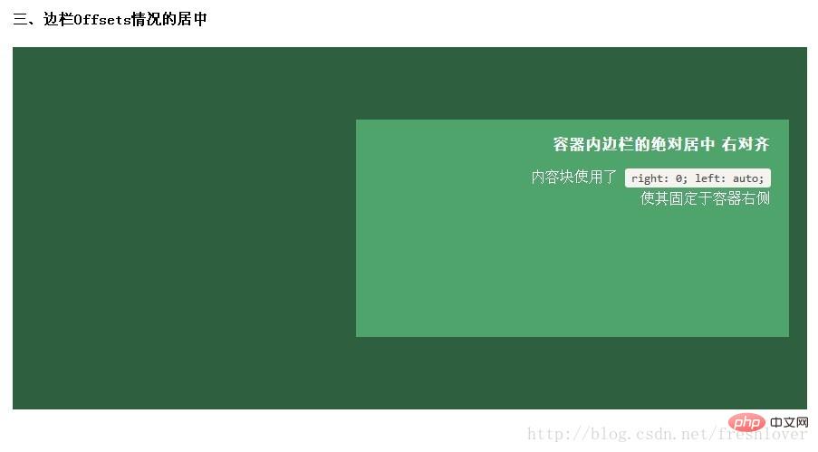
如果你要设置一个固顶的头或增加其他的边栏,只需要在内容块的样式中加入像这样的CSS样式代码:top:70px;bottom:auto;由于已经声明了margin:auto;,该内容块将会垂直居中于你通过top,left,bottom和right属性定义的边界框内。
你可以将内容块固定与屏幕的左侧或右侧,并且保持内容块垂直居中。使用right:0;left:auto;固定于屏幕右侧,使用left:0;right:auto;固定与屏幕左侧。
.Absolute-Center.is-Right {
  left: auto; right: 20px;
  text-align: right;
}

.Absolute-Center.is-Left {
  right: auto; left: 20px;
  text-align: left;
}
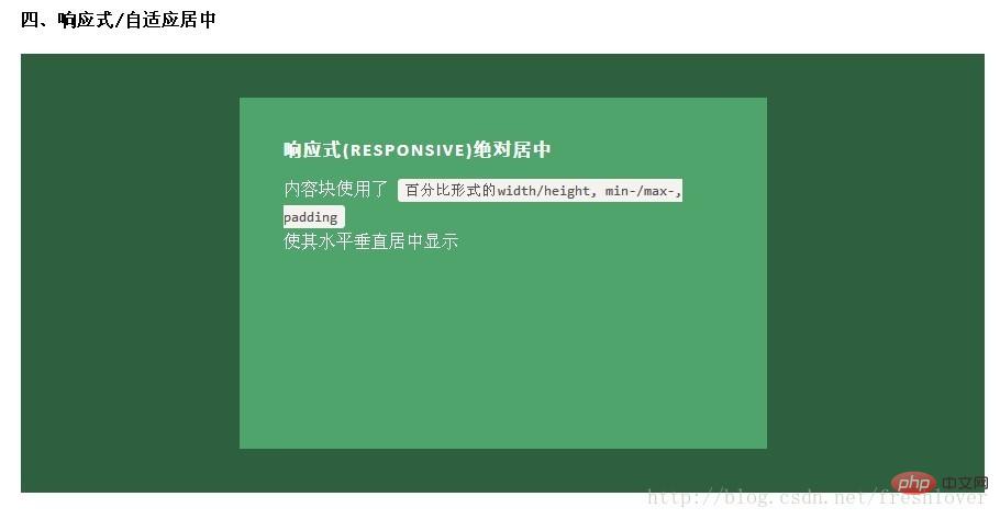
绝对居中最大的优势应该就是对百分比形式的宽高支持的非常完美。甚至min-width/max-width 和min-height/max-height这些属性在自适应盒子内的表现也和预期很一致。
.Absolute-Center.is-Responsive {
  width: 60%;
  height: 60%;
  min-width: 200px;
  max-width: 400px;
  padding: 40px;
}给内容块元素加上padding也不影响内容块元素的绝对居中实现。
内容高度大于块元素或容器(视区viewport或设为position:relative的父容器)会溢出,这时内容可能会显示到块与容器的外面,或者被截断出现显示不全(分别对应内容块overflow属性设置为visible和hidden的表现)。
加上overflow: auto会在内容高度超过容器高度的情况下给内容块显示滚动条而不越界。
.Absolute-Center.is-Overflow {
  overflow: auto;
}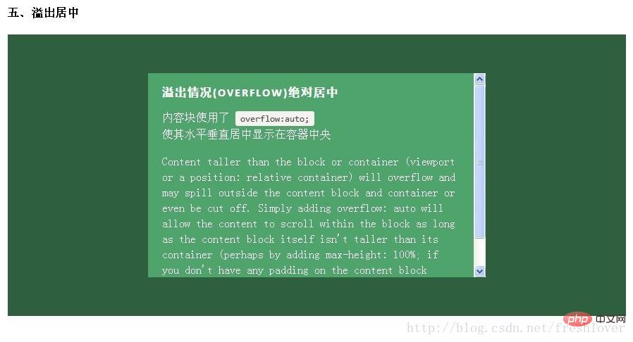
如果内容块自身不设置任何padding的话,可以设置max-height: 100%;来保证内容高度不超越容器高度。
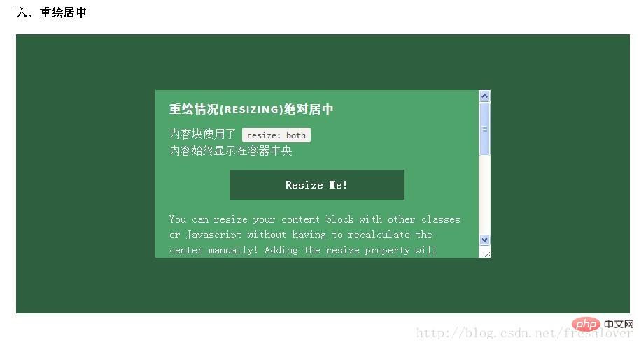
你可以使用其他class类或javascript代码来重绘内容块同时保证居中,无须手动重新计算中心尺寸。当然,你也可以添加resize属性来让用户拖拽实现内容块的重绘。
绝对居中(Absolute Centering)可以保证内容块始终居中,无论内容块是否重绘。可以通过设置min-/max-来根据自己需要限制内容块的大小,并防止内容溢出窗口/容器。
.Absolute-Center.is-Resizable {
  min-width: 20%;
  max-width: 80%;
  min-height: 20%;
  max-height: 80%;
  resize: both;
  overflow: auto;
}
如果不使用resize:both属性,可以使用CSS3动画属性transition来实现重绘的窗口之间平滑的过渡。一定要设置overflow:auto;以防重绘的内容块尺寸小于内容的实际尺寸这种情况出现。
绝对居中(AbsoluteCentering)是唯一支持resize:both属性实现垂直居中的技术。
注意:
要设置max-width/max-height属性来弥补内容块padding,否则可能溢出。
手机浏览器和IE8-IE10浏览器不支持resize属性,所以如果对你来说,这部分用户体验很必要,务必保证对resizing你的用户有可行的退路。
联合使用resize 和 transition属性会在用户重绘时,产生一个transition动画延迟时间。
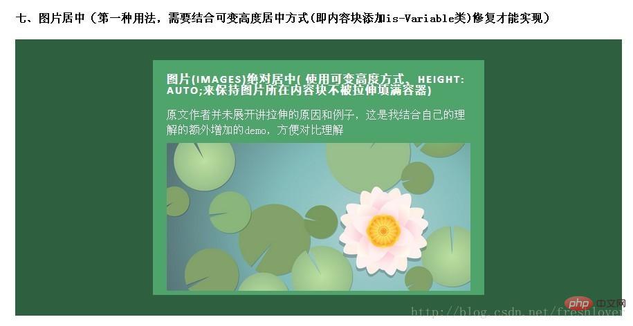
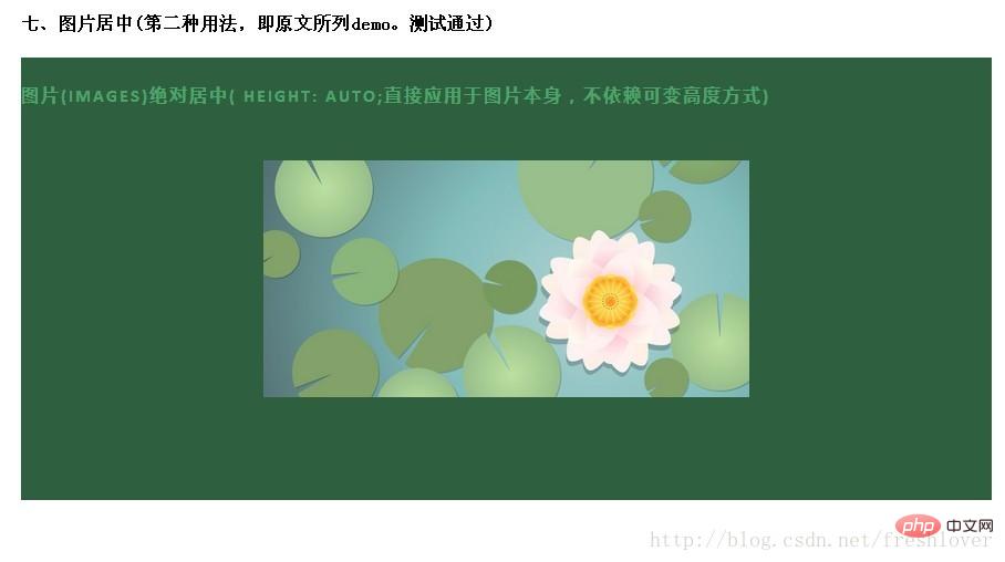
绝对居中(AbsoluteCentering)也适用于图片。对图片自身应用class类或CSS样式,并给图片添加height:auto样式,图片会自适应居中显示,如果外层容器可以resize则随着容器的重绘,图片也相应重绘,始终保持居中。
需要注意的是height:auto虽然对图片居中有用,但如果是在图片外层的内容块上应用了height:auto则会产生一些问题:规则的内容块会被拉伸填充整个容器。这时,我们可以使用可变高度(Variable Height)方式解决这个问题。问题的原因可能是渲染图片时要计算图片高度,这就如同你自己定义了图片高度一样,浏览器得到了图片高度就不会像其他情况一样去解析margin:auto垂直居中了。所以我们最好对图片自身应用这些样式而不是父元素。
HTML:
<img class="Absolute-Center is-Image lazy" src="/static/imghw/default1.png" data-src="http://placekitten.com/g/500/200" alt="Comment CSS implémente la technologie de positionnement et de centrage absolu pour le centrage horizontal et vertical" >
CSS:
.Absolute-Center.is-Image {
  height: auto;
}

.Absolute-Center.is-Image img {
  width: 100%;
  height: auto;
}最好是对图片自身应用此方法,效果如下图:
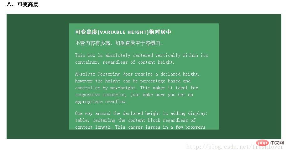
这种情况下实现绝对居中(AbsoluteCentering)必须要声明一个高度,不管你是基于百分比的高度还是通过max-height控制的高度,还有,别忘了设置合适的overflow属性。对自适应/响应式情景,这种方法很不错。
与声明高度效果相同的另一种方法是设置display:table;这样无论实际内容有多高,内容块都会保持居中。这种方法在一些浏览器(如IE/FireFox)上会有问题,我的搭档Kalley
在ELL Creative(访问ellcreative.com )上写了一个基于Modernizr插件的检测函数,用来检测浏览器是否支持这种居中方法,进一步增强用户体验。
Javascript:
/* Modernizr Test for Variable Height Content */
Modernizr.testStyles('#modernizr { display: table; height: 50px; width: 50px; margin: auto; position: absolute; top: 0; left: 0; bottom: 0; right: 0; }', function(elem, rule) {
  Modernizr.addTest('absolutecentercontent', Math.round(window.innerHeight / 2 - 25) === elem.offsetTop);
});CSS:
.absolutecentercontent .Absolute-Center.is-Variable {
  display: table;
  height: auto;
}
缺点:
浏览器兼容性不太好,若Modernizr不能满足你的需求,你需要寻找其他方法解决。
1.与上述重绘(Resizing)情况的方法不兼容
2.Firefox/IE8:使用display:table会使内容块垂直居上,不过水平还是居中的。
3.IE9/10: 使用display:table会使内容块显示在容器左上角。
4.Mobile Safari:内容块垂直居中;若使用百分比宽度,水平方向居中会稍微偏离中心位置。
绝对居中(Absolute Centering)是一种非常不错的技术,除此之外还有一些方法可以满足更多的具体需求,最常见的推荐:NegativeMargins, Transforms,Table-Cell, Inline-Block方式和新出现的Flexbox.方式。这些方法许多文章都有深入讲解,这里只做简单阐述。
这或许是当前最流行的使用方法。如果块元素尺寸已知,可以通过以下方式让内容块居中于容器显示:
外边距margin取负数,大小为width/height(不使用box-sizing: border-box时包括padding,)的一半,再加上top: 50%; left: 50%;。即:
.is-Negative {
        width: 300px;
        height: 200px;
        padding: 20px;
        position: absolute;
        top: 50%; left: 50%;
        margin-left: -170px; /* (width + padding)/2 */
        margin-top: -120px; /* (height + padding)/2 */
}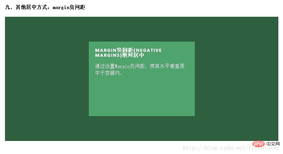
测试表明,这是唯一在IE6-IE7上也表现良好的方法。
优点:
1.良好的跨浏览器特性,兼容IE6-IE7。
2.代码量少。
缺点:
1.不能自适应。不支持百分比尺寸和min-/max-属性设置。
2.内容可能溢出容器。
3.边距大小与padding,和是否定义box-sizing: border-box有关,计算需要根据不同情况。
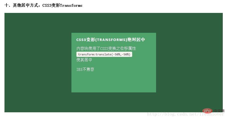
这是最简单的方法,不近能实现绝对居中同样的效果,也支持联合可变高度方式使用。内容块定义transform: translate(-50%,-50%)必须带上浏览器厂商的前缀,还要加上
top: 50%; left: 50%;
代码类:
.is-Transformed {
  width: 50%;
  margin: auto;
  position: absolute;
  top: 50%; left: 50%;
  -webkit-transform: translate(-50%,-50%);
      -ms-transform: translate(-50%,-50%);
          transform: translate(-50%,-50%);
}
优点:
1.内容可变高度
2.代码量少
缺点:
1.IE8不支持
2.属性需要写浏览器厂商前缀
3.可能干扰其他transform效果
4.某些情形下会出现文本或元素边界渲染模糊的现象
进一步了解transform实现居中的知识可以参考CSS-Tricks的文章《Centering PercentageWidth/Height Elements》
总的说来这可能是最好的居中实现方法,因为内容块高度会随着实际内容的高度变化,浏览器对此的兼容性也好。最大的缺点是需要大量额外的标记,需要三层元素让最内层的元素居中。
HTML:
<p>
  </p><p>
    </p><p>
    <!-- CONTENT -->
    </p>
CSS:
.Center-Container.is-Table { display: table; }
.is-Table .Table-Cell {
  display: table-cell;
  vertical-align: middle;
}
.is-Table .Center-Block {
  width: 50%;
  margin: 0 auto;
}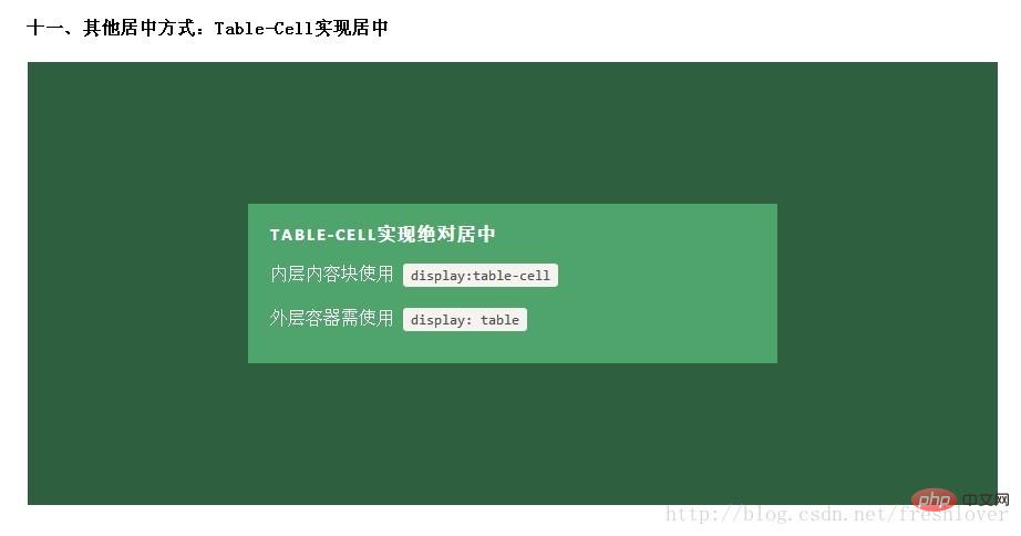
优点:
1.高度可变
2.内容溢出会将父元素撑开。
3.跨浏览器兼容性好。
缺点:
需要额外html标记
了解更多表格单元格实现居中的知识,请参考Roger Johansson发表在456bereastreet的文章《Flexibleheight vertical centering with CSS, beyond IE7》
很受欢迎的一种居中实现方式,基本思想是使用display: inline-block, vertical-align: middle和一个伪元素让内容块处于容器中央。这个概念的解释可以参考CSS-Tricks上的文章《Centering in the Unknown》
我这个例子也有一些其他地方见不到的小技巧,有助于解决一些小问题。
如果内容块宽度大于容器宽度,比如放了一个很长的文本,但内容块宽度设置最大不能超过容器的100%减去0.25em,否则使用伪元素:after内容块会被挤到容器顶部,使用:before内容块会向下偏移100%。
如果你的内容块需要占据尽可能多的水平空间,可以使用max-width: 99%;(针对较大的容器)或max-width: calc(100% -0.25em)(取决于支持的浏览器和容器宽度)。
HTML:
<p>
  </p><p>
    <!-- CONTENT -->
  </p>
CSS:
.Center-Container.is-Inline {
  text-align: center;
  overflow: auto;
}

.Center-Container.is-Inline:after,
.is-Inline .Center-Block {
  display: inline-block;
  vertical-align: middle;
}

.Center-Container.is-Inline:after {
  content: '';
  height: 100%;
  margin-left: -0.25em; /* To offset spacing. May vary by font */
}

.is-Inline .Center-Block {
  max-width: 99%; /* Prevents issues with long content causes the content block to be pushed to the top */
  /* max-width: calc(100% - 0.25em) /* Only for IE9+ */
}这种方法的优劣和单元格Table-Cell方式差不多,起初我把这种方式忽略掉了,因为这确实是一种hack方法。不过,无论如何,这是很流行的一种用法,浏览器支持的也很好。
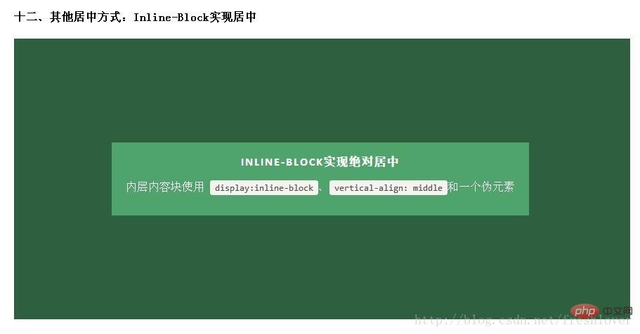
优点:
1.高度可变
2.内容溢出会将父元素撑开。
3.支持跨浏览器,也适应于IE7。
缺点:
1.需要一个容器
2.水平居中依赖于margin-left: -0.25em;该尺寸对于不同的字体/字号需要调整。
3.内容块宽度不能超过容器的100% - 0.25em。
更多相关知识参考ChrisCoyier的文章《Centeringin the Unknown》
这是CSS布局未来的趋势。Flexbox是CSS3新增属性,设计初衷是为了解决像垂直居中这样的常见布局问题。相关的文章如《Centering Elements with Flexbox》
记住Flexbox不只是用于居中,也可以分栏或者解决一些令人抓狂的布局问题。
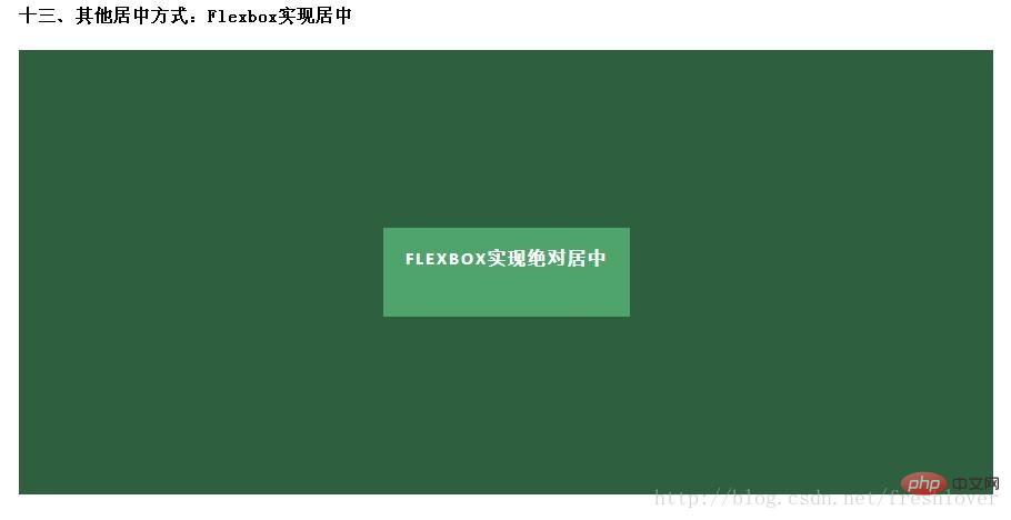
优点:
1.内容块的宽高任意,优雅的溢出。
2.可用于更复杂高级的布局技术中。
缺点:
1.IE8/IE9不支持。
2.Body需要特定的容器和CSS样式。
3.运行于现代浏览器上的代码需要浏览器厂商前缀。
4.表现上可能会有一些问题
有关Flexbox Centering的文章可以参考David Storey的文章《Designing CSS Layouts WithFlexbox Is As Easy As Pie》
建议:
每种技术都有其优劣之处。你选择哪一种技术取决于支持的浏览器和你的编码。使用上面的对照表有助于你做出决定。
作为一种简单的替代方案,绝对居中(Absolute Centering)技术表现良好。曾经你使用负边距(Negative Margins)的地方,现在可以用绝对居中(Absolute Centering)替代了。你不再需要处理讨厌的边距计算和额外的标记,而且还能让内容块自适应大小居中。
如果你的站点需要可变高度的内容,可以试试单元格(Table-Cell)和行内块元素(Inline-Block)这两种方法。如果你处在流血的边缘,试试Flexbox,体验一下这一高级布局技术的好处吧。
(学习视频分享:css视频教程)
Ce qui précède est le contenu détaillé de. pour plus d'informations, suivez d'autres articles connexes sur le site Web de PHP en chinois!


![[Web front-end] Démarrage rapide de Node.js](https://img.php.cn/upload/course/000/000/067/662b5d34ba7c0227.png)


