
 interface Web
tutoriel CSS
Vous pouvez également facilement réaliser des animations de transition sympas en utilisant CSS !
interface Web
tutoriel CSS
Vous pouvez également facilement réaliser des animations de transition sympas en utilisant CSS !
Vous pouvez également facilement réaliser des animations de transition sympas en utilisant CSS !

En utilisant CSS, vous pouvez facilement réaliser des animations de transition sympas ! Profitez simplement de la dernière spécification CSS @scroll-timeline. L'article suivant utilisera deux cas pour voir comment utiliser @scroll-timeline pour réaliser des animations de transition super sympas. J'espère que cela sera utile à tout le monde !
Sur la page d'accueil du site officiel PC de WeGame, il existe de nombreux effets d'animation basés sur le défilement bien conçus.
Ici, j'intercepte simplement deux des animations de transition les plus intéressantes pour que tout le monde puisse en faire l'expérience. Animation de transition 1 :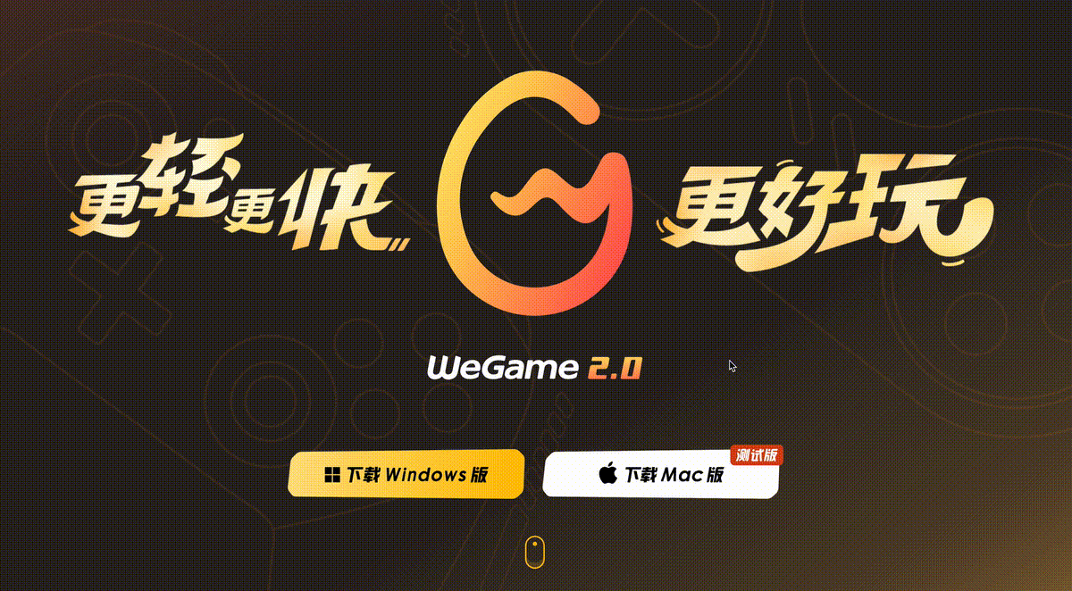
Tutoriel vidéo CSS]
Bien sûr, concernant CSS, la dernière spécification CSS @scroll-timeline, si vous ne l'avez pas appris en détail, vous pouvez d'abord lire mon articleC'est ici, c'est enfin Voici le tueur d'animation @scroll-timeline@scroll-timeline
转场动画一
首先,我们来看看这个动画:
核心步骤拆解一下:
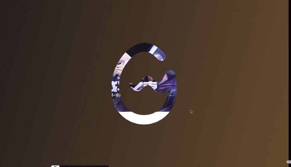
处于场景 1,接着借助 WeGame 的 LOGO,LOGO 开始放大
LOGO 放大到一定程度,开始渐隐,LOGO 背后的场景 2 逐渐渐现
LOGO 放大且渐隐消失,场景 2 完全出现
这里,要实现整个动画,有一个非常重要的场景,就是能够利用 LOGO 元素,切割背景,只看到 LOGO 背后的元素,像是得到一张这样的图片:
注意,图片的白色部分,不是白色,而是需要透明,能够透出背后的元素。
当然,我们可以让 UI 切一张这样的图出来,但是毕竟太麻烦了。
假设我们只有一张 LOGO 元素:

我们如何能够借助这个 LOGO,切割背景呢?
借助 mask 及 mask-composite 切割背景
是的,这里我们可以使用 mask。我们来尝试一下:
<div></div>
div {
    background: linear-gradient(-75deg, #715633, #2b2522);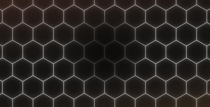
}假设我们有这样一张背景:
我们使用 LOGO 图作为 MASK,对该背景进行切割:
div {
    background: linear-gradient(-75deg, #715633, #2b2522);
    mask: url(WeGame-LOGO图.png);
    mask-repeat: no-repeat;
    mask-position: center center;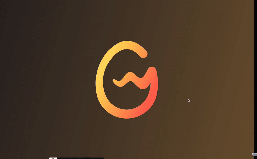
}我们会得到这样一张图:

Oh No,这与我们想象的刚好相反,我们要的是 LOGO 处透明,背景的其他处保留。
怎么做呢?不要慌,这里可以使用上我们上一篇文章介绍过的 -webkit-mask-composite,还不太了解的可以戳这里看看:高阶切图技巧!基于单张图片的任意颜色转换
我们简单改造一下代码:
div {
    background: linear-gradient(-75deg, #715633, #2b2522);
    mask: url(//wegame.gtimg.com/g.55555-r.c4663/wegame-home/sc01-logo.52fe03c4.svg), linear-gradient(#fff, #fff);
    mask-repeat: no-repeat;
    mask-position: center center;
    -webkit-mask-composite: xor;
}这样,我们能就顺利的得到了这样一张图形:

当然这里需要注意的是,白色区域并非白色,而是透明的,可以透出背后的内容。
配合 @scroll-timeline
好,如此一来,基于上述的剪切层,再配合 @scroll-timeline
Animation de transition 1🎜
🎜Tout d'abord, jetons un coup d'œil à cette animation :
🎜 🎜🎜🎜🎜Démontez les étapes principales : 🎜
- 🎜Dans la scène 1, puis avec l'aide du LOGO de WeGame, le LOGO commence à s'agrandir🎜
- 🎜 Le LOGO est agrandi dans une certaine mesure et commence à s'estomper, et la scène 2 derrière le LOGO apparaît progressivement🎜
- 🎜Le LOGO est agrandi et disparaît, et la scène 2 apparaît complètement🎜
🎜🎜Attention, 🎜 La partie blanche de l'Vous pouvez également facilement réaliser des animations de transition sympas en utilisant CSS ! n'est pas blanche, mais doit être transparente pour révéler les éléments derrière elle 🎜. 🎜🎜Bien sûr, nous pouvons laisser l'interface utilisateur découper une telle Vous pouvez également facilement réaliser des animations de transition sympas en utilisant CSS !, mais c'est trop gênant après tout. 🎜🎜Supposons que nous n'ayons qu'un seul élément LOGO : 🎜🎜🎜🎜Comment pouvons-nous utiliser ce LOGO pour couper le fond ? 🎜🎜Utilisez le masque et le masque-composite pour couper l'arrière-plan🎜
🎜Oui, nous pouvons utilisermasque ici. Essayons : 🎜<div></div><div></div><div></div>
.g-scroll {
    position: relative;
    width: 100vw;
    height: 500vh;
}
.g-wrap {
    position: fixed;
    top: 0;
    left: 0;
    width: 100vw;
    height: 100vh;
    overflow: hidden;
}
.g-container {
    position: absolute;
    top: 0;
    left: 0;
    width: 100vw;
    height: 100vh;
    animation-name: scale;
    animation-duration: 10s;
    animation-timeline: box-move;
}
.g-bg {
    position: fixed;
    width: 100vw;
    height: 100vh;
    background: url(LOGO背后的图层);
}
.g-wegame {
    position: absolute;
    width: 100vw;
    height: 100vh;
    background: linear-gradient(-75deg, #715633, #2b2522);
    mask: url(//wegame.gtimg.com/g.55555-r.c4663/wegame-home/sc01-logo.52fe03c4.svg), linear-gradient(#fff, #fff);
    mask-repeat: no-repeat;
    mask-position: center center;
    -webkit-mask-composite: xor;
}
@scroll-timeline box-move {
    source: selector("#g-scroll");
    orientation: "vertical";
}
@keyframes scale {
    0% {
        transform: scale(1);
    }
    100% {
        transform: scale(60);
    }
}🎜 🎜 Nous utilisons l'Vous pouvez également facilement réaliser des animations de transition sympas en utilisant CSS ! du LOGO comme MASQUE pour couper l'arrière-plan : 🎜<div></div><div></div><div></div> <div></div> <div></div>
 🎜🎜Oh non, c'est exactement le contraire de ce qu'on imaginait, 🎜Ce qu'on veut c'est le LOGO Transparent, conserve le reste du fond🎜. 🎜🎜Comment faire ? Pas de panique, vous pouvez utiliser le
 -webkit-mask-composite présenté dans notre article précédent. Si vous n'y connaissez pas grand chose, vous pouvez cliquer ici pour y jeter un œil : Compétences de découpe avancées ! Toute conversion de couleur basée sur une seule Vous pouvez également facilement réaliser des animations de transition sympas en utilisant CSS ! 🎜🎜🎜 Transformons simplement le code : 🎜.g-scroll {
position: relative;
width: 100vw;
height: 500vh;
}
.g-wrap {
position: fixed;
top: 0;
left: 0;
width: 100vw;
height: 100vh;
overflow: hidden;
}
.g-container {
position: absolute;
top: 0;
left: 0;
width: 100vw;
height: 100vh;
animation-name: scale;
animation-duration: 10s;
animation-timeline: box-move;
}
.g-bg {
position: fixed;
width: 100vw;
height: 100vh;
background: url(//背景图片,场景2);
}
.g-wegame {
position: absolute;
width: 100vw;
height: 100vh;
background: linear-gradient(-75deg, #715633, #2b2522);
mask: url(//WeGame-Logo.png), linear-gradient(#fff, #fff);
mask-repeat: no-repeat;
mask-position: center center;
-webkit-mask-composite: xor;
z-index: 1;
}
.g-mask {
position: aboslute;
width: 100vw;
height: 100vh;
background: linear-gradient(-75deg, #715633, #2b2522);
z-index: 2;
animation-name: reOpacityChange;
animation-duration: 10s;
animation-timeline: box-move;
animation-function-timing: linear;
}
.g-logo {
position: absolute;
background: url(//WeGame-Logo.png);
background-repeat: no-repeat;
background-position: center center;
z-index: 3;
animation-name: reOpacityChange;
animation-duration: 10s;
animation-timeline: box-move;
}
@scroll-timeline box-move {
source: selector("#g-scroll");
orientation: "vertical";
}
@keyframes reOpacityChange {
0%,
50% {
opacity: 1;
}
100% {
opacity: 0;
}
}
@keyframes scale {
0% {
transform: scale(1);
}
100% {
transform: scale(60);
}
}🎜🎜Bien sûr, ce qu'il faut noter ici, c'est que la zone blanche Elle n’est pas blanche, mais transparente, révélant ce qu’il y a derrière. 🎜🎜Avec @scroll-timeline🎜
🎜D'accord, donc, sur la base du calque de cisaillement ci-dessus, et avec@scroll-timeline, simulons un effet d'animation des plus basiques : 🎜<div></div><div></div><div></div>
.g-scroll {
position: relative;
width: 100vw;
height: 500vh;
}
.g-wrap {
position: fixed;
top: 0;
left: 0;
width: 100vw;
height: 100vh;
overflow: hidden;
}
.g-container {
position: absolute;
top: 0;
left: 0;
width: 100vw;
height: 100vh;
animation-name: scale;
animation-duration: 10s;
animation-timeline: box-move;
}
.g-bg {
position: fixed;
width: 100vw;
height: 100vh;
background: url(LOGO背后的图层);
}
.g-wegame {
position: absolute;
width: 100vw;
height: 100vh;
background: linear-gradient(-75deg, #715633, #2b2522);
mask: url(//wegame.gtimg.com/g.55555-r.c4663/wegame-home/sc01-logo.52fe03c4.svg), linear-gradient(#fff, #fff);
mask-repeat: no-repeat;
mask-position: center center;
-webkit-mask-composite: xor;
}
@scroll-timeline box-move {
source: selector("#g-scroll");
orientation: "vertical";
}
@keyframes scale {
0% {
transform: scale(1);
}
100% {
transform: scale(60);
}
}这里,想要看懂上述代码,你必须已经掌握了基本的 CSS @scroll-timeline 语法。其余的内容,简单解释下:
我们在 LOGO 后面的图层,用
.g-bg使用一张图片表示了场景 2#g-scroll用于基于滚动条的滚动,实现滚动动画.g-wegame里面就是上述使用mask和mask-composite实现的图层
好,此时,我们向下滚动动画,就会触发 .g-container 的动画,也就是从 transform: scale(1) 到 transform: scale(60),我们来看看效果:
有点那个意思了。但是,这里还缺少了一些细节。
首先我们需要有一个 LOGO,它的透明度从 1 逐渐渐隐到 0,这个比较简单,加完之后,我们看看效果:
离目标又近了一步,但是,仔细观察原效果,我们还少了一层:

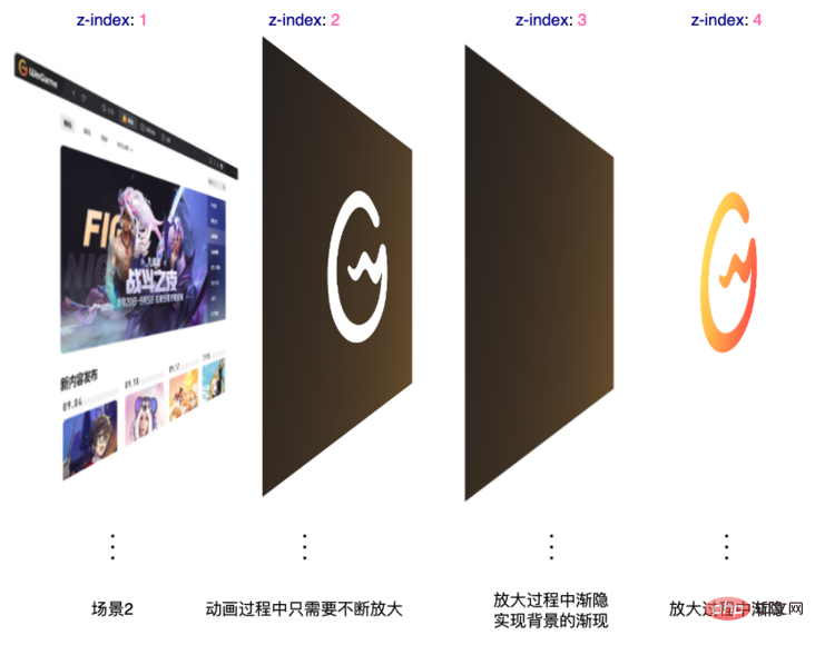
在 LOGO 渐隐的过程中,背后的背景不是直接呈现的,而是有一个渐现的过程。所以,完整而言,在动画过程从,一共会有 4 层:
所以,完整的代码,大概是这样的:
<div></div><div></div><div></div> <div></div> <div></div>
.g-scroll {
    position: relative;
    width: 100vw;
    height: 500vh;
}
.g-wrap {
    position: fixed;
    top: 0;
    left: 0;
    width: 100vw;
    height: 100vh;
    overflow: hidden;
}
.g-container {
    position: absolute;
    top: 0;
    left: 0;
    width: 100vw;
    height: 100vh;
    animation-name: scale;
    animation-duration: 10s;
    animation-timeline: box-move;
}
.g-bg {
    position: fixed;
    width: 100vw;
    height: 100vh;
    background: url(//背景图片,场景2);
}
.g-wegame {
    position: absolute;
    width: 100vw;
    height: 100vh;
    background: linear-gradient(-75deg, #715633, #2b2522);
    mask: url(//WeGame-Logo.png), linear-gradient(#fff, #fff);
    mask-repeat: no-repeat;
    mask-position: center center;
    -webkit-mask-composite: xor;
    z-index: 1;
}
.g-mask {
    position: aboslute;
    width: 100vw;
    height: 100vh;
    background: linear-gradient(-75deg, #715633, #2b2522);
    z-index: 2;
    animation-name: reOpacityChange;
    animation-duration: 10s;
    animation-timeline: box-move;
    animation-function-timing: linear;
}
.g-logo {
    position: absolute;
    background: url(//WeGame-Logo.png);
    background-repeat: no-repeat;
    background-position: center center;
    z-index: 3;
    animation-name: reOpacityChange;
    animation-duration: 10s;
    animation-timeline: box-move;
}
@scroll-timeline box-move {
    source: selector("#g-scroll");
    orientation: "vertical";
}
@keyframes reOpacityChange {
    0%,
    50% {
        opacity: 1;
    }
    100% {
        opacity: 0;
    }
}
@keyframes scale {
    0% {
        transform: scale(1);
    }
    100% {
        transform: scale(60);
    }
}这样,我们就基本能够还原原效果了:

完整的代码,你可以戳这里:CodePen Demo - WeGame Animation Demo
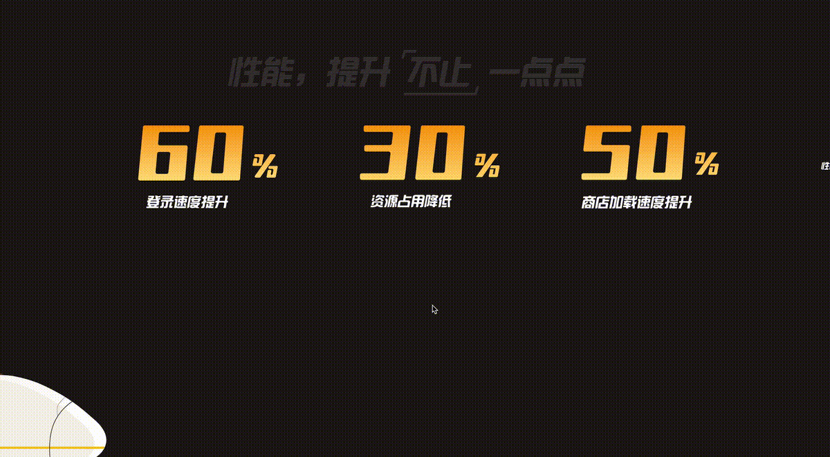
转场动画二
好,搞定了一个,我们继续来看下一个:
这里,我们也简单拆解下动画:
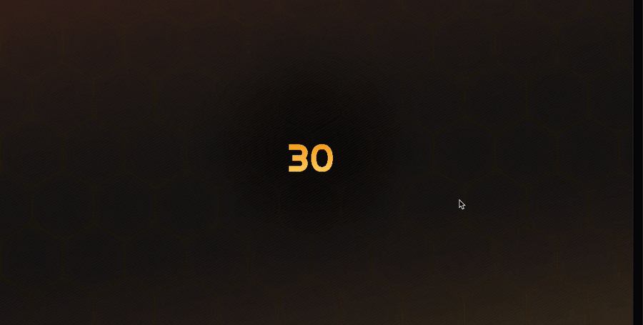
数字放大,逐渐带出场景 2
场景 2 有一个非常酷炫的光影收缩效果
这里的数字放大与第一个转场动画其实非常类似,就不详细讲了。
我们来看看,在场景 2 这里,光影的收缩效果如何实现。
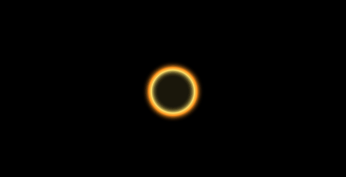
这里看似负责,但是,其实非常的简单。这里,核心在于这两张图片:
图片素材 1:
注意,这里最为核心的在于,图片中的白色不是白色,是透明的,可以透出背景的内容。
这样,我们只需要在这张图片的背后,放置另外这样一张图片:

想到了吗?没错,就是让这张图片从一个较大的 transform: scale() 值,变化到一个较小的 transform: scale() 值即可!
什么意思呢?看看这张图你就懂了:
知道了解到这一点,整个动画也就比较简单了。当然,这里我们也同样借助了 CSS @scroll-timeline 完成整个动画:
<div></div><div></div> <div></div>30
.g-scroll {
    position: relative;
    width: 100vw;
    height: 500vh;
}
.g-container {
    position: fixed;
    top: 0;
    left: 0;
    width: 100vw;
    height: 100vh;
    overflow: hidden;
}
.g-bg {
    position: absolute;
    top: 0;
    left: 0;
    width: 100%;
    height: 100%;
    background: url(//蜂巢图片.png);
    z-index: 1;
}
.g-circle {
    position: absolute;
    top: 50%;
    left: 50%;
    transform: translate(-50%, -50%) scale(.5);
    width: 400px;
    height: 400px;
    background: url(//光圈图片.png);
    animation-name: scale;
    animation-duration: 10s;
    animation-timeline: box-move;
}
.g-word {
    position: absolute;
    top: 50%;
    left: 50%;
    transform: translate(-50%, -50%);
    font-size: 12vw;
    z-index: 10;
    color: transparent;
    background: linear-gradient(#f8a011, #ffd973);
    background-clip: text;
    animation-name: scaleWord;
    animation-duration: 10s;
    animation-timeline: box-move;
}
@scroll-timeline box-move {
    source: selector("#g-scroll");
    orientation: "vertical";
}
@keyframes scale {
    0% {
        transform: translate(-50%, -50%) scale(10);
    }
    100% {
        transform: translate(-50%, -50%) scale(.5);
    }
}
@keyframes scaleWord {
    0% {
        transform: translate(-50%, -50%) scale(.5);
    }
    100% {
        transform: translate(calc(-50% - 5000px), -50%) scale(100);
    }
}整个动画需要看懂,其实还是要有一定的功底的。上效果:
完整的代码,你可以戳这里:CodePen Demo - WeGame Animation Demo
这样,借助强大的 CSS 以及一些有意思的技巧,我们利用纯 CSS 实现了这两个看似非常复杂的转场动画效果,并且,这在之前,是完全不可能使用纯 CSS 实现的。
原文地址:https://segmentfault.com/a/1190000042184211
作者:chokcoco
(Partage de vidéos d'apprentissage : web front-end)
Ce qui précède est le contenu détaillé de. pour plus d'informations, suivez d'autres articles connexes sur le site Web de PHP en chinois!

Outils d'IA chauds

Undresser.AI Undress
Application basée sur l'IA pour créer des photos de nu réalistes

AI Clothes Remover
Outil d'IA en ligne pour supprimer les vêtements des photos.

Undress AI Tool
Images de déshabillage gratuites

Clothoff.io
Dissolvant de vêtements AI

Video Face Swap
Échangez les visages dans n'importe quelle vidéo sans effort grâce à notre outil d'échange de visage AI entièrement gratuit !

Article chaud
Outils chauds

Bloc-notes++7.3.1
Éditeur de code facile à utiliser et gratuit

SublimeText3 version chinoise
Version chinoise, très simple à utiliser

Envoyer Studio 13.0.1
Puissant environnement de développement intégré PHP

Dreamweaver CS6
Outils de développement Web visuel

SublimeText3 version Mac
Logiciel d'édition de code au niveau de Dieu (SublimeText3)
Sujets chauds
 1393
1393
 52
1205
24
52
1205
24

 Comment utiliser Bootstrap en Vue
Apr 07, 2025 pm 11:33 PM
Comment utiliser Bootstrap en Vue
Apr 07, 2025 pm 11:33 PM
L'utilisation de bootstrap dans vue.js est divisée en cinq étapes: installer bootstrap. Importer un bootstrap dans main.js. Utilisez le composant bootstrap directement dans le modèle. Facultatif: style personnalisé. Facultatif: utilisez des plug-ins.
 Les rôles de HTML, CSS et JavaScript: responsabilités de base
Apr 08, 2025 pm 07:05 PM
Les rôles de HTML, CSS et JavaScript: responsabilités de base
Apr 08, 2025 pm 07:05 PM
HTML définit la structure Web, CSS est responsable du style et de la mise en page, et JavaScript donne une interaction dynamique. Les trois exercent leurs fonctions dans le développement Web et construisent conjointement un site Web coloré.
 Comment écrire des lignes fendues sur bootstrap
Apr 07, 2025 pm 03:12 PM
Comment écrire des lignes fendues sur bootstrap
Apr 07, 2025 pm 03:12 PM
Il existe deux façons de créer une ligne divisée bootstrap: en utilisant la balise, qui crée une ligne divisée horizontale. Utilisez la propriété CSS Border pour créer des lignes de fractionnement de style personnalisées.
 Comprendre HTML, CSS et JavaScript: un guide pour débutant
Apr 12, 2025 am 12:02 AM
Comprendre HTML, CSS et JavaScript: un guide pour débutant
Apr 12, 2025 am 12:02 AM
WebDevelopmentReliesOnHTML, CSS, etjavascript: 1) HTMLSTRUCTURESCONTENT, 2) CSSSTYLESIT, et3) JavascriptAdddsInterActivity, Forming TheasisofmodernweBEBExperiences.
 Comment utiliser le bouton bootstrap
Apr 07, 2025 pm 03:09 PM
Comment utiliser le bouton bootstrap
Apr 07, 2025 pm 03:09 PM
Comment utiliser le bouton bootstrap? Introduisez Bootstrap CSS pour créer des éléments de bouton et ajoutez la classe de bouton bootstrap pour ajouter du texte du bouton
 Comment configurer le cadre de bootstrap
Apr 07, 2025 pm 03:27 PM
Comment configurer le cadre de bootstrap
Apr 07, 2025 pm 03:27 PM
Pour configurer le framework Bootstrap, vous devez suivre ces étapes: 1. Référez le fichier bootstrap via CDN; 2. Téléchargez et hébergez le fichier sur votre propre serveur; 3. Incluez le fichier bootstrap dans HTML; 4. Compiler les sass / moins au besoin; 5. Importer un fichier personnalisé (facultatif). Une fois la configuration terminée, vous pouvez utiliser les systèmes, composants et styles de grille de Bootstrap pour créer des sites Web et des applications réactifs.
 Comment insérer des photos sur bootstrap
Apr 07, 2025 pm 03:30 PM
Comment insérer des photos sur bootstrap
Apr 07, 2025 pm 03:30 PM
Il existe plusieurs façons d'insérer des images dans Bootstrap: insérer directement les images, en utilisant la balise HTML IMG. Avec le composant d'image bootstrap, vous pouvez fournir des images réactives et plus de styles. Définissez la taille de l'image, utilisez la classe IMG-FLUID pour rendre l'image adaptable. Réglez la bordure en utilisant la classe IMG-border. Réglez les coins arrondis et utilisez la classe Roundée IMG. Réglez l'ombre, utilisez la classe Shadow. Redimensionner et positionner l'image, en utilisant le style CSS. À l'aide de l'image d'arrière-plan, utilisez la propriété CSS d'image d'arrière-plan.
 Comment redimensionner le bootstrap
Apr 07, 2025 pm 03:18 PM
Comment redimensionner le bootstrap
Apr 07, 2025 pm 03:18 PM
Pour ajuster la taille des éléments dans Bootstrap, vous pouvez utiliser la classe de dimension, qui comprend: ajuster la largeur: .col-, .w-, .mw-ajustement Hauteur: .h-, .min-h-, .max-h-
