With the development of the mobile Internet, A large number of front-end personnel have switched from PC to mobile. However, a lot of PC-side front-end experience is not applicable to mobile. A blog post I wrote a few days ago "Summary of some basic knowledge points of mobile H5" received a lot of clicks. Therefore, FungLeo decided that in the next time, I will launch a series of tutorials around the mobile terminal.
The CSS part of this series of articles will all be written in SASS syntax. If you don’t If you know SASS, it is recommended to read relevant tutorials, including my "Summary of SASS Learning Experience with CSS Precompilation Technology" tutorial.
This series of articles will refer to the two basic documents reset.scss and mixin.scss, which are used to reset browser styles, and some basic SASS code blocks. Since the code is longer, please refer to the "Mobile Terminal Series Blog Basics reset.scss and mixin.scss》Get.
My level is limited and my ability is average, so there will inevitably be errors and omissions in the article. Therefore, everyone is welcome to leave comments in the article. I will report it as soon as possible Response within. Thank you all.
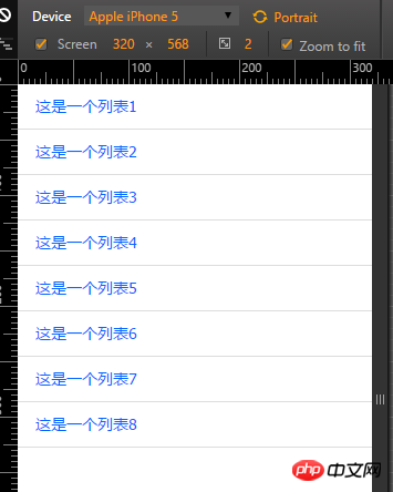
First, let’s make the simplest list. The effect we want to achieve is as shown in the figure below:

As shown above, what we want to achieve is such a simple list. This is not difficult at all.
<!DOCTYPE html><html lang="en">
<head>
<meta charset="UTF-8">
<meta name="viewport" content="width=device-width, initial-scale=1.0, maximum-scale=1.0, user-scalable=0" />
<title>list 1</title>
<link rel="stylesheet" href="../style/style.css">
</head>
<body>
<p class="list_1">
    <ul>
        <li><a href="">这是一个列表1</a></li>
        <li><a href="">这是一个列表2</a></li>
        <li><a href="">这是一个列表3</a></li>
        <li><a href="">这是一个列表4</a></li>
        <li><a href="">这是一个列表5</a></li>
        <li><a href="">这是一个列表6</a></li>
        <li><a href="">这是一个列表7</a></li>
        <li><a href="">这是一个列表8</a></li>
</ul></p></body></html>What needs to be explained here is that the mobile terminal You must add <meta name="viewport" content="width=device-width, initial-scale=1.0, maximum-scale=1.0, user-scalable=0" /> code. Otherwise, the mobile browser will treat it as a PC version of the web page, which is scalable.
It is recommended that the server, database, back-end program, front-end HTML and CSS all be unified into utf-8 encoding .Avoid garbled codes caused by encoding.
.list_1 {    ul {}
    li {
        border-bottom: 1px solid #ddd;padding:0 1.6rem;
        a {display: block;height: 4rem;line-height: 4rem;overflow: hidden;font-size: 1.4rem;}
    }
}All units here use
rem, wereset In .scss, the font size ofhtmlhas been set to62.5%, which is equivalent to 10px under normal circumstances. In other words, the above1.6 remis equivalent to16px. As for why it is written this way, please go to the link at the beginning of this article to see the explanation in the article I wrote earlier.
If you don’t know sass, please read the sass related tutorials first. Don’t think it’s difficult. You can definitely learn it in one hour and you can play it very smoothly in two days.
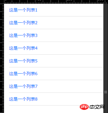
First of all , let’s take a look at the rendering:

At first glance, this list is no different from the list above. However, if we look carefully, we will find that the lines below are not The top one.
Don’t be surprised. Many times, designers have their own design concepts when designing this way. As front-end personnel, we must faithfully restore some of the small details of the designer’s design. Even if you think This is a bit unnecessary. Haha.
html code is exactly the same as the first example. I will not repeat the code here
.list_1 {    ul {padding-left: 1.6rem;}
    li {        border-bottom: 1px solid #ddd;padding-right: 1.6rem;
    a {display: block;height: 4rem;line-height: 4rem;overflow: hidden;font-size: 1.4rem;}
    }
}In fact, it is just a slight transformation Here’s an idea. Just assign the padding value on the loaded li in demo1 to ul and li.
Okay, through these two demos, we should Some basic situations have been understood. FungLeo will gradually increase the complexity of the list in the following chapters. Presenting you with a variety of different lists.
These are two appetizers, very It's simple. What needs to be explained is the following:
Do not set the width of any element, because this is a list that occupies one line
Without setting the width, you can set the inner padding, which will not cause any problems.
It is necessary to handle the hidden overflow to prevent the title from being too long and causing line breaks.
The above is the detailed content of How to make various lists on H5 mobile terminal (1). For more information, please follow other related articles on the PHP Chinese website!


