
This time I will bring you S5 to adapt to layered screens. What are the precautions for S5 to adapt to layered screens? The following is a practical case, let’s take a look.
The design is great, this time it is really "according to the design draft", because now, any machine is a standard machine according to the design draft! Developer classmates, now you can just read the design draft annotations directly!Screen adaptation
Screen adaptation should refer to the adaptation relationship between the content adaptation area and the screen area. Single-screen adaptation includes contain, cover or fill, and multi-screen adaptation is common with yikuan. contain and cover also need positioning to handle white space and excess content. Different content in the same H5 often uses different adaptation methods, that is, layering.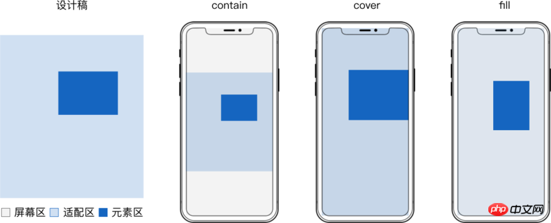

To ensure that the elements of each layer are scaled synchronously and without distortion, the adaptation area of each layer should be equal to the size of the design draft.
The direct implementation is to construct a container with the same size as the adaptation area and adapt the entire layer.
There can be several elements with the same adaptation method in the container.
Take
svg implementation as an example: <div class="code" style="position:relative; padding:0px; margin:0px;"><pre class="brush:php;toolbar:false"><!doctype html>
<html>
<body>
<style>
.layer {
position: absolute;
top: 0;
left: 0;
width: 100%;
height: 100%;
}
</style>
<!-- fill -->
<svg class="layer" viewBox="0 0 1080 1920" preserveAspectRatio="none"> <!-- 容器 -->
<rect x="0" y="0" width="1080" height="1920" fill="rgba(96,96,96,.08)"/> <!-- 元素 -->
</svg>
<!-- contain 居中 -->
<svg class="layer" viewBox="0 0 1080 1920" preserveAspectRatio="xMidYMid meet"> <!-- 容器 -->
<rect x="0" y="233" width="1080" height="1407" fill="#1565C0"/> <!-- 元素 -->
</svg>
<!-- contain 居底 -->
<svg class="layer" viewBox="0 0 1080 1920" preserveAspectRatio="xMidYMax meet"> <!-- 容器 -->
<rect x="444" y="1779" width="191" height="39" fill="#1565C0"/> <!-- 元素 -->
</svg>
</body>
</html></pre><div class="contentsignin">Copy after login</div></div>Actual effect:
 The entire layer adaptation is simple to implement, Directly reading the design draft values during development can meet the needs of most static pages.
But when there are many h5 animations, you have to consider the smoothness of the animation and the performance of the page.
Use replaceable elements such as

<object> <svg> etc. as containers, and use background images to make Elements, There are performance defects when applying css animation:
For the derivation process, see H5 Layering Derivation of screen adaptation formula
1 2 3 4 5 6 7 8 9 10 11 12 13 14 15 16 17 18 19 20 21 22 23 24 25 26 27 28 29 30 31 32 33 |
|
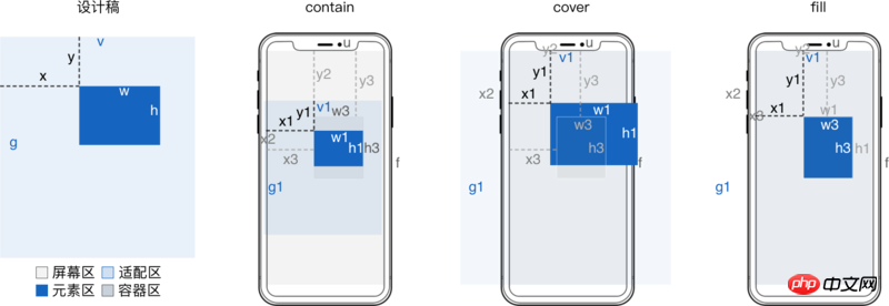
Implementation exampleWhen max-width is w/v and max-height is h/g, it corresponds to contain adaptation. When min-width is set to w/v,
min-height
is set to h/g, it corresponds to cover adaptation. When width is set to w/v and height is h/g, it means fill adaptation. contain When adapting, if the original size of the image is smaller than max-width and max-height, use zoom: 10 to enlarge or directly modify the original size of the image.
When covering adaptation, if the original size of the image is larger than min-width and min-height, use zoom: .1 to reduce or directly modify the original size of the image.
Because the percentage in top left is relative to the screen width u and height f, corresponding to m*u and n*f
Because the percentage in transform is relative to the width w1 and height h1 of the element after adaptation, it corresponds to (m*v + x)/w*w1 and (n*f + y)/h*h1
1 2 3 4 5 6 7 8 9 10 11 12 13 14 15 16 17 18 19 20 21 22 |
|
background Implementation example
<a href="http://www.php.cn/code/872.html" target="_blank">background-size</a> 值为 contain 时对应 contain 适配。
background-size 值为 cover 时对应 cover 适配。
background-size 值为 100% 100% 时对应 `fill 适配。
<a href="http://www.php.cn/wiki/896.html" target="_blank">background-position</a> 百分比和 o p 意义相同
1 2 3 4 5 6 7 8 9 10 11 12 13 14 15 16 17 18 19 |
|
<svg> 实现示例
preserveAspectRatio 的 meetOrSlice 为 meet 时对应 contain 适配。
preserveAspectRatio 的 meetOrSlice 为 slice 时对应 cover 适配。
preserveAspectRatio 值为 none 时对应 fill 适配。
这里 preserveAspectRatio 的 meetOrSlice 相对的是容器,不是 适配区 这里用 transform 来定位,而 preserveAspectRatio 的 meetOrSlice 固定为 xMinYMin。
1 2 3 4 5 6 7 8 9 10 11 12 13 14 15 16 17 18 19 20 21 22 23 24 25 26 27 28 |
|
辅助工具
手动计算百分比及写 css 很麻烦,可以借助 sass 等工具来辅助简化。
设计稿宽 v 高 g 一般是页面级常量。
只需读取设计稿里每个 元素 的横坐标 x 、纵坐标 y 、宽 w 和 高 h,然后工具生成 css 即可。
这下妈妈再也不用担心我还原问题、屏幕适配问题了。
文字处理
文字固定或单行不固定,svg 的 text 标签可以处理
文字固定或单行不固定还可以将文字转为图片
文字多行不固定,可以借助 svg 的 foreignObject 嵌入普通 p
方案对比
屏幕适配方案非常多,选哪种方式实现 整层适配 或 精简适配,下面是对比
| 方案 | 缩放 | 定位 | 文字缩放 | 兼容 |
|---|---|---|---|---|
| padding-top 百分比 | 只能依宽 | ✓ | ✗ | ✓ |
| viewport | ✓ | ✗ | ✓ | 支持情况复杂 |
| object-fit | ✓ | ✓ | ✗ | 移动端 android 4.4.4+ |
| svg preserveRatio | ✓ | ✓ | ✓ | 移动端 android 3.0+ |
| (max/min)-(width/height) | ✓ | ✓ | 固定文字 | ✓ |
| background-size | ✓ | ✓ | 文字转图片 | ✓ |
相信看了本文案例你已经掌握了方法,更多精彩请关注php中文网其它相关文章!
推荐阅读:
The above is the detailed content of S5 allows layered screens to adapt. For more information, please follow other related articles on the PHP Chinese website!
 How to start mysql service
 How to skip network connection during win11 installation
 How to solve the problem that the phpstudy port is occupied
 How to repair win7 system if it is damaged and cannot be booted
 xenserver
 Is Code Red a computer virus?
 stackoverflowatline1
 How to cancel Douyin account on Douyin
 What are the differences between Eclipse version numbers?


![[Web front-end] Node.js quick start](https://img.php.cn/upload/course/000/000/067/662b5d34ba7c0227.png)


