This time I will bring you a summary of the development skills of Vue components. What are the precautions for Vue component development? The following is a practical case, let's take a look.
Preface As I near graduation, I wrote a simple personal blog. The project address is click me to visit the project address (please ask for a star by the way). This article is the first in a series of summaries. Next, I will imitate a low-profile version of Element's dialog box and pop-up components step by step. TextVue single file component development
When using vue-cli to initialize a project, you will find that there are A HelloWorld.vue file, this is the basic development model of single-file components.// 注册
Vue.component('my-component', {
template: '<p>A custom component!</p>'
})
// 创建根实例
new Vue({
el: '#example'
})Dialog
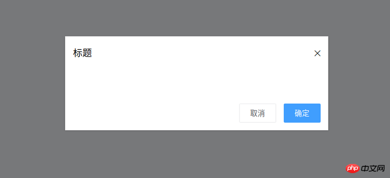
The basic style of the target dialog component is as shown in the figure:
Event (that is, tell the parent component that it is confirmed)
<template>
 <p class="ta-dialogwrapper">
 <p class="ta-dialog">
  <p class="ta-dialogheader">
  <span>{{ title }}</span>
  <i class="ios-close-empty" @click="handleCancel()"></i>
  </p>
  <p class="ta-dialogbody">
  <slot></slot>
  </p>
  <p class="ta-dialogfooter">
  <button @click="handleCancel()">取消</button>
  <button @click="handleOk()">确定</button>
  </p>
 </p>
 </p>
</template>
<script>
export default {
 name: 'Dialog',
 props: {
 title: {
  type: String,
  default: '标题'
 },
 },
 methods: {
 handleCancel() {
  this.$emit('cancel')
 },
 handleOk() {
  this.$emit('ok')
 },
 },
}
</script><ta-dialog title="弹窗标题" @ok="handleOk" @cancel="handleCancel"> <p>我是内容</p> </ta-dialog>
<template>
 <transition name="slide-down">
 <p class="ta-dialogwrapper" v-if="isShow">
  // 省略
 </p>
 </transition>
</template>
<script>
export default {
 data() {
 return {
  isShow: true
 }
 },
 methods: {
 handleCancel() {
  this.isShow = false
  this.$emit('cancel')
 },
 handleOk() {
  this.isShow = true
  this.$emit('ok')
 },
 },
}
</script> key class (css className) styles:
.slide-down-enter-active {
 animation: dialog-enter ease .3s;
}
.slide-down-leave-active {
 animation: dialog-leave ease .5s;
}
@keyframes dialog-enter {
 from {
 opacity: 0;
 transform: translateY(-20px);
 }
 to {
 opacity: 1;
 transform: translateY(0);
 }
}
@keyframes dialog-leave {
 from {
 opacity: 1;
 transform: translateY(0);
 }
 to {
 opacity: 0;
 transform: translateY(-20px);
 }
}Encapsulate Dialog to make MessageBox
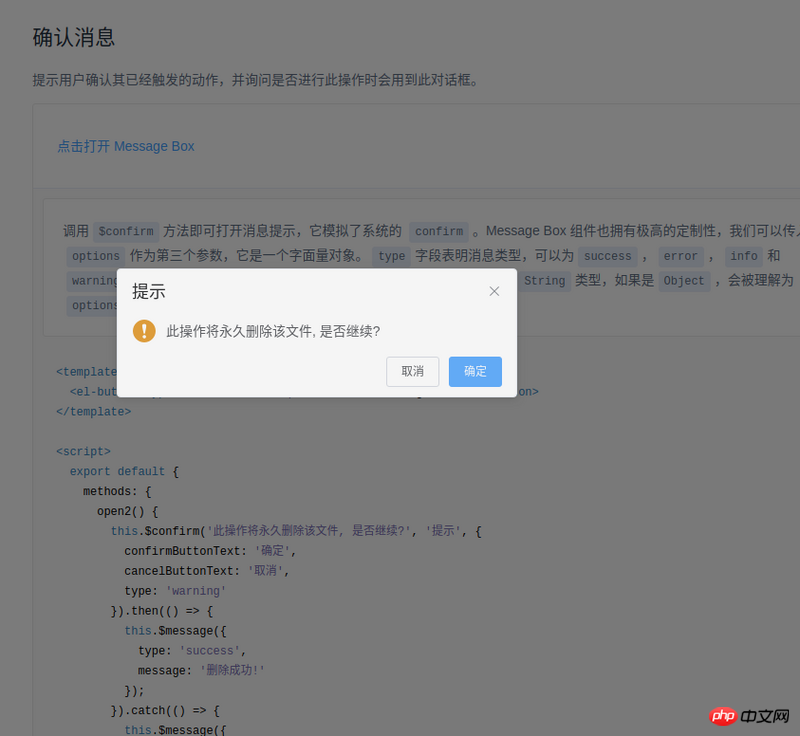
The method of using Element's MessageBox is as follows:this.$confirm('此操作将永久删除该文件, 是否继续?', '提示', {
confirmButtonText: '确定',
cancelButtonText: '取消',
type: 'warning'
}).then(() => {
this.$message({
type: 'success',
message: '删除成功!'
});
}).catch(() => {
this.$message({
type: 'info',
message: '已取消删除'
});
});
import Vue from 'vue'
import MessgaeBox from './src/index'
const Ctur = Vue.extend(MessgaeBox)
let instance = null
const callback = action => {
 if (action === 'confirm') {
 if (instance.showInput) {
  instance.resolve({ value: instance.inputValue, action })
 } else {
  instance.resolve(action)
 }
 } else {
 instance.reject(action)
 }
 instance = null
}
const showMessageBox = (tip, title, opts) => new Promise((resolve, reject) => {
 const propsData = { tip, title, ...opts }
 instance = new Ctur({ propsData }).$mount()
 instance.reject = reject
 instance.resolve = resolve
 instance.callback = callback
 document.body.appendChild(instance.$el)
})
const confirm = (tip, title, opts) => showMessageBox(tip, title, opts)
Vue.prototype.$confirm = confirmIn its code, there are two methods:
onCancel() {
 this.visible = false
 this.callback && (this.callback.call(this, 'cancel'))
},
onConfirm() {
 this.visible = false
 this.callback && (this.callback.call(this, 'confirm'))
},
instance = new Ctur({ propsData }).$mount()document.body.appendChild(instance.$el)
appendChild, and then use code like this:
Vue.nextTick(() => instance.visible = true)
Inherit the constructor of a component through Vue.extend (I don’t know how to say it properly, so I’ll just say this first), and then through this constructor, you can implement component-related properties Customization (usage scenario: js calling component)
When js calls the component, in order to maintain the animation effect of the component, you can first document.body.appendChild and then Vue.nextTick(() => ; instance.visible = true)
At this point, the simple Vue component development is summarized. The relevant code I wrote is at the address, https://github .com/mvpzx/elapse/tree/master/be/src/components
I believe you have mastered the method after reading the case in this article. For more exciting information, please pay attention to other related articles on the PHP Chinese website!
Recommended reading:
The order of operating Vue rendering and plug-in loading
Node.js crawling Douban data example
The above is the detailed content of Summary of development skills for Vue components. For more information, please follow other related articles on the PHP Chinese website!
 What is the reason for failure to connect to the server?
 How to turn off the firewall
 How to solve the problem that suddenly all folders cannot be opened in win10
 Solution to missing xlive.dll
 What is the transfer limit of Alipay?
 How to buy Bitcoin
 parseint function usage
 Solution to phpstudy3306 port being occupied


