In the previous article, we introduced the method of using HTML5 CSS3 to dynamically draw an elephant. If you are interested, you can click on the link to read → "HTML5 CSS3 to dynamically draw an elephant". This time we continue to talk about using HTML5 CSS3 to achieve animation effects and introduce how to dynamically draw a smiley face.
The main content of today’s article is: use HTML5 svg to draw a line smiley face, and then use CSS3 to add animation effects to it so that it can be drawn slowly. Just saying that you may not understand what the effect is, let’s take a look at the rendering directly:

Let’s study how to achieve this effect:
First set the background color of the entire page, the size of the svg canvas, and the color of the lines.
body {
  background: #222;
  display: flex;
  height: 100vh;
  justify-content: center;
  align-items: center;
  margin: 0;
}

svg {
  display: block;
  height: 90vmin;
  width: 90vmin;
}

.stroke {
  stroke-width: 1;
  stroke: #fff;
  fill: none;
}Then use svg to draw a line smiley face
Define the svg tag and nest an independent svg fragment in the current document
<svg viewBox="-50 -50 100 100">

</svg>
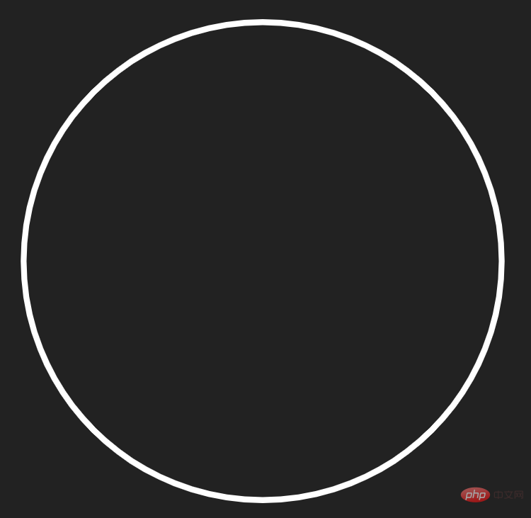
Define a path tag and draw a circle
<svg viewBox="-50 -50 100 100">
  <path class="stroke" d="M-40 0 a 40 40 0 0 1 80 0 a 40 40 0 0 1 -80 0"></path>
</svg>

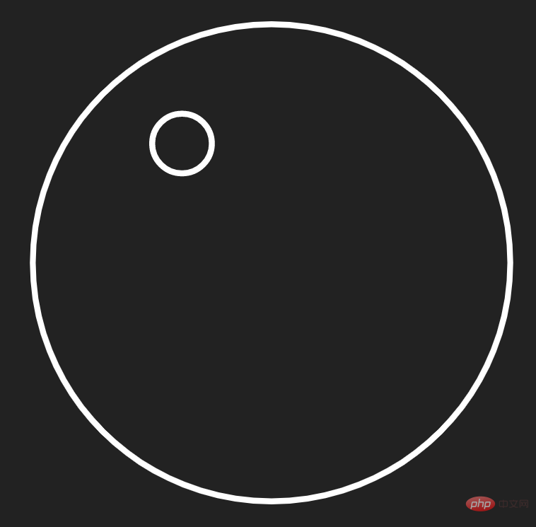
Use the path tag to draw the eye on the left
<svg viewBox="-50 -50 100 100">
  <path class="stroke" d="M-40 0 a 40 40 0 0 1 80 0 a 40 40 0 0 1 -80 0"></path>
  <path class="stroke" d="M-20 -20 a 5 5 0 0 1 10 0 a 5 5 0 0 1 -10 0"></path>
</svg>

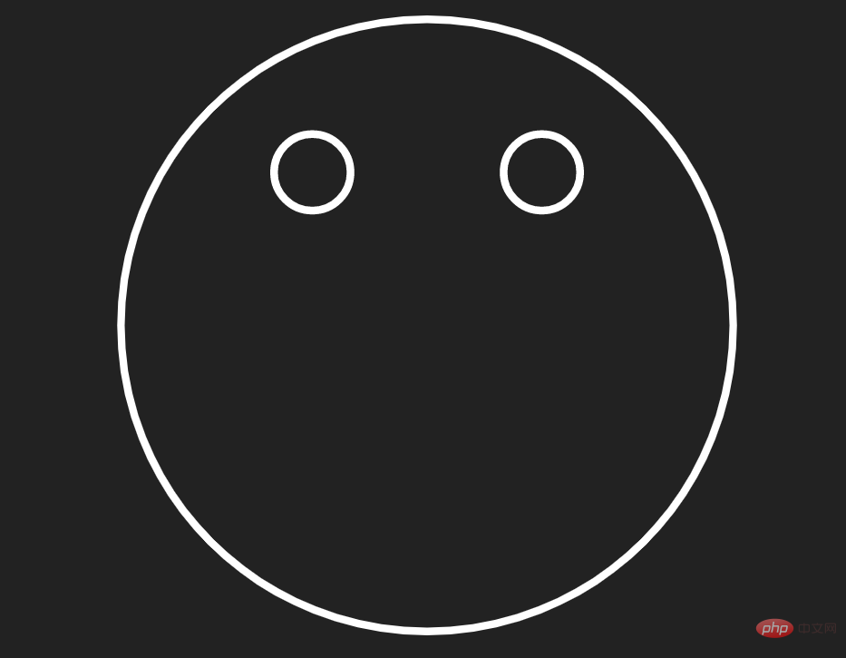
Draw out the right eye as well
<svg viewBox="-50 -50 100 100">
  <path class="stroke" d="M-40 0 a 40 40 0 0 1 80 0 a 40 40 0 0 1 -80 0"></path>
  <path class="stroke" d="M-20 -20 a 5 5 0 0 1 10 0 a 5 5 0 0 1 -10 0"></path>
  <path class="stroke" d="M10 -20 a 5 5 0 0 1 10 0 a 5 5 0 0 1 -10 0"></path>
</svg>

<svg viewBox="-50 -50 100 100">
  <path class="stroke" d="M-40 0 a 40 40 0 0 1 80 0 a 40 40 0 0 1 -80 0"></path>
  <path class="stroke" d="M-20 -20 a 5 5 0 0 1 10 0 a 5 5 0 0 1 -10 0"></path>
  <path class="stroke" d="M10 -20 a 5 5 0 0 1 10 0 a 5 5 0 0 1 -10 0"></path>
  <path class="stroke" d="M30 0 a 30 30 0 1 1 -60 0"></path>
</svg>

.stroke {
  stroke-linecap: round;
}
Finally realize the animation effect:
Bind an animation to the .stroke element, and then set the stroke-dasharray and stroke-dashoffset properties so that the smiley face pattern will be hidden first.stroke {
animation: stroke-anim 2s linear forwards;
stroke-dasharray: 300;
stroke-dashoffset: 300;
}@keyframes stroke-anim {
to {
stroke-dashoffset: 0;
}
}.stroke:nth-child(2) {
animation-delay: 2s;
}
.stroke:nth-child(3) {
animation-delay: 3s;
}
.stroke:nth-child(4) {
animation-delay: 4s;
}
@keyframes stroke-anim {
  to {
	stroke-dashoffset: 0;
  }
}
<!DOCTYPE html>
<html>
<head>
<meta charset="utf-8">
<style>
body {
background: #222;
display: flex;
height: 100vh;
justify-content: center;
align-items: center;
margin: 0;
}
svg {
display: block;
height: 90vmin;
width: 90vmin;
}
.stroke {
stroke-width: 1;
stroke: #fff;
fill: none;
stroke-linecap: round;
animation: stroke-anim 2s linear forwards;
stroke-dasharray: 300;
stroke-dashoffset: 300;
}
.stroke:nth-child(2) {
  animation-delay: 2s;
}
.stroke:nth-child(3) {
  animation-delay: 3s;
}

.stroke:nth-child(4) {
  animation-delay: 4s;
}

@keyframes stroke-anim {
  to {
	stroke-dashoffset: 0;
  }
}
</style>
</head>
<body>
<svg viewBox="-50 -50 100 100">
<path class="stroke" d="M-40 0 a 40 40 0 0 1 80 0 a 40 40 0 0 1 -80 0"></path>
<path class="stroke" d="M-20 -20 a 5 5 0 0 1 10 0 a 5 5 0 0 1 -10 0"></path>
<path class="stroke" d="M10 -20 a 5 5 0 0 1 10 0 a 5 5 0 0 1 -10 0"></path>
<path class="stroke" d="M30 0 a 30 30 0 1 1 -60 0"></path>
</svg>
</body>
</html>You can copy the above code directly and run the demonstration locally.
Here are some key tags and attributes:
@keyframes Rules
/* 定义动画*/
@keyframes 动画名称{
    /* 样式规则*/
}

/* 将它应用于元素 */
.element {
    animation-name: 动画名称(在@keyframes中已经声明好的);

    /* 或使用动画简写属性*/
    animation: 动画名称 1s ...
}animation-name:规定需要绑定到选择器的 keyframe 名称。。 animation-duration:规定完成动画所花费的时间,以秒或毫秒计。 animation-timing-function:规定动画的速度曲线。 animation-delay:规定在动画开始之前的延迟。 animation-iteration-count:规定动画应该播放的次数。 animation-direction:规定是否应该轮流反向播放动画。
The value of this property is measured in seconds or milliseconds; negative values are allowed, -2s causes the animation to start immediately, but skips 2 seconds to enter the animation.
:nth-child(n) The selector matches the nth child element in the parent element , there are no restrictions on element types.
PHP Chinese website platform has a lot of video teaching resources. Welcome everyone to learn "css video tutorial" and "HTML video tutorial"!
The above is the detailed content of How to dynamically draw a smiley face using HTML5+CSS3. For more information, please follow other related articles on the PHP Chinese website!